


Balanced Beige vs Agreeable Gray: The Comparison That Actually Helps You Decide

By Beril Yilmaz, qualified architect and interior designer
For most homes, Agreeable Gray is the easier choice: light enough to run through a whole house, warm enough never to feel cold. Balanced Beige is the right pick when you want the walls to carry visible warmth and depth, in rooms bright enough to support it. With fourteen LRV points between them, this is less a contest of undertones than a choice between two different jobs.
I treat these two as different tools rather than rivals. Agreeable Gray is a backdrop. Balanced Beige is a statement in a neutral voice. The first question I ask about either one is not gray versus beige. It is how much daylight the room actually gets.
This guide covers what the published color data tells you, how each one shifts with orientation, where each color belongs, how they work together, and the light test to run before committing to either.
The Short Answer Choose Balanced Beige if your room is bright, south- or west-facing, and you want warm, sandy walls with real presence. Choose Agreeable Gray if you want one light, flexible neutral for several rooms, or your light is north-facing or mixed. |
What the Numbers on the Swatch Card Tell You

Sherwin-Williams publishes enough data to see the difference before you buy a sample. Balanced Beige SW 7037 has an LRV of 45.6 and a hex value of #C0B2A2. Agreeable Gray SW 7029 has an LRV of 60.4 and a hex value of #D1CBC1.
The LRV gap tells you about depth: Agreeable Gray reflects roughly a third more light. The hex values tell you about warmth. In Balanced Beige, the red channel sits 30 points above the blue; in Agreeable Gray the gap is 16. Balanced Beige carries close to twice the warm bias. That is why one reads as beige and the other as greige.
Numbers do not replace a sample on your own wall. They do tell you which risk to test for: depth turning heavy with Balanced Beige, and warmth draining away with Agreeable Gray.
At a Glance
| Balanced Beige SW 7037 | Agreeable Gray SW 7029 |
Brand | Sherwin-Williams | Sherwin-Williams |
LRV | 46 | 60 |
Undertone | Warm sandy beige; can turn taupe in low light | Warm gray-beige balance; can show faint green beside yellow wood |
Character | A beige with weight - the walls become part of the scheme | A greige that steps back - the furniture leads, the walls follow |
Depth on the wall | Mid-tone; noticeably darker than the chip suggests on four walls | Light-mid; reads close to the chip on a full wall |
North-facing | Risky: depth turns heavy and brownish | Workable: shifts to a soft warm gray |
South-facing | Its best light - sandy, glowing, cosy | Leans beige; can look pale beside deep furnishings |
On walls | Feature rooms where warmth and enclosure are the goal | Whole-house color that links rooms with different light |
On cabinets | Islands and lower runs under lighter walls | Full kitchens with mixed metals and quartz |
Trim for each | Alabaster SW 7008 to keep the warmth soft | Pure White SW 7005 for clean, gentle contrast |
Architect's pick | A bright south-west living room with oak, leather and brass | An open-plan ground floor where north and south rooms meet |
Sherwin-Williams Balanced Beige SW 7037 - What It Really Looks Like

Balanced Beige has an LRV of 46, which puts it in the light-to-mid range, a full step deeper than most wall neutrals people shortlist. It is a beige with body. On a full wall it reads as a warm, sandy mid-tone, and in strong afternoon light it can lift toward a soft camel.
The depth is what makes it useful and what makes it risky. In a large, bright room it gives the walls real presence without going dark. In a small room with one north window the same depth closes in, and the warmth can turn heavy and slightly taupe as the light falls away.
It sits on the same Sherwin-Williams strip as Accessible Beige, two steps deeper. That strip relationship matters for trim and adjoining rooms. My Sherwin-Williams Balanced Beige review goes room by room through where that depth works and the whites I would put next to it.
Sherwin-Williams Agreeable Gray SW 7029 - What It Really Looks Like

Agreeable Gray has an LRV of 60, fourteen points lighter than Balanced Beige, and it sits right on the line between gray and beige. It is a true greige: warm enough to avoid feeling clinical, gray enough to stay quiet behind furniture.
Its behavior depends on orientation more than most neutrals. North light pulls it toward a soft warm gray. South and west light push it back toward beige. It shifts, but it never shouts. That range is why it can run through an entire house without one room looking off.
Beside very yellow or orange wood it can show a faint green cast, so the floor is worth checking before you commit. My Sherwin-Williams Agreeable Gray review covers those floor and trim pairings in detail, including the whites that keep it from going flat.
The Real Difference Between Balanced Beige and Agreeable Gray

The real difference is depth first, undertone second. Balanced Beige reflects roughly 46% of the light that hits it; Agreeable Gray reflects about 60%. On four walls that gap is obvious, and it changes how big and how bright a room feels.
Undertone follows from there. Balanced Beige commits to beige, with a sandy warmth that deepens as the light drops. Agreeable Gray hedges between gray and beige and lets the room decide. One adds warmth. The other absorbs whatever warmth is already there.
That makes them good partners rather than competitors: Agreeable Gray on main walls and Balanced Beige on an island, a dining room or a snug that should feel warmer. If you want beige warmth closer to Agreeable Gray's lightness, the Accessible Beige vs Agreeable Gray guide compares the lighter color from Balanced Beige's own strip directly against it.
How Each One Shifts With Orientation

North light is where the two part ways most clearly. Cool, indirect light flattens warm colors and exaggerates depth. Expect Balanced Beige to look darker and drift toward taupe, and Agreeable Gray to lose some beige and read as a soft gray.
South and west light push both warmer. Balanced Beige turns sandy and close to camel by late afternoon, which is its best moment. Agreeable Gray leans toward beige and can look paler than expected beside deep furniture.
East-facing rooms reverse during the day. Both look warmest in the morning and coolest by evening, so check them after 4pm before deciding. Your bulbs matter too: 2700K lamps add warmth to both, while 4000K LEDs pull Agreeable Gray toward gray quickly.
When to Choose Balanced Beige

Choose Balanced Beige when the room is bright and you want the walls themselves to carry warmth. South- and west-facing living rooms, dining rooms used in the evening, and large open spaces with plenty of glass all suit it.
It is a strong partner for warm wood, leather, rattan, aged brass and cream upholstery. Those materials meet its sandy depth halfway, so the room feels layered rather than beige-on-beige. It also works as a grounding color on a kitchen island or lower cabinets under lighter walls.
Skip it in small north-facing rooms and hallways with no daylight. Depth needs light to stay warm. Without it, Balanced Beige starts to read brown.
When to Choose Agreeable Gray

Choose Agreeable Gray when you need one neutral to work across rooms with different light. Open-plan layouts, hallways that link north and south rooms, and whole-house repaints are where it earns its place.
It also suits rooms that mix warm and cool finishes: white oak beside brushed nickel, quartz beside walnut. It does not take sides. That neutrality is the point.
Pass on it if the brief is cosy and enveloping. In a south-facing room it can look pale and slightly washed out next to deeper, warmer furnishings.
Trim, Ceiling and Wall Pairings
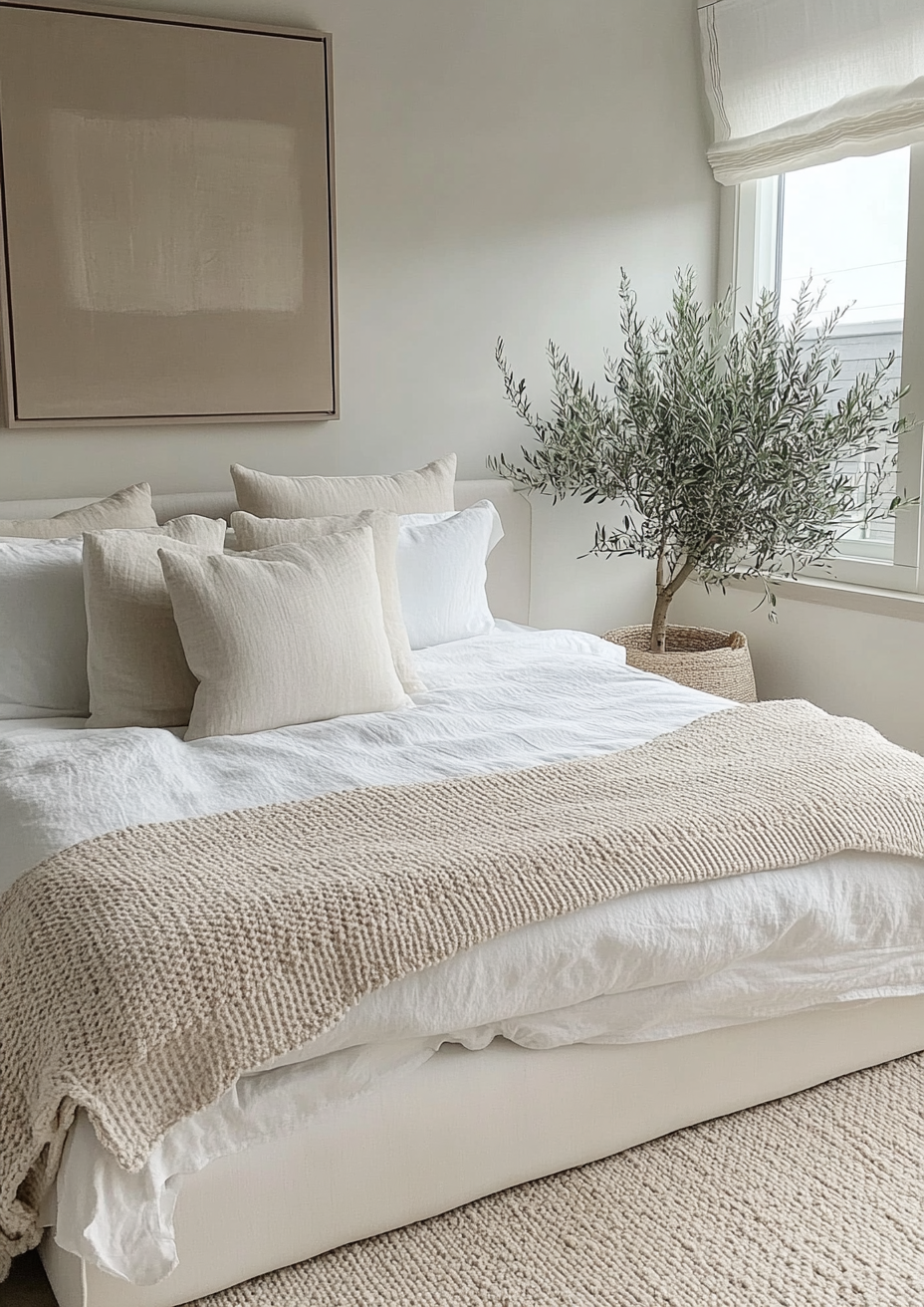
For Balanced Beige walls, keep the trim soft. Alabaster SW 7008 holds the warmth; a stark white makes the beige look darker and dustier at the joinery line. On ceilings, a warm white such as Alabaster avoids a hard band at the cornice.
For Agreeable Gray walls, Pure White SW 7005 is the reliable trim. It is clean without going blue, so the greige stays warm. Extra White SW 7006 gives a sharper, more contemporary edge if the room leans modern.
Using both in one house works when depth goes where the light is. Put Balanced Beige in the brightest room or on a single element - an island, a dining room, the lower half of a paneled wall - and let Agreeable Gray carry the circulation spaces around it.
Architect's Verdict - Balanced Beige or Agreeable Gray?

For most homes, Agreeable Gray is the safer, more flexible choice. It handles north light, open plans and mixed finishes without asking much of the room.
Balanced Beige is the better color when you want warmth you can see. In a bright room with natural materials it gives a depth Agreeable Gray cannot match. Light decides whether that depth reads as cosy or heavy.
The test: your worst light is the dimmest wall in the room, late on an overcast afternoon, with your own bulbs switched on. Paint an A3 board of each color in two coats and tape both to that wall at eye level, next to an offcut of your trim white. Look at 9am, again at dusk, and once more an hour after dark. Balanced Beige passes if it still reads as warm beige rather than brown or taupe; Agreeable Gray passes if it still reads as warm greige rather than flat gray. If Balanced Beige fails on your darkest wall, keep it for your brightest room only.
Frequently Asked Questions
Is Balanced Beige darker than Agreeable Gray?
Yes, noticeably. Balanced Beige has an LRV of 46 and Agreeable Gray an LRV of 60, so Balanced Beige reflects less light and reads as a mid-tone on the wall, while Agreeable Gray stays light.
Is Balanced Beige warmer than Agreeable Gray?
Yes. Balanced Beige is a committed warm beige. Agreeable Gray is a greige that sits between gray and beige, so it reads cooler, especially in north light.
Can I use Balanced Beige and Agreeable Gray together?
Yes - they work well as a light and deep pair. Use Agreeable Gray on main walls and Balanced Beige on an island, lower cabinets or a dining room that should feel warmer. Keep one white trim throughout to tie them together.
Which is better for a north-facing room, Balanced Beige or Agreeable Gray?
Agreeable Gray, in most north-facing rooms. It shifts toward a soft warm gray but stays light. Balanced Beige tends to look heavy and brownish without direct sun.
What white trim goes with Balanced Beige?
Alabaster SW 7008 is the softest match. It keeps the trim in the same warm family. Brighter whites like Extra White create stronger contrast and can make Balanced Beige look darker.
Final Thought
If you want a quiet background that works everywhere, Agreeable Gray is the answer. If you want the walls to feel warm and enclosing in a room that gets real daylight, Balanced Beige is worth the extra care.
Sample both on your darkest wall first. The depth difference will tell you within a day which one your room can carry.
Still not sure which one your room needs? A Paint Color Consultation gets you a custom palette built around your space and your light - book yours here. |
About the Author
Beril Yilmaz is a qualified architect and interior designer based in the UK. She runs BY Design And Viz, a design platform covering paint color reviews, interior design guidance, and residential design projects. She works with warm neutrals like Balanced Beige and Agreeable Gray across residential color schemes, and plans palettes around orientation and daylight first.


Comments