


Balboa Mist vs Alabaster: The Comparison That Actually Helps You Decide

Balboa Mist and Alabaster get pulled onto the same shortlist constantly, and the pairing rarely makes sense once you look past the fan deck. Balboa Mist is a warm greige with a fourteen-point-lower LRV and a violet undertone, while Alabaster is a warm white that sits close to the top of the reflectance scale. One is a wall colour with real depth. The other is closer to a backdrop.
I have specified both across residential projects, and I rarely treat them as competitors. They are not usually solving the same problem in the same room.
This guide covers the undertone behaviour, the LRV gap that actually matters more than either colour's individual merits, and which one your room is asking for.
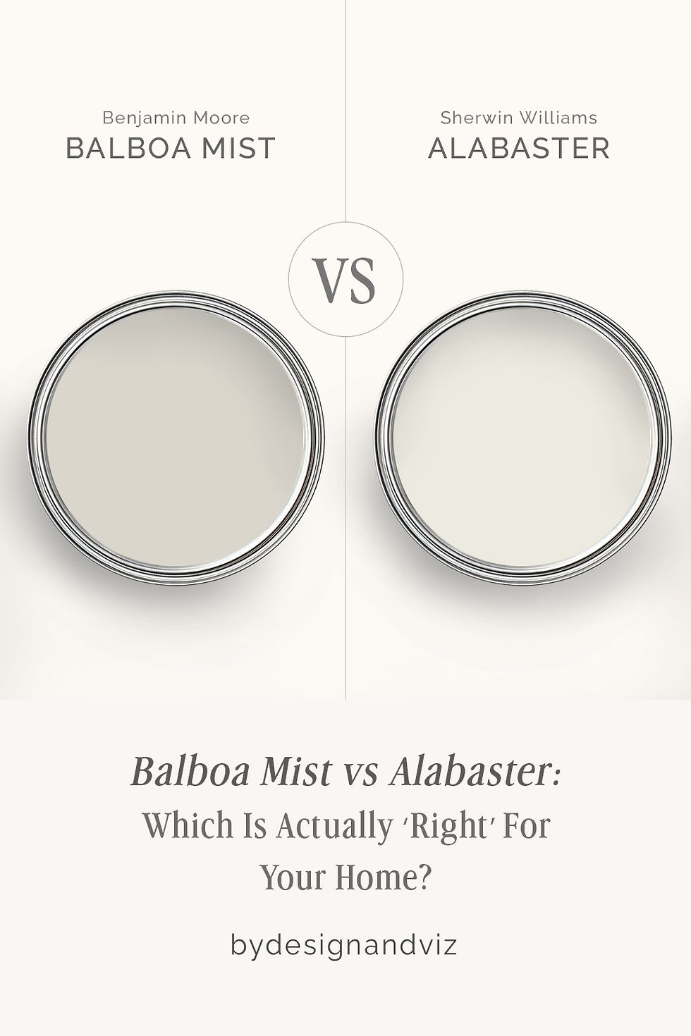
At a Glance
| Balboa Mist | Alabaster |
Brand | Benjamin Moore | Sherwin-Williams |
LRV | 67 - light greige, well below Alabaster's near-white reflectance | 82 - a near-white, reflects far more light than Balboa Mist |
Colour category | Warm greige with genuine depth - reads as a colour, not a near-white | Restrained warm white - functions as a backdrop rather than a stated colour choice |
Undertones | Violet-grey base with a warm, taupe-adjacent lean - can shift purple-pink under cool artificial light | Soft yellow held well back - warm enough to avoid reading cold, quiet enough to avoid reading cream |
Character | A considered backdrop colour with presence; holds its own against furniture and art rather than disappearing into the wall | A near-white that steps back and lets everything else in the room lead - versatile precisely because it does not assert itself |
North-facing | Workable but watch it closely - flat north light can pull the violet undertone forward and read cooler than intended | Reliable - the restrained undertone holds its warmth without tipping into obvious yellow |
South-facing | Excellent - warm daylight settles the violet undertone into a soft, sophisticated taupe-grey | Clean and crisp - warmth is present without ever competing with the room |
Open-plan | Strong - the mid-range LRV holds its greige character consistently across zones without washing out | Strong - reads consistently as a light, warm backdrop across zones with mixed light and material temperatures |
On walls | A genuine wall colour that anchors a room - it has enough depth to read as a deliberate choice, not a placeholder | A high-reflectance backdrop that brightens a room rather than anchoring it - the opposite job to Balboa Mist |
On cabinets | Excellent on lower cabinets and islands where a soft, grounded neutral works better than a near-white | The more practical choice across most kitchens, including cool stone and stainless finishes |
Use together? | Yes - Balboa Mist on walls with Alabaster on trim and ceiling is a strong pairing; the near-white trim gives the greige somewhere to land | Yes - Alabaster on trim and ceiling alongside Balboa Mist walls is the classic pairing; the reverse role rarely works as well |
Trim for each | Alabaster SW 7008 for a warm, soft-edged contrast, or Chantilly Lace OC-65 for a crisper break | Extra White SW 7006 or Pure White SW 7005 for crisp definition |
Style fit | Transitional, coastal-neutral, quiet luxury - rooms that want a considered neutral rather than a bright backdrop | Traditional, transitional, organic modern - the more versatile of the two by a wide margin |
Architect's pick | When the room needs an actual wall colour with depth - not a near-white that recedes | When the room needs brightness and a backdrop that will not compete with anything else in the space |
Benjamin Moore Balboa Mist OC-27 - What It Really Looks Like

Balboa Mist has an LRV of 67, which puts it firmly in the light greige category rather than the near-white range Alabaster occupies. The undertone is where it gets interesting: a soft violet-grey base that can lean taupe in warm light and lean purple in cool light.
It does not hedge. Balboa Mist reads as a genuine colour on the wall, not a placeholder neutral - it has enough depth to anchor a room the way Alabaster, sitting fifteen points higher on the reflectance scale, simply cannot.
In flat north-facing light or under cool LED bulbs, the violet undertone can become more assertive than expected. In warm daylight it settles into a sophisticated, taupe-leaning grey that reads as deliberate rather than accidental.
Sherwin-Williams Alabaster SW 7008 - What It Really Looks Like

Alabaster has an LRV of 82, which puts it near the top of the reflectance scale and firmly in near-white territory. The undertone is a restrained warm yellow - present enough to avoid reading cold, quiet enough that it rarely announces itself the way a true cream would.
There is nothing ambiguous about it. Alabaster is built to recede. It brightens a room, defers to whatever else is in it, and holds its warmth across a far wider range of light conditions than a colour with more depth ever could.
In direct sunlight it looks crisp and clean. In lower light or north-facing rooms it holds its warmth better than most warm whites, since the restrained undertone has little room to tip toward yellow.
The Real Difference Between Balboa Mist and Alabaster

The simplest way to explain it: Balboa Mist is a wall colour. Alabaster is a backdrop. That is not a value judgement, it is a functional distinction, and it is the fourteen-point LRV gap between them that creates it.
Balboa Mist has an LRV of 67 and Alabaster sits at 82. A gap that size is not a subtle difference in brightness - it changes what each colour is capable of doing in a room. Balboa Mist has enough depth to read as a genuine colour choice on a full wall. Alabaster reflects too much light and sits too close to white to ever behave the same way. Comparing them as if they compete for the same wall misses the point entirely.
This is why the two are so often used together rather than against each other. Balboa Mist on walls with Alabaster on trim and ceiling is a well-tested combination - the near-white trim gives the greige room to breathe, and the greige gives the trim something to define. For a closer look at how Balboa Mist performs against another Benjamin Moore neutral closer to its own depth, the Balboa Mist vs Edgecomb Gray guide covers the undertone difference between two greiges that are actually competing for the same wall.
Not sure which one works for your room? A colour consultation is included in all our design packages - book directly here. |
When to Choose Balboa Mist

Choose Balboa Mist when the room needs a wall colour with real presence - not a near-white that fades into the background. South or west-facing rooms with warm daylight let the undertone settle beautifully. Living rooms, primary bedrooms, and kitchen islands all suit its depth.
Avoid it in small, light-starved, north-facing rooms where the violet undertone has nothing to balance it. Avoid it under cool artificial lighting without testing first - the purple lean can become the dominant story rather than a subtle undertone.
When to Choose Alabaster
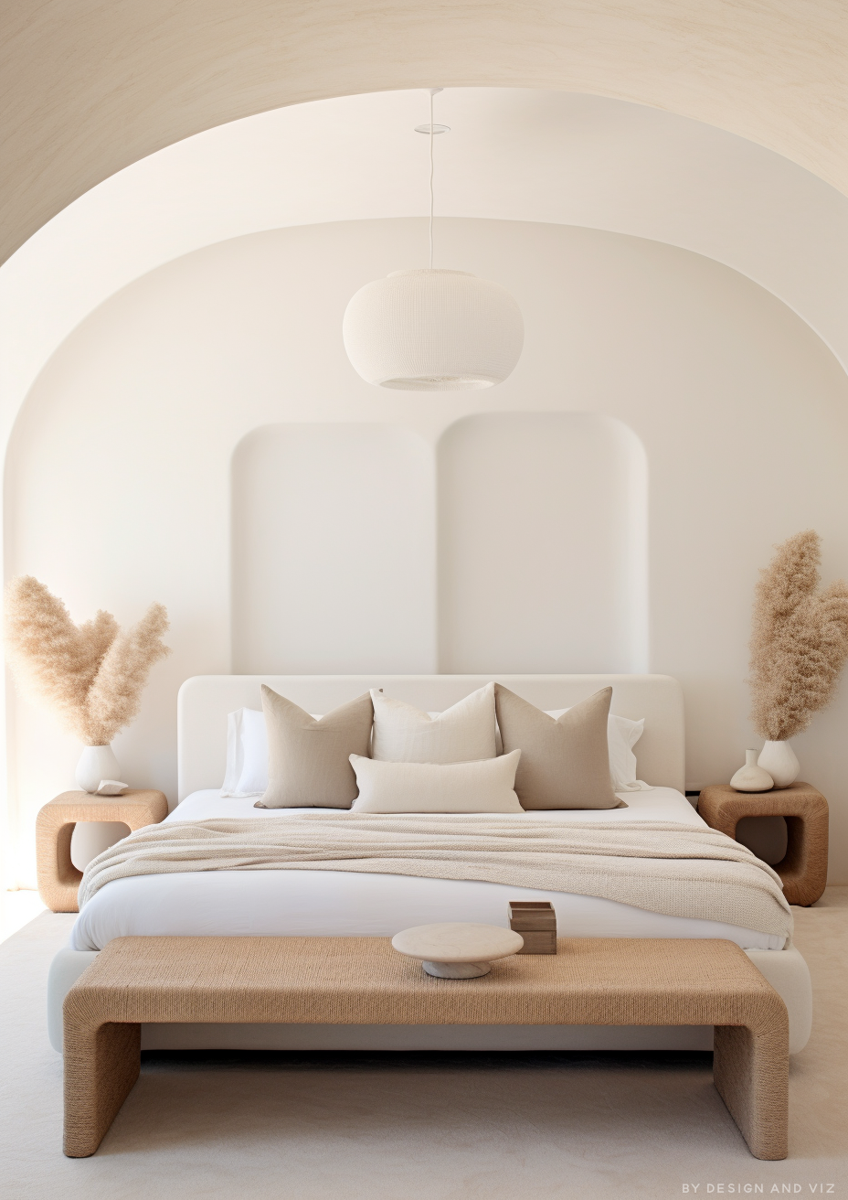
Choose Alabaster when the room needs brightness and a backdrop rather than a statement. Small or light-starved rooms, open-plan spaces with mixed material temperatures, and kitchens with cool stone or stainless finishes all suit its restraint.
Avoid it where the brief specifically calls for a colour with depth and presence - in that scenario it will read as an absence rather than a decision. Your room will tell you which one it needs.
How the Pairings Differ

For Balboa Mist on walls, Alabaster on trim and ceiling is the natural pairing - the higher-LRV white gives the greige definition without fighting its violet undertone. Chantilly Lace works as a crisper alternative where more contrast is wanted.
For Alabaster on walls, Extra White or Pure White on trim keeps the scheme clean and restrained. Alabaster on both walls and trim also works well where the goal is a seamless, quiet backdrop throughout.
Balboa Mist wants a floor with some warmth to settle its undertone - mid-tone or warm-toned wood keeps the violet in check. Alabaster is more forgiving and sits comfortably against both warm wood and cool stone.
Both colours suit brushed brass and warm metals well. Balboa Mist can look slightly cool against stainless or chrome in low light, where the violet undertone becomes more noticeable. Alabaster handles cool metals without friction.
Architect's Verdict - Balboa Mist or Alabaster?

For most homes, the choice is not really Balboa Mist or Alabaster - it is where each one belongs.
Choose Balboa Mist when the room needs a genuine wall colour - a living room, a primary bedroom, a kitchen island where a near-white would look unfinished. It has the depth to anchor a space and hold its own against furniture and art.
Choose Alabaster when the room needs brightness and restraint - a small room short on natural light, a kitchen with mixed material temperatures, or any space where the goal is a backdrop rather than a statement.
The test I always use for this pairing specifically: paint a large sample of Balboa Mist on the wall and hold an Alabaster swatch against the trim in your worst light - typically a north-facing room under LED downlights, where Balboa Mist's violet undertone is most exposed. If the greige still reads warm and considered rather than cool and purple-tinged, and the Alabaster trim stays crisp beside it, both colours pass. If the greige looks flat or cold, test Balboa Mist against a warmer trim before committing.
Frequently Asked Questions

Is Balboa Mist warmer than Alabaster?
Not exactly - Balboa Mist has a violet-grey undertone rather than a straightforwardly warm one, while Alabaster's undertone is a restrained warm yellow. Alabaster reads as the more conventionally warm colour of the two, even though Balboa Mist has real depth Alabaster lacks.
Can I use Balboa Mist and Alabaster in the same house?
Yes, and it is a well-established combination. Balboa Mist on walls with Alabaster on trim and ceiling is the classic pairing - the fourteen-point LRV gap between them creates clean, deliberate contrast rather than a clash.
Which is better for a small, dark room?
Alabaster, without much debate. Its LRV of 82 reflects significantly more light than Balboa Mist's 67, which matters more in a small or light-starved room than either colour's undertone.
Does Balboa Mist look purple on the walls?
It can, particularly under cool artificial light or in flat north-facing rooms. In warm natural light the violet settles into a sophisticated taupe-grey. Always test with a large sample patch under your room's actual lighting, day and night, before committing.
Which is better for kitchen cabinets?
It depends on the job. Alabaster is the more practical choice for upper cabinets and small kitchens where brightness matters. Balboa Mist works well on islands and lower cabinets where a grounded, warm-grey neutral is wanted instead of a near-white.
What is the LRV difference between Balboa Mist and Alabaster?
Balboa Mist has an LRV of approximately 67 and Alabaster sits at approximately 82 - a fourteen-point gap. That is a significant difference in practice, not a marginal one, and it is the reason the two colours are best understood as serving different jobs rather than competing for the same wall.
Final Thought
Balboa Mist and Alabaster are not really rivals. One is a wall colour with genuine depth and a distinctive violet-grey undertone. The other is a near-white backdrop built to recede. Treating them as competing options for the same surface misses what each one is actually good at.
If the room needs a colour with presence, Balboa Mist earns its place. If the room needs brightness and restraint, Alabaster is the safer, more reliable choice. Paint large samples of both, check them against each other in your worst light, and let the fourteen-point LRV gap do the deciding for you.
Want a complete colour scheme built around Balboa Mist or Alabaster? Our design packages cover full palette selection, finish recommendations, and 3D visualisations - see our packages. |
About the Author
Beril Yilmaz is a qualified architect and interior designer based in the UK. She runs BY Design And Viz, a design platform covering paint colour reviews, interior design guidance, and residential design projects. Beril has specified both Balboa Mist and Alabaster across residential projects in the UK and internationally — Balboa Mist as an anchoring wall colour in living rooms and primary bedrooms with warm-toned flooring, Alabaster as a high-reflectance backdrop in kitchens and open-plan spaces, often specifying both together with Balboa Mist on walls and Alabaster on trim and ceiling.


Comments