Cheetah vs Leopard Print: How to Style These Iconic Patterns in a Designer Way
- Beril Yilmaz

- Nov 7, 2025
- 6 min read
Animal prints have been a symbol of luxury and statement style for decades — and the debate of cheetah vs leopard print continues to be a favourite among designers. Both are iconic, timeless, and instantly add personality to any room when used thoughtfully.
The fascination began with fashion, but these prints have long since made their way into interiors. Their organic patterns and neutral tones blend seamlessly into contemporary spaces, acting as both a pattern and a texture.
But while they’re often used interchangeably, cheetah and leopard prints have distinct differences — and knowing which one to choose can elevate your design scheme from bold to beautifully curated.
At a Glance
• Understand the visual differences between cheetah and leopard print
• Learn which pattern suits modern, eclectic, or luxurious interiors
• Discover how to incorporate animal prints tastefully in your home
• Explore tone, colour, and pattern scale for elevated styling
• Find design inspiration for walls, fabrics, and statement decor
1. Cheetah vs Leopard Print: The Key Visual Differences
At first glance, cheetah and leopard prints may look similar, but the distinction is all in the details.
Cheetah print is made up of solid black spots scattered evenly across a tan or golden base. Each spot is distinct — no outlines, no clusters — creating a sleek, minimal, and almost modern pattern.
Leopard print, on the other hand, features clusters of dark rosettes: irregularly shaped circles with lighter centres, giving a sense of depth and texture. It feels more layered, luxurious, and dynamic — often chosen for its bold, exotic appeal.
Visually, cheetah print reads more minimal, while leopard print feels more decorative. The right choice depends on your design style and how much visual movement you want in your space.
2. Cheetah vs Leopard Print: Which One Fits Your Interior Style?

When it comes to interiors, the choice between cheetah vs leopard print depends on the mood you want to create.
Cheetah print suits modern, minimal, and contemporary interiors. Its clean, repetitive pattern works well with neutral palettes, black-and-white schemes, and structured furniture. It feels elegant and fresh — the print equivalent of quiet confidence.
Leopard print thrives in eclectic, layered, or luxe spaces. It pairs beautifully with velvet, brass, marble, and dark woods. Its irregular pattern adds warmth, character, and a hint of glamour to any room.
If you’re designing a home that blends both organic and refined elements, you can even mix the two subtly — using cheetah for smaller accents (like cushions) and leopard in larger statement pieces (like rugs or wallcoverings).
Need Guidance on Styling Animal Prints?
We’re here to help. Whether you’re reimagining your living space or curating a home full of character, our designers specialise in timeless interiors that blend personality with sophistication.
3. Cheetah vs Leopard Print: How to Use Them in Home Design

Incorporating cheetah vs leopard print into your interiors requires balance. These prints are naturally bold, so restraint is key.
For Cheetah Print
Use cheetah in smaller doses for subtle texture. Try accent cushions, upholstered stools, or framed artwork. Its even pattern makes it perfect for layering against geometric shapes or sleek, modern decor.
For Leopard Print
Leopard print, with its deeper contrast, can handle more prominence. Think large-scale rugs, accent chairs, or feature wallpaper. It brings warmth to modern spaces and instantly elevates neutral palettes.
For a cohesive look, repeat the pattern sparingly in other elements — like a small throw pillow that echoes a wallpaper motif — to keep it intentional rather than overpowering.
4. Cheetah vs Leopard Print: Colour and Tone Matter

The power of cheetah vs leopard print lies in its adaptability. Designers often use these patterns as neutrals — yes, neutrals — because they harmonise effortlessly with a range of tones.
Warm Palette
Use tan, caramel, and brown-based versions of these prints to create a cosy, layered space. They pair beautifully with walnut wood, brass lighting, and warm taupe walls.
Cool Palette
Opt for grey-based or desaturated versions for a more contemporary lo
ok. These work especially well with black accents, soft greige walls, or polished chrome details.
You can even find cheetah or leopard prints in modern colourways like charcoal, white, or muted blush — perfect for adding visual intrigue without the expected jungle tones.
5. Cheetah vs Leopard Print: Where to Use Each in the Home

The placement of cheetah vs leopard print can dramatically shift the energy of your interior.
Living Room: A leopard print rug anchors the space, while a few cheetah-patterned cushions keep things refined.
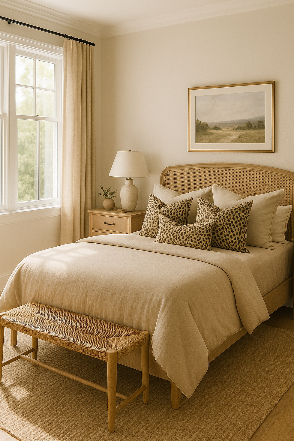
Bedroom: A leopard throw or upholstered bench adds drama; cheetah prints on linen or wall art keep it subtle.
Hallway: Try a bold leopard stair runner — it’s a high-impact moment in a transitional space.
Home Office: Cheetah print chairs or stationery can add just the right amount of flair without distraction.
The secret? Balance. Pair animal prints with textured neutrals like boucle, wood, or linen for a sophisticated, organic aesthetic.
Need Design Direction?
From statement prints to timeless neutrals, our designers can help you curate a home that feels intentional, personal, and perfectly balanced. Whether you’re starting small or tackling a full redesign, we’re here to help bring your vision to life.
6. Cheetah vs Leopard Print: Mixing Prints the Designer Way

Many homeowners fear mixing prints, but when done correctly, it can look effortlessly high-end. The cheetah vs leopard print combination is a great starting point because both share similar tones.
Here’s how to master it:
Vary scale: Use one larger pattern (like leopard) and one smaller (like cheetah) so they don’t compete.
Keep colours cohesive: Stick to one tone family — warm browns or cool greys.
Add solid grounding: Introduce solid neutrals in between (like beige upholstery or black accents) to give the eye a place to rest.
When styled well, this mix looks collected rather than chaotic — the hallmark of a designer-curated home.
7. Cheetah vs Leopard Print: How to Keep It Timeless, Not Trendy

Animal prints have longevity when used with subtlety. Instead of following short-lived trends, focus on quality, tone, and context.
Choose prints that feel organic and textural rather than overly graphic. Avoid high-shine finishes or harsh colour contrasts; instead, look for fabrics and wallpapers with a matte, woven, or slightly distressed texture.
By treating cheetah vs leopard print as an accent rather than a feature wall-to-wall theme, you’ll create a look that feels elevated, natural, and enduring.
8. Cheetah vs Leopard Print: Designer-Inspired Colour Pairings
Here are a few tried-and-tested combinations designers love when working with cheetah vs leopard print:
Leopard print + black and brass – bold, moody, and glamorous.
Cheetah print + greige and ivory – minimal, soft, and modern.
Leopard print + olive and walnut – warm and organic.
Cheetah print + pale grey and marble – clean, calm, and refined.
Pair either print with textured natural materials — rattan, linen, boucle, or stone — to keep your space feeling layered and authentic.
9. Cheetah vs Leopard Print: Final Thoughts on Choosing the Right One
In the end, the cheetah vs leopard print debate isn’t about competition — it’s about context.
If your goal is understated texture, cheetah’s soft, structured pattern works best. For warmth, richness, and personality, leopard print will never disappoint. Both bring character, movement, and subtle luxury when used with restraint.
The beauty of animal prints lies in their natural irregularity — they echo organic shapes found in the wild, yet blend seamlessly into modern homes. Whether you lean minimalist or eclectic, there’s a version of this timeless pattern that fits your style perfectly.
FAQ
1. What is the main difference between cheetah and leopard print?
Cheetah print has solid, evenly spaced black dots on a golden background, while leopard print features irregular rosettes with lighter centres, giving more visual texture.
2. Can you mix cheetah and leopard prints in one room?
Yes — when scaled and toned correctly. Use one as a larger anchor piece and the other in small accents to keep balance.
3. Which print is more timeless in interior design?
Both are classics, but cheetah print feels more minimal and modern, while leopard print carries a more luxurious, layered aesthetic.
4. What colours go best with animal prints?
Neutrals like beige, ivory, grey, and black always work. Earth tones such as terracotta, olive, and tan also complement animal prints beautifully.
Start Your Dream Home Transformation
Feeling inspired to elevate your space?
From initial concept to final styling, we’ll guide you every step of the way — bringing warmth, intention, and sophistication to your home.
Author Bio
Written by Beril Yilmaz, founder of BY Design And Viz — a UK-based interior designer known for crafting timeless, organic modern interiors with warmth and depth. Beril helps clients transform their homes through bespoke design, expert styling, and a love for natural materials and layered textures.


Comments