


Sherwin-Williams Dorian Gray Coordinating Colors: The Complete Architect's Guide

Sherwin-Williams Dorian Gray SW 7017 is a warm, medium-depth gray, and it is deeper than most people expect from the chip. An LRV of 39 carries a base of warm brown and greige with a faint hint of purple. It is not a light gray with a little character. It is a gray with real body.
I have specified Dorian Gray where a room wanted weight without going dark, and here is the honest truth: the challenge is not choosing Dorian Gray — it is choosing what goes with it. The wrong trim makes it look dull. The wrong light makes it gloomy. The right pairings give it a crisp outline and a warm, tailored feel. Here are the Dorian Gray coordinating colors named in my own review and in independent sources, and exactly why each one works.

Understanding Dorian Gray Before You Coordinate

Dorian Gray's LRV of 39 is the number to respect. It sits nine points below Mindful Gray (48), nineteen below Repose Gray (58), and well above Gauntlet Gray (17). Anything under 60 can feel heavy in a small or dim room, so this is a colour to sample on the actual wall.
The undertone is warm brown and greige with a faint purple lean. In daylight it reads soft and neutral. Under warm bulbs a taupe or violet shadow can appear in corners and evenings. In a dark room it deepens into something moodier. In a bright south-facing room it holds its colour all day.
That tells you what to coordinate it with. Warm whites and bright whites give it a crisp edge. Warm wood, brick, bronze, and brass settle it. Deep navy and charcoal make it look deliberate. The warm brown base is the thing every pairing here respects.
For the basics — undertones, the best applications, and the full pairing list from my original review — the Dorian Gray review is the place to start before you commit to a whole-house scheme.
Quick Reference Table
The six colors below are covered in full in the pairings section that follows. Each is named for Dorian Gray in my own review or in independent reviews. Two additional colors are included here for completeness.
Color | Code | Why it works with Dorian Gray |
White Dove | BM OC-17 | The soft warm white that enhances Dorian Gray's elegance — the best-balanced trim |
Pure White | SW 7005 | The clean, bright trim — gives a crisp outline against the medium-depth gray |
Alabaster | SW 7008 | The creamy, inviting contrast for a softer, warmer scheme |
Repose Gray | SW 7015 | A lighter gray for a soft, monochromatic look — nineteen LRV points lighter |
Naval | SW 6244 | Rich navy that makes Dorian Gray pop on islands, doors, and built-ins |
Evergreen Fog | SW 9130 | A soft green-gray for a nature-inspired, earthy palette |
Kendall Charcoal | BM HC-166 | Deep, dramatic gray for shutters, doors, or trim |
Swiss Coffee | BM OC-45 | A warm, creamy off-white that suits Dorian Gray's warmth |
Dorian Gray as a Wall Color — Best Pairings
White Dove OC-17 with Dorian Gray Walls

White Dove is the trim that offers the best balance. A soft, warm white, it enhances Dorian Gray's elegance without making the wall look dull. It is also the trim I name first for Dorian Gray exteriors.
This suits living rooms, bedrooms, and period homes. Keep floors and hardware warm so the whole scheme agrees.
Pure White SW 7005 with Dorian Gray Walls

Pure White is the cleaner, brighter option. Dorian Gray is dark enough to give a sophisticated contrast against Pure White trim, but light enough to stay gray rather than charcoal. Baseboards, casings, and cabinetry get a crisp outline.
Use it on interior trim, exterior trim, and the perimeter of a kitchen where Dorian Gray sits on the island. Pure White is the one to reach for when you want the crispest result.
Alabaster SW 7008 with Dorian Gray Walls
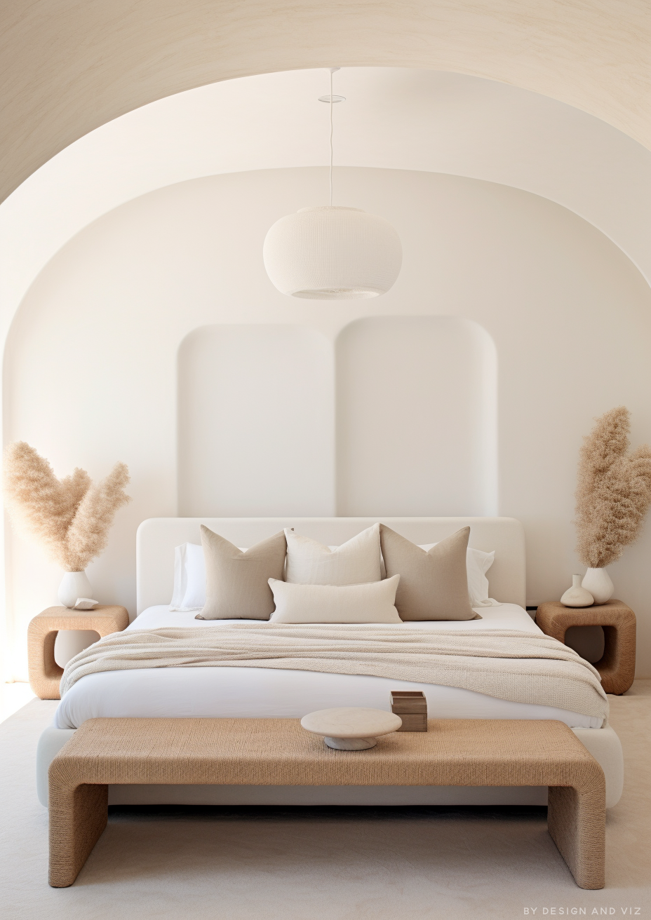
Alabaster is the creamy, inviting contrast. It is softer than Pure White and warmer than White Dove's restraint, so the scheme feels cosy rather than tailored.
This works in bedrooms and farmhouse kitchens. Pair it with earthy greens and soft beiges, as the bedroom palette suggests.
Repose Gray SW 7015 with Dorian Gray

Repose Gray is the lighter gray for a soft, monochromatic look. At LRV 58 against 39, it reads brighter and more reflective. Used on an adjoining room or an accent against Dorian Gray, the two stay in one gray family with a clear step in depth.
Repose Gray also helps in rooms with low ceilings, where a lighter wall keeps the height from feeling lowered. Dorian Gray on lower cabinets or a feature wall, with Repose Gray elsewhere, balances the depth.
Naval SW 6244 with Dorian Gray
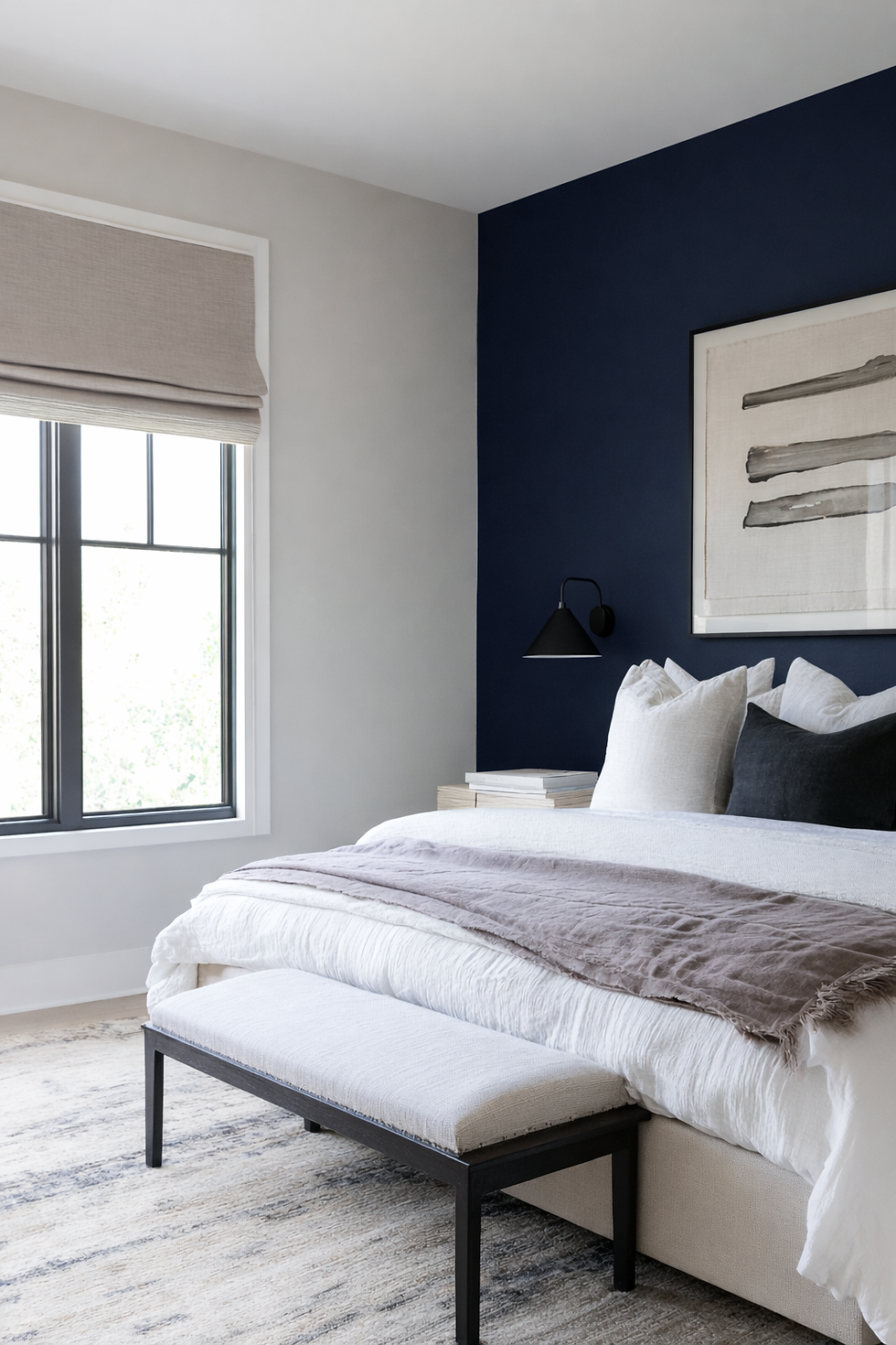
Naval is the rich navy that makes Dorian Gray pop. The warm gray recedes and the navy anchors. It is a classic contrast for an island, a front door, or built-ins.
Use it on a single surface. Brass or matte black hardware carries the pairing through.
Evergreen Fog SW 9130 with Dorian Gray

Evergreen Fog is the soft green-gray for a nature-inspired palette. It sits quietly beside Dorian Gray's brown-leaning warmth, and both stay muted. Earthy greens pair beautifully with this gray in bedrooms.
Use it on cabinetry, an accent wall, or soft furnishings, with natural wood and linen between the two.
Dorian Gray for Trim, Floors, and Finishes

White Dove or Pure White are the best-balanced trim choices. Both give a clear, crisp edge. White Dove is warmer and softer; Pure White is cleaner and brighter. Alabaster is the creamy third option. Choose by how tailored or how cosy the room should feel.
Dorian Gray is not a ceiling colour. At LRV 39 it takes light out of a room. Keep ceilings white. The one exception is a deliberate colour-drench: walls, trim, and ceiling in Dorian Gray create a coziness that feels like a warm blanket, and it suits a den, office, or dining room.
For floors, medium and dark wood tones, and warm decor accents. For fixtures, brushed gold, brass, matte black, copper, and bronze all sit well. Brick and stone keep the look grounded. For woodwork, use a satin or semi-gloss finish in your trim white.
Dorian Gray vs Repose Gray — Which Gray?

This is the most common decision. Repose Gray is the lighter, more reflective gray, with an LRV of 58. Dorian Gray is a full nineteen points deeper, with a warmer base. Dorian Gray photographs with stronger depth. Repose Gray sometimes appears more neutral than it actually is in person.
The decision comes down to depth and room. If the room has strong, consistent natural light and the brief wants a bright, calm gray, Repose Gray delivers it. If the room is genuinely bright, or you want visible contrast against white trim, Dorian Gray holds its colour all day and gives baseboards and cabinetry a crisp outline.
When in doubt, Repose Gray is the safer choice for small, dim, or low-ceilinged rooms. Dorian Gray is the right choice only when the room has the light and scale to carry its depth.
Want a complete color scheme built around Dorian Gray? A Color Direction consultation gets you a full custom palette built around your space - book yours here. |
For the full comparison of Dorian Gray against Repose Gray — how they behave with white trim, in natural light, and against flooring — the Dorian Gray vs Repose Gray guide covers every condition and a clear verdict.
Dorian Gray Coordinating Colors by Room

Living Room
Dorian Gray walls with White Dove trim, medium-toned wood floors, and warm decor creates a cosy yet elegant backdrop. It is especially good with red brick fireplaces and warm woods. For a bolder room, take Naval onto a built-in or a single wall.
Bedroom
Dorian Gray pairs beautifully with soft whites, beiges, and earthy greens in a bedroom. Alabaster trim, linen bedding, and an Evergreen Fog accent give a calm, grounded room. In a dark bedroom the colour deepens into something moodier, so sample it first.
Kitchen
On cabinetry, Dorian Gray is a refined choice with brushed gold or matte black hardware. A strong specification is Pure White on the perimeter cabinets and Dorian Gray on the island, which gives genuine contrast without a busy look.
Bathroom
In a bathroom, Dorian Gray works with white marble, brass fixtures, and wood accents for a spa-like feel. Keep the lighting warm, and expect a moodier read if the room has little natural light.
Exterior
Dorian Gray has enough depth to contrast with white or off-white trim, which makes it a strong exterior colour. Pair it with White Dove, Pure White, or Alabaster trim; Kendall Charcoal or Tricorn Black on shutters and doors; and brick, stone, and dark-stained wood.
Sample it on the actual elevation — outdoors it can read slightly cooler than the interior chip suggests.
Frequently Asked Questions

What colors go with Sherwin-Williams Dorian Gray?
White Dove, Pure White, and Alabaster for trim; Swiss Coffee and Repose Gray as neutral companions; Naval, Kendall Charcoal, and Tricorn Black for contrast; and Evergreen Fog for an earthy green-gray accent.
What is the best trim color for Dorian Gray?
White Dove or Pure White. White Dove is the warmer, softer option; Pure White is cleaner and gives the crispest outline. Alabaster works for a creamier look.
Is Dorian Gray a warm or cool gray?
It leans warm, with brown and greige undertones and a faint purple hint. In daylight it can read slightly cooler but keeps its warmth. Under artificial light it can pull a soft brown or purple, depending on the bulb.
Can Dorian Gray be used on kitchen cabinets?
Yes. It looks refined with brass, black, or nickel hardware, and it works well on an island with a lighter colour on the perimeter cabinets. Sample it at cabinet scale first, since its LRV of 39 reads deeper than the chip.
Final Thought
Dorian Gray's defining trait as a coordinating color is body. Every winning combination in this guide gives that depth a crisp white edge, a warm material to sit against, or a deeper contrast that makes it look tailored, rather than leaving a medium gray to look flat in the wrong light.
Want a complete color scheme built around Dorian Gray? Our design packages cover full palette selection, finish recommendations, and 3D visualisations - see our packages. |
About the Author
Beril Yilmaz is a qualified architect and interior designer based in the UK. She runs BY Design And Viz, a design platform covering paint colour reviews, interior design guidance, and residential design projects. Beril has specified Sherwin-Williams Dorian Gray across residential projects in the UK and internationally — on kitchen islands, in living rooms and dining rooms that wanted real depth, and on exteriors against white trim, most often paired with White Dove or Pure White.


Comments