Home Colour Schemes: 10 Designer-Approved Palettes for a Timeless Look
- Beril Yilmaz

- Feb 10, 2025
- 5 min read
Selecting the perfect home colour scheme is more than just choosing a few paint swatches. It’s about crafting a seamless flow from room to room, ensuring your space feels intentional, inviting, and uniquely yours. From soft neutrals to bold statement hues, a well-planned palette can completely transform the look and feel of your home.
But where do you start? With thousands of shades and endless combinations, the process can feel overwhelming. The good news? Creating a cohesive colour scheme is easier than you think. By following a few strategic design principles, you can bring balance, depth, and personality into every corner of your home.
Whether you prefer timeless neutrals, earthy tones, or vibrant accents, this guide will walk you through the key steps to designing a home colour scheme that feels effortlessly stylish and uniquely personal.
1. Home Colour Schemes: Define Your Home’s Vibe

Before picking up a paintbrush, consider the overall mood you want to create. Do you crave a relaxing, spa-like atmosphere? A vibrant and energetic space? A moody and sophisticated vibe? Your colour choices will directly impact how your home feels.
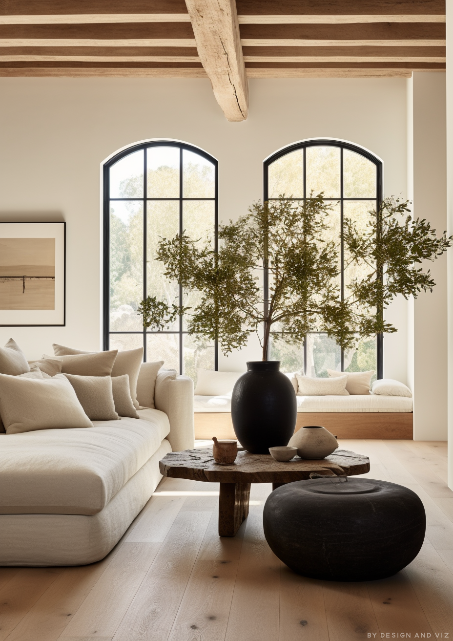
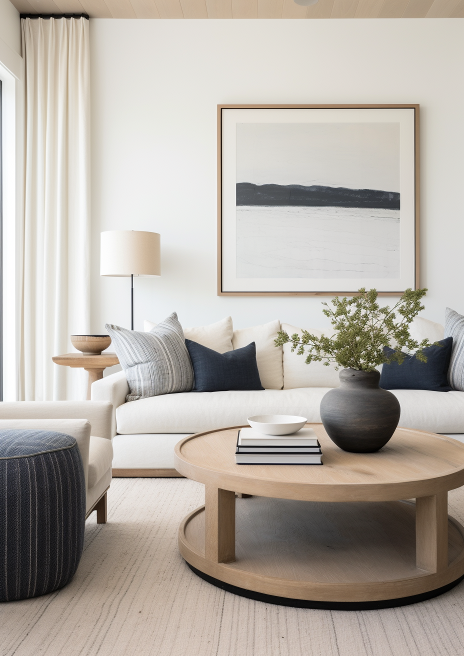
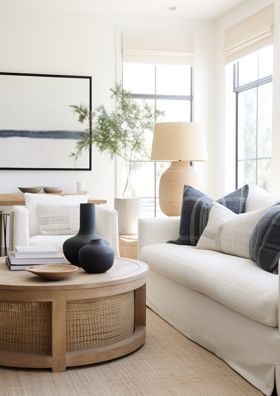
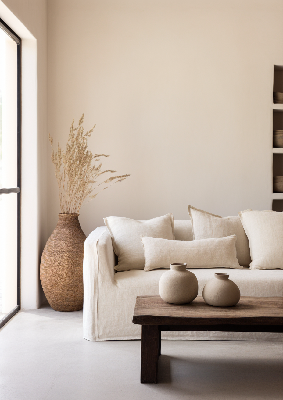
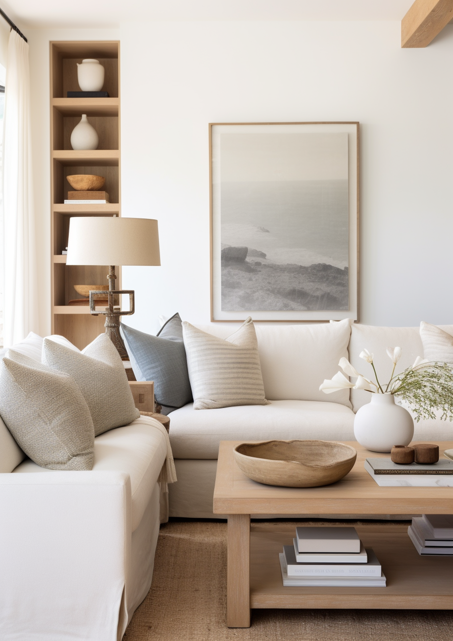
Calm & Serene: Soft blues, warm whites, and muted pastels create a tranquil setting, perfect for bedrooms and bathrooms.
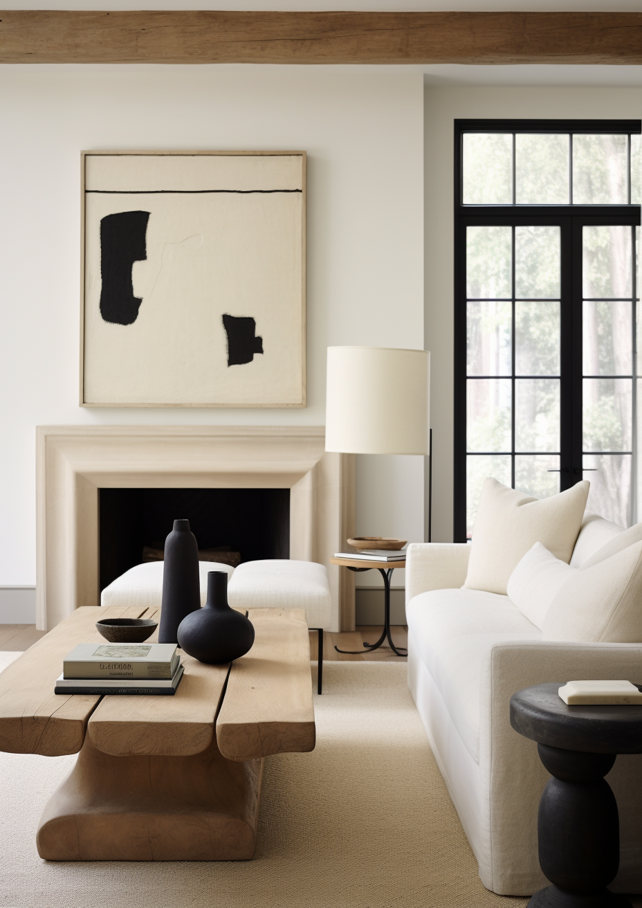
Bold & Dramatic: Deep jewel tones like emerald green, navy, and charcoal grey add richness and personality.
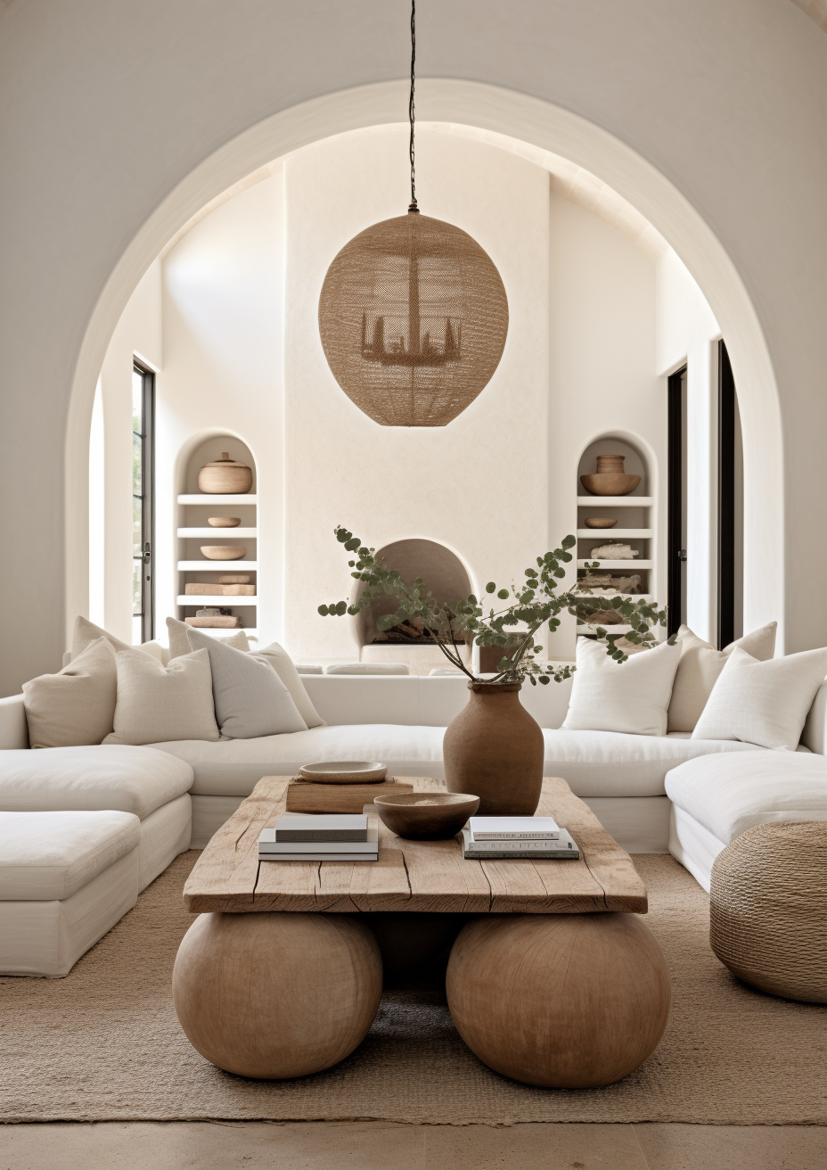
Warm & Inviting: Earthy tones such as terracotta, sand, and olive green provide a cozy and grounded feel.
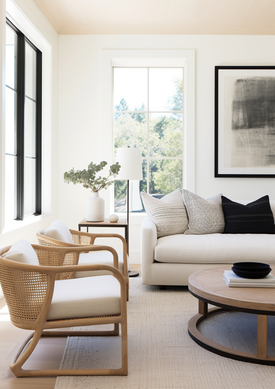
Modern & Minimalist: Monochromatic palettes in varying shades of grey, white, and beige create a sleek, timeless look.
Once you define your home’s overall aesthetic, it becomes much easier to choose complementary colours that enhance your desired ambiance.
2. Home Colour Schemes: Start with a Signature Shade
A great way to create consistency in your home is by selecting one dominant shade that will appear in multiple spaces. This doesn’t mean every room needs to be painted the same colour, but having an “anchor” shade helps tie everything together.
For example:
A soft sage green could be used in the kitchen as cabinetry, in the living room as a rug, and in the bedroom as bedding.
A warm terracotta can appear on an accent wall in one room and in decorative pillows in another.
Your signature colour acts as a foundation, allowing you to layer in complementary and contrasting hues without making the space feel disjointed.
3. Home Colour Schemes: Use a 60-30-10 Rule for Balance
A tried-and-true design trick, the 60-30-10 rule ensures that your space feels balanced rather than overwhelming. Here’s how it works:
60% of the room should be your dominant colour (walls, large furniture pieces, flooring).
30% should be a secondary colour (accent walls, textiles, smaller furniture).
10% should be a statement colour (art, pillows, accessories).
This method allows you to introduce pops of colour without overpowering the space, ensuring a visually pleasing composition.
4. Home Colour Schemes: Coordinate with Lighting & Natural Elements
Lighting plays a crucial role in how colours appear. A shade that looks warm and inviting in natural daylight can feel stark and cool under artificial lighting. Before committing to a colour, observe how it changes throughout the day in different lighting conditions.
Additionally, consider the natural elements in your home:
Hardwood floors may influence whether you choose warm or cool undertones.
Brick fireplaces pair well with earthy and neutral palettes.
Large windows with outdoor views can complement nature-inspired greens, browns, and blues.
Testing paint samples on different walls and viewing them at various times of the day can help you make the right choice.
5. Home Colour Schemes: Layer Textures & Patterns for Depth
A well-designed home colour scheme isn’t just about paint—it’s also about layering different textures and materials to add depth.
Try mixing:
Matte and glossy finishes for contrast
Textured fabrics like linen, velvet, or wool to add warmth
Natural materials like wood, stone, and metal for an organic feel
Even if you opt for a monochromatic colour palette, incorporating various textures will prevent your home from feeling flat or one-dimensional.
6. Home Colour Schemes: Don’t Be Afraid of Dark Tones
Many homeowners shy away from dark colours, fearing they will make a space feel smaller. In reality, deep hues like navy, forest green, and charcoal can add drama and sophistication—especially when paired with the right lighting and accents.
Consider using darker shades:
On an accent wall to create a focal point
On cabinetry for a sleek, modern kitchen
On ceilings for a cozy and intimate feel in bedrooms or libraries
Dark tones can make a space feel luxurious and grounded when used strategically.
7. Home Colour Schemes: Harmonize Open-Concept Spaces
If you have an open floor plan, coordinating colours across different areas is essential for visual flow. Instead of painting each space a different shade, use subtle variations of the same colour family to create cohesion.
For example:
A soft greige in the living room
A slightly warmer beige in the dining area
A deeper taupe in the kitchen cabinetry
This method keeps the design unified while allowing for slight variations that define each space.
8. Home Colour Schemes: Experiment with Statement Ceilings
Who says colour is just for walls? Painting your ceiling in a bold or unexpected shade can make a stunning impact.
Soft sky blue adds an airy, open feel to any space.
Rich terracotta brings warmth to a neutral room.
Deep charcoal creates a cozy, cocoon-like atmosphere.
Statement ceilings are an often-overlooked opportunity to add personality and depth to a room.
9. Home Colour Schemes: Create Contrast with Trim & Doors
Instead of defaulting to white trim and doors, consider using colour to add contrast.
Black trim against white walls creates a modern, high-contrast look.
Muted sage green doors add charm and personality.
Deep navy trim can make a space feel polished and elegant.
This small detail can dramatically elevate the look of your home’s interior.
FAQ: Home Colour Schemes
Q: How do I choose colours that won’t go out of style?A: Stick to timeless neutrals for large areas and introduce trends through accessories like pillows, rugs, and art.
Q: Can I mix warm and cool tones in my home?A: Yes! Just ensure there’s a balance—such as pairing cool blue walls with warm wood furniture.
Q: Should every room in my home have the same colour scheme?A: Not necessarily, but a unifying element (like a common undertone or accent colour) helps create flow.
Bring Your Vision to Life
Ready to transform your space with a professionally curated home colour scheme? At BY Design And Viz, we specialize in interior and exterior architectural design, helping you craft a stunning, cohesive look tailored to your style.
Contact us today for a consultation and let’s bring your dream home to life!


Comments