A Designer’s Take on Illusive Green Sherwin Williams and How to Make It Work Anywhere
- Beril Yilmaz

- Jan 8
- 8 min read
Illusive Green Sherwin Williams is one of those colours that looks like the answer to everything—until it isn’t.
On a screen, it reads like an elegant green-grey neutral. On your walls, it can swing greener, greyer, or slightly muddy depending on the room, the direction of light, and what you’ve already got going on with floors, worktops, and upholstery.
If you want Illusive Green Sherwin Williams to look intentional (not like a colour you panic-picked at 9pm), the key is understanding why it shifts—and planning the supporting cast around it.
At A Glance
-What Illusive Green Sherwin Williams actually is in plain terms
-How lighting direction changes what you see on the wal
l-The LRV detail that affects whether it looks heavy or balanced
-Trim and ceiling whites that don’t fight it
-How to pair it with wood tones, stone, and metals
-The sampling method that saves you from repainting
1. Illusive Green Sherwin Williams: What It Really Looks Like in Real Life

Illusive Green Sherwin Williams sits in that high-demand zone between green and grey—where a colour can behave like a neutral while still giving your room a point of view.
In practice, it often reads as a green-grey with a slightly cool lean. That means it tends to look cleaner with cooler whites and crisper finishes, and it can look a bit “off” next to very creamy whites or strongly yellow timber.
It’s also a colour that needs context. Put it in a bright room with clear daylight and it can look sophisticated and muted. Put it in a dim hallway with warm bulbs and it can drift into a darker, murkier version of itself.
Designer Tip: Treat Illusive Green Sherwin Williams like a “foundation colour,” not a feature wall colour. It performs best when you plan the whole palette around it.
YOU MAY LIKE

2. Illusive Green Sherwin Williams: The LRV Detail That Changes Everything
LRV (Light Reflectance Value) is the number that explains why a colour looks fresh in one home and heavy in another. Illusive Green Sherwin Williams sits in the darker mid-range, which means it won’t bounce a lot of light back into the room.
If you love depth, that’s a win. If your space already struggles with daylight, it’s a decision you want to make with your eyes open.
Here’s how we use LRV in real projects:
-If the room has large windows and clear daylight, Illusive Green Sherwin Williams can look balanced and architectural
-If the room is north-facing or shaded by trees, you’ll want brighter trim and stronger layered lighting
-If the room is small, keep ceilings and trim lighter to avoid the “painted box” effect-If the room has dark floors, be careful—this combo can read heavier than expected
Designer Tip: If you’re unsure, test Illusive Green Sherwin Williams on the wall behind your main seating area first. That’s where you’ll notice the shift most.
3. Illusive Green Sherwin Williams: Why It Shifts in North, South, East, and West Light

Paint doesn’t just “change.” It reacts. Illusive Green Sherwin Williams is especially reactive because it lives between colour families.
North-facing rooms tend to show colours in a flatter, cooler way. In a north-facing space, Illusive Green Sherwin Williams can pull more grey and can look more serious.
South-facing rooms amplify warmth and brightness. In south light, Illusive Green Sherwin Williams often reads greener and more open—sometimes even a touch lighter than expected.
East-facing rooms give you crisp morning light, then drop into shadow. You might love it at 9am and question it at 3pm.
West-facing rooms do the opposite: shadow earlier, stronger golden light later. In the evening, Illusive Green Sherwin Williams can look warmer and slightly deeper.
Designer Tip: Evaluate your sample at three times—morning, afternoon, and evening—using your actual bulbs on. Your “real life” lighting matters more than daylight alone.
Let’s Map Out Your Space Together
If you're planning a makeover and want a designer’s eye on how stick on tiles could work in your home, we’d love to help you visualise the transformation. Book a free 30-minute consultation and let’s sketch out a layout that feels tailored to your space.
4. Illusive Green Sherwin Williams: The Best Rooms for It and the Rooms to Think Twice About

Illusive Green Sherwin Williams works brilliantly in rooms where you want a grounded backdrop that still reads designed. Living rooms are a strong match because upholstery, rugs, and art give you plenty of opportunities to balance undertones. If you’ve got a lot of white paint and the space feels unfinished, this colour can instantly make the room feel planned.
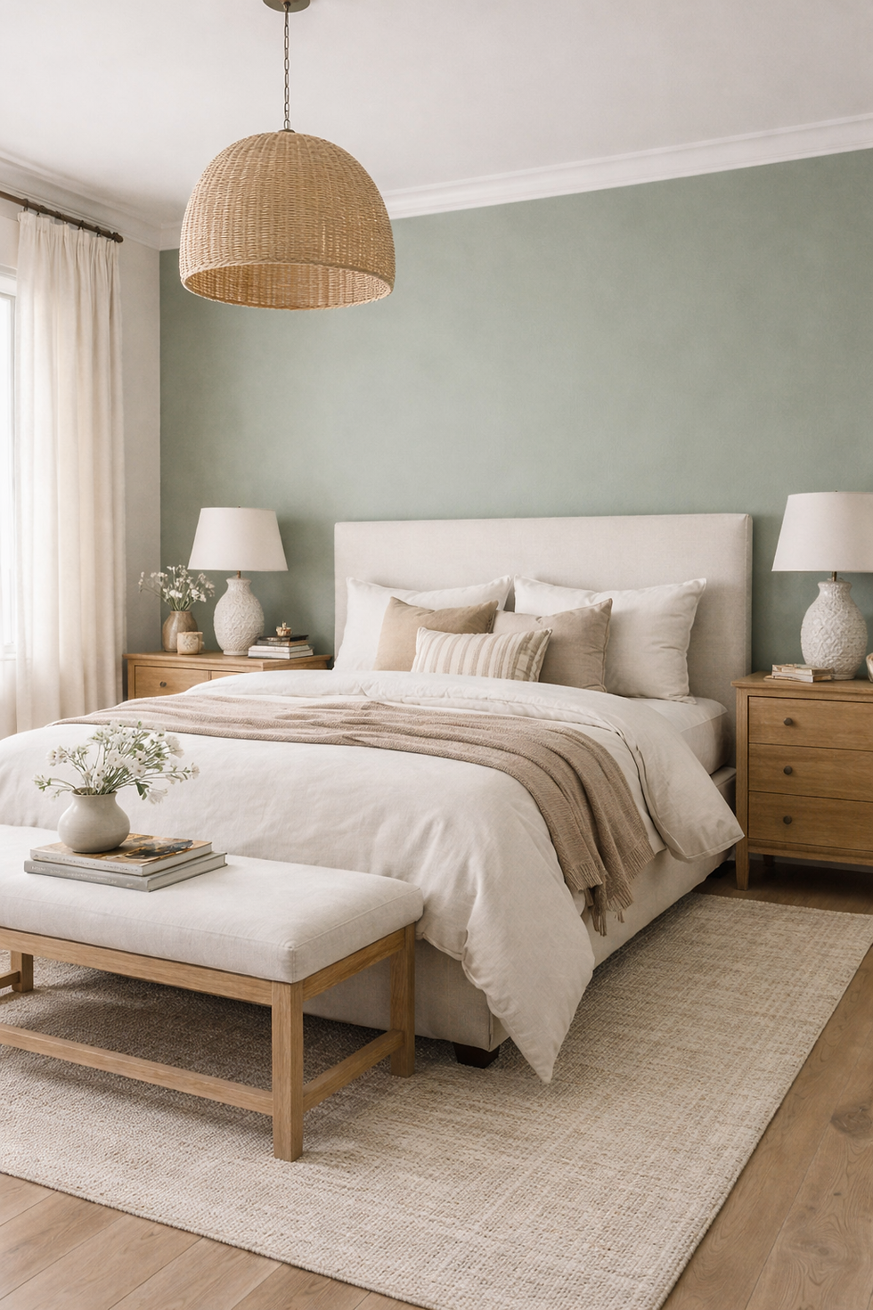
Bedrooms can also work well, especially if you keep bedding and window treatments lighter and avoid heavy yellow-based neutrals that can clash.
Kitchens are trickier, but not off the table. On cabinetry, the finish and lighting matter even more. On walls, it can be a strong alternative to standard greige if your worktops and splashback are clean and not overly creamy.
Rooms to think twice about: dark hallways, window-poor studies, and small north-facing bathrooms with warm lighting. You can still use it, but you’ll want stronger support from trim colour and lighting design.
Designer Tip: If the room has limited natural light, use Illusive Green Sherwin Williams on walls but keep the ceiling and trim noticeably lighter to maintain contrast.
5. Illusive Green Sherwin Williams: Trim and Ceiling Whites That Don’t Fight It

Trim colour is where Illusive Green Sherwin Williams either looks intentional or looks like it’s arguing with the rest of the house.
Because it leans cooler, it often pairs better with whites that are cleaner, not overly creamy. If you choose a very warm white, the green-grey can look dull or slightly dirty by comparison.
Reliable trim directions we use:
-Reserved White-style whites for a clean contrast that still feels liveable
-Pure, crisp whites if you want sharper definition (great for modern joinery)
-Soft whites that still avoid obvious yellow, especially in open-plan spaces
Ceilings matter too. A bright ceiling keeps Illusive Green Sherwin Williams from pressing downward visually, especially in rooms with standard ceiling heights.
Designer Tip: If your home has existing creamy trim you’re not repainting, sample Illusive Green Sherwin Williams next to that trim first. It will tell you very quickly if the undertones clash.
6. Illusive Green Sherwin Williams: Pairing It With Floors, Worktops, and Fixed Finishes

This is where most paint decisions succeed or fail: the things you can’t easily change.
With oak floors, Illusive Green Sherwin Williams can look excellent if the oak is more neutral or slightly weathered. If the oak is very honey-toned, the contrast can make the wall colour look cooler and greyer. With grey-toned floors (LVP, tile, concrete finishes), it can create a consistent, modern look—just watch that the whole palette doesn’t slide too flat. You’ll want texture and contrast from textiles and lighting.
With stone or quartz worktops, it depends on the veining. If your stone pulls warm beige, be careful. If it leans neutral-grey, it’s usually a smoother pairing.
Designer Tip: When you’re choosing between two greens, pick the one that looks slightly “boring” on the sample card. Once it’s on four walls, it will read stronger than you think.
7. Illusive Green Sherwin Williams: Furniture Colours That Make It Look Expensive
The fastest way to elevate Illusive Green Sherwin Williams is to keep your larger furniture pieces in a tight, edited range. Creamy-white sofas can work, but choose ones that lean neutral rather than yellow. If the sofa fabric has a warm undertone, it can make the wall colour look slightly colder in contrast.
Camel, tobacco, and mid-tone leather can look incredible with it—especially when paired with clean-lined black or bronze accents. If you want colour, choose tones that sit close to nature: deep olive textiles, charcoal, off-black, or muted navy. Bright colour accents can work too, but they need to look deliberate rather than random.
Designer Tip: Keep your largest textile (sofa or rug) neutral, then add depth with smaller pieces. Illusive Green Sherwin Williams already brings a lot of presence.
8. Illusive Green Sherwin Williams: Metals and Hardware That Look Intentional

This colour is flexible with metals, but the “best” choice depends on the rest of your palette.
Black hardware gives a clear, modern outline and can make Illusive Green Sherwin Williams look sharper.
Aged brass can work, but it’s strongest when the brass is muted rather than bright yellow. Think brushed, antique, or patinated rather than polished. Chrome and nickel look clean and tailored—especially if your space already has cooler finishes.
Designer Tip: Match the metal to the undertone of your fixed finishes. If your kitchen tap is chrome, don’t introduce high-shine brass elsewhere without a plan.
Your Renovation, Simplified
If you’re diving into a big home update, our Ultimate Renovation Planner can make the entire process far easier. From material planning to budgeting, it’s designed to keep your project organised while
helping you visualise every detail. Explore the planner and plan your makeover with clarity.
9. Illusive Green Sherwin Williams: The Mistakes That Make People Repaint

Most repaint situations aren’t because the colour is “bad.” It’s because the supporting decisions weren’t made.
The common mistakes we see:
-Using very creamy trim that makes the wall colour look dirty
-Testing only on one wall, then being surprised when it looks darker across the whole room
-Choosing warm bulbs that push the colour into a heavier, muddier version
-Pairing it with strongly yellow oak or very beige stone without balancing it
-Going too monochrome with similar greys, then wondering why the room looks flat
Designer Tip: If you love Illusive Green Sherwin Williams on a swatch but not on the wall, change your bulb temperature before you change the paint. Lighting is often the real culprit.
10. Illusive Green Sherwin Williams: How to Sample It Like a Designer

If you want a confident “yes,” sampling is everything—and most people don’t sample in a way that gives useful information.
Paint a large test area (or use a peel-and-stick sample) on at least two walls. One should be the wall that gets the most light, and one should be the wall that gets the least.
Then place your key items next to it: a cushion cover, your flooring sample, a worktop sample, and a trim white sample. This is how you see undertones, not by staring at a swatch in isolation.
Designer Tip: Don’t judge it at night with one lamp on. Turn on every light source you use in real life, then decide.
Conclusion
Illusive Green Sherwin Williams is a smart choice when you want a green-grey that reads designed without turning your home into a colour experiment. The reason it looks excellent in some homes and strange in others comes down to three things: light direction, trim choice, and what it’s paired with.
If you treat it like a foundation colour, sample it properly, and build a supporting palette around it,
Illusive Green Sherwin Williams can give you that “everything finally connects” look—without relying on trend-driven colour choices. The goal isn’t just a nice wall colour. It’s a room that makes sense
from every angle, in every kind of light, on an average Tuesday.
FAQ: Illusive Green Sherwin Williams
What undertones does Illusive Green Sherwin Williams have?
Illusive Green Sherwin Williams typically reads as a green-grey with a cool lean, meaning it can pull greyer in low light and greener in brighter daylight.
Is Illusive Green Sherwin Williams too dark for a small room?
It depends on natural light and trim contrast. In a small room with limited daylight, keep trim and ceilings lighter and plan layered lighting to avoid a heavy look.
What white trim works best with Illusive Green Sherwin Williams?
Cleaner, less creamy whites tend to pair best. Very yellow-based whites can make the wall colour look dull or slightly dirty by comparison.
Does Illusive Green Sherwin Williams work with oak floors?
Yes, especially with neutral or slightly weathered oak. With very honey-toned oak, it can read cooler, so balance it with textiles and lighting.
Start Your Dream Home Transformation
Our online design packages were created to make the entire process smoother, clearer, and far more enjoyable — no stress, no second-guessing. Whether you’re refreshing one room or reimagining your whole home, we guide you every step of the way with layouts, visuals, and a fully personalised design plan.
See our interior and exterior design packages to get started.
Author Bio
Beril Yilmaz is the founder of BY Design And Viz, an online interior and exterior design studio specialising in clear layouts, thoughtful architectural details, and design decisions that support how people actually live. With a background in architecture and a practical design approach, her work focuses on creating homes that feel considered, functional, and intentionally designed.


Comments