Pastel Blue Color: What It Is, Its Undertones, and How to Use It in Interiors
- Beril Yilmaz

- Mar 16
- 12 min read
Pastel blue is one of those color terms that everyone recognizes and almost no one can define precisely. It describes a family of soft, light blues that share a common quality — a delicate, washed-out character that sits far from saturated or navy blue — but within that family the differences in undertone are significant enough to change how a color reads in a real room. A pastel blue with a green undertone behaves completely differently from one with a gray undertone, which behaves completely differently from one with a violet undertone — and getting the undertone wrong is the most common reason pastel blue schemes fail.
This guide covers exactly what pastel blue color is, the undertone variations within the family, how pastel blue behaves in different light conditions, how to use it across different rooms, and which specific paint colors sit most accurately in the pastel blue range.
What Is Pastel Blue Color?

Pastel blue is a soft, light, low-saturation blue — a blue that has been significantly lightened, either by the addition of white or by a naturally pale, chalky quality in the pigment. The defining characteristic of any pastel blue is that its blue identity is present but gentle: it reads as clearly blue rather than gray or green, but without the intensity or depth of a mid-tone or saturated blue.
In paint terms, pastel blues typically have an LRV between 60 and 80 — they sit in the light-to-very-light range of the value scale, which gives them their airy, open quality. What separates a pastel blue from simply being a light blue is the softness of its character — the sense that the color has been washed out or diluted rather than simply lightened, giving it a gentle, almost translucent quality that more saturated blues do not have.
The closest color relatives to pastel blue are powder blue, sky blue, and the palest end of the blue-gray family. The full range of blue-gray options — including the lighter, more pastel end of that spectrum — is covered in the best blue gray paint colors guide.
Pastel Blue Color Undertones

The undertone is the single most important factor in choosing any pastel blue — it determines which rooms it suits, which materials it works alongside, and how dramatically it shifts under different light conditions. Pastel blues fall into four main undertone categories:
Green-Toned Pastel Blue

Green-toned pastel blues have a soft aqua or teal quality — they read as the blue of shallow tropical water or a clear summer sky over the sea. This is the most obviously fresh and coastal of the pastel blue undertones. In strong natural light the green quality becomes more visible and the color reads as a soft aqua; in lower light it settles into a cleaner blue. Green-toned pastel blues suit rooms with natural materials — linen, rattan, light wood — and work particularly well in bathrooms and coastal-inspired spaces where the aqua quality feels intentional rather than accidental.
Gray-Toned Pastel Blue

Gray-toned pastel blues are the most sophisticated and versatile of the pastel blue family — they have the softness of a pastel but the complexity of a blue-gray. In some lights they read almost as a pale blue-gray; in others the blue quality becomes dominant. This undertone group is the most forgiving across different room orientations and light conditions, and it sits naturally alongside contemporary materials — concrete, white oak, brushed nickel — as well as more traditional interiors. This is the undertone to choose when the brief is a soft blue that reads as considered rather than pretty.
Violet-Toned Pastel Blue

Violet-toned pastel blues sit at the border between blue and periwinkle — they have a faint purple or lavender quality that gives them a romantic, slightly nostalgic character. This undertone is the most sensitive to artificial light: warm evening lamplight pulls the violet quality forward and can make these colors read as a soft lavender rather than a blue. Always test a violet-toned pastel blue under both natural and artificial light before committing to it. These colors suit bedrooms and living rooms with warm, traditional character — they sit less naturally in kitchens or contemporary interiors where the violet shift can look accidental.
Pure Pastel Blue
Pure pastel blues have no dominant secondary undertone — they read as a clean, clear, light blue with equal distance from green, gray, and violet. This is the rarest undertone in the pastel blue family because most paint colors in this range have at least some secondary quality. True pure pastel blues are the most universally flattering but also the hardest to find — they tend to read as slightly cool in north-facing rooms and beautifully clear in south-facing ones. Powder blue is the closest named color to a pure pastel blue.
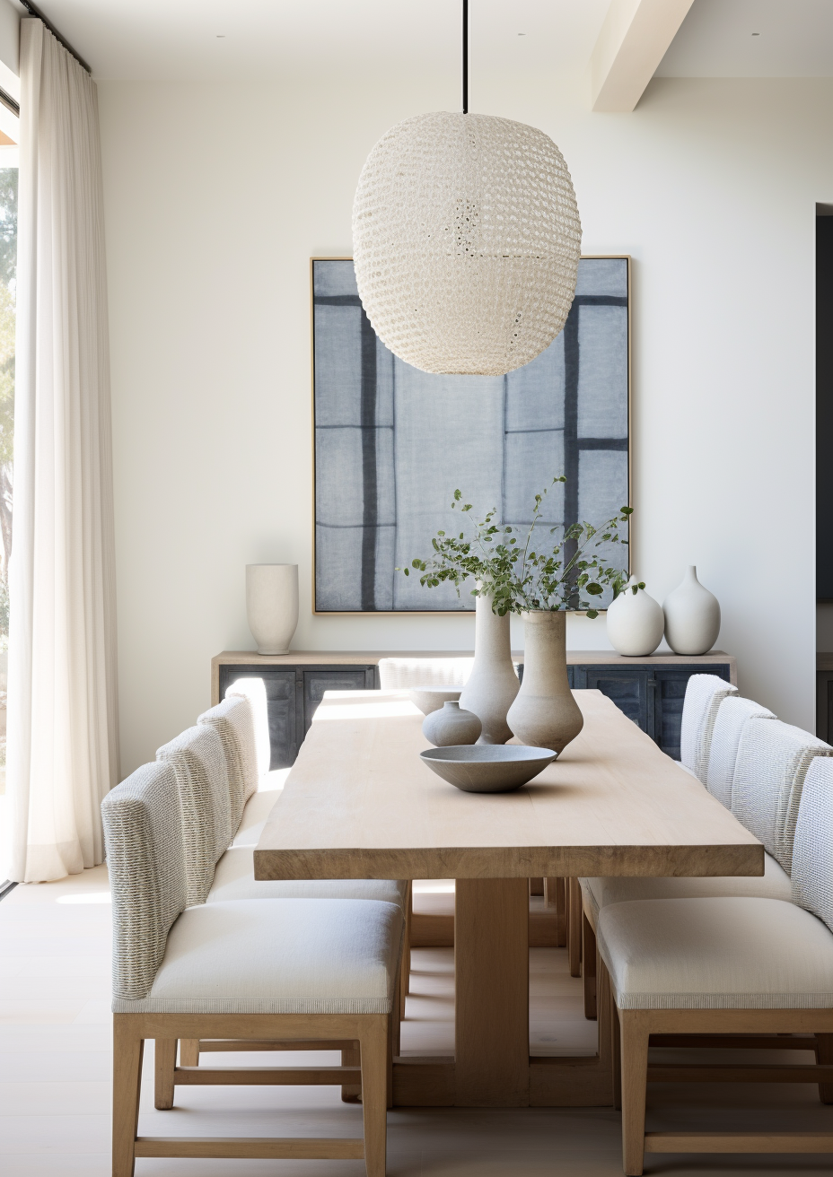
Pastel Blue vs Similar Colors

Pastel Blue vs Sky Blue
Sky blue sits slightly deeper and more saturated than pastel blue — it has more color presence and reads more clearly as a blue statement color rather than a soft, washed-out background tone. Pastel blue is lighter and softer; sky blue has more visual weight. In a room where you want the blue to be a subtle, airy backdrop, pastel blue is the right choice. In a room where you want the blue to register more clearly as a color decision, sky blue is the better direction.
Pastel Blue vs Powder Blue
Powder blue and pastel blue are close relatives — powder blue is often used as a synonym for the purest, cleanest version of pastel blue. If there is a distinction, powder blue suggests a slightly cooler, more chalky quality — the blue of old ceramic powder boxes or fine porcelain. Pastel blue is the broader family term; powder blue sits within it at the cool, clean end.
Pastel Blue vs Baby Blue
Baby blue is the warmest and softest of the pastel blue family — it has a slightly milky, creamy quality that gives it a gentle, nursery-like warmth. Pastel blue is the broader term; baby blue sits at the warmest, most delicate end of it. In contemporary interiors, baby blue can read as slightly sweet rather than sophisticated — choosing a gray-toned or green-toned pastel blue rather than a baby blue gives the scheme a more considered character.
Pastel Blue vs Blue Gray
Blue gray has significantly more gray in its makeup than pastel blue — it reads as a cool, sophisticated neutral that happens to have blue in it, rather than as a soft blue. Pastel blue reads as a blue first; blue gray reads as a neutral first. The full breakdown of the blue-gray family — including the palest options that sit closest to pastel blue — is in the best blue gray paint colors guide.
Want help choosing the right pastel blue for your space? Book a color consultation here — bydesignandviz.com/book-online |
Pastel Blue in Interior Design
Pastel blue in interior design works because it brings color into a space without the visual weight or commitment of a deeper or more saturated blue. It reads as both airy and considered — light enough to keep rooms feeling open, colored enough to register as a design decision rather than a default neutral. The key to using pastel blue well is understanding which undertone version suits the specific room and ensuring that the other elements in the room share a consistent warmth or coolness direction.
Pastel Blue on Walls

Pastel blue walls create an immediate sense of calm and airiness — the color recedes slightly, making rooms feel larger and more open than a warmer neutral would. The most important consideration for pastel blue walls is light direction. In south-facing rooms with warm natural light, almost any pastel blue works beautifully — the warmth of the light balances the coolness of the color and the result feels fresh and lively. In north-facing rooms with cool blue-toned light, pastel blues can read as cold or slightly clinical — choosing a gray-toned or green-toned pastel blue rather than a pure or violet-toned one significantly reduces this risk.
Always test pastel blue on a large sample board and view it at different times of day before committing — pastel blues shift more visibly between morning and evening light than most colors because their low saturation means the light temperature has a proportionally larger effect on their appearance.
Pastel Blue in Bedrooms

Pastel blue is one of the most frequently specified bedroom colors precisely because its cool, soft quality is genuinely conducive to rest. Studies consistently show that cool, low-saturation colors in sleeping environments support relaxation — pastel blue delivers this without the flatness of gray or the coldness of a more saturated blue. The key in a bedroom is pairing the pastel blue walls with warm-toned materials — warm linen bedding, warm wood furniture, warm brass accents — to prevent the scheme reading as cold rather than calm.
Pastel Blue in Bathrooms

Pastel blue in a bathroom — on walls, tiles, or cabinetry — creates a spa-like, clean quality that white lacks and that deeper blues can make feel heavy. Green-toned pastel blues work particularly well in bathrooms because the aqua quality relates naturally to water. Pair with white fixtures, warm white or cream towels, and brushed nickel or chrome hardware for a scheme that feels fresh and cohesive. Avoid warm brass alongside green-toned pastel blues — the contrast between the warm metal and the cool-green blue reads as a mismatch rather than a complement.
Pastel Blue in Living Rooms

Pastel blue in a living room works best when it is the backdrop for warm-toned furniture and materials rather than the dominant color of the scheme. A pastel blue living room with warm linen sofas, warm wood floors, and warm brass or bronze accents reads as sophisticated and considered. The same pastel blue room with cool gray furniture and chrome accents reads as cold. The warmth of the supporting materials determines whether a pastel blue living room feels inviting or clinical.
Pastel Blue in Kitchens
Pastel blue kitchen cabinetry has become one of the most popular contemporary kitchen color choices — it brings color and personality without the intensity of a stronger blue. Gray-toned pastel blues work best in kitchens because they read as sophisticated rather than sweet and pair naturally with both warm and cool stone countertops. White or near-white walls alongside pastel blue cabinetry keep the scheme light and clean. Warm brass hardware alongside pastel blue cabinets is one of the most consistently successful kitchen combinations in current residential design.
Pastel Blue Exteriors
Pastel blue on a house exterior creates a fresh, distinctive look that reads differently from the more commonly specified navy or mid-tone blues. It suits coastal properties naturally — the association between pastel blue and sea and sky makes the color feel contextually appropriate near water. On exteriors, choose a slightly deeper pastel blue than you would for interiors — very pale pastels can look washed out on large exterior surfaces, particularly in overcast UK light. The full range of blue exterior options, from deep navy to soft mid-tones, is covered in the blue exterior house colors guide.
Colors That Work With Pastel Blue
White and Soft White

White trim alongside pastel blue walls is the most reliable and versatile combination available — it sharpens the pastel blue without competing with it. Use a warm white rather than a stark cool white alongside pastel blue — the warmth prevents the scheme from reading as too cold. Pure White SW 7005 and White Dove OC-17 both work well.
Warm Linen and Natural Neutrals

Warm linen, cream, and natural neutral tones are the most important companions for pastel blue in any room — they provide the warmth that balances the coolness of the blue and prevent the scheme reading as clinical. Linen upholstery, cream rugs, and natural cotton textiles in warm off-white tones are the most consistent way to make a pastel blue room feel inviting rather than cold.
Warm Wood

Warm wood — light oak, white oak, or warm walnut — alongside pastel blue creates a fresh, natural, Scandinavian-influenced quality that is one of the most enduringly popular combinations in contemporary residential design. The warmth of the wood balances the coolness of the blue and the organic quality of natural wood sits naturally alongside the airy character of pastel blue.
Soft Terracotta and Warm Clay
A soft terracotta or warm clay accent — in cushions, ceramics, or a single textile — alongside pastel blue creates a warm-cool contrast that is both visually interesting and instinctively balanced. The complementary relationship between warm orange-red and cool blue is one of the fundamental color relationships in design, and at the pastel and muted end of both families the combination reads as considered and contemporary rather than bold.
Navy Blue

A deeper navy accent alongside pastel blue walls creates a tonal blue scheme with genuine depth — the contrast between the light pastel and the deep navy gives the room visual interest without introducing a contrasting color. This tonal approach works particularly well in bedrooms and living rooms. The full range of navy options is covered in the navy blue paint colors guide.
Soft Sage Green

Soft sage green alongside pastel blue creates a calm, natural, organic scheme that reads as fresh and grounded simultaneously. The shared cool-earthy quality of both colors at their softest end makes them natural companions. This combination works particularly well in bedrooms and bathrooms where a serene, nature-inspired atmosphere is the brief.
Pastel Blue Paint Colors to Consider

These are the paint colors that sit most accurately in the pastel blue family and consistently deliver good results in residential interiors:
• Misty SW 6232 (Sherwin Williams) — a soft, cool blue-gray that sits at the sophisticated, gray-toned end of the pastel blue family
• Atmospheric SW 6505 (Sherwin Williams) — a clear, slightly green-toned pastel blue that reads as fresh and airy in most light conditions
• Palladian Blue HC-144 (Benjamin Moore) — a consistently popular soft blue-green that sits at the aqua end of pastel blue
• Parma Gray No.27 (Farrow & Ball) — a chalky, sophisticated gray-toned pastel blue that suits traditional and contemporary interiors equally
• Borrowed Light No.235 (Farrow & Ball) — one of the palest options in the pastel blue family, almost neutral in strong light but clearly blue in shade
• Mountain Air 2129-50 (Benjamin Moore) — a soft, clean pastel blue at the purer end of the family with minimal secondary undertone
For the full range of blue paint options beyond the pastel family — including mid-tones, navies, and blue-grays — the best blue paint colors guide covers every category.
How Pastel Blue Behaves in Different Light

North-Facing Rooms
North-facing rooms are the most challenging environment for pastel blue — the cool, blue-toned natural light amplifies the coolness of the color and can make it read as cold or slightly gray rather than softly blue. For north-facing rooms, choose a gray-toned or green-toned pastel blue rather than a pure or violet-toned one — the secondary undertone gives the color complexity that prevents it reading as simply cold. Warm artificial lighting at 2700K-3000K is essential in north-facing pastel blue rooms.
South-Facing Rooms
South-facing rooms are the best environment for pastel blue — warm natural light warms the coolness of the color and makes it read at its most beautiful. In strong southern light, pastel blue walls have a luminous, airy quality that few other colors match. Almost any undertone variation works in a south-facing room, making this the one situation where the choice between green-toned, gray-toned, and violet-toned pastel blue can be made purely on preference rather than practicality.
Artificial Lighting
Warm artificial lighting at 2700K-3000K takes the edge off the coolness of pastel blue and makes it read as warmer and more inviting in the evening. Cool daylight bulbs above 4000K intensify the cool quality of pastel blue and can make it read as cold or clinical in the evening. Warm bulbs are strongly recommended in any room where pastel blue is the primary wall color. Violet-toned pastel blues are the most sensitive to this effect — under warm lamplight they can shift noticeably toward lavender.
Frequently Asked Questions

What color is pastel blue exactly?
Pastel blue is a soft, light, low-saturation blue — a blue that has been significantly lightened to create a delicate, washed-out character. It typically has an LRV between 60 and 80 and reads as clearly blue rather than neutral, but without the intensity of a mid-tone or saturated blue. Within the pastel blue family, undertones range from green-aqua to gray to violet.
Is pastel blue a warm or cool color?
Pastel blue is a cool color — its blue character gives it a natural coolness that distinguishes it from warm neutrals and warm colors. This coolness is part of its appeal in bedrooms and bathrooms where a calm, fresh atmosphere is the brief. It can be balanced with warm materials and warm artificial lighting to prevent the coolness reading as cold.
What colors go with pastel blue?
Warm white trim, warm linen and natural neutrals, warm wood, soft terracotta, navy blue accents, and soft sage green all work naturally alongside pastel blue. The key principle is pairing the cool blue with warm-toned companions — this balance is what makes a pastel blue room feel inviting rather than clinical.
Is pastel blue good for small rooms?
Yes — pastel blue is one of the most effective colors for making small rooms feel larger. Its cool, receding quality makes walls appear to push back, increasing the apparent size of the room. Its high LRV also keeps rooms feeling light and open. It is a particularly good choice for small bathrooms and bedrooms where an airy, spacious feeling is the priority.
What is the difference between pastel blue and baby blue?
Baby blue is the warmest, most delicate version of pastel blue — it has a slightly milky, creamy quality that gives it a gentle, soft character. Pastel blue is the broader family term that includes baby blue at its warmest end, as well as cooler, more sophisticated options like gray-toned and green-toned pastel blues. In contemporary interiors, baby blue can read as sweet rather than sophisticated — gray-toned pastel blues are a more versatile choice for adult spaces.
Final Thought
Pastel blue succeeds in interiors because it delivers color without weight — it changes the character of a room in a way that neutral paint cannot, but without the visual commitment or light-absorbing quality of a deeper blue. The key to using it well is understanding the undertone, testing it in the specific room and light conditions, and pairing it with warm-toned materials that balance its natural coolness.
Done well, a pastel blue room has a quality that is genuinely difficult to achieve with any other color — airy, calm, and considered all at once.
Want help choosing the right blue for your home? See our design packages here — bydesignandviz.com/#interiordesignpackages |
About the Author
Beril Yilmaz is a qualified architect and interior designer based in the UK. She runs BY Design And Viz, a design platform covering paint color reviews, interior design guidance, and residential design projects. Beril specifies pastel blue and soft blue color schemes for residential projects across the UK.


Comments