Spring Color Tips: 7 Must-Try Hues to Brighten Up Your Space
- Beril Yilmaz

- Mar 14, 2025
- 5 min read
Spring is the perfect time to breathe new life into your home with fresh, vibrant hues. As the seasons shift, so do our color preferences, moving away from the deep, cozy tones of winter and into something brighter, airier, and full of energy. Whether you’re looking to make subtle changes with accents and décor or planning a complete home refresh, choosing the right colors can transform your space into a springtime retreat.
This season, we’re embracing unexpected color combinations, nature-inspired palettes, and tones that create an effortless transition from spring to summer. From warm earthy shades to bold, energetic pops of color, our curated guide will help you bring seasonal inspiration into your home with ease.
Below, we break down our top spring color tips to help you make the most of the season and beyond.
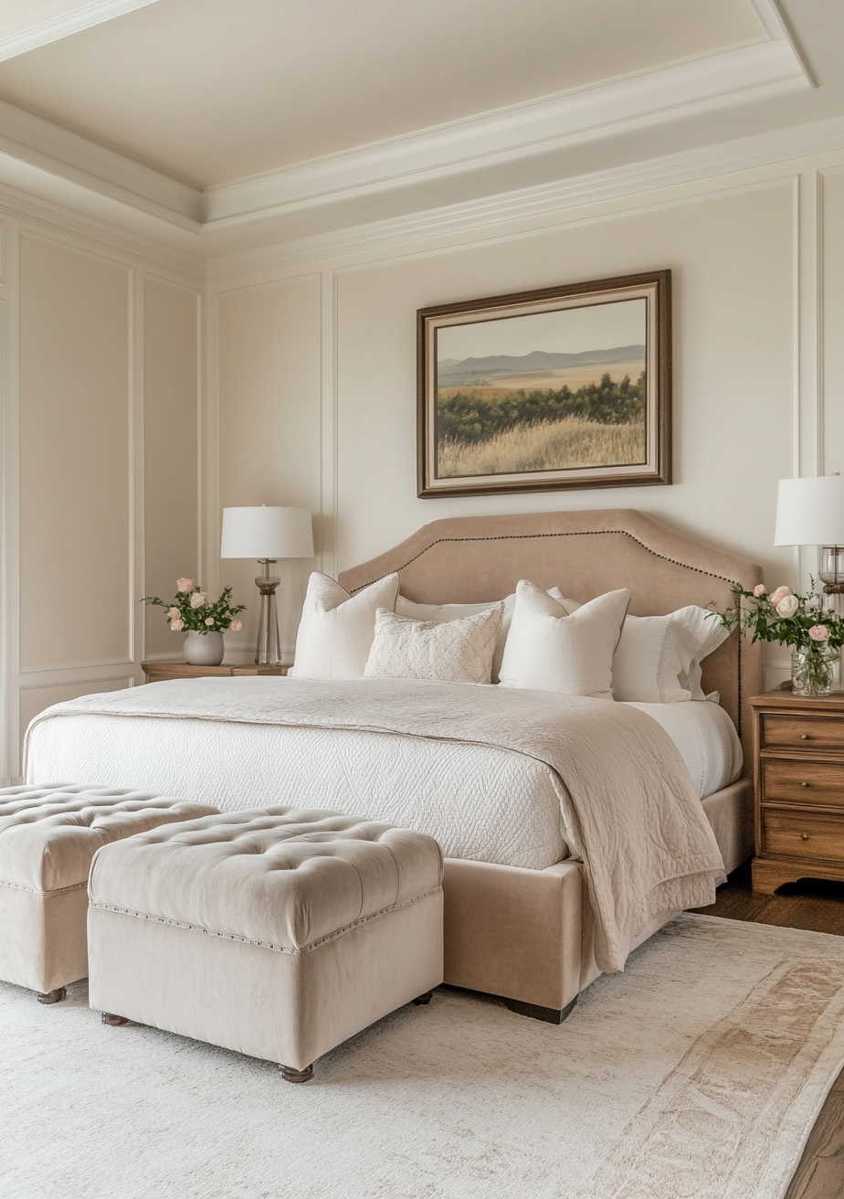
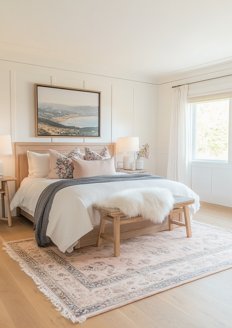
1. Spring Color Tips: Embrace Soft, Earthy Neutrals

Neutrals are no longer just about stark whites and cool grays. This spring, softer, earthier neutrals are taking over. Think warm beiges, creamy taupes, and subtle sandy hues that add a sense of warmth while keeping a space light and fresh.
These versatile colors act as a perfect base, allowing you to layer in bolder seasonal accents without overwhelming the space. They also pair beautifully with natural materials like linen, rattan, and unfinished wood, creating an effortless, organic feel that works for both interiors and exteriors.
For a modern yet inviting look, try painting your walls in a soft beige or off-white with warm undertones. Pair this with woven textures, stone finishes, and greenery to bring the beauty of nature inside.
2. Spring Color Tips: Play with Sun-Kissed Yellows

Few colors scream spring quite like yellow. This year, we’re not just talking about bright lemon tones—softer, sun-kissed shades of honey, ochre, and muted mustard are making waves. These hues exude warmth, optimism, and energy without feeling overpowering.
Yellow pairs beautifully with other warm tones like terracotta and caramel, making it an ideal choice for accent walls, throw pillows, or even upholstered furniture. For a fresh take, mix it with natural greens or deep blues to create a vibrant yet balanced look.
If you’re hesitant about going too bold, introduce yellow through décor elements like ceramic vases, linen curtains, or patterned rugs for a subtle yet impactful seasonal touch.
3. Spring Color Tips: Refresh with Soft, Botanical Greens
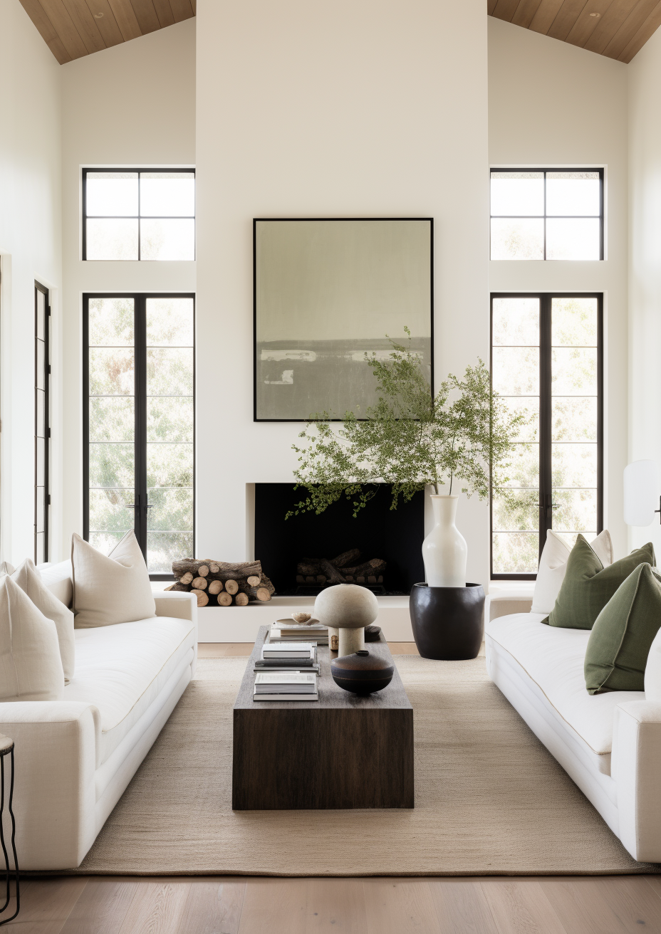
Spring is synonymous with new growth, and what better way to reflect that in your home than with shades of green? This season, botanical-inspired hues like sage, moss, and eucalyptus are trending, bringing a sense of calm and renewal.
Green is incredibly versatile and works well across a variety of styles, from modern minimalism to rustic farmhouse. Whether you opt for a soft sage wall, an olive-green sofa, or a few lush plants scattered throughout your space, this color instantly creates a soothing and refreshing atmosphere.
For an unexpected twist, mix green with warm neutrals like beige or add a pop of contrast with deep navy or burnt orange for a dynamic, nature-inspired palette.
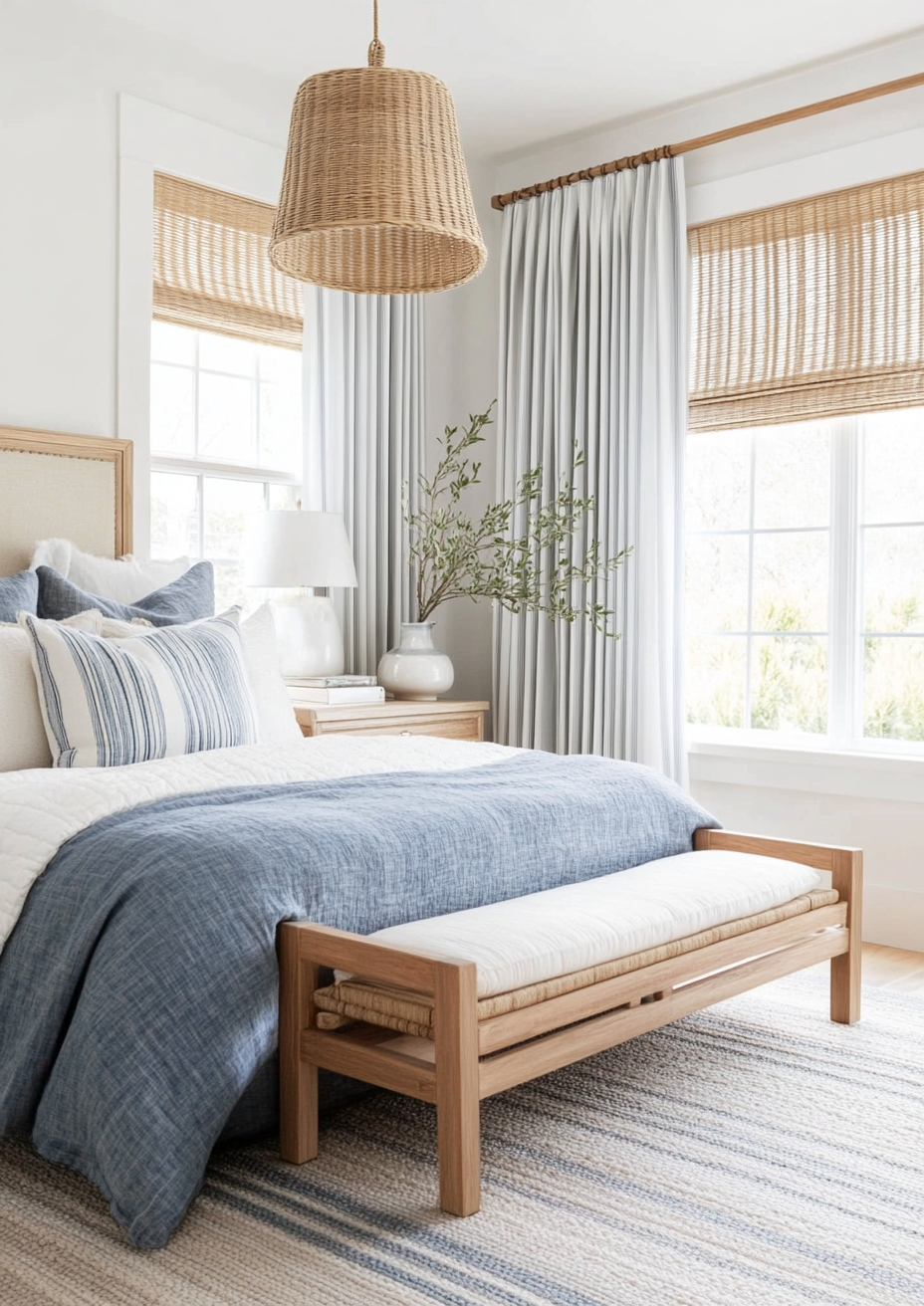
4. Spring Color Tips: Add Depth with Rich, Unexpected Blues
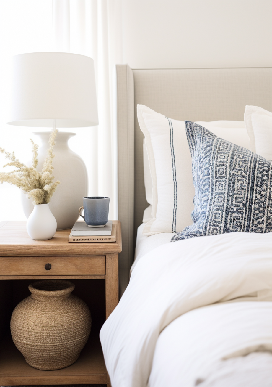
While pastels are often associated with spring, we’re seeing a shift towards deeper, more saturated blues. Colors like indigo, peacock, and stormy teal add depth and sophistication while still feeling fresh and seasonally appropriate.
These rich blue tones work particularly well as statement colors, whether through a bold feature wall, kitchen cabinets, or even in exterior siding for a striking contrast against lighter trim.
Pair these blues with warm metallics like brass and gold or soften them with neutral linens and warm wood finishes to keep the look balanced and inviting.
5. Spring Color Tips: Incorporate Playful Pastels in a Modern Way
Pastels will always have a place in spring design, but this year, we’re seeing them used in more sophisticated and unexpected ways. Instead of sugary pinks and baby blues, opt for dustier versions like muted lavender, blush, and soft peach.
These colors bring a light, airy feel to a space without feeling overly youthful. Try layering pastel shades through textiles like curtains and rugs, or go for a two-tone wall treatment with a pastel on top and a grounding neutral on the bottom.
For a fun, modern approach, pair pastels with contrasting bold colors like deep green or burnt sienna to create a dynamic and fashion-forward space.
6. Spring Color Tips: Balance Warm and Cool Tones
One of the easiest ways to make your space feel cohesive is by balancing warm and cool tones. Too many warm colors can feel overwhelming, while an all-cool palette might lack depth. The key is to find the perfect mix.
For example, if you love warm terracotta and mustard tones, balance them with cool blues or greens. If your space is dominated by soft neutrals, add contrast with a moody charcoal accent. This contrast keeps a room visually interesting and adaptable through different seasons.
A great way to experiment with this balance is through artwork, textiles, or even a statement furniture piece that complements both ends of the spectrum.
7. Spring Color Tips: Bring the Outdoors In with Floral and Garden-Inspired Tones
Spring is all about nature in bloom, so why not bring those garden hues into your home? Shades like rose, lilac, coral, and deep berry mimic the colors of fresh flowers and can instantly uplift any space.
Incorporate these tones through floral-patterned textiles, vibrant artwork, or even a bold-painted door for a charming seasonal touch. If you prefer a more subtle approach, fresh-cut flowers or dried floral arrangements in these hues can bring just the right amount of color without long-term commitment.
These colors also transition beautifully into summer, making them a great investment for year-round vibrancy.
Frequently Asked Questions
Q: How do I choose the best spring color palette for my home?A: Start with a neutral base and add in colors that reflect your personal style and the mood you want to create. Consider factors like natural light, existing furniture, and how the colors will transition into the next season.
Q: What are some easy ways to update my space for spring without repainting?A: Swap out textiles like pillows, throws, and rugs, introduce fresh flowers or greenery, and incorporate seasonal décor elements like ceramic vases in trending colors.
Q: Can I use bold colors in a small space?A: Absolutely! Darker or bolder hues can add depth to a small room when used strategically. Try an accent wall, colorful artwork, or statement furniture to add character without overwhelming the space.
Transform Your Space with BY Design And Viz
Looking to refresh your home or exterior with the perfect spring color palette? At BY Design And Viz, we specialize in creating stunning, customized designs that reflect your vision and enhance your space. Whether you need help selecting the perfect paint colors, designing a cohesive interior, or planning an exterior transformation, our team is here to bring your ideas to life.
Contact us today for a consultation and let’s bring fresh, beautiful color into your home!


Comments