Best Warm White Paint Colours: Why Designers Swear These Shades Make Every Room Feel Expensive
- Beril Yilmaz

- Oct 20, 2025
- 7 min read
There’s a reason warm white paint colours are the foundation of so many beautiful homes. They bring light, calm, and cohesion — that elusive feeling of balance that’s hard to achieve with bolder tones. Unlike stark whites, warm whites create depth and comfort, making spaces feel soft and lived-in rather than sterile.
Whether you’re updating a north-facing living room, refreshing a hallway, or designing a serene bedroom, the right shade of white will completely transform how the space feels. Choosing the perfect tone isn’t about picking “just white” — it’s about finding a white with the right undertone for your light, mood, and furnishings.
In this guide, I’ll share the best warm white paint colours for UK homes, expert tips for selecting undertones, and examples of how to use creamy whites and neutral paint colours to design soft, timeless interiors that always feel fresh.
At a Glance
The difference between warm and cool whites
The best warm white paint colours for UK homes
How lighting affects white tones
Designer tips for pairing whites with other neutrals
FAQs and expert takeaways
1. Warm White Paint Colours: Understanding the Undertones

Before we explore specific shades, it’s important to understand why warm white paint colours are different from crisp, cool whites.
Warm whites have yellow, red, or beige undertones that give them a creamy, sunlit glow. In contrast, cool whites lean towards blue or grey, creating a cleaner but sometimes harsher effect.
If you’ve ever painted a room white and found it looked cold or blue once it dried, it’s likely you chose a cool white instead of a warm one.
Designer Tip:
In north-facing rooms with limited daylight, opt for a warm white with yellow or pink undertones — it will counteract cool shadows. South-facing rooms get more natural light and can handle slightly creamier whites without appearing too yellow.
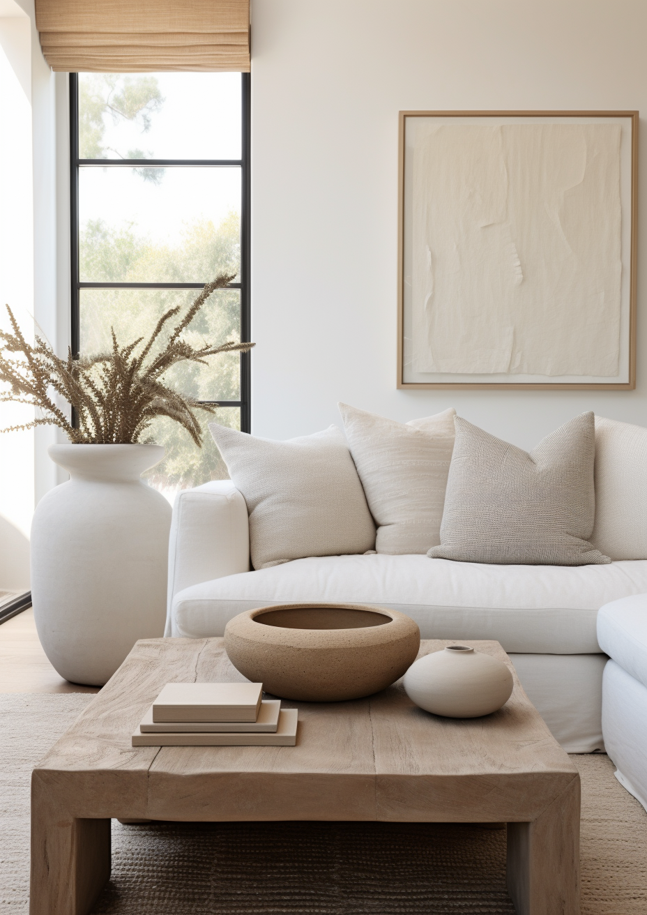
Warm whites are the key to soft white interiors that feel natural, not clinical — perfect for creating a timeless canvas that complements every texture and material.
2. Best Warm White Paint Colours: Top Picks from UK Paint Brands

Here are some of the most-loved warm white paint colours used by designers across the UK. Each one brings a slightly different tone and texture to your walls, so choosing the right one depends on your light and furnishings.
Farrow & Ball “White Tie”
A classic creamy white with subtle yellow undertones that feels soft and traditional. Perfect for heritage homes or period properties where you want warmth and depth.
Dulux Heritage “Chalk White”
An elegant, barely-there neutral with a balanced warmth. Works beautifully in both modern and classic interiors — especially in open-plan spaces.
Little Greene “Slaked Lime”
This shade offers the ideal balance between warm and neutral. It adapts beautifully to changing light, shifting from soft cream in the morning to a muted white by evening.
COAT Paints “Sunday Soul”
A modern creamy white with an almost latte-like warmth — perfect for cosy living rooms or bedrooms.
Designer Tip:
Always test at least three warm white paint colours on your wall. Observe them at different times of the day — morning, midday, and evening — as the undertones shift dramatically with light.
3. Warm White Paint Colours and Lighting: The Key to Getting It Right
Light changes everything. The same warm white can look beautifully creamy in one room and dull or yellow in another.
Natural Light
North-facing rooms: Need warmer whites with yellow or peach undertones to balance the coolness.
South-facing rooms: Receive warm sunlight — here, choose a slightly more neutral white to prevent the room feeling too yellow.
East-facing rooms: Get cool morning light and warm afternoon light — choose a balanced creamy white like Little Greene “Linen Wash.”
West-facing rooms: Glowing sunset light amplifies warmth, so opt for whites with subtle beige undertones to keep balance.
Artificial Light
Warm lighting (2,700K–3,000K): Enhances creamy undertones, great for cosy spaces.
Cool lighting (4,000K+): Neutralises warmth, making whites look cleaner and more modern.
Designer Tip:
Always test your chosen white under both natural and artificial light. What looks perfect during the day can change entirely once lamps are on in the evening.
4. Creamy Whites vs. Neutral Paint Colours: Finding Your Perfect Tone

Choosing between creamy whites and neutral paint colours depends on the atmosphere you want to create.
Creamy Whites
Creamy whites have a soft, almost buttery undertone. They’re ideal for traditional interiors, cottages, and spaces with natural textures like linen, oak, and rattan. These tones make rooms feel inviting and lived-in.
Best for: Bedrooms, living rooms, dining areas.
Try:
Farrow & Ball “Tallow”
Dulux “Natural Calico”
Little Greene “Portland Stone Pale”
Neutral Warm Whites
Neutral whites sit between cool and warm — they don’t lean too yellow or too grey. These are versatile and elegant, especially for modern, minimalist interiors.
Best for: Kitchens, hallways, and open-plan layouts.
Try:
COAT “Good Intentions”
Dulux Heritage “Greige Silk”
Farrow & Ball “School House White”
Designer Tip:
If your furniture and flooring already have strong undertones (for example, orange oak or cool grey), pick a neutral warm white to bridge the gap — it’s the easiest way to create visual harmony.
5. Using Warm White Paint Colours in Different Rooms

Every room interacts with light differently, so the same white can behave in unexpected ways. Here’s how to tailor your choice to each space.
Living Room
The heart of your home deserves a shade that feels inviting throughout the day. A warm neutral like Dulux “Egyptian Cotton” gives depth while still feeling bright. Pair with soft white interiors — linen curtains, textured rugs, and natural wood tones.
Kitchen
In a kitchen, balance is key. Opt for a clean warm white like Little Greene “White Lead” or Farrow & Ball “Wimborne White.” These tones keep the space feeling crisp but comfortable.
Bedroom
For a calming retreat, choose soft creamy whites such as Farrow & Ball “Tallow” or COAT “Sunday Soul.” These hues reflect candlelight beautifully and create a soothing atmosphere.
Hallway
A warm white with a touch of grey, like Little Greene “Linen Wash,” helps transition between rooms with different schemes — making your home feel cohesive.
Designer Tip:
If you’re unsure, start with a mid-tone warm white and adjust in future rooms. Once you live with the shade, you’ll naturally see whether you crave more warmth or crispness.
6. Pairing Warm Whites with Other Colours and Materials

White isn’t boring — it’s a foundation. When styled well, warm white paint colours can highlight the textures, materials, and accents around them.
Natural Materials
Wood, stone, and linen always look incredible against warm whites. The textures pop while maintaining softness. Try pairing a creamy white wall with a walnut console or oak floor for contrast.
Muted Colour Accents
Warm whites love muted tones like sage green, mushroom, taupe, or dusty rose. These soft shades complement white without overpowering it.
Metallic Finishes
For a touch of luxury, add brushed brass or antique bronze lighting. These finishes glow beautifully against warm whites, adding depth and a sense of understated elegance.
Designer Tip:
Avoid pairing warm whites with stark, cool colours (like pure blue or bright white trim). They can make your walls look dull or dirty by comparison. Instead, choose off-whites or tonal shades for trims and ceilings.
7. Designer Tips for a Flawless Warm White Finish

The subtleties of warm white paint colours mean application matters. Follow these insider tips for a seamless result:
Use high-quality paint. Premium paints like Farrow & Ball, Little Greene, or Dulux Heritage have superior pigments that show undertones more accurately.
Prep walls properly. Sand lightly and remove any marks — white magnifies imperfections.
Paint all walls in the same batch. Different tins can vary slightly in tone.
Test larger areas. Don’t rely on A4 swatches — paint 50x50cm patches for a realistic preview.
Pair with the right trim. For trims and ceilings, use a slightly lighter shade of your wall colour to keep it cohesive and soft.
Designer Tip:
Never choose white from a screen — the colour temperature of your device can alter the tone completely. Always sample directly on your walls.
Summary Box: Warm White Design Essentials
Design Principle | Key Takeaway |
Undertones Matter | Warm whites have yellow, beige, or pink bases for softness. |
Light Changes Colour | Always test in different rooms and at different times of day. |
Creamy vs. Neutral | Creamy whites feel cosier; neutral whites feel modern. |
Texture Enhances White | Combine with natural materials for depth and warmth. |
Finish Strong | Proper prep and consistent paint batches ensure a flawless result. |
8. FAQs: Warm White Paint Colours

1. What’s the difference between warm white and cool white paint?
Warm white paint has yellow or beige undertones that create a cosy feel, while cool white has blue or grey undertones that look cleaner but can feel cold.
2. Which warm white works best in UK homes?
Farrow & Ball “White Tie” and Little Greene “Slaked Lime” are both versatile choices that adapt beautifully to the UK’s varied light conditions.
3. Do warm whites work with grey furniture?
Yes — creamy whites complement greys beautifully. Choose a neutral warm white with beige undertones to bridge the warmth of white and the coolness of grey.
4. Are warm white walls still in style for 2025?
Absolutely. As interiors shift toward organic modern and nature-inspired palettes, warm whites remain a timeless base that enhances texture and warmth.
Conclusion

Choosing the right warm white paint colours is one of the most rewarding design decisions you can make. These shades don’t demand attention — they quietly enhance everything around them. Whether you prefer creamy whites for their softness or balanced neutrals for a cleaner look, warm whites create harmony, texture, and a lasting sense of calm.
The best part? They evolve beautifully with changing light, seasons, and decor styles — meaning your home always feels fresh, no matter the trend.
So when in doubt, go for a warm white. It’s timeless, comforting, and endlessly adaptable — a designer-approved classic that never goes out of style.
Ready to refresh your space with the perfect warm white palette?Explore my 1:1 Online Design Service — where I’ll help you choose the ideal paint colours, lighting, and materials to bring balance and warmth to your home.
👉 Book Your Online Design Consultation and let’s find your perfect shade together.


Comments