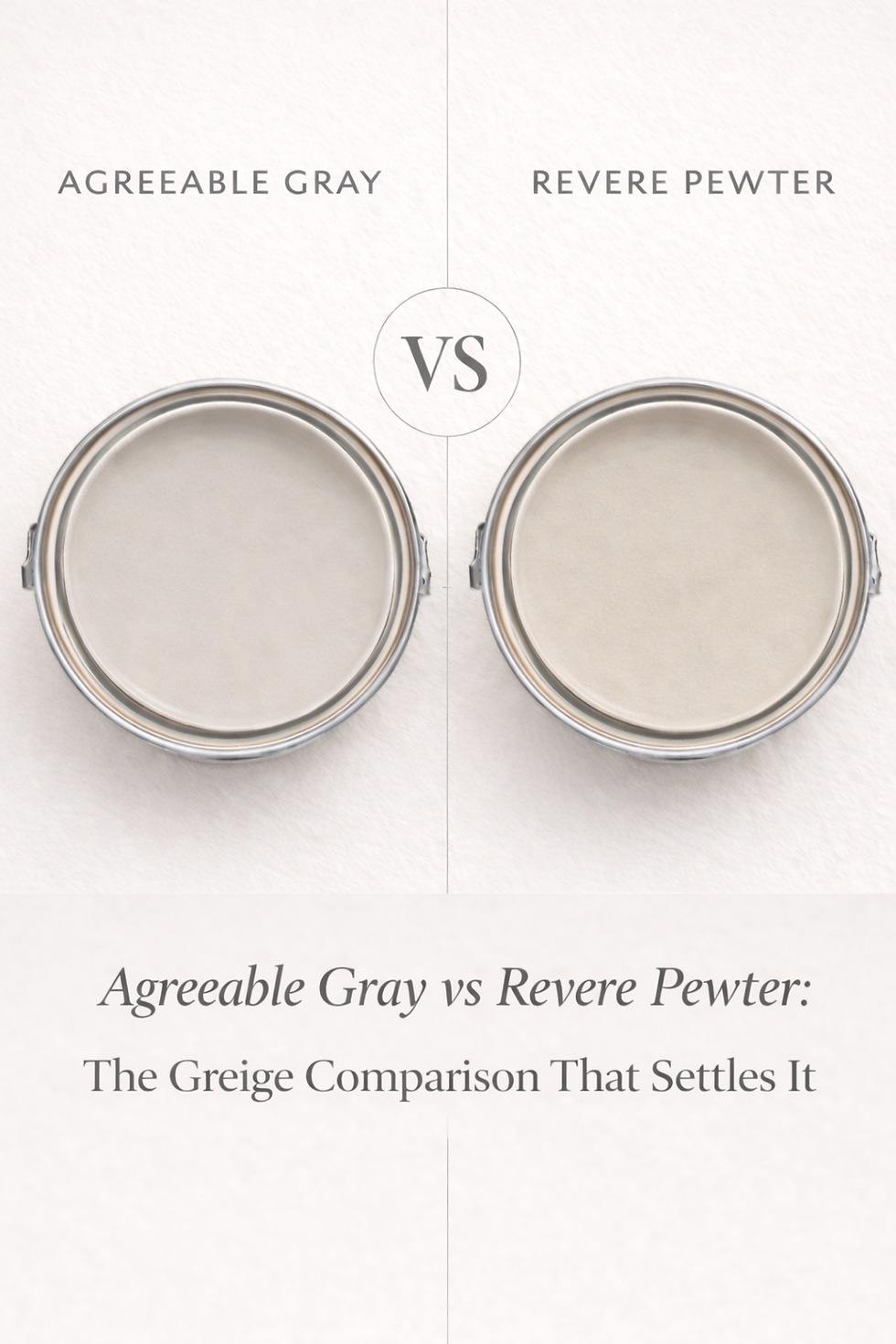
Agreeable Gray vs Revere Pewter - The Greige Comparison That Settles It
- Beril Yilmaz

- Mar 30
- 13 min read
Updated: Apr 23
Agreeable Gray SW 7029 and Revere Pewter HC-172 are the two most searched greiges in residential paint -- one from Sherwin Williams, one from Benjamin Moore, both appearing on practically every designer shortlist when the brief is a warm, sophisticated neutral. They are not the same colour, not the same depth, and not equally reliable in all conditions -- and confusing them is one of the most common and most expensive paint mistakes homeowners make. Both are warm greiges. Both are beloved. Both are genuinely excellent in the right room. The choice between them is not arbitrary -- it has a correct answer for your specific room and conditions.
This guide covers exactly how Agreeable Gray and Revere Pewter differ in LRV, undertone, character, light behavior, and room application -- with a clear verdict on which one suits which situation and why.
Side by Side
| Agreeable Gray SW 7029 | Revere Pewter HC-172 |
Brand | Sherwin Williams | Benjamin Moore |
LRV | ~60 | ~55 |
Undertone | Warm greige -- balanced beige-gray with subtle green-taupe | Warm greige -- complex brown-gray-green that shifts in cool light |
Character | Reliable, broadly versatile, consistent across conditions | Characterful, grounded, reactive -- beautiful or risky |
North-facing | Reliable -- holds warm greige character consistently | Risky -- green component can surface noticeably |
South-facing | Excellent -- reads as warm, settled greige | Excellent -- complex warmth is at its most beautiful |
Depth | Medium-light -- present but not heavy | Medium -- noticeably deeper and more grounding |
Best trim | Pure White SW 7005, Alabaster SW 7008 | White Dove OC-17, Simply White OC-117 |
Best for | Open-plan, north-facing rooms, whole house | Grounded rooms, south-facing, traditional interiors |
The First Thing to Understand -- They Are Different Brands
Agreeable Gray is Sherwin Williams. Revere Pewter is Benjamin Moore. This matters more than most people realise -- the two colours are formulated in different paint systems with different pigment combinations, and a cross-brand colour match of either will not replicate the original undertone. If you are considering both, you need to buy the actual original brand's paint -- not a competitor's match. And if you are using both in the same home, be careful about using them in adjacent rooms where both can be seen simultaneously, as the undertone difference will be visible.
Agreeable Gray SW 7029 — What It Actually Is

Agreeable Gray is the most popular paint colour Sherwin Williams makes -- not just the most popular neutral, the most popular colour overall. At LRV 60 it sits in the medium range -- present enough to read as a real neutral rather than a near-white, light enough to keep rooms feeling open and airy. It has earned its dominance by being genuinely reliable: the balanced warm greige undertone suits a wider range of rooms, orientations, and material palettes than almost any other neutral in the SW range.
Agreeable Gray's undertone is warm greige -- a balanced blend of beige and gray with a subtle green-taupe quality that becomes slightly more visible in cool north-facing light or under cool artificial lighting. In warm south-facing conditions it reads as a beautiful warm beige-gray. In cool conditions the green-taupe quality becomes slightly more earthy -- but it holds its warm character far more reliably than many greiges at this depth, which is the core reason for its enduring popularity.
The defining quality of Agreeable Gray is its reliability -- it rarely surprises in the wrong direction. It is the neutral that works when nothing else will, the colour that designers reach for when the conditions are uncertain or the brief is broad. It does not have Revere Pewter's character and drama in the right conditions -- but it never has Revere Pewter's risks in the wrong ones. The full coordinating guide for Agreeable Gray is in the Agreeable Gray coordinating colors guide.
For the full comparison of Agreeable Gray against SW Universal Khaki — the deeper, warmer tan-greige that sits 20 LRV points below — the Universal Khaki vs Agreeable Gray guide explains the difference and which one suits your room.
Revere Pewter HC-172 — What It Actually Is

Revere Pewter is one of the most characterful and most reactive greiges in the entire Benjamin Moore range. At LRV approximately 55 it is noticeably deeper than Agreeable Gray -- that 5-point LRV gap is clearly visible on a wall, and Revere Pewter's greater depth gives it a weight and groundedness that Agreeable Gray's lighter reading cannot replicate. On a wall in the right conditions, Revere Pewter looks genuinely extraordinary -- rich, grounded, sophisticated, and deeply considered.
Revere Pewter's undertone is complex -- a layering of warm brown, gray, and green that shifts depending on the light direction, the surrounding materials, and the time of day. In warm natural light the brown and gray qualities dominate and the colour reads as a rich, settled warm greige with genuine depth and character. In cooler light or north-facing conditions, the green component surfaces and the colour can read as noticeably olive or khaki. This shift is the most discussed quality of Revere Pewter and the source of both its reputation for looking wrong and its reputation for looking extraordinary -- it is the same colour in different conditions.
Revere Pewter is a reactive colour -- it responds to what is around it and reflects back what it finds. Warm floors and warm materials bring out its warmth. Cool materials and cool light bring out its green. Understanding this reactivity is the key to using it successfully. The full Revere Pewter breakdown -- including the specific room conditions and undertone triggers -- is in the Revere Pewter review.
For the full within-brand BM comparison of Revere Pewter against Balboa Mist - including the 12-point LRV gap and why their undertone families conflict on adjacent surfaces - the Balboa Mist vs Revere Pewter guide covers every condition and a clear verdict on which one your room needs.
The LRV Difference -- Why It Matters
Agreeable Gray at LRV 60 and Revere Pewter at LRV ~55 -- that 5-point gap is significant and will be clearly visible on a wall. Agreeable Gray is noticeably lighter and more airy. Revere Pewter is noticeably deeper and more grounding. In a small room with limited light, the difference in perceived space between these two colours is real -- Agreeable Gray will read as lighter and more open, Revere Pewter will read as more enveloping and more present.
The LRV difference also affects how the colours perform in challenging light conditions. At LRV 60, Agreeable Gray has enough reflectance to hold its character in north-facing and limited-light rooms. At LRV 55, Revere Pewter's greater depth means it absorbs more light -- in north-facing rooms with limited natural light, this depth combined with the green undertone risk creates a much more challenging outcome than Agreeable Gray in the same conditions.
How Each Colour Behaves in Different Light
North-Facing Rooms

North-facing rooms are the most important differentiator between these two colours -- and the situation where the wrong choice is most consequential. Agreeable Gray in a north-facing room is a reliable, well-understood choice -- the balanced warm greige undertone holds its character consistently in cool indirect light. The green-taupe quality can become slightly more visible but it reads as earthy and considered rather than obviously wrong. I specify Agreeable Gray in north-facing rooms regularly with confidence.
Revere Pewter in a north-facing room is a significantly higher-risk choice. The green component in the undertone, combined with the greater depth of LRV 55, means that in cool indirect light the colour can shift noticeably toward olive or khaki -- a reading that is difficult to anticipate from a chip and hard to work with once it is on four walls. This is the most common Revere Pewter regret scenario and it is entirely avoidable by choosing Agreeable Gray in north-facing conditions.
Verdict for north-facing rooms: Agreeable Gray without hesitation.
South-Facing Rooms

South-facing rooms are where both colours are at their most beautiful -- and where the choice between them becomes a question of character rather than risk. Agreeable Gray in south-facing conditions reads as a warm, settled, sophisticated greige -- beautiful, consistent, and exactly what it promises on the chip. Revere Pewter in south-facing conditions is where it reaches its full potential -- the complex brown-gray-green undertone becomes rich and warm in strong natural light, the depth creates a grounded, luxurious quality, and the colour looks genuinely extraordinary.
If your room is south-facing and the brief is maximum character and presence, Revere Pewter is the more dramatic and more beautiful choice. If the brief is warmth and reliability across all conditions, Agreeable Gray is the more consistent choice even in south-facing rooms.
Open-Plan Spaces
For open-plan spaces that span multiple orientations, Agreeable Gray is almost always the correct choice. The consistent, reliable undertone holds its character across north-facing and south-facing areas of the same space without the dramatic shift that Revere Pewter's reactive undertone can create. Revere Pewter in an open-plan space can read very differently in the sun-drenched south-facing living area than in the cooler north-facing kitchen -- creating an unintended inconsistency in a colour that was chosen to provide flow.
Artificial Light

Both colours behave better under warm artificial light (2700K-3000K) than under cool light. Agreeable Gray under warm bulbs reads as a beautiful warm greige that holds its character reliably into the evening. Revere Pewter under warm bulbs reads as rich, grounded, and deeply warm -- at its most sophisticated and most beautiful. Under cooler artificial light, Agreeable Gray holds its character more reliably than Revere Pewter, where the green component can surface more noticeably.
Not sure which greige is right for your home? Book a colour consultation here -- bydesignandviz.com/book-online |
Agreeable Gray vs Revere Pewter Room by Room
Living Rooms
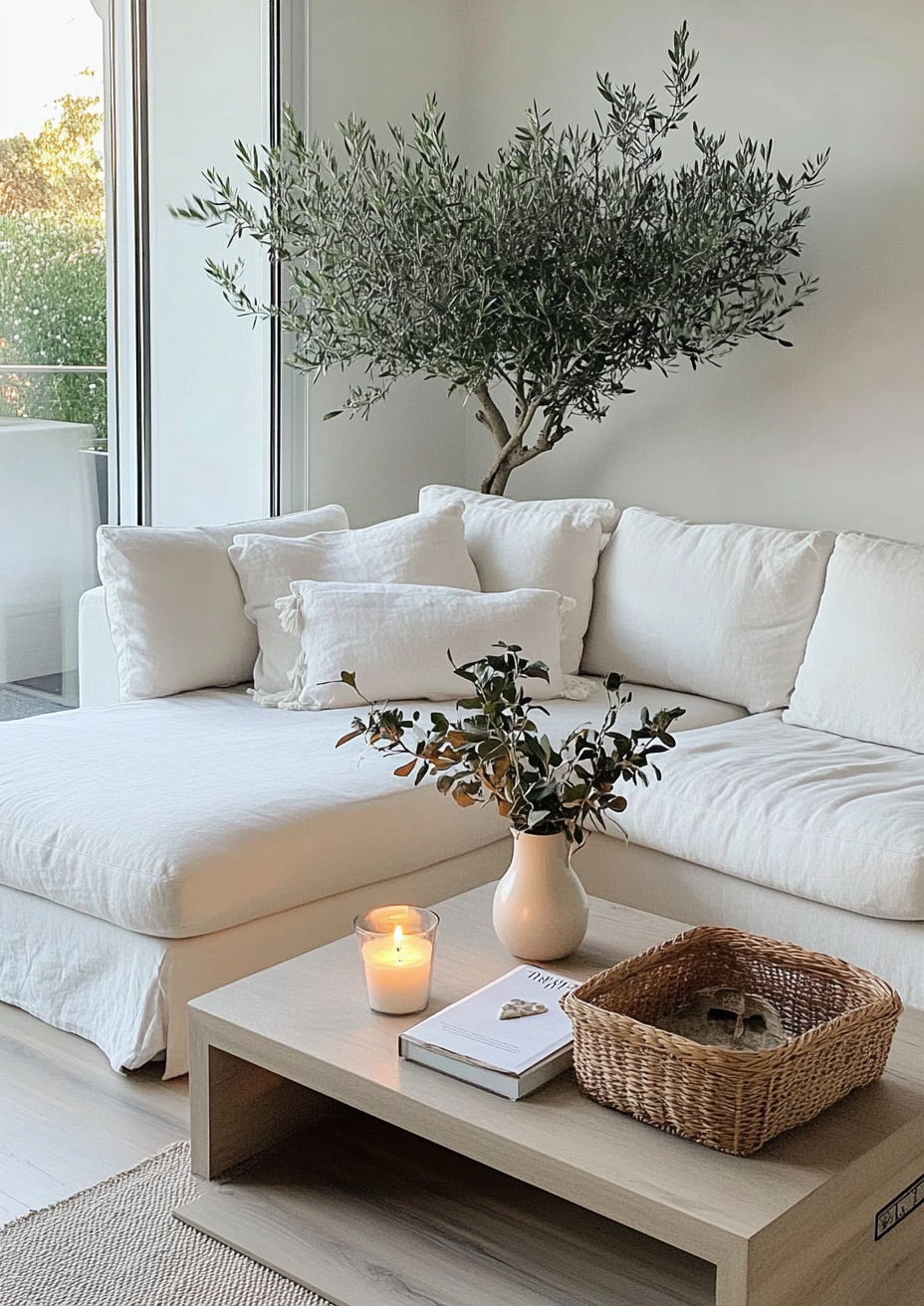
In a south-facing living room with warm materials and a traditional or transitional brief -- Revere Pewter creates a living room with genuine presence and character. The depth and complex warmth give the room a grounded, richly sophisticated quality that lighter neutrals cannot replicate. With warm wood floors, White Dove trim, and warm brass hardware it looks genuinely extraordinary.
In a north-facing living room, a large open-plan living space, or a living room with mixed light -- Agreeable Gray is the more reliable and more broadly satisfying choice. The balanced undertone reads as warm and sophisticated across all the light conditions a living room experiences throughout the day, without the risk of the green shift that can undermine Revere Pewter in less ideal conditions.
Bedrooms
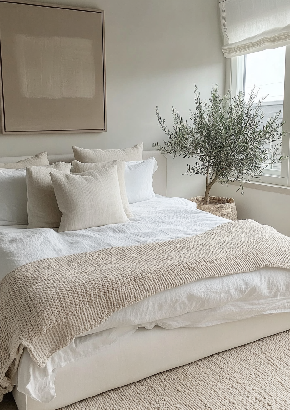
Bedrooms are where Revere Pewter's depth can work most beautifully -- a south-facing bedroom in Revere Pewter with warm materials and warm lighting creates a deeply enveloping, rich atmosphere that suits traditional and warm-palette bedrooms perfectly. The depth at LRV 55 creates a cocooning quality in a bedroom that Agreeable Gray's lighter reading does not deliver.
For north-facing bedrooms, master bedrooms used across all light conditions, and bedrooms with a more contemporary brief -- Agreeable Gray is the safer and more broadly reliable choice. Its consistency across different light conditions means it reads the same in morning light as it does under evening lamplight, which is a practically valuable quality in a room used across the whole day.
Kitchens
Revere Pewter on kitchen cabinets creates one of the most traditionally beautiful and enduring cabinet colour schemes available -- with warm stone countertops, White Dove uppers, and brass or bronze hardware, lower cabinets in Revere Pewter have a depth and richness that is genuinely hard to surpass. This is one of the most widely specified BM cabinet colours for traditional and transitional kitchens.
On kitchen walls, Revere Pewter needs careful handling alongside fixed elements -- flooring, countertops, and tiles all affect how the undertone reads. The Revere Pewter review covers the specific undertone triggers to check before committing in a kitchen context.
Agreeable Gray on kitchen walls or cabinets is the more broadly versatile choice -- it adapts reliably alongside a wider range of kitchen materials and suits contemporary, transitional, and traditional kitchens equally. For kitchens with mixed or uncertain material palettes, Agreeable Gray is the lower-risk choice.
Hallways and Entryways
Hallways often have limited natural light and complex directional light from multiple sources -- making them exactly the kind of challenging condition where Revere Pewter's reactive undertone creates most risk. In a hallway with no natural light and cool overhead lighting, Revere Pewter can read as noticeably green or olive. Agreeable Gray in the same hallway holds its warm greige character reliably.
For hallways and entryways, Agreeable Gray is the more dependable choice unless the hallway has excellent natural light from a window or skylight and you have sampled Revere Pewter extensively in the actual space.
Whole-House Use

Agreeable Gray is the more successful whole-house neutral of the two -- the reliable, consistent undertone creates a cohesive flow through a whole house without the undertone variation that Revere Pewter's reactivity can create across different room orientations. Many of the most successful neutral whole-house schemes I see use Agreeable Gray throughout precisely because it behaves predictably regardless of where it is.
Revere Pewter used throughout a whole house requires a home with good warm natural light in every room -- which is a condition most UK homes and many US homes do not meet in every room.
What to Pair With Each Colour

Agreeable Gray Pairings
Trim: Pure White SW 7005 -- the most reliable and most widely used trim alongside Agreeable Gray. Alabaster SW 7008 for a softer, more tonal relationship.
Floors: Warm wood in any tone, warm stone, warm tile -- Agreeable Gray's balanced undertone adapts to both warm and neutral floor materials reliably.
Accents: Deep navy, warm brass, soft charcoal, muted sage green, warm terracotta -- Agreeable Gray is one of the most broadly compatible neutrals for accent colour pairings. The full palette is in the Agreeable Gray coordinating colors guide.
Revere Pewter Pairings
Trim: White Dove OC-17 -- the warm undertone family they share creates the most cohesive relationship. Simply White OC-117 for a slightly crisper boundary. Avoid cool bright whites like Chantilly Lace which make Revere Pewter read more beige by contrast.
Floors: Warm wood is the most reliable floor pairing -- it brings out the warm brown quality in the undertone rather than the green. Avoid cool grey tile or cool stone which activates the green component.
Accents: Deep navy, warm burgundy, forest green, warm brass and bronze, warm cream. The full Revere Pewter pairing guide is in the Revere Pewter review.
Which Should You Choose?
Choose Agreeable Gray if:

The room is north-facing or has variable light -- Agreeable Gray's reliability in these conditions is its primary practical advantage over Revere Pewter.
The application is open-plan or whole-house -- the consistent undertone creates flow without the risk of reading differently across different parts of the same space.
You want a broadly versatile neutral that works across interior styles -- Agreeable Gray suits contemporary, transitional, traditional, and organic modern interiors equally.
You are uncertain about Revere Pewter's green risk -- if you are not confident about your room's light conditions and material palette, Agreeable Gray is the safer choice every time.
Choose Revere Pewter if:

The room is south-facing with good warm natural light -- this is where Revere Pewter's complex undertone is most rewarding and most spectacular.
The brief is maximum depth and character in a neutral -- the LRV 55 depth gives Revere Pewter a presence and groundedness that Agreeable Gray's lighter reading cannot match.
The material palette is warm throughout -- warm wood floors, warm stone, warm brass hardware all bring out the rich warmth in Revere Pewter's undertone and suppress the green risk.
The interior style is traditional or strongly transitional -- Revere Pewter's complex, characterful quality suits these styles particularly well and has a longer history in these contexts.
You have sampled extensively in the actual room -- at LRV 55 with a reactive undertone, committing to Revere Pewter without proper sampling is a high-risk approach that has produced a very large number of paint regrets.
The Closest Alternatives to Each
If Agreeable Gray feels too light -- consider Accessible Beige SW 7036 for a warmer, more beige-forward alternative at a similar depth. The full comparison is in the Accessible Beige vs Agreeable Gray guide.
If Revere Pewter feels too risky -- consider Edgecomb Gray HC-173 from Benjamin Moore, which sits at LRV 63 in the same greige family without the green undertone risk. The full Edgecomb Gray breakdown is in the Edgecomb Gray review.
If you want a cross-brand comparison within BM -- Pale Oak OC-20 at LRV ~69 is lighter than Revere Pewter and in a different undertone family, but frequently compared to it. The Pale Oak vs Revere Pewter guide covers that comparison.
Frequently Asked Questions
What is the LRV of Agreeable Gray vs Revere Pewter?
Agreeable Gray SW 7029 has an LRV of approximately 60. Revere Pewter HC-172 has an LRV of approximately 55. That 5-point gap is significant -- Agreeable Gray reads as noticeably lighter and more airy on a wall. Revere Pewter reads as noticeably deeper and more grounding. In a real room the difference is immediately visible.
Is Agreeable Gray warmer than Revere Pewter?
Agreeable Gray has a more consistently warm reading -- Revere Pewter's warmth is more complex and more variable. Agreeable Gray's balanced warm greige undertone reads as warm across most conditions. Revere Pewter reads as warm in warm light and can read as greenish or olive in cool light. Agreeable Gray is more reliably warm; Revere Pewter is more dramatically warm in the right conditions.
Can Agreeable Gray and Revere Pewter be used together?
They can be used in different rooms of the same home -- but not on adjacent surfaces that can be seen simultaneously. The undertone difference between them is visible when they are seen side by side and creates a disconnected, unresolved look. Used in separate rooms they work well together because they share the warm greige family character without being identical.
Does Revere Pewter look green?
In cool light conditions -- yes, it can. The green component in Revere Pewter's complex undertone surfaces in north-facing rooms, under cool artificial lighting, and alongside cool materials. In warm light conditions the green quality is minimal and the colour reads as a rich, warm greige. Sampling in the actual room is essential before committing.
Which is better for resale value?
Both are safe, broadly appealing neutrals that present well for resale. Agreeable Gray is arguably the more universally safe choice -- its broad versatility and reliability mean it reads well to the widest range of potential buyers. Revere Pewter in the right conditions looks more characterful and luxurious, which can be an asset if the conditions suit it.
Which is better for a small room?
Agreeable Gray -- at LRV 60 it reflects more light and makes small rooms feel more open and airy. Revere Pewter at LRV 55 has more depth and weight, which can make small rooms feel more enclosed. For small rooms with limited natural light, Agreeable Gray is the significantly safer choice.
The Verdict
Agreeable Gray vs Revere Pewter is not a close call once you know your room's conditions -- it has a correct answer. If your room is north-facing, mixed-light, open-plan, or if you are uncertain about your material palette and light conditions, Agreeable Gray is the correct choice. It is more reliable, more broadly versatile, and never produces the green-shift regret that Revere Pewter can in the wrong conditions.
If your room is south-facing with good warm natural light, your material palette is warm throughout, and you want maximum depth and character in a neutral -- Revere Pewter is the more beautiful and more rewarding choice. In those conditions it delivers a richness and sophistication that Agreeable Gray cannot match.
The rule I use with clients: if you are asking whether Revere Pewter is safe for your room, the answer is probably Agreeable Gray. The people who use Revere Pewter successfully already know it is right for their conditions before they start asking. If you are uncertain, Agreeable Gray is the most honest and most reliable answer to that uncertainty.
Need help choosing between these two greiges for your home? See our design packages here -- bydesignandviz.com/#interiordesignpackages |
About the Author
Beril Yilmaz is a qualified architect and interior designer based in the UK. She runs BY Design And Viz, a design platform covering paint colour reviews, interior design guidance, and residential design projects.


Comments