


Alabaster vs Revere Pewter: The Comparison That Actually Helps You Decide

Sherwin-Williams Alabaster and Benjamin Moore Revere Pewter turn up on the same mood boards constantly, but they are not really competing for the same wall. Alabaster sits at an LRV of 82, functionally a soft white; Revere Pewter sits at an LRV of 55.5, a true mid-depth greige. One brightens a room, the other grounds it. Both read warm-neutral rather than cold-grey, which is exactly where the confusion starts.
I have specified both across residential projects in the UK and internationally, usually not as alternatives to each other but as partners in the same scheme - Alabaster on walls or trim, Revere Pewter on cabinetry, an accent wall, or a front door. That pairing works precisely because the two colours are doing different jobs, not the same one.
This guide covers what each colour actually looks like in a room, when to choose one over the other if you genuinely are choosing between them, and how they perform together when you are not.

At a Glance
| Alabaster | Revere Pewter |
Brand | Sherwin-Williams | Benjamin Moore |
LRV | 82 - reflects light, reads as a soft white | 55.5 - a true mid-depth greige, roughly half Alabaster's reflectance |
Colour category | Warm-neutral white | Warm-toned greige, verging on taupe |
Undertones | Soft warm undertone, restrained enough to rarely announce itself | Warm grey-brown with a mineral, occasionally violet cast in flat light |
Character | Quiet, near-invisible backdrop that supports the room rather than leading it | Substantial and grounding - reads as a colour decision, not a background choice |
North-facing | Reliable - holds warmth without tipping yellow | Can drift slightly purple-grey in cool, flat light |
South-facing | Clean and bright, stays crisp rather than glowing | Warms up reliably, loses any cool cast entirely |
Open-plan | Strong - unifies zones as a consistent light backdrop | Works as an anchor on one zone, not recommended for whole-space walls |
On walls | Soft white backdrop that stays out of the way of furniture and art | Confident mid-tone colour that changes the whole feel of a room |
On cabinets | The practical, low-risk warm-white cabinet choice | A statement cabinet or island colour, not a default choice |
Use together? | Yes - Alabaster on walls with Revere Pewter on an island or front door is a classic pairing | Yes - Revere Pewter on an island or trim against Alabaster walls; the reverse needs testing first |
Trim for each | Extra White SW 7006 or Pure White SW 7005 for crisp contrast | Alabaster itself, or a soft warm white, for definition against the depth |
Style fit | Transitional, coastal, modern farmhouse | Traditional, modern farmhouse, colonial revival |
Architect's pick | When the room needs a light, adaptable backdrop that won't fight other finishes | When the room needs weight, contrast, or a grounding anchor |
Sherwin-Williams Alabaster SW 7008 - What It Really Looks Like

Alabaster has an LRV of approximately 82, which puts it in the soft-white category rather than true white. The undertone is warm but so restrained it rarely announces itself - Alabaster reads as a clean backdrop first and a warm colour second.
It does not compete for attention. In good daylight it looks close to a soft white; under warm evening bulbs it deepens slightly without turning yellow. That restraint is exactly why it appears on so many designer shortlists - it does the job of a white without the starkness of a true white.
For how Alabaster compares against a true warm grey rather than a warm greige, the Alabaster vs Agreeable Gray guide breaks down the undertone gap and which rooms favour the cooler of the two.
Benjamin Moore Revere Pewter HC-172 - What It Really Looks Like

Revere Pewter has an LRV of approximately 55.5, roughly half of Alabaster's, which makes it a genuine mid-depth colour rather than an off-white. The undertone is a warm grey-brown that can pick up a faint mineral or violet cast in cool, low light - something Alabaster never does.
It changes a room. Where Alabaster recedes, Revere Pewter asserts itself. On a full wall it reads as a considered colour choice, not a background one, which is why it performs so well on kitchen islands, front doors, and accent walls where the brief calls for weight.
In warm daylight it settles into a straightforward, likeable greige. In north light or under cool bulbs, watch it closely - the undertone is the one variable that genuinely moves.
The Real Difference Between Alabaster and Revere Pewter

The simplest way to frame it: Alabaster is a backdrop, Revere Pewter is a decision. One disappears into a room; the other reorganises it.
The two aren't really in competition for the same wall - a 26-point LRV gap is the difference between a colour that reflects light and one that visibly absorbs it. Side by side, Alabaster looks almost white next to Revere Pewter's clear grey-brown depth. That gap is the whole story: this comparison is less about undertone and more about how much visual weight a room can carry.
Alabaster on walls with Revere Pewter on the kitchen island or front door is a well-tested combination - the two colours share enough warmth to sit together without clashing, while the brightness gap does the work of contrast. Reversing it - Revere Pewter on the walls with Alabaster on trim - is a heavier, more traditional look and needs a room with enough natural light to carry it. Alabaster vs Pale Oak guide covers a closer-LRV comparison for anyone weighing two lighter neutrals rather than a light-and-mid-tone pairing like this one.
When to Choose Alabaster
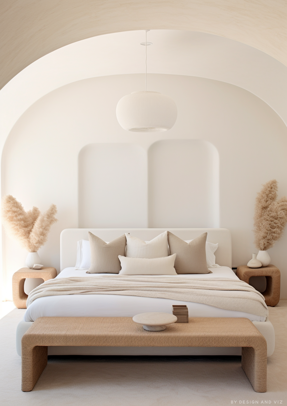
Choose Alabaster when the room needs a light, adaptable backdrop that won't fight the other finishes. It suits open-plan spaces, rooms with mixed light, and any scheme where the walls should support the furniture rather than compete with it.
Reach for it in kitchens with cool stone or stainless steel, in north-facing rooms that need reliable warmth without risk, and in any home where resale flexibility matters more than making a statement.
Avoid Alabaster where the brief specifically calls for depth or contrast - on its own it can look flat next to bold cabinetry, dark floors, or a room that wants a grounding colour rather than a light one.
When to Choose Revere Pewter

Choose Revere Pewter when the room needs weight, contrast, or a grounding anchor colour. It performs best on kitchen islands, built-in cabinetry, front doors, and accent walls - anywhere the brief wants the colour to be noticed, not just present.
It suits traditional and modern farmhouse interiors with warm wood tones and brass or oil-rubbed bronze hardware, and it holds real depth against white trim rather than washing out.
Avoid Revere Pewter as a whole-house wall colour in rooms with limited natural light - in flat, cool light the undertone can drift toward purple-grey rather than the warm greige it shows in good light. Test it in the room's worst light before committing to a full wall.
How the Pairings Differ

For Alabaster on walls, Extra White or Pure White on trim keeps the look crisp; pairing it with Revere Pewter on an island, front door, or built-in gives the room a single point of contrast rather than none.
For Revere Pewter on walls, Alabaster or a soft warm white on trim is the classic combination - the brightness step is large enough to define the trim clearly without looking stark against the depth of the wall colour.
Both colours suit warm wood flooring. Revere Pewter is the more forgiving of the two against cool grey stone or tile, since its own undertone already sits closer to grey; Alabaster needs warmer materials nearby to avoid reading flat and characterless.
Alabaster works with brushed nickel, brass, or matte black without issue. Revere Pewter looks best with warmer metals - aged brass, oil-rubbed bronze, or brushed gold - which pick up its warm undertone rather than fighting it.
Architect's Verdict - Alabaster or Revere Pewter?

This is rarely an either-or decision, but when it is, the choice comes down to how much visual weight the room can carry.
Alabaster is the right call for spaces that need to stay light and flexible - open-plan living areas, rooms with limited natural light, or any interior where the walls need to support rather than lead.
Revere Pewter is the right call when the room can take a mid-tone anchor - a kitchen island, a moody powder room, a front door that needs to hold its own against a light exterior.
The test: paint a large sample of Revere Pewter on the wall that gets the least light in the room, then check it at midday and again after dark under your actual bulbs. If it holds a warm grey-brown and doesn't drift purple, it passes. If it turns cool or slightly violet in that worst-case spot, keep it to cabinetry or an accent rather than the whole wall, and let Alabaster carry the rest of the room.
Frequently Asked Questions

Is Revere Pewter darker than Alabaster?
Yes - significantly. Alabaster has an LRV of approximately 82 and Revere Pewter approximately 55.5, a 26-point gap. That's the difference between a soft white and a true mid-depth greige, not two shades of the same colour.
Can I use Alabaster and Revere Pewter in the same room?
Yes, and it's one of the more reliable pairings in either colour family. Alabaster on walls with Revere Pewter on an island, front door, or built-in gives a room a single confident point of contrast without needing a third colour.
Does Revere Pewter look purple?
It can, in the wrong light. In flat, cool, north-facing light, Revere Pewter's grey-brown undertone can pick up a faint violet cast. In warm daylight or under incandescent bulbs it reads as a straightforward warm greige. Always test it in the room's dimmest corner before committing to a full wall.
Which is better for kitchen cabinets?
It depends on the statement you want to make. Alabaster is the safer, more universally practical cabinet colour. Revere Pewter is the better choice for an island or a lower-cabinet run that's meant to stand apart from white uppers.
Is Alabaster too plain without a contrast colour?
On its own, it can read flat. Alabaster performs best with a contrast point - trim, an island, a piece of furniture - rather than as the only colour in a room. Pairing it with something like Revere Pewter solves that in one move.
What is the LRV of Alabaster vs Revere Pewter?
Alabaster is approximately 82 and Revere Pewter is approximately 55.5. That 26-point gap is the largest factor in how the two colours behave - it's a lightness difference more than an undertone one.
Final Thought
Alabaster and Revere Pewter aren't really rivals. They sit at opposite ends of the same warm-neutral family, and most of the time the better question isn't which one to choose but how to use them together.
Alabaster carries the room when the brief is light, flexible, and low-risk. Revere Pewter carries the accent when the brief needs weight and a little drama. Used together, each one does the job the other can't.
Want a complete colour scheme built around Alabaster or Revere Pewter? Our design packages cover full palette selection, finish recommendations, and 3D visualisations - see our packages. |
About the Author
Beril Yilmaz is a qualified architect and interior designer based in the UK. She runs BY Design And Viz, a design platform covering paint colour reviews, interior design guidance, and residential design projects. Beril has specified both Alabaster and Revere Pewter across residential projects in the UK and internationally - Alabaster on walls and trim in open-plan and transitional spaces where light and material temperature vary, Revere Pewter on kitchen islands, front doors, and accent walls where a room needs a grounding anchor, often specifying both together in the same scheme.


Comments