


Balboa Mist vs Swiss Coffee: The Comparison That Actually Helps You Decide

These two rarely get shortlisted against each other, and that is exactly why the comparison is useful. Balboa Mist is a warm greige with a mauve-violet undertone sitting around LRV 67, while Swiss Coffee is a warm, creamy off-white with a yellow-green undertone at LRV 82 - a fifteen-point brightness gap and two completely different colour families. One is a wall colour that reads as pale grey-taupe. The other is a near-white that reads as soft cream. Put them in the same house and they do very different jobs.
I have used both across residential projects, Balboa Mist as a whole-room neutral that needs to flatter both warm wood and cool stone, Swiss Coffee as a warm backdrop white for trim-heavy, traditional interiors. They are not interchangeable, and the decision between them usually comes down to whether the room needs a colour or a white.
This guide covers the undertones, the light behaviour, the pairing logic, and exactly which rooms call for each one.

At a Glance
| Balboa Mist | Swiss Coffee |
Brand | Benjamin Moore | Benjamin Moore |
LRV | 67 - a true light greige, well below Swiss Coffee's near-white brightness | 82 - a true near-white, fifteen points brighter than Balboa Mist |
Colour category | Warm light gray / greige - a colour in its own right, not an off-white | Warm creamy off-white - sits in the white family, not the greige family |
Undertones | Soft violet-mauve over a warm beige base - visible undertone, not a whisper | Yellow-beige with a faint green cast - creamy rather than buttery, with a cooler edge than most warm whites |
Character | A pale, sophisticated grey-taupe that shifts warmer or cooler with the light; reads as a genuine wall colour | A soft, creamy white that can shift green in flat light - warm and inviting, occasionally unpredictable |
North-facing | Risky - flat cool light pulls the violet forward and can turn it dull purple-grey | Workable - the green cast keeps it from turning obviously yellow, though it can look slightly murky |
South-facing | Excellent - warm light settles the violet into a soft, elegant taupe | Warm and inviting - strong light brings out the cream without tipping into stark yellow |
Open-plan | Strong - its chameleon quality lets it read consistently as neutral across mixed-temperature zones | Moderate - the undertone shift between rooms can read inconsistently across different light sources |
On walls | A genuine pale grey-taupe backdrop with presence - not a near-white, a colour | A soft near-white backdrop with a creamy, occasionally green-tinted warmth - not a colour statement |
On cabinets | Best on furniture-grade cabinetry in transitional kitchens; too much colour for spaces wanting a clean white | A dependable warm white for traditional and builder-grade kitchens with wood tones |
Use together? | Rarely paired directly - different LRV bands and different jobs in a scheme, not a wall-and-trim pairing | Rarely paired directly with Balboa Mist - different function in a palette, not a coordinating pair |
Trim for each | White Dove OC-17 for warmth, or Chantilly Lace for a crisper lift | Simply White or SW Pure White for a brighter contrast on adjoining trim |
Style fit | Transitional, modern greige schemes, whole-house grey-taupe neutrals | Traditional, classic, warm-white whole-house schemes |
Architect's pick | When the brief calls for a pale grey-taupe wall colour, not a white | When the brief calls for a warm, creamy near-white rather than a true white or a colour |
Benjamin Moore Balboa Mist OC-27 - What It Really Looks Like

Balboa Mist has an LRV of approximately 67 and a soft violet-mauve undertone over a warm beige base. Pulled from the fan deck it barely registers - a pale, sleepy neutral. Rolled onto a full wall it transforms into something with real presence.
In warm, south-facing light the violet settles into an elegant taupe. In flat, north-facing light it can cool into more of a putty-grey with the violet more visible. There is nothing subtle about that shift once you see it.
It does not behave like most whites. Balboa Mist is a genuine colour choice, closer in spirit to a soft heather-grey than to any off-white collection entry, and it needs to be treated as a wall colour in a scheme rather than a background note.
Against cool stone or grey-toned materials it holds together better than most warm greiges, since the violet undertone is closer to neutral than a straight yellow or brown base would be.
Benjamin Moore Swiss Coffee OC-45 - What It Really Looks Like

Swiss Coffee has an LRV of approximately 82 and a warm yellow-beige undertone with a subtle green cast. It is a near-white rather than a colour, and its job in a scheme is to be a soft, warm backdrop rather than a statement.
In strong, warm daylight it reads as a gentle cream. In flat or artificial light the green cast can surface, occasionally reading slightly murky rather than warm. That unpredictability is its defining trait.
It does not commit as hard to warmth as a true cream would. Some designers reduce it to 75 percent strength specifically to soften the yellow-green shift in low light, which says something about how much the undertone can move.
Against warm wood and warm stone it settles comfortably into a classic, livable white. Against cool materials or cool artificial lighting, the green undertone becomes the dominant impression rather than the warmth.
The Real Difference Between Balboa Mist and Swiss Coffee
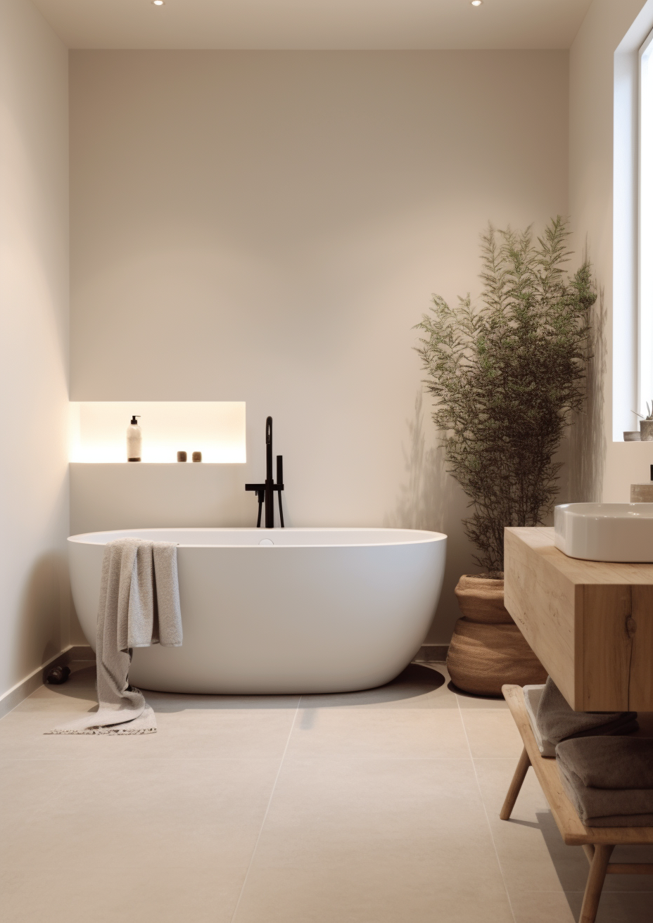
Balboa Mist is a colour. Swiss Coffee is a white. That is the whole comparison in one line. Balboa Mist sits at LRV 67 with enough saturation to read as a genuine pale grey-taupe on a wall - it behaves like paint, shifting between violet and beige depending on the light. Swiss Coffee sits at LRV 82, firmly in near-white territory, and its job is to be a soft, warm backdrop rather than a statement.
The fifteen-point LRV gap is the more important number here, not the undertone family. A room painted Balboa Mist will feel noticeably deeper and more atmospheric than the same room in Swiss Coffee, which will read bright and open by comparison. This is not a close call the way Creamy vs Alabaster is - the two occupy different brightness bands entirely.
They are rarely used together in the same scheme for that reason - Balboa Mist does a wall's job and Swiss Coffee does a trim-and-backdrop job, and pairing them directly usually means picking one as the dominant note and the other as a supporting white elsewhere in the house. For a related read on how Balboa Mist performs against a true near-white neutral in its own LRV band, the Balboa Mist vs Pale Oak guide breaks down how it holds up against a lighter, pinker greige with a similar warm base.
Not sure which one works for your room? A colour consultation is included in all our design packages - book directly here. |
When to Choose Balboa Mist

Choose Balboa Mist when the brief calls for a genuine pale grey-taupe colour, not a white. It works best in transitional living rooms and primary bedrooms where the walls need presence without going dark.
It is particularly strong in open-plan spaces with mixed light, since its violet-beige balance tends to hold together as a neutral across different zones rather than reading as one colour in the kitchen and another in the hallway.
Its LRV of 67 keeps rooms feeling light while still offering enough depth to ground a scheme that would look flat in a near-white.
Avoid it in north-facing rooms with predominantly cool artificial lighting - the violet undertone can turn dull and slightly cold without warm light or warm materials to offset it. Avoid it, too, where the brief specifically calls for a crisp white; Balboa Mist will never read as white, only as a soft grey.
When to Choose Swiss Coffee

Choose Swiss Coffee when the room needs a warm, creamy near-white rather than a colour. It suits traditional kitchens, trim-heavy hallways, and whole-house white schemes where the goal is softness rather than statement.
It is a dependable choice in rooms with warm wood floors and warm furnishings, where its creamy undertone has something to agree with.
The colour holds its warmth without going stark, which is its main advantage over brighter whites.
Avoid it in rooms with strong cool artificial lighting or minimal natural light, where the green undertone can read slightly murky rather than warm. Designers who have tested it against Studio McGee-style interiors often reduce it to 75% strength for this reason - full strength can lean greener than expected in low light.
How the Pairings Differ

For Balboa Mist on walls, White Dove is the natural trim choice - its warmth keeps the pairing cohesive without fighting the violet undertone. Chantilly Lace works for a crisper, higher-contrast finish in more formal rooms.
For Swiss Coffee on walls, a slightly brighter white on trim creates clean definition - Simply White or SW Pure White both work well without clashing with the green-yellow undertone underneath.
Both colours favour warm wood tones over cool stone. Balboa Mist is more forgiving of cool grey stone thanks to its violet undertone, which does not fight cool materials as hard as a straight yellow undertone would. Swiss Coffee needs warmer surroundings - cool stone or cool-toned tile can make its green cast more noticeable.
Balboa Mist works well with both brushed nickel and warm brass, thanks to its balanced violet-beige undertone. Swiss Coffee leans more comfortably toward brass and gold - cool metals can occasionally sharpen the green undertone in a way that reads unintentional.
Architect's Verdict - Balboa Mist or Swiss Coffee?

These two rarely compete for the same wall, and the verdict reflects that: this is less a choice between two similar colours and more a decision about which job the room needs done.
If the room needs a genuine pale grey-taupe colour with real depth and presence, Balboa Mist is the answer. It brings sophistication to transitional and modern-neutral schemes that a near-white simply cannot deliver, and its chameleon undertone makes it one of the more forgiving greiges across mixed light.
If the room needs a soft, warm, creamy backdrop white, Swiss Coffee does that job well. It is not the crispest or most predictable white on the market, but in a room with warm materials and consistent lighting, it delivers a classic, timeless warmth that suits traditional interiors especially well.
The test I always use for this pairing: paint a large sample of Swiss Coffee in the room with the worst light - typically a north-facing space with mixed LED bulbs - and check for any green cast by mid-afternoon. Then hold a Balboa Mist sample in the same spot and watch whether the violet settles into taupe or drifts toward flat grey-purple. A pass looks like this: Swiss Coffee reads warm rather than murky, and Balboa Mist reads as soft taupe rather than cold grey. If either one fails that test, you have your answer.
Frequently Asked Questions

Is Balboa Mist the same brightness as Swiss Coffee?
No - Balboa Mist has an LRV of approximately 67, while Swiss Coffee sits at approximately 82. That fifteen-point gap makes Swiss Coffee read as a true near-white, while Balboa Mist reads as a genuine pale grey-taupe colour. They occupy different brightness bands entirely.
Can I use Balboa Mist and Swiss Coffee in the same house?
Yes, but they are not a direct wall-and-trim pairing the way closely matched neutrals are. Balboa Mist works best as a standalone wall colour in one zone, with Swiss Coffee used separately as a trim or backdrop white elsewhere in the home.
Which is better for a north-facing room?
Neither is ideal, but Swiss Coffee is the more forgiving of the two in flat, cool light. Its green undertone prevents it from turning obviously yellow, while Balboa Mist's violet undertone can drift toward a duller, colder grey-purple without warm light to balance it.
Does Swiss Coffee look green on the walls?
In some lighting, yes - it has a subtle green undertone alongside its yellow-beige base. This is most noticeable in low natural light or under cool LED bulbs. Testing a large sample patch across a full day is the only reliable way to catch it before committing.
Is Balboa Mist a good whole-house colour?
It can be, particularly in transitional homes with mixed warm and cool materials. Its balanced violet-beige undertone tends to hold together as a neutral across different rooms and light conditions better than many single-toned greiges.
What is the LRV of Balboa Mist vs Swiss Coffee?
Balboa Mist has an LRV of approximately 67 and Swiss Coffee has an LRV of approximately 82. This is a significant gap in practice - Balboa Mist will read noticeably deeper and more colour-forward on a wall than Swiss Coffee, which reads as a soft, bright near-white.
Final Thought
Balboa Mist and Swiss Coffee are not really rivals - they solve different problems. The choice is not about which one is better, it is about whether your room needs a colour or a white.
If you want a pale grey-taupe wall colour with real depth and a chameleon quality across changing light, Balboa Mist is the stronger choice. If you want a warm, creamy near-white that keeps a traditional room feeling soft and timeless, Swiss Coffee delivers that reliably in the right materials and light. Buy sample pots of both, paint large patches in your worst-light room, and check them morning and evening. The answer will be clear within a day.
Want a complete colour scheme built around Balboa Mist or Swiss Coffee? Our design packages cover full palette selection, finish recommendations, and 3D visualisations - see our packages. |
About the Author
Beril Yilmaz is a qualified architect and interior designer based in the UK. She runs BY Design And Viz, a design platform covering paint colour reviews, interior design guidance, and residential design projects. Beril has specified both Balboa Mist and Swiss Coffee across residential projects in the UK and internationally - Balboa Mist as a whole-room grey-taupe neutral in transitional living spaces, Swiss Coffee as a warm backdrop white in traditional, trim-heavy interiors, occasionally using both in the same home as separate colour statements rather than a coordinated wall-and-trim pair.




Comments