Blue Contrast Colour: 12 Bold Combinations to Transform Your Home (Designer’s Secrets)
- Beril Yilmaz

- Feb 10
- 6 min read
Blue is one of those colours that almost everyone loves, yet many homeowners hesitate when it comes to actually using it. Sometimes it feels too cold. Other times it feels too safe. More often than not, the issue isn’t blue itself—it’s what’s (not) paired with it.
When blue is styled without contrast, it can fall flat. A navy room can feel heavy, a pale blue space can feel washed out, and a bright blue accent can feel disconnected. The solution isn’t avoiding blue; it’s understanding blue contrasting colours and how to use them intentionally.
This guide is written like an interior design studio notebook—not a textbook. We’ll move beyond colour-wheel theory and focus on how blue feels in real homes, how contrast changes that feeling, and how to confidently choose combinations that look layered, warm, and intentional rather than accidental.
At a Glance: What You’ll Learn in This Guide

What blue contrasting colours actually are (in real-life terms)
How different shades of blue change the contrast you need
The best contrasting colours for navy, sky blue, and royal blue
How warm tones balance blue interiors
Why texture and material matter as much as colour
Common mistakes people make when pairing blue
Answers to the most searched Google questions about blue contrast
1. Blue Contrasting Colours: What Contrast Really Means in Interior Design

When people hear “contrast colour,” they often think of opposites on a colour wheel. While that’s technically correct, interior design works on a more emotional level.
Contrast is about balance.
Blue is naturally calming, cool, and controlled. When used alone, it can feel distant or overly serious. Contrast introduces warmth, depth, and energy—turning blue from a flat background into a lived-in, welcoming colour.
In interiors, contrast comes from:
Temperature (cool blue vs warm tones)
Depth (dark blue vs light neutrals)
Material (smooth blue paint vs textured surfaces)
Saturation (muted blue vs bold accent colours)
Understanding contrast this way allows you to style blue in a way that feels intentional rather than decorative for decoration’s sake.
2. Blue Contrasting Colours: Why Blue Needs Contrast More Than Most Colours

Blue behaves differently than beige, grey, or white. Those neutrals quietly support a space. Blue, however, actively sets a mood.
Without contrast:
Navy can feel heavy or enclosed
Light blue can feel cold or unfinished
Bright blue can feel loud or disconnected
With the right contrast:
Navy becomes elegant and architectural
Light blue feels fresh and grounded
Bright blue feels confident and playful
Contrast is what gives blue its versatility. It’s also why blue works across styles—from modern minimal to boho to classic homes—if it’s paired thoughtfully.
3. Blue Contrasting Colours: Warm Tones That Balance Cool Blues
One of the most effective ways to contrast blue is by introducing warmth.
Earthy Neutrals
Warm beige, sand, camel, and soft taupe are excellent partners for blue. They soften its coolness without competing for attention. This combination works especially well in living rooms and bedrooms where comfort matters.
Terracotta and Clay
These tones sit opposite blue emotionally rather than literally. Terracotta adds warmth, texture, and a grounded feeling that keeps blue from feeling sterile. This pairing is ideal for Mediterranean, boho, and modern-organic interiors.
Mustard and Ochre
Yellow-based tones bring energy to blue. Muted versions like mustard or ochre prevent the combination from becoming too primary or playful. This contrast works beautifully with navy and mid-tone blues.
4. Blue Contrasting Colours: Navy Blue and Its Best Matches

Navy is deep, dramatic, and grounding—but it needs contrast to breathe.
Navy + Soft White
This is a classic for a reason. Warm whites prevent navy from feeling too stark and highlight architectural details like trim, paneling, and built-ins.
Navy + Brass or Gold
Metallic warmth lifts navy instantly. Brass lighting, hardware, or decor introduces contrast without adding another colour, making the space feel layered and refined.
Navy + Warm Wood
Natural wood tones—especially oak, walnut, or rattan—soften navy’s formality. This pairing feels modern yet timeless and works across living rooms, dining spaces, and even kitchens.
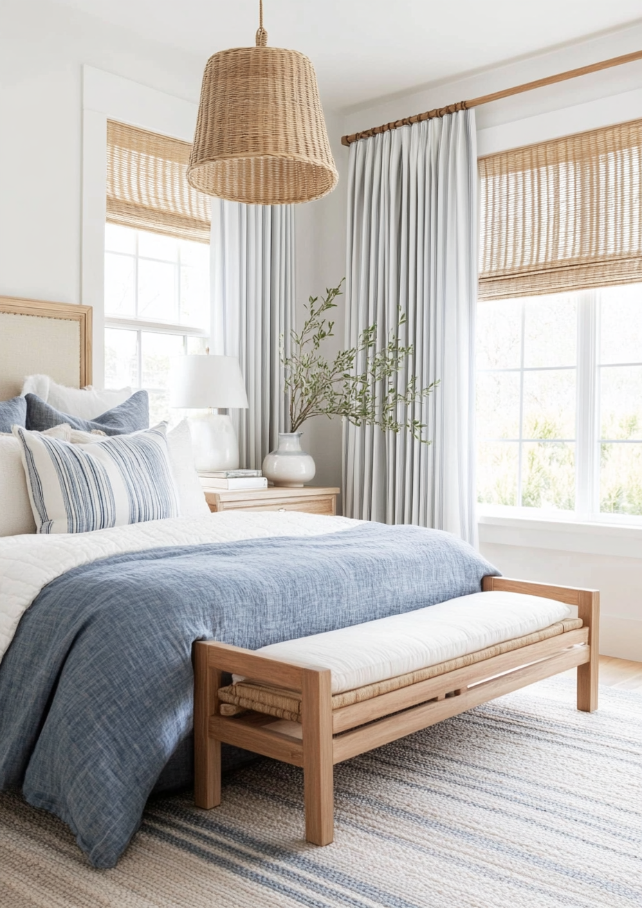
5. Blue Contrasting Colours: Light Blue and How to Keep It Grounded

Light blue is airy and calming, but without contrast it can feel flat or juvenile.
Light Blue + Crisp White
This pairing feels clean and fresh, especially in bathrooms and kitchens. The key is keeping the white warm rather than stark.
Light Blue + Natural Textures
Woven materials, linen, stone, and wood bring depth to pale blue spaces. Texture becomes the contrast when colour stays subtle.
Light Blue + Muted Greens
Soft greens and sage tones create a nature-inspired palette that feels calm rather than cold. This works particularly well in bedrooms and relaxed living spaces.
6. Blue Contrasting Colours: Royal and Bright Blues Done Right

Brighter blues are confident and expressive, but they need careful balancing.
Bright Blue + Neutral Grey
Grey tones—especially mid to warm greys—help ground bold blues and keep them from feeling overpowering.
Bright Blue + Black Accents
Used sparingly, black sharpens blue and gives it a modern edge. Think thin frames, light fixtures, or small decor pieces.
Bright Blue + Soft Neutrals
Cream, off-white, and pale stone tones calm bold blues and allow them to shine without overwhelming the room.
7. Blue Contrasting Colours: Material and Texture Matter Too

Colour contrast isn’t only about paint.
A blue wall paired with:
Rattan furniture adds softness and warmth
Marble surfaces introduce elegance and light
Wool or boucle textiles balance coolness with comfort
Matte finishes soften bold blues
Glossy finishes enhance depth in darker blues
This is why blue works so well across styles. The same blue paint can feel completely different depending on what it’s paired with.
8. Blue Contrasting Colours: Common Mistakes to Avoid

Pairing blue only with cool greys, making the space feel cold
Using pure black instead of softer charcoal tones
Ignoring undertones (some blues lean green, others purple)
Overusing contrast without a neutral base
Forgetting texture and relying on colour alone
Contrast should feel balanced—not dramatic for drama’s sake.
9. Blue Contrasting Colours: How to Test Before You Commit

Before painting or buying furniture:
Test colours in natural and artificial light
Look at samples next to fixed elements (floors, countertops)
Observe the space at different times of day
Introduce contrast first through accessories or textiles
Small experiments lead to confident decisions.
Frequently Asked Questions About Blue Contrasting Colours

What is the best contrasting colour for blue?
Warm neutrals like beige, camel, and terracotta are among the best contrasting colours for blue because they balance its cool undertones.
Does blue make a room feel cold?
Blue can feel cold if not balanced properly. Adding warm contrasting colours, textures, and lighting prevents this.
Can blue work with brown furniture?
Yes. Brown, especially warm wood tones, is one of the best contrasts for blue and creates a timeless, grounded look.
Is blue and grey a good combination?
It can be, but it works best when the grey is warm or mid-toned. Cool grey and blue together can feel flat if not layered carefully.
How many contrasting colours should I use with blue?
Usually one main contrast and one neutral is enough. Too many contrasts can make the space feel busy.
Conclusion: Why Blue Contrast Is a Design Power Move
Blue doesn’t need to be safe, and it doesn’t need to be bold for bold’s sake. When paired with the right contrasting colours, blue becomes adaptable, layered, and timeless.
Understanding blue contrasting colours allows you to:
Make confident colour decisions
Avoid common design mistakes
Create spaces that feel warm, balanced, and intentional
If you’re ready to stop guessing and want professional guidance tailored to your home, BY Design And Viz offers interior design services that help you choose colours, materials, and layouts with clarity and confidence.
Start Your Dream Home Transformation
Our online design packages were created to make the entire process smoother, clearer, and far more enjoyable — no stress, no second-guessing. Whether you’re refreshing one room or reimagining your whole home, we guide you every step of the way with layouts, visuals, and a fully personalised design plan.
See our interior and exterior design packages to get started.
Author Bio
Beril Yilmaz is the founder of BY Design And Viz, an online interior and exterior design studio specialising in clear layouts, thoughtful architectural details, and design decisions that support how people actually live. With a background in architecture and a practical design approach, her work focuses on creating homes that feel considered, functional, and intentionally designed.


Comments