


Calm vs Pale Oak: The Comparison That Actually Helps You Decide

Calm and Pale Oak share the same undertone family and almost nothing else. Both carry a whisper of lavender-pink beneath a neutral base, and both belong to Benjamin Moore's Off-White Collection - but one sits close enough to white to barely register as colour, and the other is a full taupe-greige with genuine depth on the wall. Confuse them on the strip and the room gets the wrong result.
I have specified both across residential projects, and the mix-up is almost always about depth, not undertone. Calm reads as a near-white. Pale Oak reads as an actual colour. That distinction matters more than anything else on the paint card.
This guide covers where each one belongs, how they behave in real light, and why the seven-point LRV gap between them - not the shared undertone - is what actually decides which one your room needs.

At a Glance
| Calm | Pale Oak |
Brand | Benjamin Moore | Benjamin Moore |
LRV | 76 - near-white, sits close to the top of the range | 69 - a genuine step down from Calm, reads as an actual colour |
Colour category | Near-white with a whisper of colour - barely reads as a neutral at all | True taupe-greige with real depth - unmistakably a neutral, not a near-white |
Undertones | Faint cool lavender-grey - present but restrained, rarely announces itself | Warm pink-lavender, visible in most light conditions and shifts with materials |
Character | Quiet and barely-there; behaves almost like a soft trim white | Substantial and considered; shifts between beige and grey depending on context |
North-facing | Risky - can flatten to a cold, slightly chalky white without warm materials nearby | Reliable - holds its warmth and depth better than Calm in cooler light |
South-facing | Washes out further toward true white; the undertone becomes almost undetectable | The pink undertone activates and can read faintly rosy in strong light |
Open-plan | Weak - too pale to anchor larger volumes or read consistently across zones | Strong - reads consistently as an intentional neutral across mixed zones |
On walls | A near-white backdrop that adds brightness with the faintest hint of softness | A substantial greige backdrop with genuine depth and presence |
On cabinets | Too pale in most kitchens; tends to wash out against white trim and stone | One of Benjamin Moore's most popular cabinet colours, especially on islands |
Use together? | Yes - Calm on trim with Pale Oak on walls is a tested, low-risk pairing | Pale Oak walls with Calm on trim is the classic pairing; the reverse needs testing |
Trim for each | Chantilly Lace for crisp contrast, or Simply White for a softer step | White Dove or Calm for a clean step up in brightness |
Style fit | Modern, minimal, coastal | Transitional, organic modern, traditional |
Architect's pick | When the brief wants brightness first, with only the faintest whisper of colour | When the brief needs a genuine neutral with weight and warmth, not restraint |
Benjamin Moore Calm OC-22 - What It Really Looks Like

Calm has an LRV of approximately 76, which puts it firmly in the near-white category - lighter than almost every true greige on the market. In flat or north light it can look close to a plain trim white with the faintest grey-lavender cast, and in bright south light it often bleaches out to something indistinguishable from an actual white. It does not commit to colour. That is what makes it useful, and what makes it risky in the wrong room.
The undertone is real but restrained - a cool lavender-grey rather than anything you would call purple in normal use. Under warm incandescent light it can pick up a faint pink cast; under cool daylight it settles into something closer to a soft dove grey. It is one of the palest neutrals Benjamin Moore makes that still reads as having a temperature at all.
For how Calm compares to a deeper, more assertive Benjamin Moore neutral it is often placed against - Balboa Mist vs Calm guide covers the depth gap between the two and which rooms each one can actually carry.
Benjamin Moore Pale Oak OC-20 - What It Really Looks Like

Pale Oak has an LRV of approximately 69, a meaningful step down from Calm's near-white brightness and enough to read as an actual colour rather than an off-white. The undertone is a warm pink-lavender that shows up clearly against white trim, and it shifts noticeably with the room's material palette - beige-leaning against warm wood, grey-leaning against cool stone. There is nothing ambiguous about its presence on a wall. It reads as taupe, not white.
In south or west light the pink undertone activates and the colour can look faintly rosy - a quality many designers specify deliberately. In flatter or north light it settles into a more neutral warm grey. It is one of the most reliably warm greiges in Benjamin Moore's range, which is exactly why it shows up so often on open-plan walls and kitchen islands.
For the comparison against a lighter Benjamin Moore neighbour that gets shortlisted against Pale Oak just as often - Dove Wing vs Pale Oak guide walks through the undertone gap and which one holds up better in a north-facing room.
The Real Difference Between Calm and Pale Oak
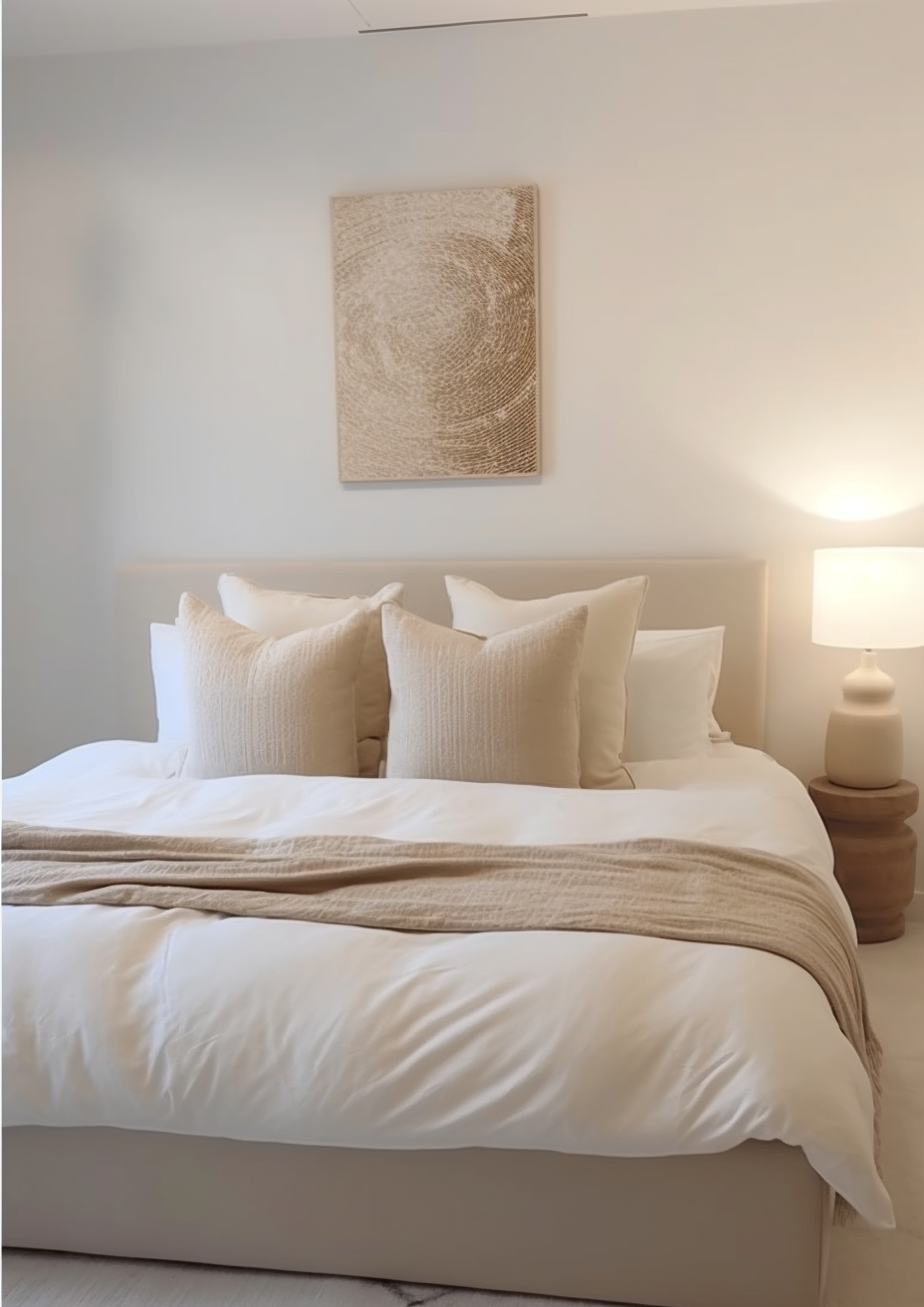
The simplest way to separate them: Calm is barely a colour. Pale Oak is unmistakably one. Both share the same lavender-pink undertone family, but the seven-point LRV gap between them changes everything about how that undertone actually reads on the wall.
Calm sits at LRV 76, close enough to true white that its undertone only shows in raking light or against a warmer trim. Pale Oak sits at LRV 69, low enough that the pink-lavender undertone is visible in almost any light condition. The undertone family is identical. The depth is not.
Calm on trim with Pale Oak walls is a tested, low-risk pairing since they share an undertone family and rarely clash - though for more contrast than Calm's near-white restraint allows, the White Dove vs Pale Oak guide covers a brighter trim option and where the extra contrast actually earns its place.
Not sure which one is right for your room? A Color Direction consultation gets you a full custom palette built around your space - book yours here. |
When to Choose Calm

Choose Calm when you want a wall colour that behaves almost like a white but softens the starkness slightly. It suits modern, minimal, and coastal interiors where the brief is brightness first and colour second. Bathrooms, hallways, and small rooms that need to feel larger all benefit from how little visual weight it adds.
Use it where the room already has warmth from its materials and the walls simply need to stay quiet. It does not fight for attention. It should not have to.
Avoid Calm in a north-facing room with no warm materials nearby - the lavender-grey undertone can flatten out, and the wall can end up looking chalky rather than intentional.
When to Choose Pale Oak

Choose Pale Oak when the brief calls for a genuine greige with real depth and presence, not a whisper of colour. It suits transitional, organic modern, and traditional interiors where the walls are meant to read as an intentional neutral, not an almost-white. Open-plan spaces benefit from its consistency across different material zones.
It is one of the most popular cabinet colours in the Benjamin Moore range for a reason - it holds its warmth against both warm wood and cool stone. Choose it where the room needs a considered neutral, not a background.
Avoid Pale Oak where the brief genuinely wants brightness above everything else - at LRV 69 it will read noticeably deeper than Calm, Chantilly Lace, or other true near-whites in the same room.
How the Pairings Differ

Calm on walls pairs cleanly with almost any white trim - Chantilly Lace for crisp definition, Simply White for something marginally softer. Because Calm sits so close to white itself, the contrast with the trim does most of the work.
Pale Oak on walls wants a trim with enough brightness to read as a genuine step up - White Dove or Calm both work, giving definition without fighting the greige undertone.
Both colours work with warm wood tones, but Pale Oak is the more forgiving of the two against cool stone and tile - its lower LRV and stronger undertone hold their own where Calm can look washed out and characterless.
Calm suits brushed nickel and chrome, where its near-white restraint lets cool metals read clean. Pale Oak works well with warm brass and matte black, both of which pick up on its pink-lavender depth rather than fighting it.
Architect's Verdict - Calm or Pale Oak?

For most homes, Pale Oak is the more versatile choice - it has enough presence to anchor a room and enough warmth to work across mixed material palettes without disappearing.
Calm is the right call when the brief is brightness with the faintest hint of softness - a near-white for a small bathroom, a hallway, or a modern scheme where colour needs to stay almost invisible.
Pale Oak is the right call when the brief wants an actual neutral with weight - a taupe-greige that reads as a deliberate design decision rather than an accident of light.
Test this properly: buy sample pots of both, paint two patches on the same wall, and check them in the worst light your room gets - typically a grey, overcast afternoon with no direct sun. If Calm still reads as a colour rather than fading to plain white, it has enough presence to work. If Pale Oak looks flat or muddy rather than warm, the room's light cannot support it. Give it a full day before deciding.
Frequently Asked Questions

Is Calm the same as Pale Oak, just lighter?
No - they share an undertone family but not a category. Calm is a near-white; Pale Oak is a genuine taupe-greige. The seven-point LRV gap is enough to change how each one reads on the wall, not just how bright it looks.
Can I use Calm and Pale Oak in the same room?
Yes - Calm on trim with Pale Oak on walls is a tested combination. The shared undertone keeps them from clashing, and the LRV gap creates clean, deliberate contrast.
Which is better for a north-facing room?
Pale Oak handles north light better than Calm. Calm's near-white base can turn flat and slightly cold without warm materials to balance it, while Pale Oak's deeper, warmer undertone holds its character even in cooler light.
Does Pale Oak look pink?
It can, in the right light. South and west-facing rooms activate the pink-lavender undertone more visibly than north-facing ones. It is rarely an issue in practice, but worth testing if you are sensitive to warm undertones.
Which is better for kitchen cabinets?
Pale Oak is the far more popular cabinet colour of the two. Its depth and warmth read as intentional against both warm wood and cool stone. Calm is generally too pale to register as a considered cabinet choice.
What is the LRV of Calm vs Pale Oak?
Calm has an LRV of approximately 76, and Pale Oak has an LRV of approximately 69. The seven-point gap is the single biggest factor separating how the two colours behave in real rooms.
Final Thought
Calm and Pale Oak are not really competing for the same job. One is a near-white for rooms that want brightness with the faintest whisper of colour. The other is a genuine neutral for rooms that want warmth and weight without going beige.
If your room needs to feel light and the brief barely wants colour at all, Calm is the answer. If your room needs a considered, warm neutral with real presence, Pale Oak delivers it. Test both before committing - the LRV gap between them is large enough to matter in almost any light.
Want a complete colour scheme built around Calm or Pale Oak? Our design packages cover full palette selection, finish recommendations, and 3D visualisations - see our packages. |
About the Author
Beril Yilmaz is a qualified architect and interior designer based in the UK. She runs BY Design And Viz, a design platform covering paint colour reviews, interior design guidance, and residential design projects. Beril has specified both Calm and Pale Oak across residential projects in the UK and internationally - Calm in modern and coastal interiors where the brief called for brightness with barely a whisper of colour, Pale Oak in transitional and open-plan spaces where the walls needed real warmth and presence, often specifying Calm on trim alongside Pale Oak walls in the same scheme.


Comments