


Balboa Mist vs Calm: The Comparison That Actually Helps You Decide

Updated: Sep 10
Balboa Mist and Calm both belong to Benjamin Moore's warm-neutral family, and both get shortlisted by anyone weighing up a gray that isn't cold. That's where the similarity ends. Balboa Mist sits at an LRV of 67 with a taupe-violet undertone that gives it real weight on the wall. Calm sits nearly ten points brighter at LRV 76, with a softer lavender-gray undertone that reads closer to a pale off-white than a true gray. They are not two versions of the same color - they solve different problems.
I have specified both across residential projects, and the choice between them has never come down to preference alone. It comes down to how much depth a room's light can actually support.
This guide covers the undertone and LRV difference in detail, where each color performs best, how they pair together, and which one your room actually needs.

At a Glance
| Balboa Mist | Calm |
Brand | Benjamin Moore | Benjamin Moore |
LRV | 67 - mid-depth, holds real presence on the wall | 76 - light and airy, reads nearly as an off-white |
Colour category | Committed warm greige - functions as a true wall colour, not a backdrop | Pale near-white with a cool lavender-gray cast - functions as a soft backdrop |
Undertones | Taupe-violet, visible and consistent across most lighting conditions | Subtle lavender-gray, held well back - rarely reads as purple on its own |
Character | Substantial and grounding; reads as a wall colour with weight rather than a pale neutral | Quiet and airy; reads closer to a soft off-white than a true gray |
North-facing | Holds its warmth - doesn't slide cold the way thinner grays do | Can turn faintly purple-cool without warm light or materials to offset it |
South-facing | Can deepen and read heavier in strong direct light | Stays crisp and luminous - the light activates it without pushing it warm |
Open-plan | Strong as an anchor, but limits overall brightness across the space | Strong - keeps spaces feeling open and reflects light consistently across zones |
On walls | Full wall colour with real depth - reads consistently from every angle | Soft backdrop that recedes rather than commands - lets furniture and materials lead |
On cabinets | Grounding choice, especially on lower cabinetry alongside a paler upper or trim | Better suited to walls or upper cabinetry than a full cabinet run - too pale to anchor on its own |
Use together? | Yes - Balboa Mist on walls or lower cabinetry with Calm on trim is a considered pairing | Yes - Calm on trim or upper cabinetry alongside Balboa Mist walls is the classic pairing |
Trim for each | Calm for a clean lift in brightness, or White Dove for more contrast | White Dove or Simply White for crisp, clean definition |
Style fit | Transitional, traditional, grounded warm-neutral schemes | Soft contemporary, coastal, and calm minimalist schemes |
Architect's pick | When the room needs an anchor - open-plan spaces, mixed materials, or a scheme that would lose definition with a paler neutral | When the brief needs light and quiet neutrality without the walls disappearing into plain white |
Benjamin Moore Balboa Mist HC-1 - What It Really Looks Like

Balboa Mist has an LRV of 67, which puts it firmly in the mid-depth warm greige category. The undertone is a soft taupe-violet - present, but never loud - and it shows up consistently whether the light is warm or cool. There is nothing washed out about it.
In natural daylight Balboa Mist reads as a considered, grounded neutral - warm enough to avoid the flatness that pure grays fall into, but restrained enough that it never tips fully into beige. In low evening light the violet cast deepens slightly and the colour takes on real weight.
It does not disappear. Balboa Mist behaves like a true wall colour rather than a background one. It holds its own against furniture, fabric, and changing light, which is why it works so well as an anchor in open, mixed-material rooms.
For how Balboa Mist compares against a cooler, more neutral gray it's constantly shortlisted alongside, the Balboa Mist vs Agreeable Gray guide breaks down the undertone difference and which one holds up better in mixed lighting.
Benjamin Moore Calm OC-22 - What It Really Looks Like
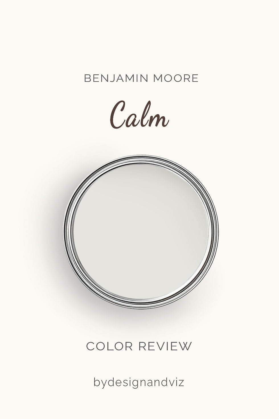
Calm has an LRV of 76, nearly ten points brighter than Balboa Mist, and the difference shows immediately on the wall. The undertone is a soft lavender-gray - cooler and quieter than Balboa Mist's taupe-violet, and far less assertive.
In good daylight Calm reads as a pale, airy near-white with only a whisper of gray behind it. It is easy to mistake for a plain off-white until you set it beside something warmer, at which point the cool lavender cast becomes obvious.
It recedes rather than announces itself. Calm works as a backdrop, not a statement - the kind of neutral that lets furniture, art, and materials do the talking while the walls simply support the room.
The Real Difference Between Balboa Mist and Calm
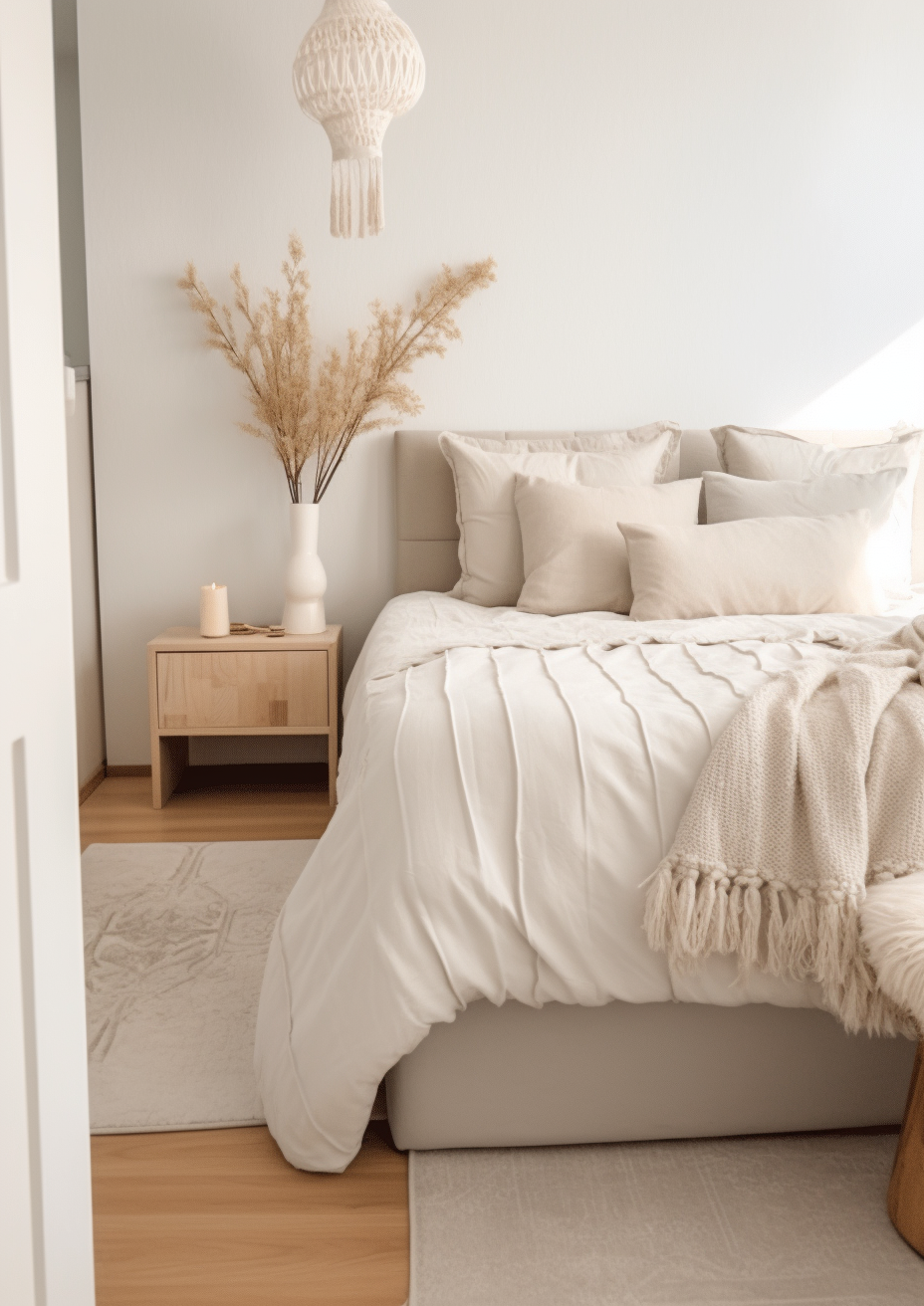
The gap between Balboa Mist and Calm comes down to two things: nearly ten LRV points and a genuinely different weight of undertone. Balboa Mist is a mid-depth taupe-violet greige with real presence. Calm is a pale lavender-gray that reads closer to white than gray in most light. Side by side, they are not competing for the same job. For how Pale Oak compares to Calm - the paler, near-white Benjamin Moore neutral it shares an undertone family with - the Calm vs Pale Oak guide covers the LRV gap between them and when the brief calls for presence over restraint.
Balboa Mist sits at LRV 67; Calm sits at LRV 76. That is a big enough gap that the two rarely solve the same brief. Balboa Mist anchors a room. Calm opens one up. Choosing between them is less about undertone preference and more about how much depth the space can actually spare.
The two pair well together precisely because they don't compete. Balboa Mist on walls or lower cabinetry with Calm on trim or upper cabinetry creates a considered, layered neutral scheme without any undertone conflict. For the comparison of Balboa Mist against a warmer greige a full LRV step higher on the same brand's chart, the Balboa Mist vs Pale Oak guide covers how far a five-to-ten-point LRV gap actually changes how a room reads.
Not sure which one works for your room? A colour consultation is included in all our design packages - book directly here. |
When to Choose Balboa Mist

Choose Balboa Mist when the room needs a true wall colour with depth and presence. These are the conditions where it wins:
Open-plan spaces that need an anchor rather than another pale surface. Living rooms and hallways with mixed warm materials - wood floors, stone, brass - where a greige with real weight ties everything together. Kitchens where the cabinetry needs grounding rather than lightening. Bedrooms in period properties where a soft, warm depth suits the architecture.
Avoid Balboa Mist in small, low-light rooms where its depth will read as heavy rather than considered. Avoid it where the brief is specifically for brightness and airiness - that job belongs to Calm.
When to Choose Calm
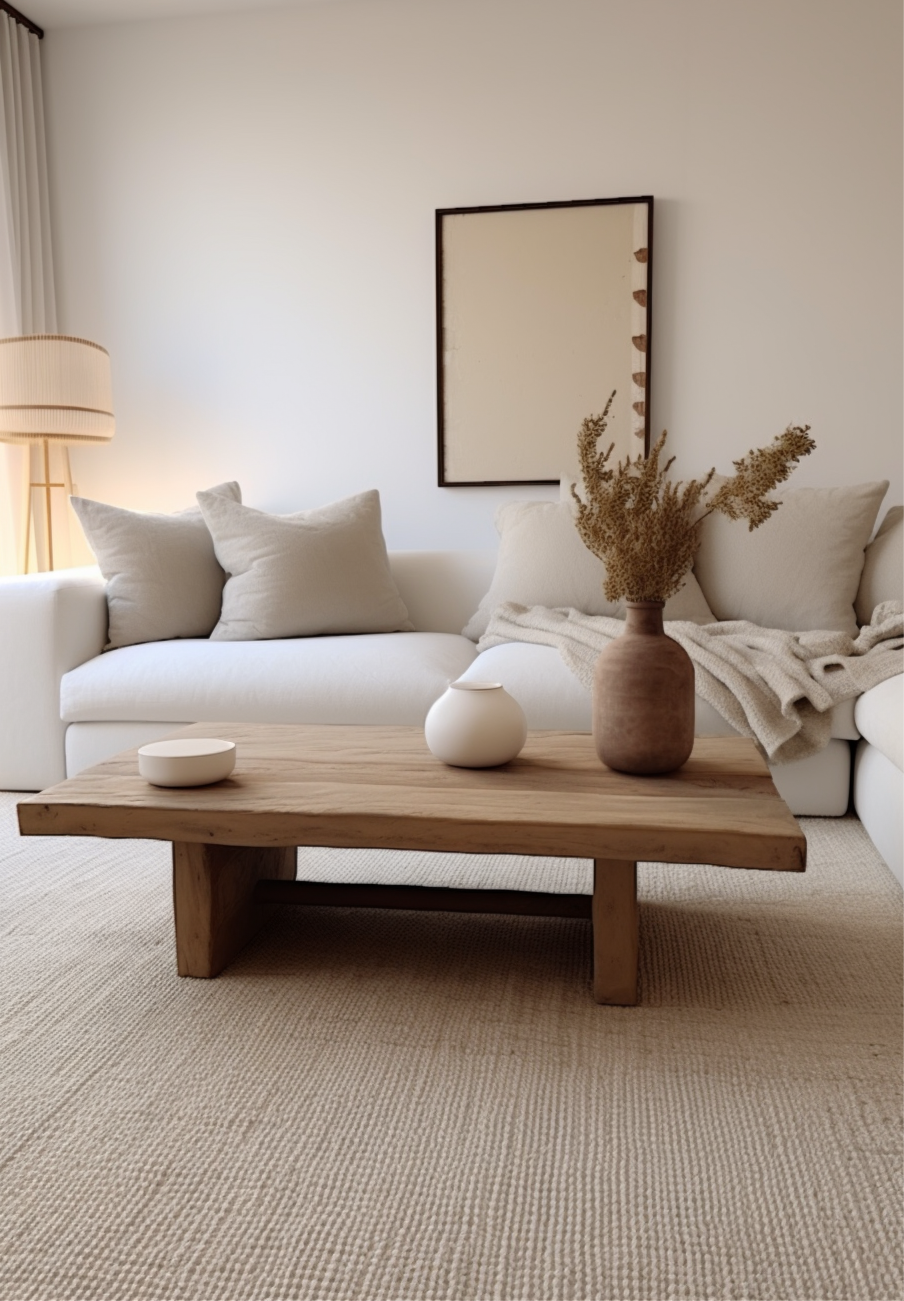
Choose Calm when the brief calls for light and quiet neutrality without the walls disappearing into plain white. These are the situations where it outperforms Balboa Mist:
Small or low-light rooms that need every available LRV point. Bathrooms, bedrooms, and hallways where a soft, cool-leaning neutral suits a calmer mood. Transitional or coastal schemes where a hint of lavender-gray works better than a warm greige. Any room where Balboa Mist has been tested and found too heavy for the available light.
Avoid Calm in rooms with predominantly warm materials - its cooler undertone can feel slightly at odds with warm wood and brass rather than complementing them the way Balboa Mist does.
How the Pairings Differ
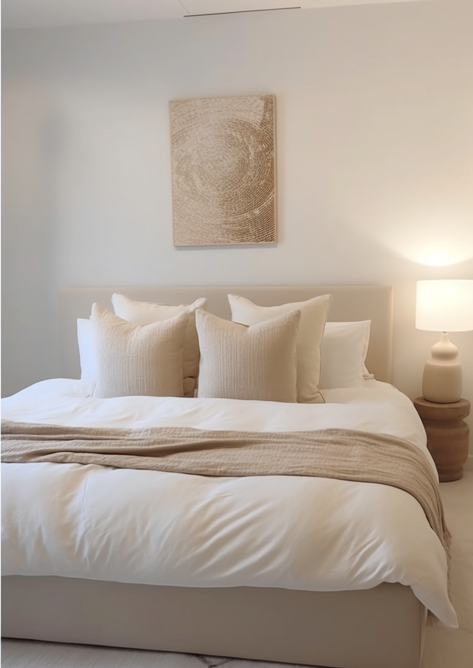
For Balboa Mist on walls, Calm or White Dove on trim gives a clean lift in brightness without breaking from the warm-neutral family. Avoid a stark, cool white trim, which will make Balboa Mist's violet undertone look muddier by contrast.
For Calm on walls, White Dove or Simply White on trim keeps the scheme crisp and cohesive. Calm on both walls and trim works well in bedrooms and bathrooms where the goal is a soft, enveloping near-white.
Both colours suit warm wood tones, though Balboa Mist needs it more urgently - pair it with cool grey flooring and the greige can start to look flat. Calm is more forgiving and sits comfortably alongside warm oak, pale stone, or cooler engineered floors alike.
Balboa Mist favours aged brass and warm bronze, which lean into its taupe-violet undertone. Calm works well with brushed nickel and matte black, hardware finishes that echo its cooler, quieter character.
Architect's Verdict - Balboa Mist or Calm?

For most rooms, the decision comes down to how much depth the space can absorb.
Balboa Mist is the right choice when the room needs an anchor - open-plan spaces, mixed-material rooms, or any scheme where a pale neutral would simply vanish. Its taupe-violet undertone gives it enough presence to hold its own against furniture and changing light.
Calm is the right choice when brightness is the priority and the room can't afford to lose any LRV points. In a small, low-light space, Calm keeps things feeling open where Balboa Mist would feel closed in.
The test I always use for this pairing: paint large sample patches of both on a north-facing wall - the worst-case light for greiges and lavenders alike - and check them at midday and again at dusk. If Balboa Mist still reads as a considered warm gray rather than flat and murky, it passes. If Calm holds its light, airy quality without tipping visibly purple, it passes too. Whichever one fails in your room is the one to rule out.
Frequently Asked Questions

Is Balboa Mist warmer than Calm?
Yes - Balboa Mist has a stronger, more visible taupe-violet undertone and a noticeably lower LRV, which together give it more warmth and weight than Calm. Calm's lavender-gray undertone is real but far more restrained, and its higher LRV keeps it reading closer to a pale off-white.
Can I use Balboa Mist and Calm in the same house?
Yes, and the pairing works well because the two don't compete. Balboa Mist on walls or lower cabinetry with Calm on trim or upper surfaces creates a layered neutral scheme that shares an undertone family without clashing.
Which is better for a small room?
Calm is the safer choice for small or low-light rooms. Its higher LRV means it reflects more available light, which keeps a small space from feeling closed in. Balboa Mist's extra depth can make a small room feel more enclosed unless there is strong natural light to offset it.
Does Balboa Mist look purple?
In most light, no - the undertone reads as a soft taupe-gray rather than an obvious violet. It can show a touch more purple in cool, low light or beside very warm materials, but it rarely reads as purple on its own.
Which is better for kitchen cabinets?
Balboa Mist is the more grounding choice for kitchen cabinets, particularly lower cabinetry where some depth and presence are wanted. Calm works better on upper cabinets or walls, where its lighter, quieter character keeps the scheme from feeling heavy.
What is the LRV of Balboa Mist vs Calm?
Balboa Mist has an LRV of approximately 67, and Calm has an LRV of approximately 76. That nine-point gap is significant in practice - Calm reflects noticeably more light, which is why the two are best understood as serving different jobs rather than as interchangeable options.
Final Thought
Balboa Mist and Calm are both excellent Benjamin Moore neutrals, but they are not really competing for the same wall. One brings depth and presence; the other brings light and quiet. The choice is less about which undertone you prefer and more about how much brightness the room can spare.
If the room needs an anchor and has the light to support some depth, Balboa Mist will reward you with real presence and warmth. If brightness is non-negotiable, Calm is the more reliable, forgiving choice. Buy sample pots of both, paint patches on your darkest wall, and check them at midday and at dusk. The one that still looks good at dusk is the one your room needs.
Want a complete colour scheme built around Balboa Mist or Calm? Our design packages cover full palette selection, finish recommendations, and 3D visualisations - see our packages. |
About the Author
Beril Yilmaz is a qualified architect and interior designer based in the UK. She runs BY Design And Viz, a design platform covering paint colour reviews, interior design guidance, and residential design projects. Beril has specified both Balboa Mist and Calm across residential projects in the UK and internationally - Balboa Mist in open-plan living spaces and traditional kitchens where a grounded neutral was needed, Calm in small bedrooms and bathrooms where brightness was the priority, often specifying both together with Balboa Mist on walls and Calm on trim.


Comments