Ecru vs Beige: The Subtle Difference That Can Transform Your Home
- Beril Yilmaz

- Oct 20, 2025
- 6 min read
Updated: Mar 24
When it comes to designing with neutrals, few comparisons cause as much quiet confusion as ecru vs beige. Both are soft, calming, and endlessly versatile — yet they behave differently under light and can completely change the mood of a room.
If you’ve ever found yourself standing in front of a paint chart, wondering whether to go for beige, ecru, or even ivory, you’re not alone. These tones might seem similar at first glance, but to a designer, the difference is significant — ecru is cooler and more sophisticated, while beige leans warmer and more traditional.
In this post, I’ll guide you through everything you need to know about ecru vs beige, including how they differ, where to use them, and how to pair them with other warm neutral colours. You’ll also find expert styling advice, recommended paint shades, and easy ways to get the balance right in your own home.
At a Glance
What makes ecru and beige different
When to use ecru paint vs beige tones
Designer-approved pairings with ivory, taupe, and greige
Warm neutral colour schemes for modern interiors
Expert tips on texture, lighting, and finishes
1. Ecru vs Beige: Understanding the Difference

At first sight, ecru and beige belong to the same family — soft, light, neutral. But their undertones make them behave quite differently.
What Is Ecru?
Ecru takes its name from the French word for “raw” or “unbleached.” It resembles the natural colour of unbleached linen or cotton — a light cream with subtle grey or yellow undertones. It’s often slightly cooler and more refined than beige, with a hint of natural depth that works beautifully in modern and minimalist interiors.
You Might Also Like : Shoji White Sherwin Williams – Is This The Best Off-White for Your Home?
What Is Beige?
Beige, by contrast, carries warmer yellow and pink undertones. It feels cosier and more traditional, lending warmth and comfort to a space. Beige has been a classic for decades because it complements wood tones and pairs easily with white, taupe, or soft browns.
Designer Tip: If your space faces north or gets less natural light, beige adds instant warmth. For bright, sun-filled rooms, ecru paint helps soften glare and creates an elegant, balanced atmosphere.
2. Ecru Paint: The Designer’s Choice for Calm, Balanced Spaces

Ecru paint has become increasingly popular among designers because of its adaptability. It’s one of those shades that instantly makes a room feel tranquil, yet still contemporary.
Why Designers Love Ecru
Ecru has a barely-there grey base that keeps it from looking too yellow or too pink. It reads as soft, natural, and effortlessly chic — making it ideal for neutral lovers who prefer calm spaces that still have personality.
It works especially well with oak flooring, linen upholstery, and natural stone. It’s the paint colour equivalent of a perfectly tailored linen shirt — understated but full of texture.
Recommended Ecru Paint Shades:
Farrow & Ball “Stony Ground” – soft with earthy undertones
Dulux Heritage “Ecru” – a classic, warm-neutral mid-tone
Little Greene “Portland Stone Pale” – gentle and refined
Designer Tip: Use ecru paint on both walls and woodwork for a seamless, cocooning look. Finish with matte or eggshell texture for depth.
3. Beige Tones: Classic, Timeless, and Comforting

While ecru speaks to calm modernity, beige remains the go-to for warmth and comfort. It’s versatile, easy to pair, and brings a welcoming glow to any space.
Beige in Traditional and Modern Homes
Beige works beautifully in older properties or spaces with architectural detail. It enhances plaster mouldings, fireplaces, and natural wood. In modern homes, beige can be given a fresh update when combined with black accents, stone finishes, or textural layering.
Best Beige Paint Colours:
Farrow & Ball “String” – warm, golden beige
Dulux Heritage “Honey Beige” – soft and inviting
Little Greene “Rolling Fog” – beige with a subtle contemporary grey base
Designer Tip: If beige ever feels too yellow, tone it down with cooler neutrals — greige, mushroom, or taupe. The balance of warm and cool tones keeps the scheme timeless.
4. Beige vs Ivory: How These Neutrals Compare

When you’re exploring beige vs ivory, the distinction is all about depth and undertone. Ivory sits lighter on the spectrum — closer to off-white — while beige carries more pigment and warmth.
Ivory is excellent for ceilings, trims, and accents because it reflects more light. Beige, on the other hand, is ideal for main walls or large surfaces where you want visible warmth and substance.
Pairing beige with ivory creates beautiful contrast — one enhances the other, especially in layered, tonal schemes.
Designer Tip: For a foolproof pairing, try Farrow & Ball “Shadow White” on walls with “Ivory Tusk” by Coat Paints on trim. The result is subtly layered and works with both modern and classic decor.
5. Warm Neutral Colours: The Perfect Backdrop for Every Style

Ecru, beige, ivory, and taupe all belong to the same family of warm neutral colours, which form the foundation of timeless interiors. These shades pair effortlessly with natural materials and help create a relaxed, harmonious mood.
For Modern Minimalism
Combine ecru paint with pale ash wood, boucle upholstery, and black metal detailing for understated sophistication.
For Organic Modern Style
Blend beige with clay, off-white, and rust tones. Add handcrafted ceramics, woven baskets, and dried foliage for natural warmth.
For Classic Elegance
Pair ecru walls with beige linen sofas and ivory trims — add antique brass and marble to elevate the look.
Designer Tip: The key to working with warm neutrals is variation — mix subtle differences in tone, texture, and finish so the space feels layered rather than flat.
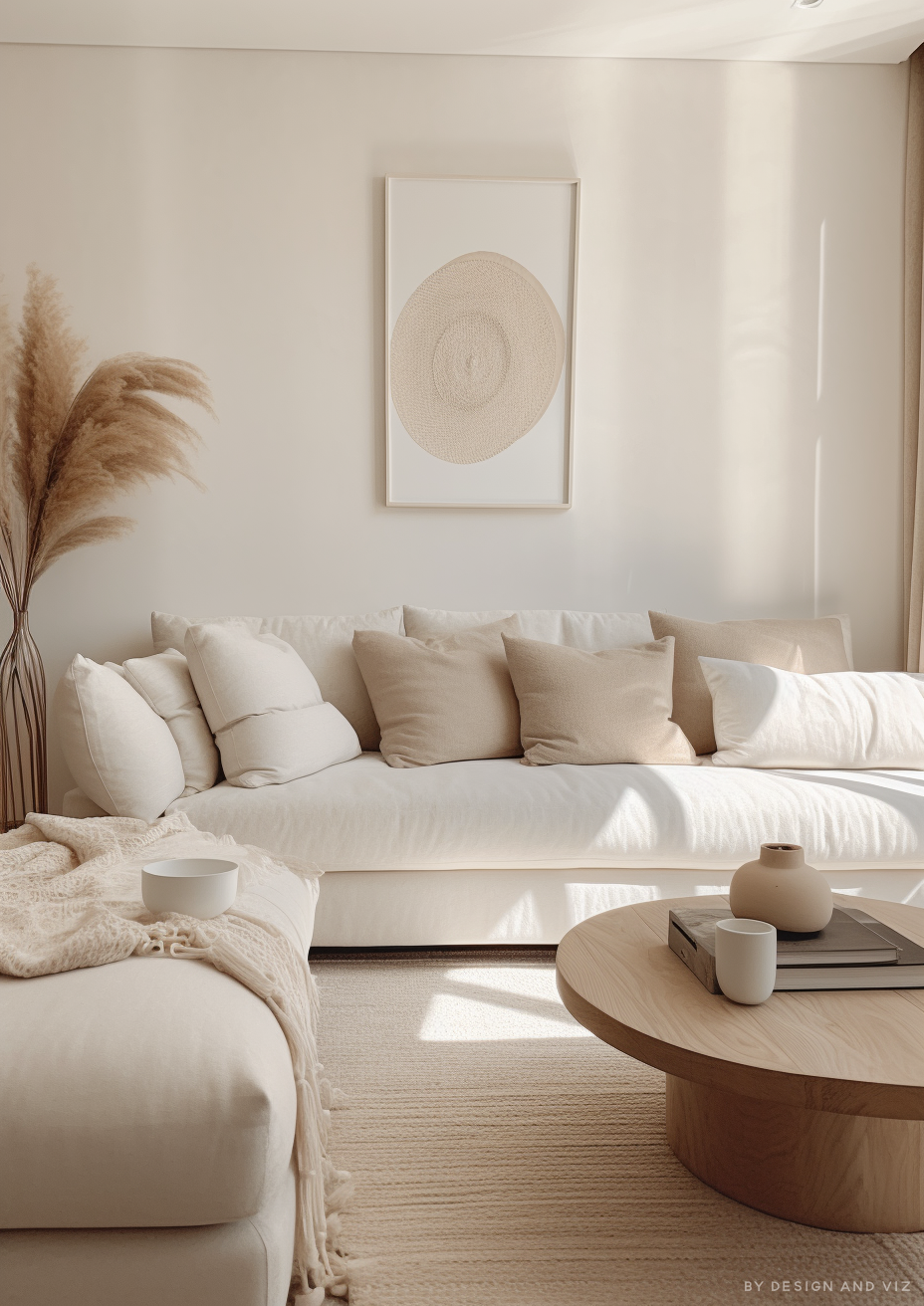
6. How to Style Your Home Using Ecru and Beige Together

The real magic happens when you use both ecru and beige within one room. Their slight tonal differences create depth and sophistication that pure white or single-tone schemes can’t achieve.
Layering for Texture and Warmth
Start with ecru walls as a subtle backdrop, then introduce beige through textiles — a linen sofa, throw pillows, or curtains. Add ivory accents through trim, lampshades, or decorative ceramics.
Designer Tip: Lighting changes everything. Use warm LED bulbs (2,700K) to bring out the richness of beige, or cooler daylight bulbs (4,000K) to highlight the neutrality of ecru.
Summary Box: Key Takeaways
Design Element | Ecru | Beige |
Undertone | Cool with grey/yellow base | Warm with yellow/pink base |
Best For | Modern, minimal spaces | Classic, traditional interiors |
Pairs Well With | Grey, taupe, black, oak | Cream, ivory, gold, rattan |
Lighting | Works best in bright rooms | Ideal for low-light or north-facing rooms |
Designer Tip | Use for walls and cabinetry | Use for textiles and decor layering |
7. FAQs: Ecru vs Beige Explained

1. What is the main difference between ecru and beige?
Ecru has a cooler, more natural undertone, while beige leans warmer and more golden. Ecru feels slightly grey-based, whereas beige is creamier and richer.
2. Which is better for small rooms — ecru or beige?
Ecru works beautifully in small, bright spaces as it reflects light softly. Beige suits darker or north-facing rooms, adding warmth and comfort.
3. Can I mix ecru and beige in one room?
Absolutely. Pair ecru walls with beige upholstery and ivory trims for depth and harmony. Mixing these shades creates visual texture while maintaining a cohesive palette.
4. Are warm neutral colours still in style for 2025?
Yes. After years of cool greys, the shift toward warmth, texture, and organic tones continues. Warm neutrals like ecru and beige define the new timeless aesthetic.
8. Conclusion: Choosing Between Ecru and Beige

When it comes to ecru vs beige, the choice isn’t about right or wrong — it’s about mood.
If you’re drawn to understated elegance and quiet balance, ecru might be your perfect match. If you crave warmth and cosiness, beige delivers it beautifully.
These warm neutral colours are timeless precisely because they evolve with your space. Whether you prefer ecru’s modern restraint or beige’s classic charm, both create a backdrop that allows texture, light, and personal style to shine.
So next time you’re testing swatches, take a moment to observe them in natural and artificial light. That subtle shift between beige and ecru may just be the detail that transforms your home.
Ready to choose the perfect neutral palette for your home?Whether you’re torn between ecru vs beige or need guidance finding your ideal warm neutral colours, I can help you design a cohesive, timeless scheme tailored to your space.
👉 Book Your 1:1 Online Design Service with By Design and Viz — get expert paint recommendations, material combinations, and full room concepts from a professional interior designer.


Comments