Farrow & Ball Cornforth White: The Grey That Isn't Quite Grey
- Beril Yilmaz

- Mar 2
- 8 min read
Most people who end up choosing Cornforth White did not set out looking for a grey. They were looking for a neutral — something that would sit quietly in the background, work with almost anything, and not commit too hard in either direction. That is exactly what Cornforth White does, and it is why it has been one of Farrow & Ball's most consistently popular colours for years.
It occupies a genuinely useful position in the palette: warmer than a true grey, cooler than a warm neutral, more interesting than an off-white. That in-between quality is what makes it so useful in practice — and also what makes it confusing when people try to predict how it will look from a small swatch. I have specified Cornforth White many times and it still occasionally surprises me depending on the room. Here is what I have learnt.
At a Glance
Paint code | No. 228 |
LRV | ~57 — moderate, absorbs more light than it appears to on the card |
Undertones | Cool grey with a barely-there warm base — reads as a greyed-down neutral rather than a true grey |
Best rooms | Living rooms, bedrooms, studies, hallways — best where you want a calm, composed backdrop |
Light direction | Best in south or east facing rooms — north facing will push it noticeably greyer and cooler |
Finish options | Estate Emulsion, Modern Emulsion, Dead Flat, Estate Eggshell for woodwork |
Pairs with | All White or Strong White trim, Wevet on ceilings, Pavilion Gray, Skimming Stone, Railings, pale bleached oak, brushed nickel |
Designer's verdict | One of the most reliable cool neutrals in the F&B range — but only if your room suits a cool undertone |
Cornforth White on the Wall — What You Are Actually Getting

Cornforth White has an LRV of approximately 57, which is lower than many people expect from a colour that reads as a pale neutral on the paint card. In practice this means it brings real presence to a room — it is not a light, airy white, it is a grounded neutral with depth. In a large room with good light this is an asset. In a small dark room it can feel oppressive.
The undertone is cool grey with a barely perceptible warm base underneath. In direct natural light — particularly southern or eastern light — that warm base surfaces slightly and the colour reads as a sophisticated warm-cool neutral, sitting comfortably in the greige territory without committing to either side. In duller light or northern exposures, the grey component takes over and the colour reads clearly as grey.
This behaviour is worth understanding clearly because it is where most of the confusion about Cornforth White comes from. People test it in their living room in the afternoon and love it, then look at it in the morning and wonder if they have made a mistake. Both observations are correct — it is doing different things in different light. Whether that is a feature or a problem depends entirely on how you feel about a colour that moves.
Where Cornforth White Earns Its Place

The rooms where it excels
South and east facing living rooms and bedrooms are the ideal context. The natural light gives the warm base enough to work with, and the result is a colour that feels neither cold nor committed — exactly the quality most people are looking for when they describe wanting 'a sophisticated neutral.'
Studies and home offices are another strong application. Cornforth White's composed, slightly serious quality suits working environments well. It is calm without being sterile, and it recedes enough to let furniture and books become the focus of the room.
Open-plan spaces where you need a neutral that bridges different zones without dominating any of them are also well served by Cornforth White. Its in-between quality — not quite warm, not quite cool — makes it unusually easy to transition between adjacent colours and materials.
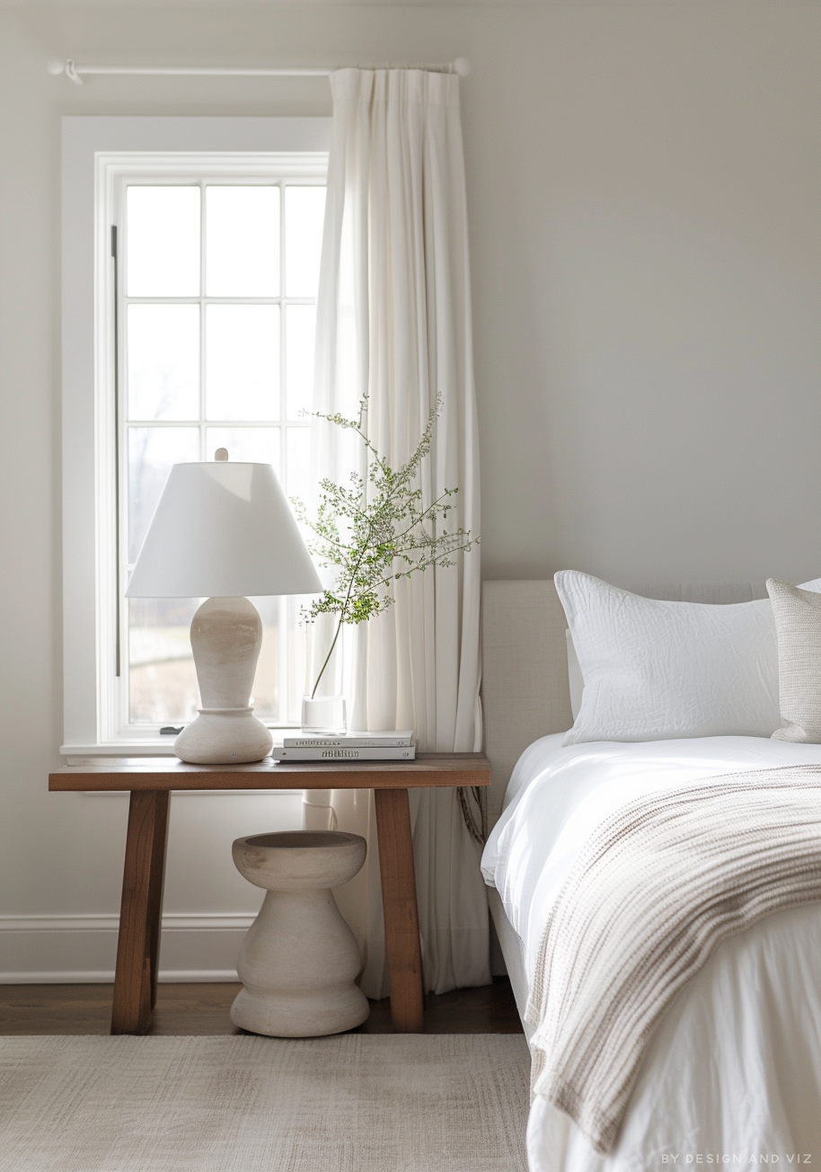
It works particularly well alongside Wevet. Using Wevet on ceilings with Cornforth White on walls creates a tonal palette that is beautifully layered — both colours share the cool grey family but sit at different depths, and the effect is considered and architectural.
Where it falls short
North-facing rooms are the main area of risk. Without warm natural light to activate the base undertone, Cornforth White reads clearly and persistently as grey. Whether that is acceptable depends on the brief — if the client actually wants grey walls, it is fine. If they want a neutral with warmth, they are in the wrong paint.
Rooms with warm honey-toned wood floors or terracotta tiles can clash with Cornforth White's cool quality. The undertone conflict creates a visual tension that most people find unsatisfying. In those rooms, Skimming Stone or Elephant's Breath would be a more harmonious choice.
Anyone expecting Cornforth White to add warmth or cosiness to a room will be disappointed. This is a cool, composed neutral. It does calm and restraint beautifully. It does not do warm and welcoming.
Not sure whether Cornforth White works for your specific room? A colour consultation is included in all our design packages — book directly here: bydesignandviz.com/book-online |
What to Pair With Cornforth White

For trim and woodwork, Strong White (No. 2001) is my preferred choice alongside Cornforth White — their undertones are compatible and the contrast is clean without being stark. All White (No. 2005) also works for a crisper edge. Avoid brilliant white trade paint, which will make Cornforth White look murky and unintentional by comparison.
For ceilings, Wevet (No. 273) creates a beautiful tonal relationship — the two colours share their cool grey family and step naturally from one to the other. Using Cornforth White on ceilings too is also an option for a fully enveloping, architectural feel.
On adjacent walls or in connecting rooms, Pavilion Gray is a natural step darker that keeps the cool grey scheme cohesive. For something with more drama, Railings or Hague Blue work excellently — the depth of those dark colours sits well against Cornforth White's restraint.
Skimming Stone is a useful companion in open-plan spaces where you want to transition from the cool grey-neutral of Cornforth White to something with more warmth in an adjoining zone.
For flooring, cool stone — limestone, large-format porcelain, polished concrete — is the most harmonious choice. Bleached or lightly oiled oak also works well. Warm honey oak and red-toned timber floors will create an undertone conflict that is difficult to resolve.
A pairing that works better than it sounds: Cornforth White walls with deep forest green on a kitchen island or a piece of painted furniture. The cool grey of Cornforth White gives the green somewhere to breathe, and the result looks genuinely considered rather than trend-led.
Architect's Verdict — Who Should Use Cornforth White?

Cornforth White is genuinely one of the most useful cool neutrals Farrow & Ball make. It sits in a position that is difficult to occupy well — not quite white, not quite grey, not warm, not cold — and it does it with real assurance. The LRV of 57 gives it presence and depth that paler neutrals lack, and the undertone complexity means it behaves differently through the day in a way that most people find interesting rather than frustrating.
I would specify it confidently for: south or east facing living rooms and bedrooms where a calm, sophisticated backdrop is the brief; studies and home offices where a composed, slightly serious atmosphere is appropriate; open-plan spaces where an in-between neutral needs to bridge warmer and cooler zones; and anywhere that Wevet feels too pale and Pavilion Gray feels too committed.
I would steer clients away from it in north-facing rooms where grey is not the intention, in rooms with warm wood floors where the undertone conflict will cause problems, and for anyone who wants their walls to feel warm and inviting. For those briefs, Skimming Stone or Slipper Satin are the more honest recommendation.
Common Mistakes With Cornforth White

Expecting it to look the same as it does on the card
The swatch in the tin lid — or even the large paint card — does not prepare you for how Cornforth White reads across a full wall in your specific room. The LRV of 57 means it brings considerably more depth than the card suggests. Always test a large painted sample, minimum A3, and look at it over 48 hours in different light conditions before committing.
Using warm-toned wood floors without testing first
Honey oak, warm walnut, and red-toned timber floors create an undertone conflict with Cornforth White that most people find uncomfortable. The cool grey of the walls and the warmth of the floor pull in different directions. If your flooring is warm-toned, test Cornforth White directly in the room — or consider Skimming Stone, which bridges that gap far more naturally.
Pairing it with brilliant white trim
The same mistake appears in almost every F&B neutral. Brilliant white woodwork makes Cornforth White look grey and slightly grubby rather than composed and considered. Use Strong White or All White — both share enough of the cool undertone family to sit comfortably alongside it.
Using it in a north-facing room hoping for a neutral
In north-facing rooms without compensating warmth, Cornforth White reads as grey — not as the ambiguous neutral it is in better light. If the brief is specifically for a warm neutral in a north-facing room, this is the wrong paint. Skimming Stone will behave more kindly in that context, though even that should be tested carefully.
Frequently Asked Questions

Is Cornforth White warm or cool?
Cool, with a barely perceptible warm base that only surfaces in good direct light. In most conditions it reads as a cool grey-neutral. If you need a warm neutral, Skimming Stone or Slipper Satin are the more appropriate choices. Cornforth White is for people who want calm and composure, not warmth.
What is the difference between Cornforth White and Skimming Stone?
Skimming Stone (No. 241) is warmer — it has a yellow-pink base that gives it a greige quality and makes it feel welcoming in warm light. Cornforth White is cooler and more neutral, sitting clearly in the grey family. They are often compared because both are popular mid-depth neutrals, but they behave quite differently. Cornforth White is the better choice for a cool, contemporary brief; Skimming Stone for a warm, characterful one.
What is the difference between Cornforth White and Wevet?
Wevet (No. 273) is considerably paler — LRV around 83 versus Cornforth White's 57. Wevet recedes and almost disappears into the room. Cornforth White has real presence and depth. Both are cool neutrals and they work beautifully together — Wevet on ceilings, Cornforth White on walls — but they are not interchangeable.
Can I use Cornforth White throughout an open-plan space?
Yes, and it works very well in that application. Its in-between quality — not quite warm, not quite cool — makes it unusually easy to sustain across a large space without it becoming monotonous or oppressive. Use Strong White on the joinery throughout to keep it cohesive.
Does Cornforth White work on kitchen cabinets?
Yes, in the right kitchen. On painted shaker or in-frame cabinets in a period or transitional kitchen it looks excellent — calm, sophisticated, and easy to live with. On very contemporary handleless cabinetry it can look slightly indeterminate. Use Estate Eggshell or a specialist cabinet paint in the same colour for durability.
What finish should I use for Cornforth White?
Estate Emulsion on walls in living rooms and bedrooms — the chalky matt quality suits the colour's composure. Modern Emulsion for kitchens, bathrooms, and hallways where durability matters. Estate Eggshell on all woodwork. Dead Flat is an excellent option if you want the same paint on walls and woodwork for a fully unified scheme.
Final Thought
Cornforth White is one of those colours that looks obvious in retrospect. Once it is on the wall in the right room, it is hard to imagine anything else working as well. Getting to that point requires testing it properly in your specific light conditions — a five-minute decision in a paint shop will not tell you what this colour does in your hallway at eight in the morning.
Take the sample pot home, paint a large patch, and give it a few days. If it still reads as the calm, composed neutral you are looking for across all light conditions, you have found the right paint.
Want a full colour scheme built around Cornforth White? Our design packages cover complete palette selection, finish recommendations and 3D visualisations — see our packages at bydesignandviz.com. |
About the Author
Beril Yilmaz is a qualified architect and interior designer based in the UK. She runs BY Design And Viz, a design platform covering paint colour reviews, interior design guidance, and residential design projects. Beril has specified Farrow & Ball paints across residential projects in the UK and internationally, including Cornforth White in both period and contemporary homes.


Comments