Farrow & Ball Strong White: What It Really Looks Like and Where It Works
- Beril Yilmaz

- Feb 27
- 8 min read
Updated: Mar 2
Most people expect a white called 'Strong White' to be bright, clean, and crisp. It is none of those things — and that is exactly what makes it so good.
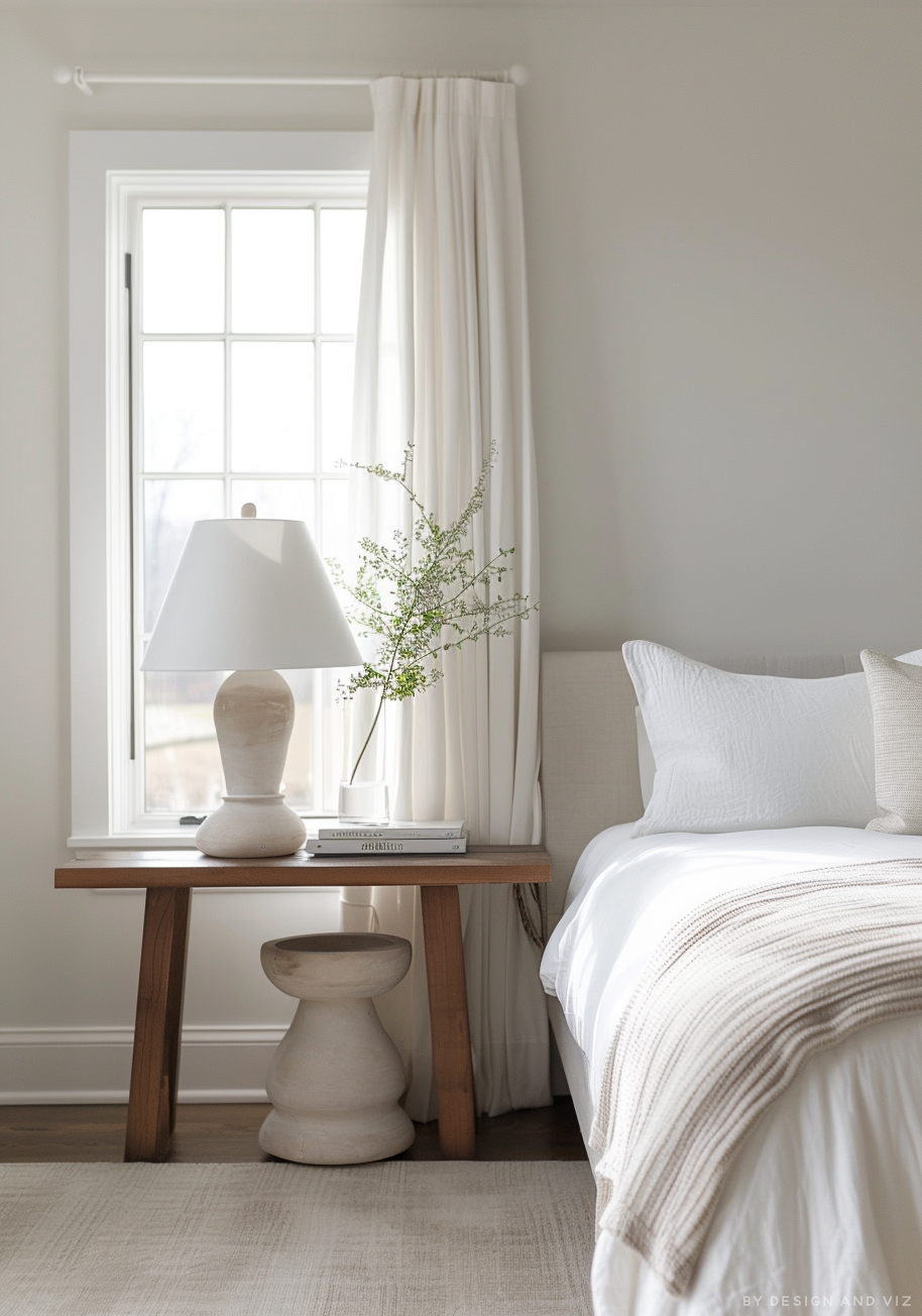
Strong White (No. 2001) is actually one of the palest neutrals in the Farrow & Ball range. It sits right on the boundary between white and grey, with cool undertones that shift subtly depending on your light. I have specified it on dozens of projects and the reaction is always the same: people who expect it to be stark are surprised by how soft it feels on the wall.
In this review I am going to tell you exactly what Strong White looks like in real rooms, where it earns its place, and when I would steer a client towards something else.
At a Glance
Paint code | No. 2001 |
LRV | 75 — reflects a lot of light, reads bright in good natural light |
Undertones | Cool grey with the faintest hint of warmth — not blue, not green, just grey |
Best rooms | Living rooms, hallways, kitchens, bedrooms with good light |
Light direction | Best in south or east facing rooms — can read cold in north facing |
Finish options | Estate Emulsion, Modern Emulsion, Dead Flat, Flat Eggshell for woodwork |
Pairs with | All White trim, Skimming Stone, Elephant's Breath, Ammonite, dark wood |
Designer's verdict | One of the most versatile cool whites available — but know its limits |
What Farrow & Ball Strong White Actually Looks Like

Strong White has an LRV of 75, which puts it firmly in the bright end of the neutral spectrum. On the paint chart it reads as a very pale grey-white — not quite white, not quite grey, just delicately in between.
The undertone is cool grey, very subtle. This is not a white with obvious blue or green pull. In daylight, especially southern light, it almost disappears into a clean off-white. In lower light or north-facing rooms, the grey undertone surfaces and the colour takes on a slightly architectural, urban quality.
This is actually noted in its name. Farrow & Ball describe it as a 'contemporary neutral' — the grey undertone is intentional, designed to add that cool modern edge that pure whites lack.
One important note: Strong White is not warm. If you are after a creamy, soft white with yellow or pink undertones, you are looking at the wrong paint. For that warmth, Wimborne White or Slipper Satin would serve you better. Strong White sits in the cool, composed camp.
Where Strong White Works — And Where It Doesn't

Where it Earns its Place
Strong White is at its best in well-lit spaces where the cool undertone reads as crisp and clean rather than flat. These are the conditions where I specify it with confidence:
South and east facing living rooms — the light is warm enough to balance the cool undertone beautifully
Open-plan kitchens and diners — it works as a unifying neutral across large spaces without dominating
Hallways with good borrowed light — the grey quality gives it more interest than a plain white would
Modern or period homes wanting a contemporary edge — it sits between eras without looking out of place
As a whole-house neutral — it flows between rooms without jarring, which is why so many people use it throughout
Where it Struggles
I would not specify Strong White in the following situations without testing first:
North-facing rooms with limited natural light — the grey undertone dominates and the room can feel cold and flat
Small rooms with no windows — it has enough grey to make a dark space feel smaller than it is
Rooms with lots of cool grey existing materials — stone worktops, slate floors, cool metal — the palette can tip too cold
Anyone wanting a 'warm white' feel — this is the wrong paint entirely, look at Wimborne White or Slipper Satin instead
The north-facing issue is worth taking seriously. I have seen it painted in several north-facing rooms by homeowners who loved it in their south-facing kitchen and were disappointed when it felt completely different on the other side of the house. Always test before committing.
What to Pair With Strong White

Strong White sits in Farrow & Ball's Contemporary Neutrals group, which means it is designed to layer with other neutrals in that family. Here is how I approach pairings in practice:
Trim and Ceilings
All White (No. 2005) is the natural choice for trim alongside Strong White — it gives a clean, defined contrast without going stark. For ceilings, Strong White itself works beautifully if you want a seamless, enveloping feel.
Avoid pairing Strong White walls with brilliant white trim — the contrast will make Strong White look grubby and grey rather than sophisticated.
Other Walls and Adjacent Rooms
Skimming Stone moves into warmer neutral territory and creates a lovely soft transition from Strong White. Elephant's Breath is slightly darker and warmer — excellent for creating depth between rooms. Ammonite is a cooler pairing that stays within the contemporary neutral mood.
Floors, Furniture and Materials
Warm wood tones — pale oak, walnut, oiled timber — balance the coolness of Strong White very well. Linen, cotton, wool textiles in natural undyed tones work beautifully.
Brass and antique gold hardware adds warmth without looking forced. Black accents — ironmongery, picture frames, furniture legs — give definition and lean into the contemporary quality of the colour.
Stone surfaces with warm veining work better than cold grey stone, which can push the palette too far into the cool zone.
Not sure whether Strong White works in your specific room? A colour consultation is included in all our design packages — book online and I will give you a definitive answer based on your actual space and lighting. |
Strong White vs Other Farrow & Ball Whites — Quick Guide

Strong White sits in a cluster of Farrow & Ball whites that look similar on paper but behave quite differently on the wall. Here is how to tell them apart at a glance:
Strong White No. 2001 | Cool grey undertone, LRV 75 — contemporary, composed, cool |
Wevet No. 273 | Even cooler and slightly airier — more neutral, less urban feel |
Wimborne White No. 239 | Warm creamy undertone — soft and traditional, never cold |
Slipper Satin No. 2004 | Noticeably warm and creamy — the warmest of the popular F&B whites |
All White No. 2005 | Purest white in the range — clean, bright, no obvious undertone |
I have written a full comparison of Strong White vs Wevet separately if you are deciding between those two specifically — it covers undertone differences, room applications and lighting in much more detail.
Finish Options — Which One Should You Choose?

The finish affects how Strong White reads on the wall almost as much as the colour itself. Here is how I make the decision:
•Estate Emulsion — chalky, very flat (2% sheen). Minimises imperfections. Best for bedrooms and living rooms in good condition. Beautiful but not washable
•Modern Emulsion — durable and washable (7% sheen). Best for kitchens, bathrooms, hallways, children's rooms, or any high-traffic area
•Dead Flat — the most matt option and the newest Farrow & Ball finish. Multi-surface so you can use the same paint on walls and woodwork for a full-room effect. Scuff-resistant
•Flat Eggshell — for woodwork, skirting boards, architraves and doors. Low sheen, washable, elegant
For most homes I would recommend Modern Emulsion on walls and Flat Eggshell on woodwork. The finish holds up to real life without losing the quality of the colour.
Common Mistakes With Strong White

Pairing it With Brilliant White Trim
This is the most common mistake I see. Brilliant white is much brighter and has blue undertones that make Strong White's grey undertone look dirty by comparison. Always use All White or a similarly soft white for trim.
Using it In Every Room Without Checking Orientation
Strong White as a whole-house colour is genuinely beautiful — but only if every room has adequate natural light. People fall in love with it in a south-facing room and paint the whole house without testing the north-facing bedroom or internal hallway. Always test in the darkest room first.
Expecting it to Look Like Wevet
They are close but they are not the same. Wevet is slightly more neutral and airier. Strong White has more of a cool grey identity. People sometimes buy one expecting the other, especially from photos online. Get sample pots of both and view them together in your actual room before deciding.
Choosing the Wrong Finish for the Room
Estate Emulsion is gorgeous but it marks easily. In a hallway or kitchen it will show scuffs and fingerprints within months. Modern Emulsion in those spaces, always.
[Image suggestion: Comparison of Strong White in a north-facing vs south-facing room showing the undertone difference]
Designer's Verdict — Is Strong White Worth It?

Yes — but only if you have the right room for it.
Strong White is one of my most used Farrow & Ball whites precisely because it sits so well in modern homes without feeling clinical. The grey undertone gives it a quality that pure whites lack. It reads differently through the day in a way that makes rooms feel considered rather than just painted.
Where it fails is predictable — north-facing rooms with limited light, spaces that need warmth, and situations where someone is trying to recreate the softness of Slipper Satin or Wimborne White. It is not a warm white and should not be treated as one.
Used in the right conditions — good natural light, contemporary or transitional styling, paired with All White trim and warm wood tones — it is genuinely one of the most liveable whites I know.
FAQ : Farrow & Ball Strong White
Is Farrow & Ball Strong White warm or cool?
Cool. It has a grey undertone that reads as contemporary and composed rather than warm and creamy. If you want warmth, Wimborne White or Slipper Satin are the better choices.
Does Strong White look grey on the wall?
In good natural light, no — it reads as a soft white. In north-facing rooms or artificial light it can show more of its grey undertone. Always test in the darkest room in your house before committing.
What is the LRV of Strong White?
75. That is relatively high, meaning it reflects a lot of light and will read bright in well-lit spaces. Anything below LRV 50 starts to feel dark — Strong White is firmly in the bright camp.
Can I use Strong White on kitchen cabinets?
Yes, in Flat Eggshell finish. It is a beautiful cabinet colour — sophisticated and contemporary without being stark. Pair with brass or black hardware rather than chrome.
What trim colour goes with Strong White?
All White (No. 2005) is the safest choice — it gives clean definition without the harshness of brilliant white. For a more tonal, seamless look, use Strong White on the trim too.
Is Strong White good for exteriors?
Yes — it works well on rendered facades, especially with dark window frames or dark front doors. It reads slightly grey outdoors which gives a contemporary edge without looking cold.
Final Thought
Strong White is one of those colours that rewards careful use. Specify it in the right room — good light, contemporary feel, All White trim — and it is quietly brilliant. Put it in a dark north-facing room and it will disappoint.
Take a sample pot home before you commit. View it at morning, noon and evening. If it still looks good at 7pm under your artificial lighting, you have found your white.
Want a complete colour scheme built around Strong White? Our design packages include full palette selection, finish recommendations and 3D visualisations — see here. |
About the Author
Beril Yilmaz is a qualified architect and founder of BY Design And Viz, an interior and exterior design studio. She specifies Farrow & Ball paints regularly across residential projects in the UK and internationally, including strong neutrals, heritage whites and contemporary colour palettes.


Comments