


Farrow & Ball Dimity No. 2008 - An Architect's Honest Review

Farrow & Ball Dimity No. 2008 is a colour people choose expecting a white and receive a cream. On the chip it looks like a soft, pale near-white; on the wall, at LRV ~77, it carries enough warm, red-based colour to read as a gentle cream-beige, and that gap between expectation and result is where most disappointment starts. It is not a bright white and it is not a greige. It sits in a narrow middle position that rewards the right room and punishes the wrong pairing.
I have specified Dimity in period terraces, cottage-style kitchens and softly lit bedrooms, and the pattern is consistent: it flatters rooms that already hold some warmth and it struggles in rooms that do not. It also sits very close to its neighbour Slipper Satin, which is why the two get confused so often. Dimity is the slightly lighter and more enveloping of the pair, and the choice between them is subtler than most guides admit.
This review covers the undertone, the LRV in practical terms, how Dimity behaves in north-facing and south-facing light, what to use on trim, floors and metals, how it compares with Slipper Satin, Skimming Stone and Wimborne White, and an honest view of who should choose it.
Dimity No. 2008 - The Key Facts
Collection | Farrow & Ball - Red Based Neutrals group |
LRV | ~77 (light zone - a soft, warm near-white that is visibly deeper than a true white) |
Undertone | Warm red-based cream-beige - soft, enveloping, understated |
Character | Traditional, period, cottage, soft contemporary |
Best trim | Wimborne White No. 239 for a quiet step up, All White No. 2005 for deliberate contrast |
Best orientation | South, east or west-facing - north-facing works only with 2700K lighting and warm materials |
Main risk | In north light or under 4000K+ bulbs the warmth drains and it settles into a flat putty-beige; against a bright white trim it can read as tinted or dingy |
Dimity Undertones - What Is Actually Going On
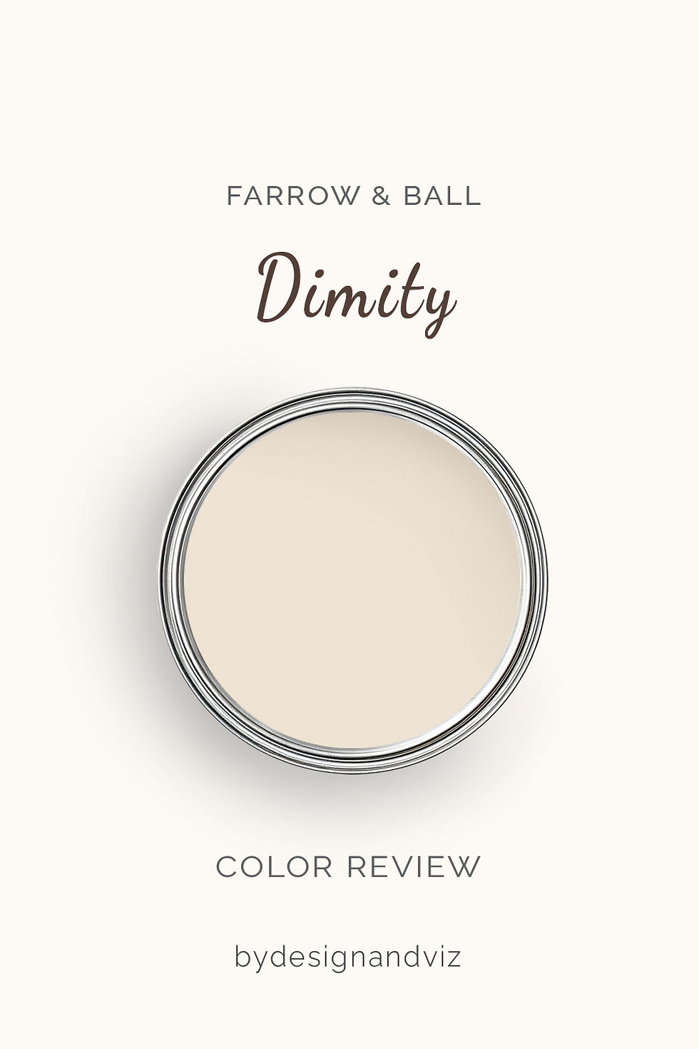
Dimity is warm, and its warmth is red-based rather than yellow. Farrow & Ball files it under its Red Based Neutrals group and describes the undertone as warm, which is a more precise clue than the word cream suggests. On a wall it reads as a soft, slightly rosy-biscuit cream, not a butter or buttermilk yellow. Online databases disagree on whether the cast leans more yellow or more red-orange, so I treat the exact direction as something to confirm on a large sample rather than a fixed fact.
The warmth is what makes Dimity feel enveloping rather than crisp. It gives walls a lived-in softness that bright whites cannot offer, and it hides the harshness of strong daylight without looking heavy. That same quality is why it suits period architecture, where a pure white often feels clinical against old plasterwork and timber.
The risk sits in rooms that cannot supply their own warmth. Without warm light or warm materials to feed the undertone, the cream loses its glow and shifts toward a dull, flat beige. Dimity next to a very bright white also changes character, because the contrast exposes the colour in it and the wall can look tinted rather than soft.
LRV - What 77 Means in a Real Room
At LRV ~77, Dimity sits comfortably in the light zone. Independent sources place it between 76 and 78, so I work with a figure of about 77. That is bright enough to keep a smaller room open and to carry a dim hallway, yet far enough below a true white that the wall reads as a colour with intent.
The useful comparisons are close to home. Dimity is a couple of points lighter than Slipper Satin at roughly 75, which is why the two look so alike. It is around 9 to 12 points lighter than Skimming Stone, where sources put the LRV between 65 and 68, and that gap is easy to see in a dim room. Against Wimborne White at roughly 89 to 90 the difference is larger still, around 11 to 13 points.
How Dimity Behaves in Different Light

South-Facing Rooms
South-facing rooms show Dimity at its most generous. Strong, warm light amplifies the red-based cream and the wall glows rather than merely reflecting. Through the middle of the day the colour stays soft and even, and in the evening it deepens slightly toward a honeyed biscuit.
The one adjustment I make in very bright south rooms is to check that the trim does not fight it. A stark white skirting beside sunlit Dimity makes the wall look more yellow than intended, so the trim choice matters more here than in any other orientation.
North-Facing Rooms
Dimity in a north-facing room is workable, but it is not automatic. Cool, indirect light removes the warmth the colour depends on, and the cream reads more muted and slightly flatter than it did on the chip. Because the LRV is high, the room still feels light, which is a real advantage over deeper beiges and greiges that turn gloomy in the same conditions.
To keep it from drifting toward a dull putty tone, I specify 2700K bulbs in every fitting, warm timber or a woven rug on the floor, and at least one brass or bronze element. Take all of that away and a cooler, cleaner off-white is usually the better answer for a north-facing room.
East and West-Facing Rooms
East-facing rooms give Dimity a bright, warm morning and a quieter afternoon. The cream glows early in the day and settles into a calmer, more muted version once the sun moves round. For a breakfast room or a bedroom that is used mainly in the morning, that rhythm is a pleasure.
West-facing rooms reverse it. The colour is restrained through the day and then warms richly in late light, which suits dining rooms and sitting rooms used in the evening. In both cases I want to see a sample across the full day before signing off.
Artificial Lighting
Bulb temperature changes Dimity more than most people expect. At 2700K the cream is rich and soft, and the red-based warmth is fully supported. At 4000K and above the glow drains away and the wall reads as a flat, slightly grey-tinged beige.
I treat 2700K as the working rule for every room with Dimity on the walls. If a client needs cool task lighting, in a kitchen worktop zone for example, I keep it localised and let the ambient light stay warm.
Not sure if Dimity works for your room? A colour consultation is included in all our design packages - book directly here. |
Trim Colours and What to Pair With Dimity

Trim - Stay Warm, Stay Close
Wimborne White No. 239 is the trim colour I reach for first. Sources place it around LRV 89 to 90 with a warm, pale cream character, so it lifts the trim just enough to define it without exposing the colour in the wall. The full palette logic is in the Farrow & Ball Wimborne White review, and the pairing of Dimity and Wimborne White is one of the most reliable in the range.
All White No. 2005, which sources put at roughly LRV 92 to 94, gives a deliberately crisper edge and suits a more contemporary reading of Dimity. The trade-off is contrast: the brighter the trim, the more cream the wall appears, so I only use it where that clarity is the intention.
Floor Materials
Warm oak, honey-toned boards and natural stone floors all sit comfortably beneath Dimity. The shared warmth means the floor and wall read as one family rather than competing. Limestone and sandstone-toned tiles are especially good in kitchens and hallways.
Cool blue-grey tile and grey-washed timber are the combinations I avoid. They draw the red-based warmth out of the wall and make Dimity look yellowed by comparison.
Metal Finishes
Aged brass, unlacquered brass and bronze are the most natural metals for Dimity. Their warmth echoes the wall, and the patina of unlacquered finishes suits the soft, slightly worn character of the colour. In a kitchen they work well on cabinet pulls and tap fittings.
Polished nickel can work where a cooler accent is wanted, but chrome tends to sharpen the room and works against the softness that makes Dimity appealing.
Accent Colours
Deep, cool colours give Dimity the contrast it lacks on its own. Hague Blue No. 30, with an LRV of roughly 6 to 7 and a cool blue base with a green-grey cast, is the accent I use most often on joinery, a boot room or a study wall. The cool depth makes the cream look cleaner and more intentional.
Earthy terracotta, soft clay and muted olive greens also sit well because they share the warmth. I would avoid cool pastels, which can make the cream look dated rather than considered.
Dimity Room by Room

Bedrooms
Dimity is a natural bedroom colour. The warm, soft cream is restful, and a light LRV keeps the room from feeling closed in. I pair it with natural linen bedding, a warm timber floor and 2700K bedside lamps.
In a north-facing bedroom I would only commit if the lighting is warm throughout, since the room is mostly used at night under artificial light where the colour is most exposed.
Living Rooms
Living rooms are where Dimity delivers the most atmosphere. It sits well with traditional furniture, timber, textured fabrics and aged metals, and it brings a calm that does not feel stark. In a period living room it complements original cornicing and panelling without highlighting every imperfection.
In a very minimalist, cool-toned contemporary space it can feel too soft and the room tends to work better with a cleaner off-white.
Kitchens
Dimity in a kitchen is one of the most effective uses of the colour. The warm cream flatters timber worktops, brass hardware and natural stone, and it avoids the clinical edge of a bright white. It works well on walls and equally well on shaker-style cabinetry.
For cabinets I pair it with Wimborne White on the ceiling and architraves, and I keep the worktop task lighting localised so the ambient light stays warm. If the kitchen has cool grey stone, check the sample against it carefully before committing.
Bathrooms
Bathrooms suit Dimity when the materials carry some warmth. Honed stone, brass taps and a timber vanity bring out the soft cream and give the room a gentle, enveloping feel. Bright cool-white sanitaryware sits a little starkly against it, so I lean toward warm white ceramics.
Where the bathroom is windowless, 2700K lighting is essential or the wall drifts toward a flat beige.
Home Offices and Studies
Dimity makes a calm, unfussy backdrop for a home office or study. The warm cream is easy on the eyes through long working days and it does not compete with screens or books. Paired with a deep blue joinery or shelving colour and a brass desk lamp, it feels considered rather than plain.
In a north-facing study I add a warm task lamp and a timber desk to keep the room from feeling flat in the afternoons.
Who Dimity Is Right For - And Who It Is Not

Dimity is right for you if:
The interior is traditional, period, cottage-style or softly contemporary - these briefs thrive on a warm, enveloping cream. Dimity gives plaster, timber and aged metals a gentle backdrop that a brighter white would sharpen too much.
The room is south, east or west-facing with warm natural light - this is where the red-based warmth is fully supported and the colour glows. It will look at its best from morning through to evening without needing extra intervention.
You want a soft off-white that feels deeper than a true white - at LRV ~77, Dimity gives presence while still keeping a room light. It suits anyone who finds Wimborne White too stark but wants to stay in the pale family.
You are happy to commit to 2700K lighting and warm materials - these two choices do most of the work in keeping the colour rich. With them in place, even a lower-light room can carry Dimity well.
Dimity is not right for you if:
The room is north-facing and the lighting or materials are cool - cold light and grey finishes drain the warmth, leaving a flat putty beige. A cleaner, cooler off-white is a better fit there.
You want a crisp, bright or gallery-style white - Dimity is a cream with real colour in it, not a clean white. If you want a bright, neutral backdrop, Wimborne White or a cooler white is the correct direction.
The scheme is dominated by cool greys, blue-greys or chrome - the warmth in Dimity fights those materials and tends to look yellowed beside them. Skimming Stone or a cooler neutral is a better partner for that palette.
You will not sample it in the actual room - the gap between chip and wall is real for any warm off-white. A large painted sample viewed in your own lighting is the only reliable test.
How Dimity Compares to Similar Colours

vs Slipper Satin No. 2004 - Slipper Satin is Dimity's closest neighbour, with an LRV of about 75 against Dimity's 77. Sources describe Slipper Satin as a creamy, subtly warm off-white, while Dimity carries Farrow & Ball's red-based warmth, so the difference is a matter of degree rather than direction and it is most noticeable side by side. Dimity is the marginally lighter, softer choice; Slipper Satin is the one to try if Dimity looks a touch too rosy in your room. The full Farrow & Ball Slipper Satin review sets out where it works best.
vs Skimming Stone No. 241 - Skimming Stone is a warm greige with an LRV of roughly 65 to 68, so it is around 9 to 12 points deeper than Dimity. It has a grey-beige base rather than Dimity's cream, which makes it the better partner for cooler stone, grey flooring and more contemporary rooms. Dimity is the right choice where you want light and softness, Skimming Stone where you want a little more depth and a stronger neutral. The two sit either side of the line explored in the Slipper Satin vs Skimming Stone guide.
vs Wimborne White No. 239 - Wimborne White is a very pale warm cream at roughly LRV 89 to 90, so it is about 11 to 13 points lighter than Dimity and reads far closer to white. The pair work together well, with Wimborne White on trim and ceiling and Dimity on the walls. If you find Dimity too coloured for your room, Wimborne White is the next step up in brightness.
Frequently Asked Questions
Is Dimity warm or cool?
Dimity is warm. Farrow & Ball places it in its Red Based Neutrals group and describes a delightfully warm undertone, and independent sources agree it sits firmly on the warm side. It reads as a soft cream-beige rather than a clean white or a grey. If you want a cool or neutral backdrop, this is not the right colour.
What is the difference between Dimity and Slipper Satin?
They are very close, and the difference is subtle. Dimity is roughly LRV 77 and Slipper Satin roughly 75, and databases measure the colour gap between them as small. Dimity reads slightly lighter and softer, while Slipper Satin is generally described as creamier. In most rooms the lighting and trim will change the result more than the choice between the two, so sample both side by side.
Is Dimity good in a north-facing room?
It can be, with the right support. The high LRV keeps the room light, but cool north light removes the warmth and leaves the colour looking flatter and more muted. Use 2700K bulbs, warm timber and at least one brass or bronze element to keep it rich. Without those, a cooler off-white is usually a safer choice.
Does Dimity work in a kitchen?
Yes, it is one of the best uses of the colour. The warm cream flatters timber, brass and natural stone and avoids the cold feel of a brighter white. It works on both walls and cabinetry. Check it against any cool grey stone or tile before committing.
How does Dimity compare with Skimming Stone and Wimborne White?
Dimity sits between the two in character. It is about 9 to 12 points lighter than Skimming Stone, a warm greige with a grey-beige base, and about 11 to 13 points deeper than Wimborne White, a near-white cream. Pair it with Wimborne White on trim for a quiet step up in brightness. Choose Skimming Stone instead if you want a deeper, more grey-leaning neutral.
What is the best trim colour for Dimity?
Wimborne White No. 239 is the safest choice. It is a pale, warm cream that defines the trim without exposing the colour in the wall. All White No. 2005 gives crisper contrast but makes Dimity look more tinted. Avoid cool, bright whites, which tend to make the wall look yellowed.
The Verdict

Farrow & Ball Dimity is a soft, warm and quietly generous colour, provided the room suits it. Dimity is neither a white nor a greige. It is a cream with real warmth that rewards good light, warm materials and a sympathetic trim, and that looks flat when those are missing.
In a south, east or west-facing room with warm bulbs and timber or stone underfoot, it makes a space feel calm and settled. For how it sits beside its nearest neighbour, the Slipper Satin vs Skimming Stone guide is a useful next read.
Before you commit, run this test in order. Paint a large sample on two walls, one facing the window and one away from it, and fit your trim colour beside it. View them at 8am, at midday and at 8pm with 2700K bulbs switched on, and compare the result against your floor and your largest piece of furniture. If it still looks soft and warm in all three, you have the right colour.
Want a complete colour scheme built around Dimity? Our design packages cover full palette selection, finish recommendations, and 3D visualisations - see our packages. |
About the Author
Beril Yilmaz is a qualified architect and interior designer based in the UK. She runs BY Design And Viz, a design platform covering paint colour reviews, interior design guidance, and residential design projects. Beril has specified Dimity across residential projects in the UK and internationally - most often in period living rooms, cottage-style kitchens and south or west-facing bedrooms, paired with Wimborne White trim and warm timber floors.


Comments