Farrow & Ball Slipper Satin: What It Really Looks Like and Where It Works
- Beril Yilmaz

- Mar 2
- 8 min read
Updated: Mar 3
There is a reason Slipper Satin consistently appears on lists of the most popular Farrow & Ball colours. It sits in a genuinely difficult spot on the colour spectrum — warm enough to feel cosy, pale enough to function as a neutral, and complex enough that it never reads as flat or boring. It is also a colour that confuses people constantly, usually because it behaves so differently across different rooms and lighting conditions.
I have specified Slipper Satin for clients more times than I can count, and the questions are always the same: will it look yellow? Will it work in a north-facing room? Is it too warm for a kitchen? In this review I am going to give you the answers based on what I have actually seen in real rooms — not just what the paint card says.
At a Glance
Paint code | No. 2004 |
LRV | 60 — reflects moderate light, reads warm and enveloping |
Undertones | Warm yellow-pink — closer to cream than white, with the faintest peach quality in warm light |
Best rooms | Living rooms, bedrooms, hallways, dining rooms — particularly in older or period properties |
Light direction | Best in south or west facing rooms — workable in east facing — genuinely difficult in north facing |
Finish options | Estate Emulsion, Modern Emulsion, Dead Flat, Estate Eggshell for woodwork and joinery |
Pairs with | All White or Wimborne White trim, Elephant's Breath, Mole's Breath, warm wood tones, brass hardware |
Designer's verdict | One of the most flattering warm whites available — but only in the right light conditions |
What Farrow & Ball Slipper Satin Actually Looks Like

Slipper Satin has an LRV of 60, which puts it noticeably lower than most whites and off-whites. That number matters — it means the colour absorbs more light than you might expect from a pale paint. In a bright south-facing room this is what gives it that warm, enveloping quality. In a darker room it can start to feel heavy.
The undertone is warm yellow-pink — not aggressively yellow, but definitively warm. In direct daylight it reads as a soft, creamy off-white, somewhere between cream and pale buttermilk. In warm artificial light in the evenings, a gentle peach quality emerges. This is not a flaw — most people who love Slipper Satin love it precisely for what it does in candlelight or lamp light.
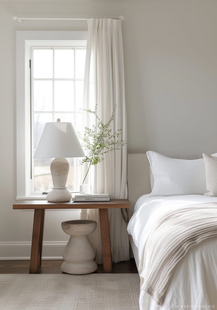
This is worth understanding clearly: Slipper Satin is not a white. It is a warm neutral that happens to be pale. If you are looking for a clean, crisp white with no colour story, this is the wrong paint. Strong White or All White would serve you far better. Slipper Satin is for people who want their walls to feel warm, aged, and full of character.
Where Slipper Satin Works — And Where It Doesn't
Where it works well
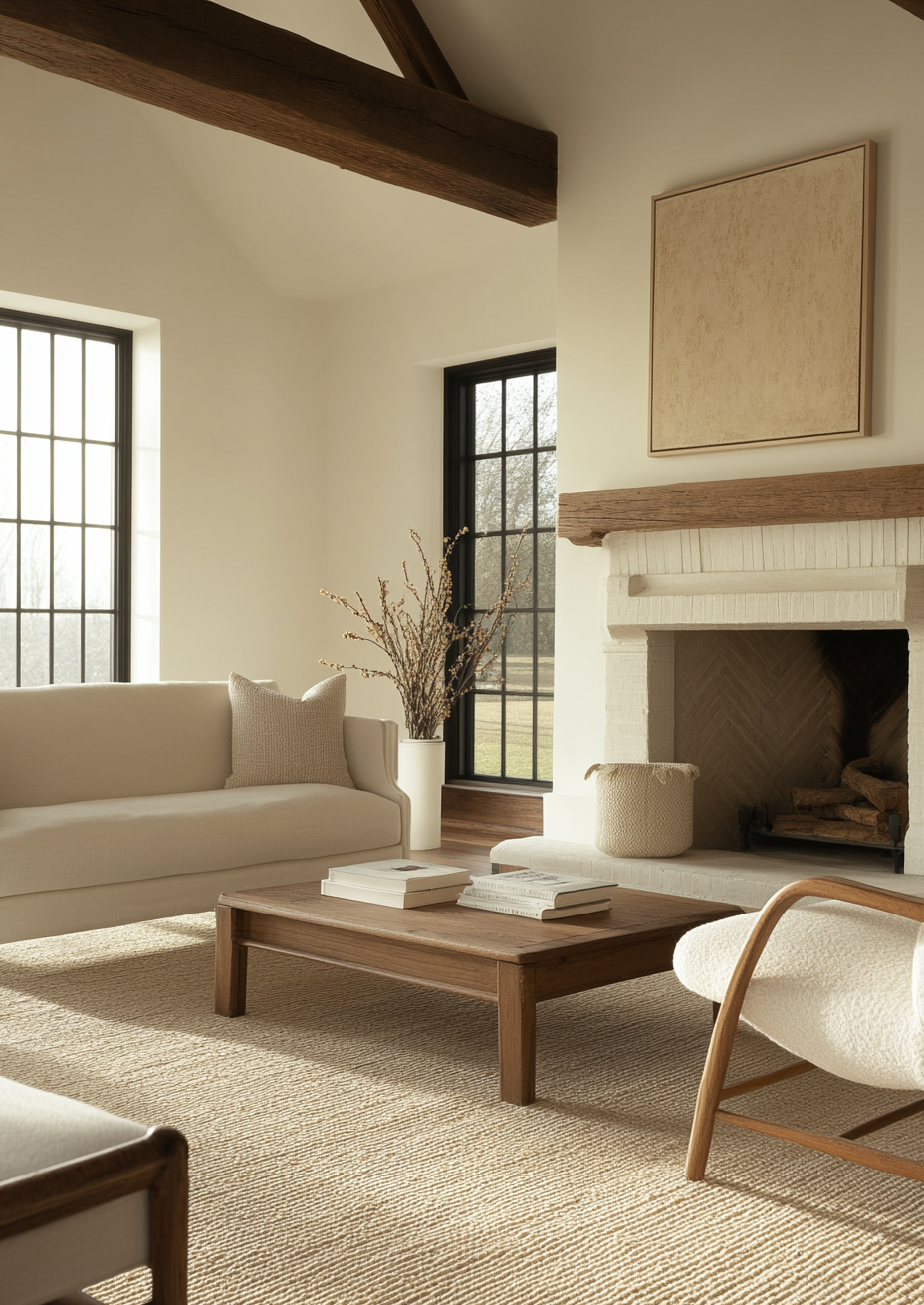
South and west facing rooms are where Slipper Satin is at its absolute best. The warm undertone catches natural light beautifully, and the colour shifts throughout the day in a way that feels alive rather than flat. Living rooms and bedrooms are the most natural home for it.
Period and older properties are another strong context. Victorian and Edwardian houses have a warmth in their materials — original timber floors, brick fireplaces, cornicing — and Slipper Satin sits naturally in that palette in a way that cooler neutrals never quite manage. I have specified it extensively in older properties and it always looks like it belongs.
Open-plan spaces that include both living and dining areas also suit Slipper Satin well. The warmth reads as inviting across a large space without becoming oppressive the way a deeper colour might.
Where it struggles
North-facing rooms are the biggest problem. The lack of direct sunlight means Slipper Satin's warm undertone has nothing to activate it — the result can look dull, slightly dirty, and lacking the energy the colour is supposed to have. I would not specify it in a north-facing room without very warm artificial lighting to compensate.
Modern, minimal interiors with cool-toned finishes — concrete, cool grey stone, stainless steel — will clash with Slipper Satin's warmth. The colour reads as dated against those materials rather than characterful. For contemporary interiors, Strong White or Wevet would be a more harmonious choice.
Very small rooms with limited natural light should also avoid it. The lower LRV means the room will feel smaller and darker than it actually is.
If you are unsure whether Slipper Satin is right for your specific room, a colour consultation is included in all our design packages — book directly here: bydesignandviz.com/book-online |
The Best Colours to Pair With Slipper Satin

For trim and joinery, All White (No. 2005) is the classic pairing and for good reason. It is crisp and bright without being cold, and it has just enough warmth to sit harmoniously next to Slipper Satin without clashing. Wimborne White (No. 239) is a slightly creamier alternative for those who want the trim to feel softer and more unified with the wall colour.
On adjacent walls or in open-plan spaces, Elephant's Breath (No. 229) works beautifully — the warm grey shares Slipper Satin's undertone family and the two colours settle together naturally. Mole's Breath (No. 276) is a deeper option for anyone who wants more drama in a connecting space.
For flooring, warm wood tones are the natural companion. Pale oak, aged pine, and dark walnut all work, though for different reasons — pale oak keeps things airy, dark walnut adds depth and richness. Avoid cool grey stone or polished concrete, which will fight the warmth of the walls.
One pairing that surprises people: Slipper Satin works well with deep teal or forest green as an accent — whether in soft furnishings, a painted piece of furniture, or a feature wall in a connecting room. The warmth of the satin and the depth of the green create a palette that feels genuinely considered.
For hardware and metalwork, brass and aged brass are the obvious choice. Unlacquered brass in particular looks remarkable against Slipper Satin walls — the colours have a historic kinship that feels effortless.
Designer's Verdict — Is Slipper Satin Worth It?

Slipper Satin is one of those colours that earns its popularity legitimately. It is not fashionable in the trendy sense — it has been a consistently strong seller for Farrow & Ball for years — and it is not fashionable in the way that means it will date badly in five years' time. It is simply a very good warm white that does what warm whites are supposed to do.
I keep coming back to it for period properties, for south-facing living rooms, and for any client who wants their home to feel genuinely warm and welcoming rather than clean and clinical. The LRV of 60 is lower than most people realise when they are choosing from a small swatch, so I always recommend testing it in the actual room before committing.
Where I would steer people away from it: north-facing rooms, very contemporary interiors, and rooms where the brief is specifically for a clean crisp white. In those conditions, it will look wrong. In the right conditions, it is one of the best warm neutrals available.
Common Mistakes With Slipper Satin

Using it in a north-facing room without testing first
This is the most common mistake I see. Slipper Satin in a north-facing room with cool northern light loses all its warmth and reads as a flat, slightly murky off-white. If you are committed to a north-facing application, pair it with very warm artificial lighting — warm white bulbs at 2700K rather than cool white — and test a large sample before committing.
Pairing it with brilliant white trim
Brilliant white from a trade paint range will look garish against Slipper Satin. The stark cool brightness of standard white woodwork will make the wall colour look yellowed and tired by comparison. Always use All White or Wimborne White — both from Farrow & Ball — for the joinery. The undertone families need to match.

Choosing it on the basis of a small swatch
The LRV of 60 is deceptive on a small card in a paint shop. Buy a large sample pot and paint a minimum A3 area directly onto your wall. Leave it for 48 hours and look at it in morning light, afternoon light, and evening lamplight before making the decision.
Using it in a very modern or minimal interior
Slipper Satin carries a warmth and historicism that sits awkwardly in very contemporary interiors. If your brief is sleek, minimal, and modern — with polished stone floors, handleless cabinetry, and minimal furniture — this is the wrong colour. Strong White or Wevet will serve you better in that context.
Frequently Asked Questions

Does Slipper Satin look yellow on the walls?
In warm or direct natural light, yes — it has a noticeable yellow-cream quality. This is part of its appeal, not a flaw. In cooler or northern light, the yellow is less obvious but the colour can look flat. If you are concerned about yellow undertones, test it in your specific light conditions before committing.
Is Slipper Satin warm or cool?
Definitively warm. It sits in the yellow-pink undertone family, closer to cream than to white. It is one of the warmer entries in Farrow & Ball's white and off-white range. If you want something cooler, Strong White or Wevet would be a more appropriate choice.
What is the difference between Slipper Satin and Wimborne White?
Both are warm whites with yellow undertones, but Wimborne White (No. 239) is slightly brighter with a higher LRV of around 75. Slipper Satin is deeper, richer, and more noticeably cream. Wimborne White is better for rooms where you want warmth without sacrificing brightness. Slipper Satin is for rooms where you want the colour to have real presence.
Can I use Slipper Satin in a kitchen?
Yes, but with caveats. In a warm south-facing kitchen with natural wood elements and warm hardware, it can look beautiful. In a sleek modern kitchen with cool stone worktops and stainless steel appliances, it will clash. It works best in unfitted or semi-fitted kitchens in older properties rather than in contemporary fitted kitchens.
What finish should I use for Slipper Satin on walls?
Estate Emulsion for walls in most rooms — it has the characteristic Farrow & Ball chalky matt finish that suits the colour's warmth. Modern Emulsion is slightly more durable and is better in kitchens, bathrooms, or anywhere with high traffic. For woodwork and joinery, Estate Eggshell gives a soft sheen that is practical and period-appropriate.
How does Slipper Satin compare to Strong White?
Strong White (No. 2001) has a cool grey undertone — it is composed and contemporary. Slipper Satin is the opposite: warm, creamy, and characterful. They are not interchangeable. Choose Strong White for a modern or Scandinavian brief. Choose Slipper Satin for period properties, traditional interiors, or anywhere warmth is the priority.
Final Thought
Slipper Satin is a colour with a very clear identity. It knows exactly what it is — a warm, creamy, characterful white that belongs in rooms where comfort and atmosphere matter more than crispness. Spend five minutes testing it in your actual room before you commit, pay attention to your light conditions, and use the right trim colour. Do those three things and it will likely look exactly as good as you are hoping.
Want a complete warm colour scheme built around Slipper Satin? See our design packages at bydesignandviz.com — we will handle the full palette. |
About the Author
Beril Yilmaz is a qualified architect and interior designer based in the UK. She runs BY Design And Viz, a design platform covering paint colour reviews, interior design guidance, and residential design projects. Beril has specified Farrow & Ball paints across residential projects in the UK and internationally, including Slipper Satin in both period conversions and new-build interiors.


Comments