


Farrow & Ball Pointing 2003 - An Architect's Honest Review

Farrow & Ball Pointing 2003 is one of the most requested off-whites in the entire F&B range, and it is also one of the most consistently misread. People search for it wanting a safe, blank neutral - the paint equivalent of a full stop - and what they actually get is a warm, red-based white with a genuine personality of its own. Named after the colour of lime pointing in traditional brickwork, it was built to soften and warm a room, not to disappear into it.
Pointing is warm. That is the fact that determines everything else about how to use it. It sits in F&B's own Red Based Neutrals grouping, built on a soft pink-red undertone over a beige-cream base - a genuinely different colour family from the brand's cooler, grey-based whites such as Strong White or Wevet. Most people shopping for a Farrow & Ball off-white assume all of them behave the same way on the wall. Pointing does not - and treating it as a neutral stand-in for a cool white is the single most common mistake I see with this colour.
What follows is a full breakdown of Pointing's undertone, its LRV, how it holds up across different orientations and light types, the trims and materials that suit it, and a candid verdict on the rooms and briefs where it genuinely earns its popularity.
Pointing 2003 - The Key Facts
Collection | Farrow & Ball Warm Neutrals / Red Based Neutrals |
LRV | ~87 (light zone - one of the brighter warm neutrals in the F&B range, well short of a true brilliant white) |
Undertone | Warm - a soft red-pink base over a beige-cream foundation |
Character | English country, traditional, soft-contemporary |
Best trim | Wimborne White No.239 or All White No.2005 |
Best orientation | North or east-facing - cooler light keeps the warm undertone soft rather than tipping toward pink in strong sun |
Main risk | In direct south-facing sun the red undertone can intensify into an obvious pink; against cool blue-white trim or grey stone it can look chalky and mismatched |
Pointing Undertones - What Is Actually Going On

The undertone of Pointing is warm - a soft red-pink cast layered over a beige-cream base, and understanding that combination is essential before specifying it. It is not obviously pink in the way that a true blush would be. The beige-cream base is strong enough to keep it reading as an off-white rather than a tinted colour on most walls. What it reads as instead is a soft, warm, slightly historic white - not a clean, contemporary neutral and not a beige, but something gentler and more specific than either.
The red is what gives Pointing its character - the quality that makes it feel considered and lived-in rather than default. The beige-cream base is what keeps it wearable as a whole-house white rather than a statement colour. Together they read as inviting and softly traditional in rooms that have enough natural warmth or warm materials to sit alongside them. For a genuinely cool counterpart in the same brand - the closest thing F&B makes to Pointing's opposite - the Farrow & Ball Wevet review covers a soft grey-toned neutral built on almost the opposite undertone logic.
The real risk sits with strong, direct, unfiltered sun - a south-facing room with large uncovered windows, or a room finished predominantly in blue-toned or very cool materials. In those conditions the red undertone has nothing to restrain it and can intensify into a visible pink rather than the soft warm white the chip suggested. I have had clients fall for Pointing on a north-facing showroom wall and find it noticeably pinker once it went up in a sun-drenched south-facing kitchen - the colour had not changed, the light had simply amplified the one pigment direction it already had.
LRV - What ~87 Means in a Real Room
At an LRV of roughly 87, Pointing lands solidly in F&B's light band - high enough that rooms stay bright and lifted, but with enough pigment behind it to read as a colour with real identity rather than a blank backdrop. It sits well above F&B's warm greiges such as Skimming Stone (~66-68) and meaningfully above Strong White (~75-80), while staying just under the brand's true near-whites.
In practical terms, LRV 87 means Pointing will not make a room feel dim; even a smaller or more enclosed space keeps a genuine sense of airiness with this colour on the walls. What it does not do is behave like a flat, characterless white - the red-beige base still asserts itself, especially on a large uninterrupted wall, giving it a quiet presence rather than heaviness. For how Pointing compares to a genuinely deeper F&B warm neutral in daily use, the Farrow & Ball Skimming Stone review covers the 20-point LRV gap and what it means for a smaller or darker room.
How Pointing Behaves in Different Light
South-Facing Rooms
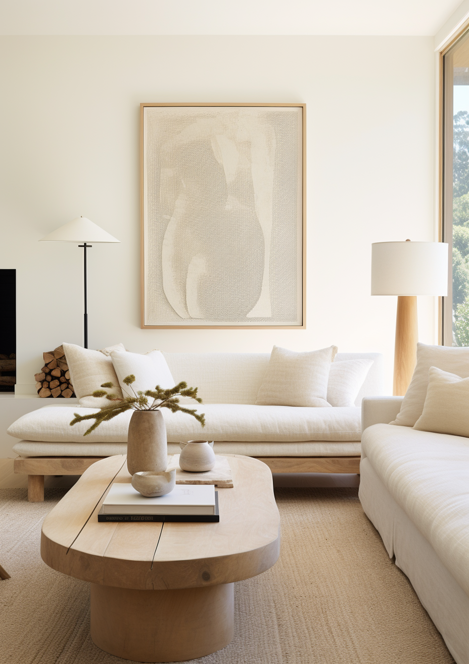
South-facing rooms are where Pointing needs the most careful judgement, not the least - a reversal of how most warm neutrals behave. Strong, direct, unfiltered southern sun pushes the red undertone toward visible pink, particularly in the afternoon when the light itself warms. I would always ask to see a large sample on the actual south wall, left up across a full day, before committing - the difference between a soft warm white and an obvious pink can be the difference between morning and mid-afternoon light in the same room.
North-Facing Rooms
North-facing rooms are where Pointing performs most reliably in my experience - the cooler, more even light has nothing to overheat the red undertone, so the colour settles into the soft warm white it is designed to be. I have specified it in north-facing hallways, bedrooms, and sitting rooms with warm wood floors and brass fittings, and the result consistently reads as inviting rather than cold, which is exactly the problem a north-facing room usually needs solved. This is one of the few warm off-whites I would actively recommend for a north-facing room without a long list of compensating conditions.
East and West-Facing Rooms
East-facing rooms receive warm, low morning light and cooler light for the rest of the day - Pointing reads at its softest and most flattering first thing, then settles into a calmer, less pronounced warmth through the afternoon. West-facing rooms see the reverse: a calmer read for most of the day, then a warm, sometimes golden lift in the late afternoon and evening as the light turns low and warm again. For rooms used mainly in the evening - a dining room, a sitting room - a west-facing Pointing wall can be genuinely beautiful at the hours it is used most.
Artificial Lighting
Artificial lighting matters less for Pointing than it does for F&B's cooler neutrals, but it is not irrelevant. Warm-spectrum bulbs at 2700K reinforce the red-beige undertone and keep the colour reading soft and traditional in the evening. Cool daylight bulbs at 4000K and above will not turn Pointing cold the way they would a genuinely cool neutral, but they do flatten some of its warmth and can make it read closer to a plain beige than the softly pink-toned white it is on a warmer bulb. I generally recommend 2700K-3000K throughout a Pointing room to keep the character the colour was chosen for.
Not sure if Pointing works for your room? A colour consultation is included in all our design packages - book directly here. |
Trim Colours and What to Pair With Pointing

Trim - Stay in the Warm White Family
The most important trim rule for Pointing is to stay in the warm white family, not the cool blue-white family. Wimborne White No.239 is my usual first choice for trim alongside Pointing - Farrow & Ball itself pairs the two in its own sample sets, and Wimborne White's warm cream undertone sits close enough to Pointing's own warmth to create a clean, considered boundary rather than a fight. All White No.2005 is a reliable brighter alternative when a crisper contrast is wanted - it carries almost no undertone of its own, so it lifts a Pointing room without introducing a competing colour direction.
Avoid Strong White and Wevet on trim alongside Pointing. Both carry a cool grey base that sits in direct opposition to Pointing's warmth - the contrast reads as an undertone clash rather than a considered pairing, and against that cool trim Pointing's own warmth can start to look dated or slightly dirty by comparison. For the full standalone review of one of those cooler F&B whites - useful if you are weighing a cool-toned scheme instead - the Farrow & Ball Strong White review covers its own undertone and where it works.
Floor Materials
Warm wood floors are the most natural flooring pairing for Pointing - honey oak, walnut, and other warm-toned timbers relate directly to the red-beige undertone and reinforce rather than compete with it. Cool, pale ash or bleached oak floors can work but need warm furnishings elsewhere in the room to stop the combination reading flat.
Grey stone, polished concrete, and other cool hard flooring create a genuine undertone conflict with Pointing - the coolness of the floor fights the warmth of the walls, and the room can end up feeling unresolved rather than deliberately contrasted. If a client is committed to a cool stone floor, I steer them toward a cooler F&B white instead of trying to force Pointing to work against it.
Metal Finishes
Brass and aged brass are the most natural metal companions for Pointing - the warm gold tone shares Pointing's own warmth, and the pairing reads as considered rather than accidental. Unlacquered or aged brass in particular develops a patina that only deepens this relationship over time.
Chrome and brushed nickel are not wrong with Pointing, but they need to be used with intent rather than as a default. A single cool metal fixture against Pointing's warmth can look like an oversight; used consistently throughout a scheme - taps, handles, light fittings - the cool-warm contrast can read as a deliberate design choice rather than a mismatch.
Accent Colours
The accent colours that work best alongside Pointing are warm, earthy, and traditional in character. Deep terracotta and warm rust tones sit naturally with the red undertone and create a cohesive, English-country palette. Soft sage and muted olive greens provide a gentle, organic contrast that does not fight Pointing's warmth the way a cool blue-grey would.
Avoid cool, icy blues and blue-based greys as a primary accent alongside Pointing - the coolness sits in direct opposition to the red-beige undertone and the pairing tends to read as a mistake rather than a considered contrast. For a genuinely cool-toned F&B neutral to build a scheme around instead, where blues and cool greys sit far more naturally, the Farrow & Ball Wimborne White review is a useful comparison point for how a warmer-but-quieter F&B white handles the same materials.
Pointing Room by Room

Bathrooms
Bathrooms are where Pointing performs consistently well, particularly in north or east-facing spaces. My standard specification for a Pointing bathroom is: Pointing walls, Wimborne White ceiling and trim, warm-toned natural stone or timber-look tile, brass fixtures, and warm-white towels. In a north-facing bathroom this combination avoids the clinical, cold feel that a true white so often produces.
Bedrooms
Pointing in a bedroom creates a genuinely restful, traditional atmosphere that suits English-country and soft-contemporary briefs equally well. I have specified it in north and east-facing bedrooms with warm oak floors, linen bedding, and 2700K bedside lighting, and the result consistently reads as calm and inviting rather than flat. In a strongly south-facing bedroom I would sample thoroughly first, since the same warmth that makes it restful elsewhere can tip toward pink in unfiltered afternoon sun.
Living Rooms
Living rooms are one of Pointing's strongest applications, particularly in period and traditional properties. In a north or east-facing living room with warm wood floors, linen or wool upholstery, and brass table lamps, Pointing on the walls creates a scheme that reads as genuinely considered and lived-in rather than simply painted. In a strongly contemporary, cool-toned living room - polished concrete, chrome, glass - Pointing will generally fight the brief rather than complement it.
Kitchens
Pointing on kitchen walls in a traditional or country-style kitchen is a dependable, well-tested choice - the warm off-white sits naturally alongside painted timber cabinetry, brass hardware, and warm stone worktops. On kitchen cabinets it is a softer, more classic option than the brand's cooler whites, though a strongly south-facing kitchen with large windows needs a careful sample check before committing at that scale.
Home Offices and Studies
Pointing is a strong choice for a traditional home office or study, though not the obvious one for a sleek, minimal work space. The warmth suits a room built around bookshelves, warm wood furniture, and a more classic aesthetic, and it tends to feel considerably calmer than a stark white in a room used for long stretches of focused work. Paired with dark wood shelving, brass desk accessories, and a warm reading lamp, a Pointing study leans traditional and comfortable rather than clinical.
Who Pointing Is Right For - And Who It Is Not

Pointing is right for you if:
The interior style is English country, traditional, or soft-contemporary - Pointing's warm red-beige character is precisely what these briefs call for, and it reads as considered rather than accidental in period properties especially.
The room is north or east-facing, or otherwise lacks strong direct sun - this is the condition under which Pointing performs most reliably, since the absence of intense direct light keeps the red undertone soft rather than pushing it toward visible pink.
You want a warm off-white with genuine character, not a blank neutral - most people reaching for a Farrow & Ball white want something more considered than a plain builder's white, and Pointing delivers warmth and history that a truly neutral white cannot.
You are working with warm materials as a baseline - warm wood floors, brass fixtures, and warm textiles all reinforce Pointing's undertone rather than fighting it, and the colour rewards a scheme that is already leaning warm.
Pointing is not right for you if:
The room is strongly south-facing with large, uncovered windows - without some means of softening direct afternoon sun, Pointing's red undertone can intensify into an obvious pink that surprises people who sampled it in a north-facing showroom.
The material palette is predominantly cool - grey stone, polished concrete, chrome, and blue-based whites will all sit in tension with Pointing's warmth rather than complementing it, and the result tends to read as unresolved rather than intentionally contrasted.
The brief is sleek, minimal, and contemporary - Pointing carries a traditional, historic character that works against a strongly modern, pared-back aesthetic; a cooler F&B white such as Strong White or Wevet will usually serve that brief better.
A large-scale sample in the actual room isn't something you're willing to test first - Pointing is one of the F&B colours most likely to shift between chip and wall depending on orientation and light intensity, and skipping that step is the single biggest cause of disappointment with this colour.
How Pointing Compares to Similar Colours
vs Wimborne White No.239 - Wimborne White sits at a similar LRV (~89 versus Pointing's ~87) but carries a lighter, creamy-yellow undertone rather than Pointing's red-pink base - it reads as a quieter, more versatile warm white, which is exactly why Farrow & Ball pairs the two as wall-and-trim partners. Choose Wimborne White where you want warmth without any pink direction at all; choose Pointing where you want that warmth to carry a genuine, slightly historic character.
vs Strong White No.2001 - Strong White sits meaningfully deeper (roughly LRV 75-80, with sources disagreeing on the exact figure) and carries a cool grey undertone, placing it in almost direct opposition to Pointing's warm red base. The two should not share adjacent trim-and-wall surfaces - the undertone conflict is visible - but they represent the two ends of F&B's white spectrum: warm-traditional versus cool-contemporary, and the choice between them should be driven entirely by which brief the room is actually serving.
vs Skimming Stone No.241 - Skimming Stone is a genuinely deeper colour at roughly LRV 66-68, a warm stone-grey greige rather than Pointing's lighter warm white. Where Pointing reads as a soft off-white, Skimming Stone reads as a colour in its own right with real presence on the wall - useful when a room needs more weight and depth than Pointing's lighter LRV can provide, while still staying within the same warm, F&B-neutral family.
vs Wevet No.273 - Wevet sits close to Pointing in LRV (approximately 82 versus Pointing's ~87) but is built on an almost opposite undertone logic - a soft, understated grey rather than Pointing's red-beige warmth. In the same room, Pointing reads as inviting and traditional while Wevet reads as quiet and contemporary; they suit genuinely different material palettes and should rarely be specified as alternatives for the same brief.
Frequently Asked Questions
Is Pointing warm or cool?
Pointing is warm. Its red-pink undertone over a beige-cream base places it firmly in Farrow & Ball's Warm Neutrals / Red Based Neutrals grouping. This is the single fact to weigh before anything else - if the brief calls for a cool, contemporary neutral, Pointing is the wrong colour; if it calls for a soft, traditional warmth, it is one of the most dependable choices in the F&B range.
Does Pointing look pink on the wall?
In most conditions Pointing reads as a soft warm white rather than an obviously pink colour. The beige-cream base keeps the red undertone in check on most walls and in most orientations. In strong, direct, unfiltered south-facing sun, however, the red can intensify into a visible pink that surprises people who first saw the colour in a showroom or on a small chip - a large sample left up in the actual room, watched across a full day, is the only reliable way to know how it will read in your specific light.
What is the best trim colour for Pointing?
Wimborne White No.239 for a warm, closely related trim, or All White No.2005 for a slightly crisper contrast. Both stay within the warm-to-neutral white family and avoid the undertone conflict that a cool, blue-based white would create. Avoid Strong White and Wevet on trim directly alongside Pointing - both carry a cool grey base that sits in visible tension with Pointing's warmth.
Can Pointing work in a strongly south-facing room?
With careful sampling, yes - but it needs more caution than most other F&B warm neutrals. The main risk in a south-facing room is direct, unfiltered afternoon sun pushing the red undertone toward pink. I recommend testing a large sample directly on the sunniest wall and observing it specifically in the early and late afternoon before committing, since that is when the effect is most pronounced.
What rooms is Pointing best for?
North and east-facing bedrooms, living rooms, and bathrooms are where Pointing performs most consistently - the absence of intense direct sun lets its warm character read as intended without tipping toward pink. It also works well in traditional kitchens and studies with warm materials. It is least reliable in strongly south-facing rooms with large windows and in any interior built around a cool, contemporary material palette.
The Verdict
Farrow & Ball Pointing is a genuinely dependable warm off-white - in the rooms and light conditions that suit it. It is not the blank, safe neutral its popularity suggests. It is a specific, warm, red-based colour that performs best with cooler natural light, warm materials, and a traditional or soft-contemporary brief, and it needs real caution in strongly sunny, south-facing rooms or cool, contemporary schemes.
In the right conditions - and I have specified it across enough north and east-facing rooms to trust this - Pointing delivers a genuinely inviting, considered warmth that few truly neutral whites can match. For a broader look at how Pointing sits within F&B's wider range of warm and cool whites, the Farrow & Ball Skimming Stone review is a useful next stop for anyone deciding between a light warm white and a deeper warm greige.
Before committing, run this sequence on an A2-sized sample painted directly on your wall, not a chip held up to it. First, check it at mid-morning against your north or east-facing elevation if you have one, where Pointing should read as a calm, soft warm white. Second, check the same sample on your sunniest wall in the early afternoon, specifically looking for any pink cast appearing in the direct light. Third, view it again after dark under your actual bulbs at their usual brightness, not a daylight showroom bulb. If it holds a soft, warm, non-pink character in all three checks, Pointing will perform reliably in that room; if the afternoon check shows an obvious pink shift, treat that as a genuine warning rather than something later coats will correct.
Want a complete colour scheme built around Pointing? Our design packages cover full palette selection, finish recommendations, and 3D visualisations - see our packages. |
About the Author
Beril Yilmaz is a qualified architect and interior designer based in the UK. She runs BY Design And Viz, a design platform covering paint colour reviews, interior design guidance, and residential design projects. Beril has specified Pointing across residential projects in the UK - most often in north and east-facing bedrooms, living rooms, and bathrooms, paired with warm oak floors and brass fixtures.


Comments