


A Complete Color Guide To Matching Hardwood Floating Shelves With Your Walls And Furniture

Hardwood floating shelves are a practical, stylish way to bring natural materials into your home. Whether you're decorating a spacious living room or working with an awkward corner, the right wood tone can transform an ordinary wall into an attractive design feature.
However, choosing the perfect shelves involves more than picking a beautiful wood. To create a balanced, cohesive interior, you need to understand how different wood colors interact with your walls, furniture, and existing decor.
Understanding Wood Tones And Undertones

Before choosing hardwood floating shelves, understand the difference between wood tones and undertones. Wood tones describe the material's overall lightness or darkness, while undertones refer to the subtle colors beneath the surface.
For example, oak often features golden, beige, or slightly pink undertones, depending on the species and finish. Mahogany typically has a richer reddish-brown color, while maple tends to have a lighter, creamier appearance.
Recognizing these differences makes it much easier to coordinate your shelves with existing furniture. The goal isn't necessarily to match every wooden surface perfectly but to create a consistent visual relationship between materials.
Matching Light Wood Shelves With Wall Colors
Light hardwood shelves work especially well in smaller rooms, narrow spaces, and interiors where maintaining an open atmosphere matters. Their natural appearance creates a subtle decorative feature without overwhelming the surrounding walls.
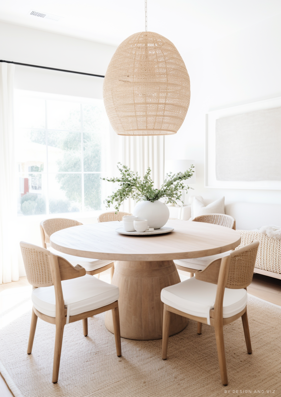
White and off-white walls pair beautifully with light oak or maple shelving, creating a fresh, minimalist look. This combination works especially well in Scandinavian-inspired interiors, where natural materials and neutral colors play a key role.
Soft gray walls can also complement lighter woods, although choosing the right undertone is essential. Warm gray shades generally work well with golden oak, while cooler grays pair better with pale, neutral-toned maple.
For a slightly more colorful approach, consider sage green, dusty blue, or muted peach walls. These shades add personality while letting the wood's natural grain remain visible.
Choosing Dark Wood Shelves For Contrast
Dark hardwood shelves offer a different design experience, adding depth, contrast, and drama. They work particularly well in rooms that already feature rich colors, statement furniture, or sophisticated decorative elements.
Deep brown shelves against cream or beige walls create an elegant contrast without making the room feel excessively dark. This combination works especially well in living rooms, home offices, and bedrooms where warmth and comfort are priorities.
Dark wood can also look striking against navy blue, forest green, or charcoal walls. However, keep lighting sufficient because combining several dark surfaces can make smaller spaces feel enclosed.
When using dark shelves in compact rooms, consider limiting them to one feature wall. This creates a focal point while allowing lighter surrounding surfaces to maintain visual balance.
Coordinating Hardwood Shelves With Existing Furniture
Matching floating shelves with furniture doesn't mean every wooden element needs an identical finish. In fact, combining different wood tones can create a more interesting and layered interior when done thoughtfully.
Start by identifying the dominant wood tone in your room, whether it's a dining table, entertainment unit, or hardwood flooring. Your shelves can either complement that tone or introduce a carefully chosen contrast.
For example, a room featuring medium oak furniture could benefit from lighter oak shelves with similar warm undertones. Alternatively, darker shelving can add contrast while staying harmonious through shared golden or reddish tones.
Avoid introducing too many unrelated wood finishes into one space. Repeating two or three complementary tones throughout the room generally creates a more intentional appearance.
Creating Balance With Warm And Cool Color Palettes
Understanding color temperature is another important part of coordinating hardwood shelves with interior decor. Warm colors include beige, terracotta, cream, and earthy reds, while cool colors include blue, gray, and certain shades of green.
Warm-toned hardwoods naturally complement earthy interior palettes. For example, golden oak shelves can look particularly attractive against terracotta walls, cream upholstery, and natural woven accessories.
Cooler interiors can benefit from pale woods with neutral undertones. Light maple shelves against soft blue walls or cool white cabinetry can create a clean, contemporary appearance.
However, mixing warm and cool elements isn't necessarily a design mistake. Adding warm wooden shelves to a predominantly cool room can soften the atmosphere and keep the space from feeling overly clinical.
Selecting The Right Wood Material And Finish

Different hardwood species offer distinctive colors, grain patterns, and visual characteristics. Choosing the right material is therefore just as important as selecting the surrounding wall color.
Oak is a versatile option that suits traditional, contemporary, and rustic interiors. Maple offers a smoother, lighter look, while mahogany brings rich color that works well in more dramatic settings.
For homeowners exploring different hardwood options, NookWoodWorking offers solid hardwood floating shelves in several wood species, sizes, and styles. The selection includes natural and unfinished options, letting homeowners coordinate shelving with their preferred interior color schemes.
Remember that protective finishes can influence the final appearance of natural wood. Oils and stains can deepen color or emphasize certain undertones, so it's always worth examining samples before deciding.
Using Floating Shelves In Awkward And Tricky Spaces
Awkward corners, narrow alcoves, and irregular wall sections often present decorating challenges. Floating shelves offer an effective solution because they add storage and display space without bulky furniture.
In a narrow alcove, matching the shelves closely to the wall color can create a subtle, integrated appearance. Alternatively, contrasting wood tones can highlight the architectural feature and transform it into an intentional focal point.
Small corners often benefit from lighter shelves because they maintain a sense of openness. Darker shelves can also work, particularly when balanced with light walls and carefully selected accessories.
For rooms with unusual layouts, consider repeating the shelf's wood tone elsewhere through picture frames, furniture legs, or decorative objects. This helps connect otherwise disconnected areas and creates visual continuity throughout the room.
Styling Shelves With Complementary Decorative Colors
Once you've chosen your hardwood shelves, the objects you display can strengthen your overall color scheme. Books, ceramics, plants, and framed artwork provide opportunities to introduce complementary shades.
Light wooden shelves look particularly attractive with white ceramics, soft green plants, and neutral accessories. These combinations highlight natural textures while keeping a calm, uncluttered look.
Darker shelves can benefit from lighter decorative pieces that create contrast. Cream pottery, metallic accents, and pale books help keep dark wooden surfaces from looking visually heavy.
Avoid filling every available inch with decorative objects. Leaving some open space lets the hardwood's natural grain and color become part of the display.
Testing Colors Before Making Your Final Decision
Lighting can dramatically change how wood colors appear throughout the day. A shelf that looks golden under warm artificial lighting may appear noticeably different in natural daylight.
Before committing to a particular finish, compare wood samples against your walls and furniture under different lighting conditions. Watch how the colors shift in the morning, afternoon, and evening.
Also consider the room's long-term decorating plans. Versatile wood tones make it easier to update wall colors, upholstery, and accessories without replacing your shelving.
Conclusion
Matching hardwood floating shelves to your walls and furniture creates harmony between color, texture, and natural materials. Whether you prefer light oak against neutral walls or rich mahogany paired with dramatic colors, thoughtful coordination can enhance almost any interior.
By understanding wood undertones, considering existing furniture, and experimenting with complementary color palettes, you can create shelves that feel like a natural extension of your home's design. The right combination will improve functionality while bringing warmth, character, and visual balance to even the most challenging spaces.


Comments