


Natural Linen vs Alabaster: The Comparison That Actually Helps You Decide

Updated: Aug 11
Natural Linen and Alabaster get cross-shopped as if they were two versions of the same warm neutral, but they belong to different families and do different jobs. Natural Linen SW 9109 is a warm light beige with genuine body - a colour that puts warmth and softness onto the walls themselves. Alabaster SW 7008 is a soft warm white that brightens and recedes, adding atmosphere without adding colour. One is a beige. The other is an off-white. That single distinction settles most of the decision before undertone or lighting enters the conversation.
The numbers make the gap concrete: Natural Linen sits at LRV 66 and Alabaster at LRV 82 - sixteen points apart, clearly visible on a wall. Natural Linen reads as a grounded, creamy beige with a yellow base softened by grey and the faintest whisper of pink. Alabaster reads as a luminous warm white that stays white in good light and only hints at greige in poor light. They are not rivals for the same brief; they are answers to two different questions about how much colour you want the walls to carry.
This guide covers exactly how Natural Linen and Alabaster differ in undertone, LRV, light behaviour, and room application - including when Alabaster belongs on the trim above Natural Linen walls and why that pairing only works in one mood.

At a Glance
| Natural Linen | Alabaster |
Brand | Sherwin-Williams | Sherwin-Williams |
LRV | 66 - light-mid beige with genuine body | 82 - warm white that still reads as white |
Colour category | Warm light beige - a colour with depth, not an off-white | Soft warm white - an off-white, not a beige |
Undertones | Yellow base with a whisper of pink-peach, muted by grey so it never tips gold | Subtle greige-yellow; warm enough to soften, restrained enough to stay white |
Character | Soft, creamy, grounded beige - puts warmth and atmosphere onto the walls | Creamy, gentle, luminous warm white - softens and brightens without adding colour |
North-facing | Good - the grey in the mix steadies it; warmth mutes slightly but holds | Good - warmth keeps it from going cold; can read faintly greige in poor light |
South-facing | Beautiful - the yellow base glows into a sun-warmed beige | Excellent - glows soft and creamy without buttering |
Open-plan | Good - reads consistently, deepening a touch in low-light corners | Excellent - SW's most consistent whole-home warm white |
On walls | A genuine warm beige backdrop that contributes colour and cosiness | A soft white backdrop that brightens and recedes - adds light, not colour |
On cabinets | Strong for modern-farmhouse and organic-modern cabinetry with wood and brass | SW's most specified warm-white cabinet colour |
Use together? | Alabaster on trim works only as a soft tonal scheme - low contrast, no crisp line | Yes as a quiet tonal trim over Natural Linen; not for crisp definition |
Trim for each | SW Pure White or Chantilly Lace for crisp definition | Itself, or SW Pure White for a crisper boundary |
Style fit | Modern farmhouse, organic modern, transitional, warm coastal | Transitional, farmhouse, classic, contemporary-warm |
Architect's pick | When the walls themselves need to carry warmth and beige body | When the walls should brighten and soften rather than add colour |
SW Natural Linen - What It Really Looks Like

Natural Linen has an LRV of 66 and behaves like a colour, not an off-white. The base is a soft yellow warmed further by a faint pink-peach, with just enough grey worked through it to stop the whole thing tipping gold or tan. That grey is the discipline in the recipe - it keeps Natural Linen reading as a modern, balanced beige rather than the heavy Tuscan beige of twenty years ago. On a wall it has presence: it contributes warmth and softness instead of simply brightening the room.
It is a beige built for atmosphere, not for stepping back. Natural Linen suits rooms that want warmth in the walls themselves - modern farmhouse, organic modern, and warm coastal schemes where wood, woven texture, and warm stone set the direction. In south light the yellow base glows; in north light the grey steadies it and the warmth mutes without disappearing. For where it sits against the cooler, greyer SW neutral it is most often confused with, the Natural Linen vs Accessible Beige guide maps the beige-to-greige line and shows which side of it your room actually wants.
For the Sherwin-Williams version of the same beige-versus-gray decision, the Natural Linen vs Agreeable Gray guide covers how SW's most popular warm beige and warm gray compare in undertone, LRV, and room application.
SW Alabaster - What It Really Looks Like

Alabaster has an LRV of 82 and reads as a soft, warm white - sixteen points brighter than Natural Linen and in a different category entirely. The undertone is a subtle greige-yellow: enough warmth to keep it from reading cold or clinical, restrained enough that it still registers as white rather than cream or beige. That balance is exactly why it became SW's default warm white for whole-home schemes and cabinetry. It brightens a room and softens its edges without putting any real colour on the walls.
Its job is to recede, gently. Alabaster is the warm white you reach for when the brief is light and softness rather than atmosphere and body - it lifts a room without competing with anything in it. In south light it glows creamy; in poor artificial light it can drop slightly toward greige, which is the one condition worth sampling for. For how it compares to the warmer, creamier SW white a step further into yellow, the Creamy vs Alabaster guide sets out how much warmth each one carries and where the line between soft-white and cream actually falls.
The Real Difference Between Natural Linen and Alabaster

Natural Linen is a warm beige with body. Alabaster is a soft warm white that recedes. They are sixteen LRV points and one whole category apart - the decision is not which warm neutral you prefer but whether you want the walls to add colour or simply add light.
Natural Linen rooms feel warm, grounded, and atmospheric - the walls themselves contribute softness and a creamy beige character. Alabaster rooms feel light, soft, and luminous - the walls brighten and step back, leaving the warmth to the furnishings and materials. In a bright south-facing room both look lovely and the choice comes down to mood. In a low-light north-facing room they separate hard: Natural Linen holds its cosy beige, while Alabaster can thin toward a flat greige if the lighting is poor. For how a lighter, lower-chroma warm neutral compares to Natural Linen, the Sherwin-Williams White Duck review covers the full undertone and LRV breakdown.
Alabaster on trim above Natural Linen walls works - but only in one mood. Because both are warm SW neutrals, Alabaster makes a soft, tonal trim that produces a quiet, enveloping, low-contrast scheme. It will not give you a crisp architectural line - the sixteen-point gap reads as a gentle tonal step, not a definition. If you want Natural Linen walls with genuine trim contrast, reach past Alabaster for a cooler bright white such as Pure White or Chantilly Lace. For how Alabaster reads against a greige with real body rather than a beige, the Alabaster vs Pale Oak guide shows where the soft-white-against-neutral relationship holds and where the contrast gets too quiet to register.
Not sure which one works for your room? A colour consultation is included in all our design packages - book directly here. |
When to Choose Natural Linen

Choose Natural Linen when the walls themselves should carry warmth. Modern farmhouse, organic modern, and transitional interiors where the neutral needs body and atmosphere rather than brightness alone. Rooms with warm wood floors, woven textures, and warm metals where a soft beige ties the palette together. Low-light spaces that need warmth without going stark - the grey in the mix keeps it from flattening. Cabinetry where a warm, organic, lived-in neutral is the brief rather than a clean white.
Natural Linen is the wrong call when you want the walls to disappear. It has too much colour to read as a quiet backdrop - in a scheme that wants brightness and a near-white envelope, its beige body will feel like a commitment you did not intend to make.
For how Repose Gray compares to Natural Linen - a warm beige on the opposite side of the undertone spectrum - the Natural Linen vs Repose Gray guide explains which one holds up better in mixed-material, unpredictable-light rooms.
When to Choose Alabaster

Choose Alabaster when the walls should brighten and soften, not add colour. Whole-home schemes that need one warm white to carry across every room and orientation. Trim, cabinetry, and ceilings where a soft warm white is the architectural baseline. Rooms with good natural light where the goal is a luminous, near-white envelope rather than a beige with body. Schemes built on layered texture and warm accents where the walls should stay quiet and let the materials speak.
Alabaster is the wrong call when the room needs the walls to do the warming. It softens and brightens, but it will not contribute the genuine beige warmth that grounds a palette - in a low-light room that needs colour on the walls, Alabaster can read thin where Natural Linen reads cosy.
How the Pairings Differ
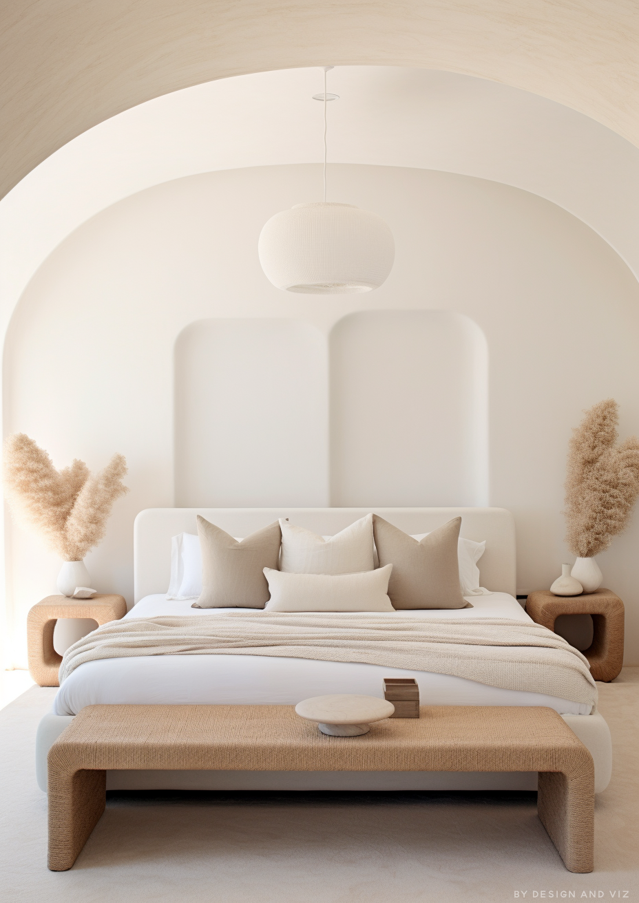
For Natural Linen on walls, SW Pure White or Chantilly Lace on trim gives the crisp definition the warm beige needs to read as deliberate - the cool bright white sharpens the boundary and stops the scheme going muddy. Alabaster on trim is the alternative for a soft, tonal, low-contrast look, but only when a quiet enveloping mood is the intention.
For Alabaster on walls, Alabaster itself on trim and ceilings creates a seamless, soft-white envelope. Pure White provides a crisper trim boundary for those wanting more definition against the warm white walls without breaking the warmth of the scheme.
For flooring, Natural Linen is strongest with warm wood and warm stone, where the beige body and the material direction reinforce each other; cool grey stone can make its warmth read heavier than intended. Alabaster handles the full range - warm wood, pale stone, and contemporary tile all sit comfortably beneath a soft warm white.
For hardware, Natural Linen is happiest with warm metals - aged brass, brushed brass, and bronze complement the beige warmth, though matte black also grounds it well. Alabaster takes every finish, from warm brass to matte black to polished chrome, because the soft-white base does not commit hard to any undertone direction.
For how Chantilly Lace compares to Natural Linen - a warm Sherwin-Williams neutral at a much lower LRV, built for the wall rather than the trim - the Natural Linen vs Chantilly Lace guide covers the wall-and-trim logic behind the pairing and the light test to confirm it works in your room.
Architect's Verdict - Natural Linen or Alabaster?

These two are not competing for the same brief. The question is whether the walls should add warmth or add light - colour with body, or a soft white that steps back.
If the brief is a warm beige with genuine body - walls that carry softness and atmosphere, grounded in warm wood and warm materials, cosy even in low light - Natural Linen is the answer. It puts the warmth into the walls themselves.
If the brief is a soft warm white that brightens and recedes - a luminous whole-home envelope that lifts a room without adding colour - Alabaster is the answer, with Pure White on trim when you want a crisper line.
Sample both on the north-facing wall - the worst case for this comparison - and view them at dusk under your evening lights. A pass for Alabaster is a wall that still reads clearly as a soft white, lighter and cleaner than the beige beside it; if at dusk Alabaster collapses into something indistinguishable from a flat pale greige, that room's light wants the committed warmth of Natural Linen instead.
For the comparison between Cloud White and Natural Linen - a near-white paired against a genuine beige-greige wall colour rather than another off-white - the Natural Linen vs Cloud White guide explains which rooms call for depth and which call for a quieter backdrop.
Frequently Asked Questions

Is Natural Linen darker than Alabaster?
Yes - by sixteen LRV points. Natural Linen has an LRV of 66 and Alabaster has an LRV of 82. Natural Linen reads as a warm light beige with body; Alabaster reads as a soft warm white. The gap is clearly visible on a wall, and the two sit in different colour categories rather than being two shades of the same neutral.
Can I use Alabaster on trim with Natural Linen on walls?
Yes, but only for a soft, tonal, low-contrast scheme. Both are warm SW neutrals, so Alabaster trim above Natural Linen walls reads as a gentle tonal step rather than a crisp architectural line. For genuine trim definition against Natural Linen, choose a cooler bright white such as Pure White or Chantilly Lace instead.
Which is better for a north-facing room?
It depends on whether you want warmth or brightness. Natural Linen holds its cosy beige character in north light because the grey in its mix steadies it. Alabaster stays acceptable but can thin toward a flat greige in poor light. If a low-light north room needs the walls to feel warm, Natural Linen is the safer call; if it simply needs to feel brighter, Alabaster works with good lighting.
Does Natural Linen look yellow?
It reads warm, but not strongly yellow. The base is yellow with a whisper of pink-peach, muted by grey so it never tips gold or tan. In bright south light the warmth comes forward; in cooler or indirect light the grey steadies it and it leans softly greige. It is a modern, balanced beige rather than the heavy yellow-beige of older schemes.
What is the LRV of Natural Linen vs Alabaster?
Natural Linen SW 9109 has an LRV of 66 and Alabaster SW 7008 has an LRV of 82. Natural Linen sits in the light-to-mid range with genuine body; Alabaster sits in the warm-white range and still reads as white. The sixteen-point gap is why one contributes colour to a room and the other contributes light.
Which one should I use for a whole-home colour?
Alabaster is the more natural whole-home choice. Its soft warm white reads consistently across every orientation and lets each room's materials carry the character. Natural Linen also works whole-home, but as a committed beige it puts warmth into every wall - lovely if that is the brief, heavier than intended if you simply wanted a bright, neutral envelope.
Final Thought
Natural Linen and Alabaster are cross-shopped constantly, but they answer two different questions. Do you want the walls to add warmth, or just add light?
Warm beige with genuine body, for rooms that should feel grounded and cosy - Natural Linen. Soft warm white that brightens and recedes, for a luminous whole-home envelope - Alabaster. Sample both on the north wall at dusk. The sixteen-point gap, easy to underestimate on a chip, will be unmistakable in your own light.
Want a complete colour scheme built around Natural Linen or Alabaster? Our design packages cover full palette selection, finish recommendations, and 3D visualisations - see our packages. |
About the Author
Beril Yilmaz is a qualified architect and interior designer based in the UK. She runs BY Design And Viz, a design platform covering paint colour reviews, interior design guidance, and residential design projects. Beril has specified both Sherwin-Williams Natural Linen and Alabaster across residential projects in the UK and internationally - Natural Linen in modern-farmhouse and organic-modern schemes where the walls themselves should carry warmth, Alabaster as a soft warm-white envelope and trim colour, including on the trim above Natural Linen walls where a quiet, tonal scheme is the brief.


Comments