Purple Blue Color: What It Is and How to Use It in Interior Design
- Beril Yilmaz

- Feb 12
- 5 min read
Purple blue is having a quiet but powerful moment. Sitting somewhere between violet and blue, this elusive color is being searched more than ever because homeowners are craving interiors that feel calm, layered, and emotionally rich—without tipping into cold minimalism or overwhelming drama.
Unlike classic blues or bold purples, purple blue is hard to define. It shifts with light, changes with surrounding materials, and can feel airy in one room and moody in another. That uncertainty is exactly why people are drawn to it—and also why they’re nervous to use it incorrectly.
This guide is designed to remove that fear. If you’ve ever wondered whether purple blue is right for your home, how to style it without making a space feel childish or dark, or which tones actually work in real interiors, you’re in the right place.
At a Glance: What You’ll Learn in This Guide
What purple blue actually is and why it’s trending now
The difference between periwinkle, indigo, violet-blue, and ultramarine
How lighting dramatically changes purple blue
The best color palettes to pair with purple blue
Room-by-room styling guidance
Common mistakes to avoid
Answers to the most searched Google questions about purple blue
1. Purple Blue: What This Color Really Is (And Why It’s So Confusing)

Purple blue is a color family that sits between blue and purple, often shifting depending on light, undertones, and surrounding materials. Purple blue is not a single shade—it’s a spectrum. Purple blue often sits within the broader family of jewel tones, offering depth and richness without the intensity of more saturated hues. It lives between blue and purple on the color wheel and can lean warm or cool depending on its undertones.
Some purple blue shades feel soft and powdery, similar to periwinkle. Others feel deep and saturated, closer to indigo or violet. This is why people struggle to describe it: two homeowners can say “purple blue” and mean completely different things.
What defines purple blue is balance. It carries the calm of blue with the complexity and emotion of purple. Unlike true purple, it rarely feels theatrical. Unlike true blue, it doesn’t feel stark or overly cool.
This balance is what makes purple blue so appealing—and so tricky.
2. Purple Blue: Why Searches Are Exploding Right Now

Purple blue’s rise isn’t random. It aligns perfectly with where interior design is heading.
People are moving away from flat neutrals and craving spaces that feel emotional, cocooning, and slightly mysterious. At the same time, bold color feels risky, especially in permanent finishes like paint.
Purple blue offers a solution:
It feels expressive without being loud
It reads neutral-adjacent in many settings
It works in modern, transitional, and even minimal homes
There’s also a cultural shift happening. Screens, technology, and digital life are pushing us toward colors that feel dreamy and atmospheric—colors that soften the edge between reality and calm. Purple blue fits perfectly into that mindset.
3. Purple Blue: Understanding the Main Shade Families

Not all purple blue tones behave the same way. Knowing the category you’re working with is essential.
Periwinkle-Leaning Purple Blue
Soft, airy, and slightly playful. These tones work beautifully in bedrooms, nurseries, and light-filled living spaces. They reflect light well and feel optimistic rather than moody.
Indigo-Leaning Purple Blue
Deeper, richer, and more grounded. These shades feel luxurious and intentional, making them ideal for dining rooms, offices, or accent walls. These shades are often confused with indigo, especially in low light or north-facing rooms.
Violet-Leaning Purple Blue
More expressive and artistic. Best used sparingly—think upholstery, artwork, or powder rooms—where you want personality without overwhelming the space.
4. Purple Blue: The Lighting Warning Every Homeowner Needs

Purple blue is a chameleon.
In daylight, it can appear soft and blue-forward.At night, it can deepen dramatically and lean purple or even gray.
North-facing rooms tend to pull out cooler, bluer undertones.South-facing rooms warm the color and reveal its purple side.
Before committing, test samples on multiple walls and observe them throughout the day. This step alone can prevent regret.
5. Purple Blue: The Best Color Pairings That Always Work

Purple blue thrives when balanced correctly.
Purple Blue + Warm Neutrals
Think soft beige, warm taupe, creamy off-white. This combination keeps the color grounded and timeless.
Purple Blue + Natural Wood
Oak, walnut, and even darker stained woods anchor purple blue and prevent it from feeling synthetic.
Purple Blue + Charcoal or Graphite
For a modern edge, darker neutrals add structure and sophistication. When paired thoughtfully, purple blue can contrast beautifully with deeper shades like deep purple without feeling overly dramatic.
Purple Blue + Muted Metallics
Brushed brass, antique bronze, or soft gold enhance the richness without overpowering it.
6. Purple Blue: Room-by-Room Styling Guide

Living Rooms
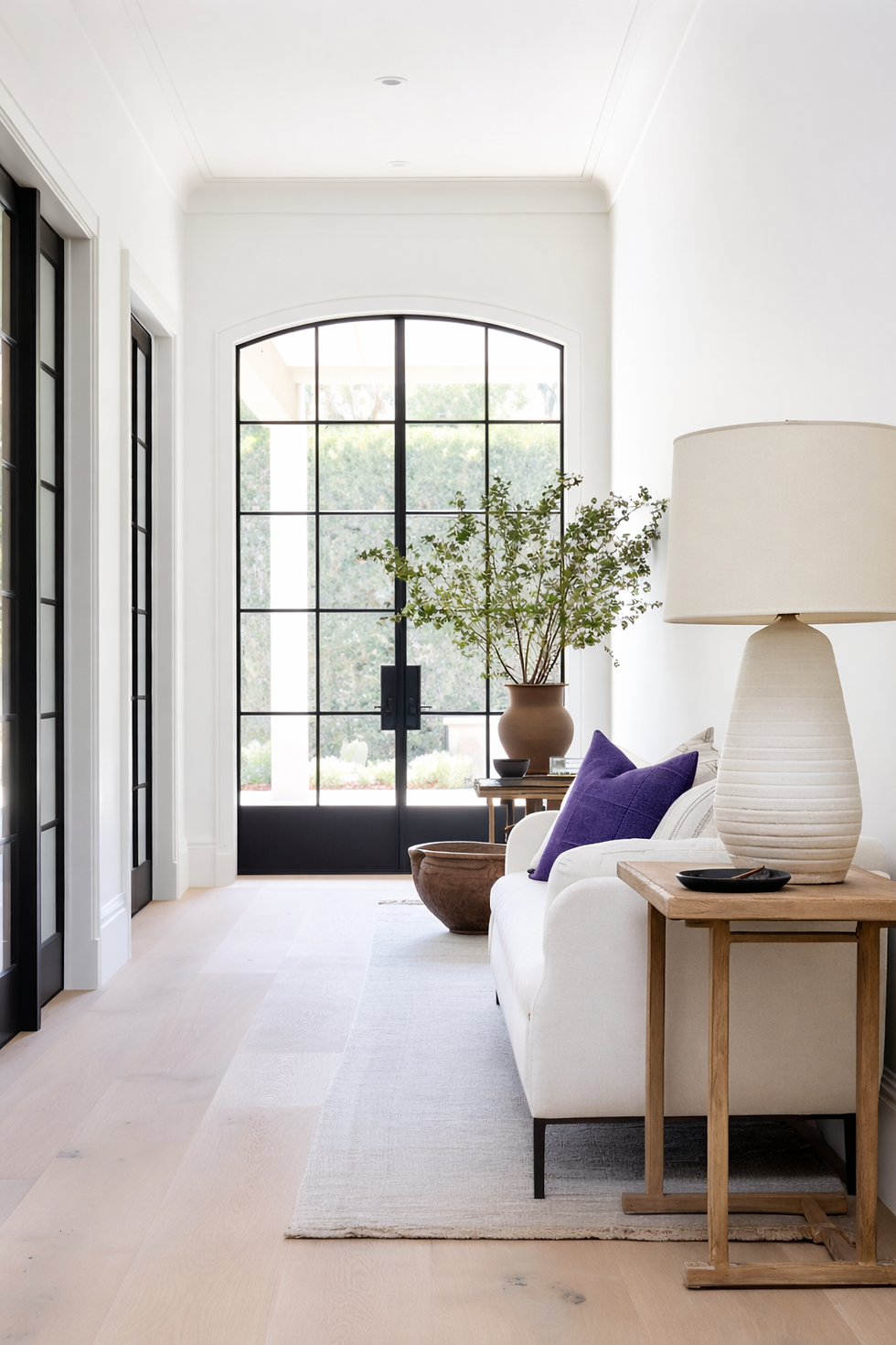
Use purple blue as an accent—sofas, feature walls, or drapery work beautifully. Keep the rest of the palette restrained.
Bedrooms
Purple blue shines here. It promotes calm while still feeling layered and cozy. Pair with warm lighting and textured bedding.
Home Offices
Indigo-toned purple blues encourage focus and depth. Balance with lighter desks and shelving.
Bathrooms
Smaller spaces are perfect for experimenting. Purple blue tiles or painted walls create a spa-like atmosphere when paired with stone or matte finishes.
7. Purple Blue: Common Styling Mistakes to Avoid

Overusing it: Too much purple blue can feel juvenile
Pairing with icy whites: This makes the space feel cold
Ignoring texture: Flat finishes can make the color fall flat
Skipping samples: This is non-negotiable with this shade
Purple blue needs contrast, warmth, and intention.
8. Purple Blue: Is It Modern or Timeless?

Both—when done right.
Purple blue doesn’t belong to a single trend. It adapts. Styled with clean lines and minimal decor, it feels modern. Paired with traditional elements, it feels romantic and classic.
This flexibility is why it’s becoming a long-term favorite rather than a passing fad.
9. Purple Blue: Who Should Use This Color?

Purple blue is ideal if:
You’re bored of beige but not ready for bold color
You want a calm, layered interior
You appreciate subtle complexity in design
It’s less ideal if:
You prefer ultra-bright, high-contrast interiors
Your space lacks natural or layered lighting
10. Purple Blue: How to Start Small If You’re Unsure

Start with:
Cushions or throws
Artwork
Accent chairs
Lampshades
Live with the color before committing to walls or cabinetry.
Frequently Asked Questions About Purple Blue
Is purple blue more purple or more blue?
It depends on undertones and lighting. That’s what makes it unique.
Does purple blue make rooms feel dark?
Only if overused or paired with cool lighting and dark finishes.
Is purple blue good for small rooms?
Yes, especially lighter or periwinkle-leaning shades.
What colors clash with purple blue?
Bright reds, neon tones, and icy grays can feel harsh against it.
Conclusion: Why Purple Blue Is Worth the Attention
Purple blue is not an easy color—but it’s a rewarding one. It invites depth, softness, and emotion into a space without shouting for attention. When styled thoughtfully, it feels timeless, personal, and quietly luxurious.
If you’re looking to move beyond safe neutrals and create a home that feels calm yet expressive, purple blue might be the missing link.
Start Your Dream Home Transformation
Our online design packages were created to make the entire process smoother, clearer, and far more enjoyable — no stress, no second-guessing. Whether you’re refreshing one room or reimagining your whole home, we guide you every step of the way with layouts, visuals, and a fully personalised design plan.
See our interior and exterior design packages to get started.
Author Bio
Beril Yilmaz is the founder of BY Design And Viz, an online interior and exterior design studio specialising in clear layouts, thoughtful architectural details, and design decisions that support how people actually live. With a background in architecture and a practical design approach, her work focuses on creating homes that feel considered, functional, and intentionally designed.


