


Sherwin Williams Repose Gray vs Accessible Beige: The Comparison That Actually Helps You Decide

Updated: Sep 21
Repose Gray and Accessible Beige are both Sherwin Williams neutrals, both consistently appearing on designer shortlists, and both sitting at almost exactly the same LRV. That near-identical brightness level is what makes this comparison so interesting - and so frequently misunderstood. On a brightness scale, these two colours are virtually the same. On a wall in a real room, they create entirely different atmospheres. The difference is not depth. It is direction.
Repose Gray SW 7015 reads as a cool grey-greige. Its complex undertone - violet-purple and green components sitting within a cool grey base - makes it a sophisticated, contemporary, and genuinely light-sensitive colour that rewards precise conditions. Accessible Beige SW 7036 reads as a warm beige-greige. Its direct warm beige-tan undertone with a greige anchor makes it a committed, peacekeeping warm neutral that rewards warm materials and warm light. Same depth. Opposite temperature directions. That distinction defines every practical decision that follows from it.
This guide covers exactly how Repose Gray and Accessible Beige differ in undertone, character, light behaviour, and room application - with a clear verdict on which one to choose and when.
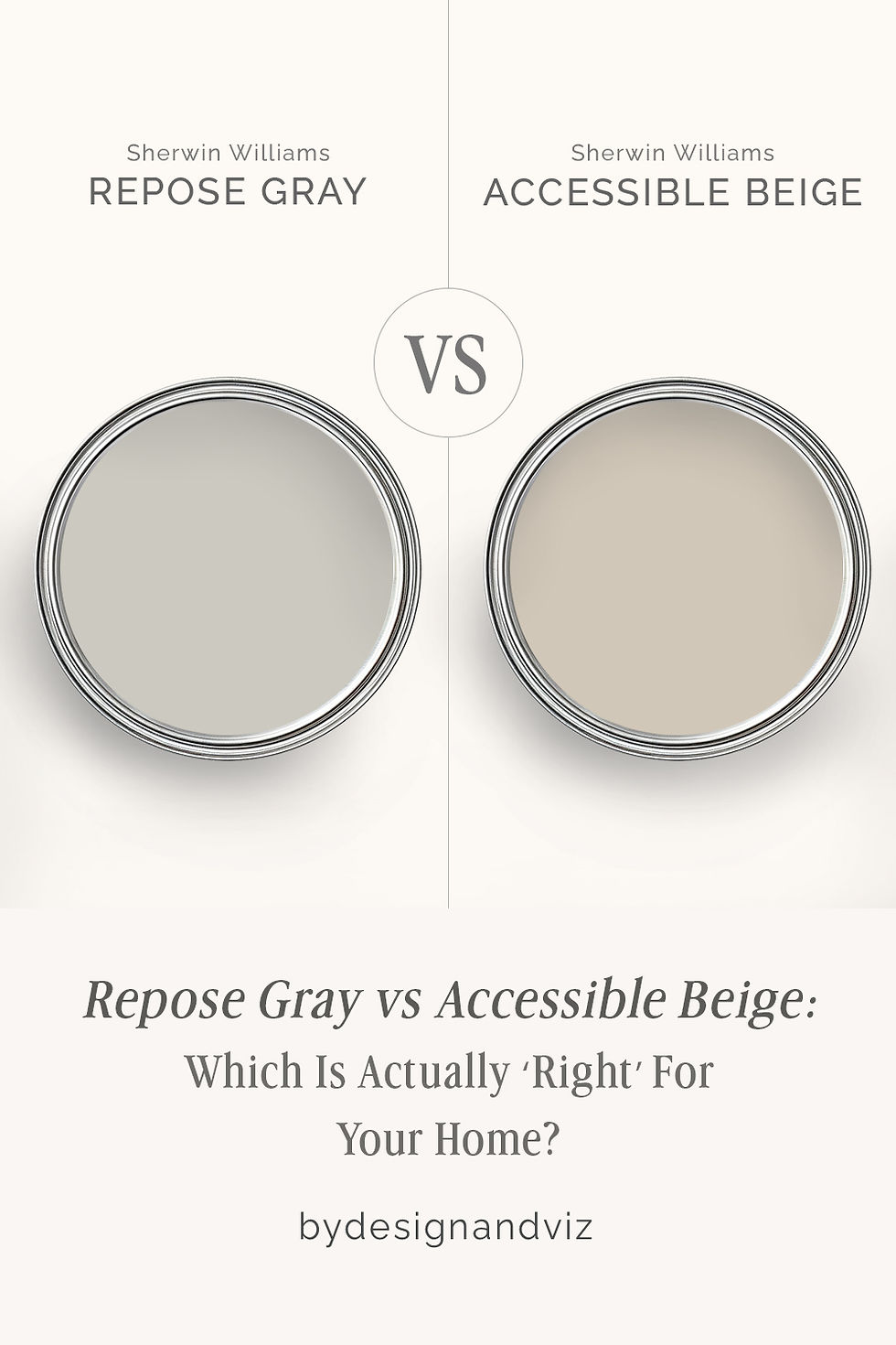
At a Glance
| Repose Gray SW 7015 | Accessible Beige SW 7036 |
Brand | Sherwin Williams | Sherwin Williams |
LRV | 58 - medium cool grey-greige | 58 - medium warm beige-greige |
Colour category | Cool grey-greige - sophisticated, complex, light-sensitive | Warm beige-greige - committed, peacekeeping, warm-forward |
Undertones | Cool grey with violet-purple and green components - complex, chameleon-like | Warm beige-tan with greige anchor - direct, clearly beige-forward |
Character | Sophisticated, complex cool grey with depth and precision | Warm, grounded, settled beige with peacekeeping presence |
North-facing | Risky - violet undertone surfaces in cool indirect light, can read lavender | Good - warm beige holds; can read slightly flat in very cool light |
South-facing | Excellent - warm light suppresses violet, greige quality at its best | Excellent - beige warmth glows, most beautiful in strong light |
Open-plan | Good - needs consistent warm light; challenging if north zones present | Good - performs best in consistently warm light |
Whole-house | Can work as a progression - Accessible Beige in warm zones, Repose Gray in neutral zones | Natural warm-to-cool progression with Repose Gray works well in whole-house schemes |
Trim | Pure White SW 7005 or Extra White SW 7006 only - no warm whites | Alabaster SW 7008 most natural; Pure White SW 7005 for more contrast |
Style fit | Contemporary, transitional, organic modern - cool and mixed palettes | Traditional, transitional, farmhouse, warm contemporary |
Architect's pick | When sophisticated cool grey-greige depth is the brief | When warm committed beige-greige with settled presence is the brief |
SW Repose Gray SW 7015 - What It Really Looks Like

Repose Gray has an LRV of approximately 58 and a complex undertone containing both violet-purple and green components within a cool grey base. In warm south-facing light with 2700K artificial lighting, the warm light suppresses the violet and the green-taupe quality comes forward - the colour reads as a beautifully balanced, sophisticated cool greige. In north-facing conditions or under cool daylight-balanced lighting, the violet undertone surfaces and Repose Gray can shift toward lavender or purple-grey.
Repose Gray is not a forgiving neutral. It is a complex, light-sensitive colour that requires precise specification. The trim rule is non-negotiable: Pure White SW 7005 or Extra White SW 7006 only. Any warm white on trim - including Alabaster, Accessible Beige, or any warm neutral - will activate the violet undertone and make the walls read as more purple. Always sample it in your specific room across a full day before committing. For its full coordination picture, the Repose Gray coordinating colours guide covers every pairing and condition.
SW Accessible Beige SW 7036 - What It Really Looks Like

Accessible Beige has an LRV of 58 - the same depth as Repose Gray, but with a completely different undertone character. The base is warm beige-tan with a greige anchor - direct, clearly beige-forward, and committed to its warmth in a way that Repose Gray's complex cool base never approaches. It reads as what I call a peacekeeping neutral: warm and grounded enough to read as a deliberate colour decision, balanced and restrained enough to work alongside almost any fixed material without creating undertone tension.
In south-facing light Accessible Beige glows with genuine warmth - the beige quality activates and the room feels inviting and grounded. In north-facing conditions the warmth holds reasonably well, though in very cool indirect light the colour can read slightly flat. It is a significantly more forgiving and predictable specification than Repose Gray across varied light conditions. For how it compares to the other SW warm neutral it is most often confused with, the Accessible Beige vs Agreeable Gray guide covers that distinction in detail.
The Real Difference Between Repose Gray and Accessible Beige

Repose Gray and Accessible Beige sit at virtually the same LRV - approximately 58 for both. On a brightness scale they are identical. On a wall they create entirely opposite atmospheres. This is what makes this comparison so important and so often misunderstood.
Repose Gray rooms feel sophisticated, cool-leaning, and specifically grey - the complex undertone creates a precise, contemporary character. Accessible Beige rooms feel warm, settled, and specifically beige - the direct undertone creates a grounded, traditional, peacekeeping warmth. At the same LRV, these two colours could not create more different rooms.
For how Repose Gray compares to Dover White - a bright warm white most often used to lighten the very rooms Repose Gray is chosen to ground - the Dover White vs Repose Gray guide covers the eleven-point LRV difference and the classic perimeter-and-island pairing between them.
The trim rules are opposite and non-negotiable. Repose Gray requires near-neutral or cool whites on trim only - Pure White SW 7005 is the standard. Any warm white activates the violet and makes the walls read as more purple. Accessible Beige requires warm whites on trim - Alabaster SW 7008 is the most natural choice. Any cool white or near-neutral white creates an undertone conflict with Accessible Beige's warm beige direction and makes the walls read as yellowed by comparison. Two colours at the same LRV with completely opposite trim requirements - that single fact captures the undertone difference most precisely.
They can work together in a whole-house scheme - but in separate zones. Accessible Beige in south-facing rooms where warmth is amplified, Repose Gray in more neutral or north-facing rooms where the cooler quality suits the light. This warm-to-cool progression through a house reads as intentional and sophisticated when executed well. The key rule is never on adjacent surfaces - the undertone contrast is immediately visible and creates an unintentional clash rather than a considered transition. For the full comparison of Repose Gray against the other SW neutral it is most directly compared against, the Agreeable Gray vs Repose Gray guide gives essential context on where Repose Gray sits in the SW neutral range.
Not sure which one works for your room? A colour consultation is included in all our design packages - book directly here. |
When to Choose Repose Gray

Choose Repose Gray when sophisticated cool grey-greige depth is the brief - and when the room has the light and material conditions to carry it. South-facing rooms or rooms with warm 2700K artificial lighting where the violet is suppressed. Contemporary, transitional, and organic modern interiors where a precise, architectural grey character is the goal. Rooms with stone countertops, white oak floors, mixed metals, and contemporary joinery where the cool quality relates naturally to the material palette.
Always sample Repose Gray across a full day in your specific room before committing. Its light sensitivity is real and pronounced - the difference between Repose Gray in good warm light and Repose Gray in cool north-facing light is dramatic enough that multiple clients have needed to repaint after committing from a chip alone.
When to Choose Accessible Beige

Choose Accessible Beige when warm, settled beige-greige with committed presence is the brief. Traditional, transitional, and warm contemporary interiors where the walls need to contribute warmth and character. Rooms with warm wood floors, warm stone, and brass or bronze hardware. South and west-facing rooms where the beige warmth activates most beautifully. Any room where Repose Gray's cool complexity would feel too light-sensitive, too risky, or too cool for the brief.
Accessible Beige is the significantly safer specification for most residential rooms. Its direct warm undertone is more predictable across varied light conditions and less likely to produce an unwanted result than Repose Gray's complex cool-violet base. If there is any uncertainty about the light conditions in a room, Accessible Beige is the lower-risk choice between the two.
How the Pairings Differ

For Repose Gray on walls, Pure White SW 7005 on trim is the most universally reliable choice - near-neutral quality provides clean definition without activating the violet undertone. Extra White SW 7006 gives a slightly brighter result. Alabaster SW 7008 on trim should be avoided - the warm cream activates the violet and makes the walls read as more purple. Any warm beige or greige - including Accessible Beige - on trim alongside Repose Gray walls creates the same problem.
For Accessible Beige on walls, Alabaster SW 7008 on trim is the most natural pairing - the warm cream-greige bridges Accessible Beige's warmth without creating the depth mismatch that other trim choices produce. Pure White SW 7005 gives a crisper result. Repose Gray on trim alongside Accessible Beige walls is not possible - the cool grey quality reads as a competing colour rather than a trim white and the undertone contrast is clearly uncomfortable.
For flooring, Repose Gray works best with cool-to-neutral materials - white oak, light stone, limestone, and polished concrete suit the cool undertone. Accessible Beige works most naturally with warm wood floors - warm oak, honey wood, and traditional hardwood share the beige-tan warmth and create an instinctively cohesive relationship. This difference in floor compatibility is one of the clearest practical guides to which colour belongs in which room.
For hardware, Repose Gray is strongest with cool metals - brushed nickel, chrome, and matte black. Accessible Beige is strongest with warm metals - aged brass, warm bronze, and matte gold. Again, opposite preferences from two colours at the same LRV.
Architect's Verdict - Repose Gray or Accessible Beige?

Same depth. Opposite characters. The choice between them is not about how much colour you want on the walls - it is about which temperature direction the room needs.
If the brief is sophisticated cool grey-greige - contemporary, precise, and architectural - Repose Gray is the answer, with Pure White SW on trim, warm 2700K lighting, and cool-to-neutral floor materials. Sample it carefully before committing.
If the brief is warm, settled, peacekeeping beige-greige - traditional, grounded, and broadly predictable - Accessible Beige is the answer, with Alabaster SW on trim and warm materials throughout. It is the significantly lower-risk specification for most rooms and most clients.
The test: look at large samples of both in your room at the worst light moment of the day. Repose Gray in cool light is the most revealing test - if the violet surfaces noticeably, that is your answer. Accessible Beige in cool light should still read as warm and inviting. If it reads flat rather than warm - Agreeable Gray SW 7029 is a more balanced and reliable alternative.
Frequently Asked Questions

Do Repose Gray and Accessible Beige have the same LRV?
Yes - both have an LRV of approximately 58. This makes them unusual in any VS comparison - the same depth with completely opposite undertone characters. Repose Gray reads as cool grey-greige. Accessible Beige reads as warm beige-greige. Same brightness on paper, entirely different rooms in practice.
Which is warmer - Repose Gray or Accessible Beige?
Accessible Beige is significantly warmer. The direct warm beige-tan undertone commits fully to its warm direction in any light condition. Repose Gray reads as warm only in south-facing rooms with 2700K warm artificial lighting - the violet undertone can surface in cooler conditions and shift the colour toward a distinctly cool grey-lavender reading.
Can I use Repose Gray and Accessible Beige in the same home?
Yes - in separate zones, never on adjacent surfaces. Accessible Beige in south-facing rooms where warmth is amplified, Repose Gray in more neutral rooms where the cooler sophisticated quality suits the light. This warm-to-cool zone progression reads as intentional and well-considered in a whole-house scheme. Adjacent surfaces create an obvious undertone clash that looks like a mistake rather than a decision.
Which is better for north-facing rooms?
Accessible Beige handles north-facing rooms more reliably than Repose Gray. The warm beige-tan holds its warmth in cool indirect light - the colour can read slightly flat but it does not read as cool or violet. Repose Gray in a north-facing room with no warm artificial lighting is one of the riskiest mainstream neutral specifications - the violet undertone surfaces clearly and the colour can read as lavender or purple-grey. For any north-facing condition, Accessible Beige is the considerably safer choice.
What trim goes with Repose Gray vs Accessible Beige?
Opposite trim requirements. Repose Gray: Pure White SW 7005 or Extra White SW 7006 only - no warm whites. Accessible Beige: Alabaster SW 7008 most natural, Pure White SW 7005 for more contrast. The trim requirement alone is one of the clearest indicators of how different these two same-LRV colours actually are.
Final Thought
Repose Gray and Accessible Beige are the most striking illustration of why LRV alone tells you nothing useful about how a colour will actually perform in a room. Identical depth. Opposite temperature. Opposite trim requirements. Opposite material affinities. Opposite light sensitivity profiles.
Cool, sophisticated, architectural grey - Repose Gray with Pure White SW on trim in a south-facing room with warm lighting and stone or white oak floors. Warm, settled, peacekeeping beige - Accessible Beige with Alabaster SW on trim and warm wood floors throughout. Never on adjacent surfaces. Sample both at large scale in your room and the answer will be unmistakably clear within 24 hours.
Want a complete colour scheme built around Repose Gray or Accessible Beige? Our design packages cover full palette selection, finish recommendations, and 3D visualisations - see our packages. |
About the Author
Beril Yilmaz is a qualified architect and interior designer based in the UK. She runs BY Design And Viz, a design platform covering paint colour reviews, interior design guidance, and residential design projects. Beril has specified both Sherwin Williams Repose Gray and Accessible Beige across residential projects in the UK and internationally - often in a deliberate warm-to-cool zone progression within the same whole-house scheme, with Accessible Beige in warm south-facing living spaces and Repose Gray in more neutral rooms with warm artificial lighting and contemporary material palettes.


Comments