


Dover White vs Repose Gray: The Comparison That Actually Helps You Decide

Dover White and Repose Gray solve two different problems, and that is exactly why they end up on the same shortlist. Dover White is a warm, ivory-leaning off-white with an LRV in the high sixties. Repose Gray is a warm gray with an LRV in the high fifties, sitting closer to the middle of the value scale. One brightens a room without turning it stark. The other quiets a room without turning it cold. On a swatch they look unrelated. In a client's actual floor plan, they are usually the final two options left standing.
I have specified both across very different rooms, and the decision almost never comes down to which one I personally prefer. It comes down to how much light the room gets, how warm or cool the fixed materials already are, and whether the client wants a wall that recedes or one that gives the room some weight.
Here is how I actually choose between them, room by room.

At a Glance
| Dover White | Repose Gray |
Brand | Sherwin-Williams | Sherwin-Williams |
LRV | 69 - bright, warm off-white that still reads as white from across the room | 58 - a mid-tone value that gives the wall real presence without reading dark |
Colour category | Warm ivory white - reads as a soft, brightened white rather than a true cream | Warm greige - balanced between grey and beige, never tipping fully into either |
Undertones | Gentle warm undertone with a whisper of yellow-gray - present, but never loud enough to read as cream | Soft violet-grey undertone held in check by warmth - reads neutral rather than cool or purple |
Character | Versatile warm white built to brighten without going stark; reads calm rather than characterful | A true chameleon; shifts subtly with the room's light and materials while staying grounded and calm |
North-facing | Reliable - the warmth is subtle enough to hold its own without tipping cold or grey | Dependable - the warmth in its base keeps it from turning flat or blue in cool light |
South-facing | Clean and bright - stays a true white rather than warming into visible cream | Excellent - warms slightly without losing its grey structure |
Open-plan | Strong - the restrained undertone reads consistently as light moves across zones | Very strong - one of the most consistently reviewed greiges for spaces with mixed light |
On walls | Soft, brightening backdrop that stays quietly warm rather than announcing a colour | A grounded, mid-tone backdrop that gives a room weight and definition rather than recede into the background |
On cabinets | A dependable choice across most kitchens, including cooler stone and stainless finishes | Popular on islands and lower cabinets paired with a white upper - reads sophisticated against most stone |
Use together? | Yes - Dover White on walls with Repose Gray on an island or accent wall is a considered, well-balanced pairing | Yes - Repose Gray on an island or accent wall with Dover White on the perimeter is a classic layered-neutral scheme |
Trim for each | Extra White SW 7006 or Pure White SW 7005 for crisp definition | Pure White SW 7005 or Extra White SW 7006 for a crisp, defined edge |
Style fit | Transitional, coastal, modern farmhouse - light and adaptable interiors | Transitional, modern farmhouse, contemporary - the more grounded, design-forward of the two |
Architect's pick | When the room needs brightness and warmth without any hint of grey or drama | When the room needs definition and a sense of calm weight, not just brightness |
Sherwin-Williams Dover White SW 6385 - What It Really Looks Like
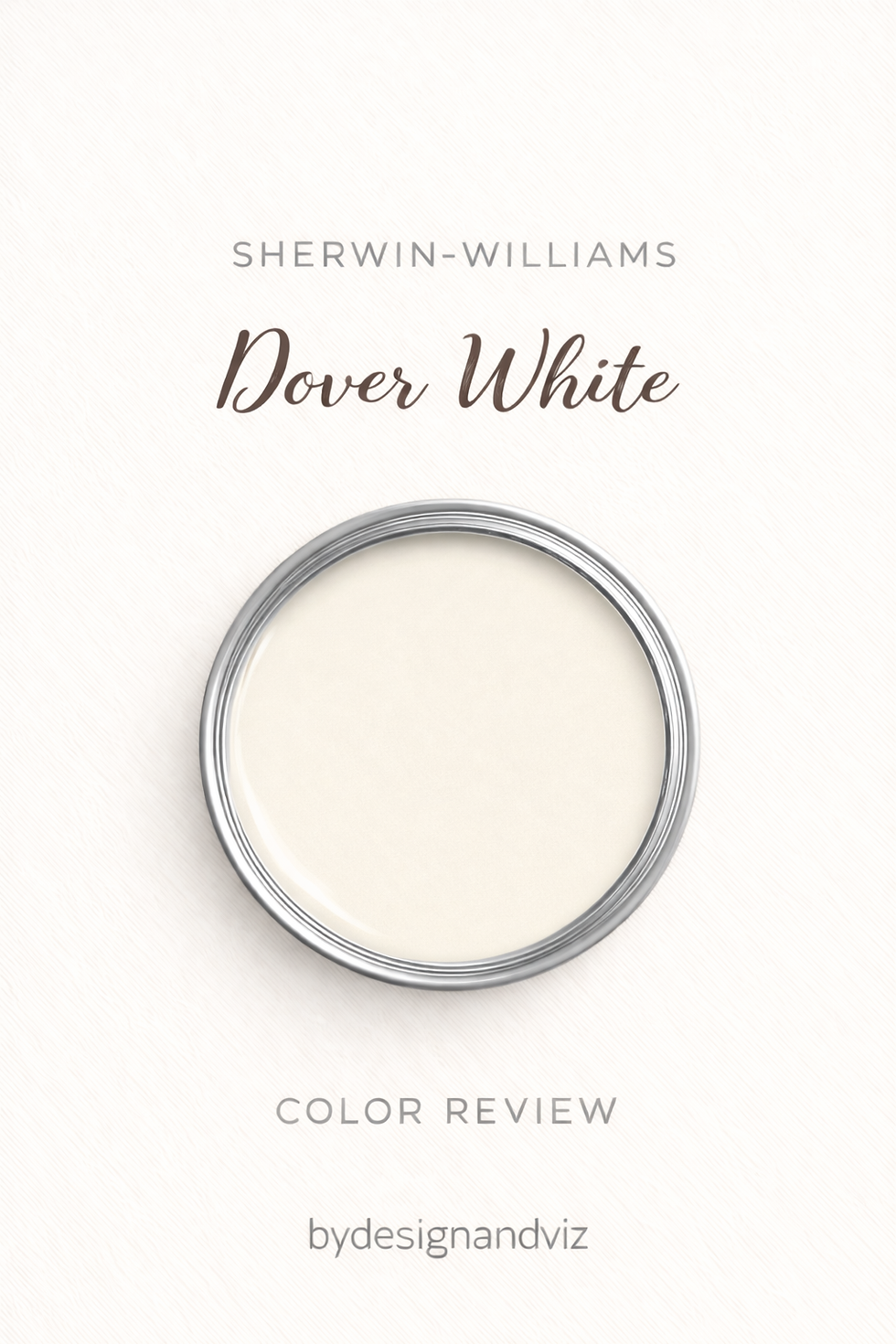
Dover White has an LRV of approximately 69, which puts it firmly in the bright, warm-white category. It reads as a clean off-white in most light, with just enough undertone to stop it feeling clinical. There is nothing ambiguous about it - this is a white that behaves like a white.
The undertone is warm, but it is careful about it. Where Creamy or Navajo White lean visibly yellow, Dover White holds that warmth back to a whisper. In north light it can pick up the faintest grey cast; in south light it stays crisp rather than warming into cream. It does not swing dramatically in either direction.
The practical upside is versatility. Dover White sits comfortably next to warm wood floors and next to cooler stone countertops without conflict, which is why it shows up so often as the safe, brightening choice in transitional kitchens and open-plan living spaces.
For readers weighing Dover White against a deeper, more grounded gray with the same undertone family, the Dover White vs Alabaster guide walks through how far a restrained warm white can be pushed before it needs a genuine warm neutral like Repose Gray instead.
Sherwin-Williams Repose Gray SW 7015 - What It Really Looks Like

Repose Gray has an LRV of approximately 58, which puts it solidly in the mid-tone range. It reads noticeably darker and more grounded than Dover White on the wall, closer to a true warm gray than an off-white. It is not trying to brighten a room. It is trying to give one weight.
The undertone is where it earns its reputation. Repose Gray carries a soft violet-grey base that is kept in check by enough warmth to avoid the cold, flat quality that plagues lesser warm grays. In changing light it shifts - sometimes reading closer to greige, sometimes closer to a true soft grey - without ever looking unresolved.
This adaptability is exactly why it is one of Sherwin-Williams' most specified neutrals. It holds its composure in rooms with mixed material temperatures, which is precisely where a color like Creamy or Dover White would need more careful handling.
For a closer look at how Repose Gray holds up against a lighter warm neutral in the same mixed-material rooms it is chosen for, the Repose Gray vs Accessible Beige guide breaks down which one reads truer against warm stone and which handles cool light better.
The Real Difference Between Dover White and Repose Gray

The simplest way to put it: Dover White is a value decision, Repose Gray is a mood decision. Dover White's entire job is to sit high on the LRV scale and behave like a brightening neutral white. Repose Gray sits eleven points lower and behaves like a genuine wall colour - one with grounded, deliberate presence.
That eleven-point LRV gap is the real story here, not the undertone. Dover White at 69 reflects a good deal of light and reads as white from across a room. Repose Gray at 58 reflects noticeably less, and the difference shows up the moment both are on a full wall rather than a paint chip - Repose Gray reads as a considered mid-tone neutral, not a shade of white with a name.
The two are rarely competing for the same wall. More often, Dover White handles the brightening work - trim, ceilings, a north-facing room that needs lightening - while Repose Gray does the grounding work on an island, an accent wall, or a room built for calm rather than brightness. For a closer look at how Dover White performs against a true warm white built for the same brightening role, the Dover White vs White Dove guide compares the two head-to-head across light direction and undertone.
Not sure which one is right for your room? A Color Direction consultation gets you a full custom palette built around your space - book yours here. |
When to Choose Dover White

Choose Dover White when the room needs light and the brief calls for warmth without weight. These are the conditions where it earns its place:
North or east-facing rooms that need brightening without going cold. Kitchens and bathrooms where a crisp, clean white is required but pure white feels too stark and clinical against the room's other finishes. Open-plan spaces where the wall colour needs to read consistently from the north-facing end to the south-facing end. Trim, ceilings, and millwork where a soft white is wanted but full-strength Pure White would feel jarring against warmer furnishings.
Avoid Dover White where you actually want the room to feel enclosed or moody - its whole purpose is to lighten, and it will fight a brief that calls for depth. Avoid it, too, in rooms already flooded with warm afternoon light, where its subtlety can simply disappear and read as plain white.
When to Choose Repose Gray

Choose Repose Gray when the room calls for grounded, sophisticated neutral rather than simple brightness. These are the situations where it outperforms Dover White:
Living rooms and primary bedrooms where the goal is calm, layered depth rather than a bright, airy feel. Kitchen islands and cabinetry paired with a white perimeter, where the contrast in value does the visual work. Open-plan spaces with mixed cool and warm materials, where a true warm gray settles disputes that a lighter white cannot. Exteriors and accent walls where a mid-tone neutral is wanted without committing to a stronger colour.
Avoid Repose Gray in small, low-light rooms where you specifically need brightness - its mid-tone value will read darker than expected once it is on four walls rather than a swatch. Avoid it, too, where the brief is explicitly for a bright, white-forward scheme; that is Dover White's job, not this one.
How the Pairings Differ

For Dover White on walls, Repose Gray earns its place on an island, a built-in, or a single accent wall rather than a full room. The value contrast between the two - bright white walls against a grounded mid-tone gray - is what makes the pairing work; using both at full wall coverage in the same open room tends to compete rather than complement.
For Repose Gray on walls, Pure White or Extra White on trim keeps the definition crisp without competing for attention. Repose Gray on both walls and trim, in a single tonal scheme, is increasingly popular in bedrooms where the goal is enveloping calm rather than contrast.
Both colours work with a wide range of floor tones, which is part of why they show up together so often. Dover White is the more forgiving of the two against cool-toned floors; Repose Gray performs best against warm or mid-toned wood, where its violet-grey undertone has something to settle against rather than fight.
For hardware, Dover White pairs easily with brushed nickel, matte black, or brass - its restrained undertone does not pick a fight with any of them. Repose Gray leans slightly more sophisticated with matte black and brushed nickel; warm brass can occasionally read at odds with its cooler violet undertone in low light.
Architect's Verdict - Dover White or Repose Gray?

For most homes - particularly rooms that need brightening, or open-plan spaces where the wall colour has to read consistently across zones - Dover White is the more forgiving choice. It does the quiet work of lifting a space without asking anything of the room around it.
Dover White is the right call when the brief is brightness - a north-facing kitchen that needs lightening, trim and millwork that need to stay soft rather than stark, an open-plan space where the colour has to hold steady from one end of the room to the other. It is the safer, more versatile pick.
Repose Gray is the right call when the brief is presence - a living room or primary bedroom that wants grounded, layered calm rather than airy brightness, or an island and cabinetry scheme that needs contrast against a white perimeter. It rewards rooms with good ambient light and settles less well into small, dim spaces.
The test I always use for this specific pairing: paint a large sample of Repose Gray on the darkest wall of the room - typically the one furthest from the window - and check it in flat afternoon light with no direct sun. If it still reads as a considered warm grey rather than going flat or muddy, it passes and the room can support it. If it goes dull, go with Dover White instead. Your worst light, not your best, is the one that matters here.
Frequently Asked Questions

Is Dover White warmer than Repose Gray?
Dover White carries a subtler, more restrained warmth, while Repose Gray's warmth is filtered through a soft violet-grey base. Neither is dramatically warm - Dover White reads as a gently warmed white, and Repose Gray reads as a warm grey rather than a warm white. They are warm in different registers, not different degrees.
Can I use Dover White and Repose Gray in the same house?
Yes, and it is a common, well-tested pairing. Dover White on walls and trim throughout the main living areas, with Repose Gray reserved for an island, an accent wall, or a powder room, gives a home brightness where it is needed and grounded contrast where it adds interest.
Which is better for kitchen cabinets?
It depends on the role. Dover White is the more practical choice for a full white kitchen with a light, airy brief. Repose Gray works best on an island or lower cabinetry paired with white uppers, where the value contrast between the two does the visual work. Always test both against your actual countertop before committing.
Does Repose Gray look purple?
It can, in certain artificial light. Repose Gray's violet-grey undertone is usually well restrained, but under cool LED lighting or in a very dim room it can occasionally read slightly cooler and closer to purple-grey than intended. Testing with a large sample under your actual evening lighting is the safest way to rule this out.
Which is better for a small, dark room?
Dover White is the safer choice for small or dark rooms. Its higher LRV keeps it reflecting light rather than absorbing it. Repose Gray's mid-tone value can make an already dim room feel smaller and heavier, which is why it performs best in rooms with reasonable ambient light to begin with.
What is the LRV difference between Dover White and Repose Gray?
Dover White has an LRV of approximately 69, and Repose Gray has an LRV of approximately 58 - an eleven-point gap. That is a meaningful difference in practice: Dover White reads as a true brightening white, while Repose Gray reads as a genuine mid-tone neutral wall colour, not a shade of white.
Final Thought
Dover White and Repose Gray are not really competing for the same job. The choice between them is less about which is the better neutral and more about what the room is asking for.
If the room needs light and a calm, brightening backdrop, Dover White will do that job without complaint. If the room needs grounded presence and a considered mid-tone neutral, Repose Gray delivers real character without tipping into a full colour statement. Buy sample pots of both, paint large patches on your darkest and brightest walls, and check them morning and evening. The room will tell you which one it needs within a day.
Want a complete colour scheme built around Dover White or Repose Gray? Our design packages cover full palette selection, finish recommendations, and 3D visualisations - see our packages. |
About the Author
Beril Yilmaz is a qualified architect and interior designer based in the UK. She runs BY Design And Viz, a design platform covering paint colour reviews, interior design guidance, and residential design projects. Beril has specified both Dover White and Repose Gray across residential projects in the UK and internationally - Dover White on trim, ceilings, and brightening north-facing rooms, Repose Gray on kitchen islands and accent walls where a room needs grounded presence, often specifying both together in the same scheme with Repose Gray anchoring a Dover White perimeter.




Comments