


Sanctuary vs Pure White: The Comparison That Actually Helps You Decide

These two rarely get compared, and that is exactly why the comparison is useful. Sherwin-Williams Sanctuary is a warm greige-beige with an LRV of 76, and Pure White is a soft true white with an LRV of 84 — an 8-point gap that is not small in practice. One is a neutral with body and depth. The other is a clean, versatile white. Put them on adjoining walls and the difference is immediate.
I have specified Sanctuary as a wall colour and Pure White as a trim, cabinet, and whole-house white on the same projects, and the pairing works precisely because they are not trying to do the same job. Sanctuary carries the room. Pure White defines the edges.
This guide covers the undertone difference, which rooms each one actually belongs in, and how to use them together without either one fighting the other.

At a Glance
| Sanctuary | Pure White |
Brand | Sherwin-Williams | Sherwin-Williams |
LRV | 76 - light, but with real body; reflects less than Pure White and reads as a neutral, not a white | 84 - very light and highly reflective; noticeably brighter than Sanctuary on the wall, not just on paper |
Colour category | Warm greige-beige - a neutral with presence, not a white in the conventional sense | Soft true white - warm enough to avoid feeling clinical, restrained enough to read as genuinely white |
Undertones | Warm orange-red undertone, muted and low-saturation - shows as a soft, sandy warmth rather than pink or yellow | The faintest warm-grey whisper, sometimes described as a wink of warmth - present but never visible as a colour in its own right |
Character | Grounded and enveloping; behaves like a wall colour with weight, not a backdrop white | Quiet and versatile; behaves like a backdrop, never competes with the room around it |
North-facing | Workable - the muted undertone holds its warmth without turning obviously orange in flat light | Reliable - the soft warmth keeps it from reading cold or blue in flat light |
South-facing | Rich - warm light draws out the sandy depth and the colour reads full and considered | Clean - stays crisp and bright without tipping warm or yellow |
Open-plan | Strong - reads as a settled neutral across zones rather than shifting between white and beige | Strong - reads consistently as white across zones regardless of light temperature |
On walls | Full-bodied warm neutral backdrop - reads as intentionally beige, not an off-white that missed | Soft, versatile white backdrop that recedes rather than asserts itself |
On cabinets | Best in warm, organic-modern kitchens with wood and stone; too much depth for a crisp all-white kitchen | The more practical choice for most kitchens - reads clean against both warm and cool stone |
Use together? | Yes - Pure White on trim against Sanctuary walls is the standard, well-tested pairing | Yes - Pure White on trim against Sanctuary walls is the classic pairing; Pure White walls with Sanctuary used sparingly elsewhere also works |
Trim for each | Pure White SW 7005 for clean definition, or Chantilly Lace for sharper contrast | Works as its own trim in most schemes, or Extra White for a cooler, higher-contrast edge |
Style fit | Organic modern, transitional, warm minimalist - rooms that want a neutral with depth | Traditional, transitional, coastal, contemporary - closer to universally usable than almost any other white in the range |
Architect's pick | When the brief calls for a warm neutral with genuine body, not another off-white | When the brief calls for a genuinely neutral white that will not fight any material or finish in the room |
Sherwin-Williams Sanctuary SW 9583 - What It Really Looks Like

Sanctuary has an LRV of 76, which puts it in the light-neutral category rather than the white category. It is a beige-greige with a muted orange-red undertone, and unlike a warm white, it does not try to read as white in any light. It commits to being a neutral. There is no ambiguity about what it is.
In natural daylight Sanctuary reads as a soft, sandy neutral with genuine depth - warmer than a true greige, quieter than a committed beige. It has body. Where a warm white like Alabaster or Pure White sits close to the wall in perception, Sanctuary sits back and fills the room. In evening light the undertone deepens further and the colour reads warm and settled rather than washed out.
The thing to understand about Sanctuary is that it is not a light-brightening colour. It reflects a reasonable amount of light for its LRV, but its job in a room is to add warmth and grounding, not to open up a dim space. Pair it with natural materials - oak, linen, warm stone - and it looks intentional. Pair it with anything stark or cool and the muted undertone reads as flat rather than warm.
Sherwin-Williams Pure White SW 7005 - What It Really Looks Like
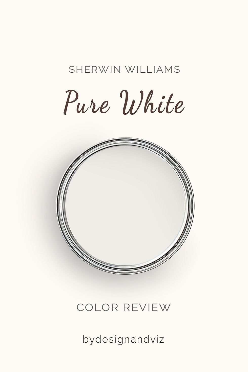
Pure White has an LRV of 84, roughly 8 points brighter than Sanctuary, and the difference shows on the wall, not just on the fan deck. Its undertone is famously restrained - a whisper of warm grey that keeps it from feeling stark, without ever announcing itself as a colour. It is one of the most dependable whites in the Sherwin-Williams range for exactly this reason.
In direct sunlight Pure White looks clean and soft rather than blinding. In lower or north-facing light it holds its warmth well enough to avoid the flat, slightly blue look that some whites take on. It does not hedge toward warm or cool - it simply reads as white, which is precisely what makes it so easy to place next to almost anything.
This restraint is also its limitation. Pure White does not carry a room the way Sanctuary does. It is a backdrop colour, built to disappear into trim, cabinetry, and whole-house schemes rather than to anchor a space on its own. Used as a wall colour it works everywhere, but it will never deliver the depth a warm neutral like Sanctuary provides.
The Real Difference Between Sanctuary and Pure White

The simplest way to put it: Sanctuary is a neutral with weight, and Pure White is a white with none. They are not two shades of the same idea the way most paired comparisons on this blog are - they are different tools for different jobs, which is exactly why they pair so well together.
The 8-point LRV gap between them is bigger than it looks on paper. On a fan deck, 76 and 84 can seem close. On adjoining walls in the same room, Pure White reads noticeably brighter and Sanctuary reads noticeably deeper - the gap is felt, not just measured.
Pure White on trim against Sanctuary walls is the standard, well-tested combination - the crisp trim gives the warm wall colour a clean edge to sit against, and the reverse pairing rarely gets used because Sanctuary reads too heavy for joinery. For the comparison of Sanctuary against a brighter, cooler competitor that shows just how differently a warm neutral and a near-white behave under the same light, the Sanctuary vs Chantilly Lace guide walks through the contrast in more detail and which rooms lean toward which colour.
Not sure which one is right for your room? A Color Direction consultation gets you a full custom palette built around your space - book yours here. |
When to Choose Sanctuary

Choose Sanctuary when the room needs a warm neutral with real depth, not another soft white. These are the conditions where it is the right answer:
Living rooms, primary bedrooms, and studies where the goal is a grounded, enveloping backdrop. Organic-modern or transitional interiors built around wood, linen, and stone rather than crisp finishes. Rooms with good natural light where a beige-greige can read warm rather than dull. Open-plan spaces where you want one settled neutral to carry every zone rather than a white that shifts between rooms.
Avoid Sanctuary in small, dim, north-facing rooms with limited natural light - its lower reflectance will read heavier and flatter than the LRV number suggests. Avoid it anywhere the brief specifically calls for brightness or a crisp, white backdrop; that is Pure White's job, not Sanctuary's.
When to Choose Pure White
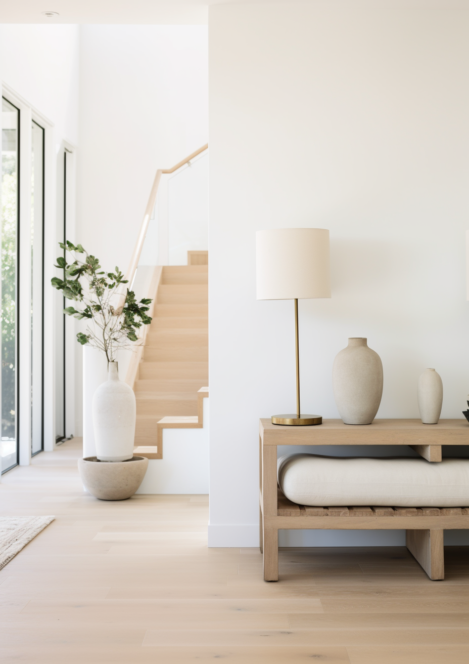
Choose Pure White when you want a genuinely neutral white that will not clash with anything else in the room. These are the situations where it outperforms Sanctuary:
Trim, doors, and cabinetry in almost any scheme, warm or cool. Whole-house colour schemes where consistency across rooms with different light exposures matters more than character. Kitchens with mixed warm and cool finishes, where a warmer neutral like Sanctuary would tip the balance toward beige. Any room where the brief is brightness and versatility rather than depth and warmth.
Pure White is also the more forgiving choice for anyone unsure which way a room's light will read a colour - its restraint means it rarely goes wrong. It is the safer default when in doubt.
How the Pairings Differ

For Sanctuary on walls, Pure White is the natural trim choice - the brightness step creates definition without introducing a cool contrast the warm undertone would fight. Extra White is an option where more contrast is wanted, though it reads slightly cooler against Sanctuary's warmth than Pure White does.
For Pure White on walls, it can act as its own trim colour in a monochromatic scheme, or be paired with Sanctuary as an accent wall or adjoining room for warmth without committing the whole space to a deeper neutral.
For flooring, Sanctuary wants warm wood or warm stone to support its undertone - cool grey flooring alongside Sanctuary walls creates a mismatch that is hard to resolve. Pure White is far more forgiving and sits comfortably against warm or cool floors alike.
For hardware, Sanctuary pairs best with warm metals - aged brass, warm bronze, matte black with a warm cast. Pure White is genuinely flexible here and works with brushed nickel, chrome, brass, or black without any of them looking out of place.
Architect's Verdict - Sanctuary or Pure White?

For most whole-house schemes, Pure White is the more reliable foundation - it works as trim, cabinetry, and even a wall colour without introducing risk, and it will not clash with whatever finishes come later.
Sanctuary is the right choice when a room specifically needs warmth and depth - a living room built around wood and linen, a primary bedroom meant to feel enveloping rather than airy, an open-plan space that wants one grounded neutral running through it. In the right light, Sanctuary gives a room a presence that no white in the range can match.
Pure White is the right choice everywhere else - trim, cabinets, whole-house consistency, and any room where the brief is brightness rather than character. It is the safer, more universal pick, and in a house with mixed finishes it is very hard to get wrong.
The test I always use for this pairing: paint a large sample of Sanctuary on the wall you are considering, then hold a Pure White trim sample against it in your dimmest north-facing corner - the worst-case light in the house. If Sanctuary still reads warm and settled rather than flat or muddy, and Pure White still reads clean against it rather than stark, you have your combination confirmed. Check again in evening lamplight before you commit to paint.
Frequently Asked Questions

Is Sanctuary warmer than Pure White?
Yes - Sanctuary has a more pronounced warm undertone and considerably lower LRV, which gives it more visible depth and warmth than Pure White. Pure White carries only the faintest hint of warmth, restrained enough that most people read it as a neutral white rather than a warm one.
Can I use Sanctuary and Pure White in the same room?
Yes, and it is a well-established pairing. Sanctuary on walls with Pure White on trim is the standard combination - the brightness step creates clean definition while the warm undertones stay compatible. They read as a considered pair rather than a mismatch.
Which is better for a whole-house colour scheme?
Pure White is the more practical choice for whole-house use. Its restraint means it holds up consistently across rooms with different light exposures. Sanctuary is best used selectively, in rooms where its depth is wanted, rather than as a single colour run through an entire home.
Does Sanctuary look beige or grey?
Both, depending on the light. Sanctuary's undertone is a muted orange-red, which reads as a soft, sandy beige in warm light and settles toward a quieter greige in cooler or lower light. It rarely tips fully into either category, which is part of its appeal as a neutral.
Which is better for a north-facing room?
Pure White handles a north-facing room more reliably than Sanctuary. Its lower reflectance means Sanctuary can read flatter and heavier in cool, indirect light, while Pure White's faint warmth keeps it from looking cold. If the room is genuinely dim, test both with a large sample before deciding.
What is the LRV difference between Sanctuary and Pure White?
Sanctuary has an LRV of approximately 76 and Pure White has an LRV of approximately 84 - an 8-point gap that is meaningful in practice. Pure White reflects noticeably more light, which is why it reads as a true white while Sanctuary reads as a neutral with depth.
Final Thought
Sanctuary and Pure White are not really competing for the same job. The choice between them is less about which one is better and more about what the room is asking for.
If the room wants warmth, depth, and a grounded neutral to build around, Sanctuary delivers it. If the room wants a reliable, versatile white that will not clash with anything, Pure White is the safer and more flexible choice. Used together, on walls and trim respectively, they are one of the more dependable pairings in the Sherwin-Williams range.
Want a complete colour scheme built around Sanctuary or Pure White? Our design packages cover full palette selection, finish recommendations, and 3D visualisations - see our packages. |
About the Author
Beril Yilmaz is a qualified architect and interior designer based in the UK. She runs BY Design And Viz, a design platform covering paint colour reviews, interior design guidance, and residential design projects. Beril has specified both Sanctuary and Pure White across residential projects in the UK and internationally - Sanctuary on walls in organic-modern living rooms and primary bedrooms built around wood and linen, Pure White on trim, doors, and cabinetry across nearly every scheme she designs, often specifying both together with Pure White carrying the joinery against Sanctuary's warmth.


Comments