


Sanctuary vs Chantilly Lace: The Comparison That Actually Helps You Decide

Sanctuary and Chantilly Lace end up on the same shortlist more often than their 16-point LRV gap should allow. Sanctuary is a warm, muted off-white that sits mid-range in reflectance. Chantilly Lace is one of the brightest, crispest whites Benjamin Moore makes. They are not close rivals fighting over the same wall. They are two different tools being asked to do two different jobs, and the confusion starts the moment someone searches "warm white" without specifying how warm or how white.
I have specified both across UK residential projects, often in the same house but never in the same role. Sanctuary anchors a room. Chantilly Lace opens one up. Once you understand what separates them, the choice stops being difficult.
This guide covers the undertone and LRV difference in detail, where each color performs best, and the specific light test that will tell you which one your room actually needs.

At a Glance
| Sanctuary | Chantilly Lace |
Brand | Sherwin-Williams | Benjamin Moore |
LRV | 76 - warm off-white, mid-range reflectance | 92 - one of the brightest whites available, near-maximum reflectance |
Colour category | Muted warm greige-beige - reads as quiet and grounded, never bright | True cool-neutral white - crisp, clean, almost no warmth to speak of |
Undertones | Soft beige with a grey-green cast - warmth is present but heavily restrained | Faint cool grey-blue - close to undertone-free, which is what makes it read as pure white |
Character | Sophisticated and enveloping; behaves like a warm neutral wall colour, not a white | Bright, expansive, and precise; behaves like a gallery white rather than a soft neutral |
North-facing | Workable - the grey cast keeps it from turning yellow, but it can read flat without warm accents | Reliable - the cool cast holds steady and never turns yellow or muddy |
South-facing | Excellent - the beige undertone deepens gently without tipping into cream | Can read slightly stark in direct sun - benefits from warm materials to soften the effect |
Open-plan | Moderate - reads consistently but visibly darker than any true white nearby | Strong - the high LRV keeps it consistent across every zone and every light condition |
On walls | Full-coverage warm neutral backdrop - grounds a room the way a wall colour is meant to | Bright, high-reflectance backdrop that maximises light rather than grounding a room |
On cabinets | Best on lower cabinetry or islands paired with a brighter white upper - too muted for full-kitchen coverage | Excellent - the standard choice for crisp white kitchens, bathrooms, and built-ins |
Use together? | Yes - Sanctuary on walls with Chantilly Lace on trim is a strong pairing; the reverse rarely works | Yes - Chantilly Lace on trim alongside Sanctuary walls is the classic pairing; both on walls together needs zoning |
Trim for each | Chantilly Lace OC-65 for genuine contrast, or Extra White SW 7006 for a closer-value step | Itself, for a seamless all-white scheme, or a slightly warmer white where full brightness feels too clinical |
Style fit | Transitional, organic modern, warm minimalist interiors | Modern, Scandinavian, coastal, and any interior built around maximising natural light |
Architect's pick | When the room needs a grounded, enveloping neutral rather than a bright backdrop | When the brief calls for maximum brightness and a genuinely neutral, undertone-free white |
Sherwin-Williams Sanctuary SW 9583 - What It Really Looks Like

Sanctuary has an LRV of 76, which puts it in the mid-range off-white category rather than the bright-white category most comparisons assume it belongs to. It is warm, but the warmth is filtered through a soft grey-green cast that keeps it from ever reading as cream or beige in the obvious way.
The undertone is the whole story here. Sourced from Sherwin-Williams' Designer Color Collection, Sanctuary was built to sit between a true neutral and a warm off-white without committing fully to either. It does not hedge toward brightness. In low light it can look almost taupe; in strong daylight it settles into a soft, sophisticated beige-grey.
Sanctuary pairs naturally within its own warm-neutral family - for how it holds up against Sherwin-Williams' most popular warm off-white, Sanctuary vs Alabaster guide breaks down the six-point LRV gap and which one wins in mixed light.
Benjamin Moore Chantilly Lace OC-65 - What It Really Looks Like

Chantilly Lace has an LRV of 92, making it one of the highest-reflectance whites on the market. There is nothing ambiguous about it. It is a true white with almost no undertone to speak of - just a faint cool cast that keeps it from reading warm under any lighting condition.
It behaves like a precision tool, not a mood. Because the undertone is so restrained, Chantilly Lace does not shift character the way warmer whites do across a day. Morning, midday, and evening light all read it roughly the same way - bright, clean, and slightly cool. That consistency is the entire appeal.
For how Chantilly Lace performs against Sherwin-Williams' most-discussed off-white alternative, Alabaster vs Chantilly Lace guide covers the undertone gap and which one holds up better in a north-facing room.
The Real Difference Between Sanctuary and Chantilly Lace

The simplest way to put it: Sanctuary is a warm neutral wall colour. Chantilly Lace is a bright, cool-neutral true white. They are not shades of the same idea - they solve different problems.
The 16-point LRV gap is the real story here, not a footnote. Sanctuary reflects light in the mid-70s and reads as a genuine neutral with body and depth. Chantilly Lace sits in the low 90s and reads as close to pure white as most people ever paint a wall. Side by side, the gap is not subtle - it is the difference between a wall colour and a trim colour.
This is exactly why they work so well together and so poorly as competitors. Sanctuary on walls with Chantilly Lace on trim and ceiling is a well-established pairing - the LRV gap that makes them unsuitable as alternatives is precisely what makes the contrast between them read as clean and intentional. For a related Sanctuary pairing built around the same warm-neutral logic, the Sanctuary vs Shoji White guide covers how Sanctuary performs against a lighter, more restrained warm neutral - useful if Chantilly Lace ultimately proves too bright for your room.
Not sure which one works for your room? A colour consultation is included in all our design packages - book directly here. |
When to Choose Sanctuary

Choose Sanctuary when the room needs to feel grounded rather than bright. These are the conditions where it performs best:
South or west-facing rooms with strong natural light, where the muted undertone has room to breathe without looking flat. Living rooms, primary bedrooms, and studies where the goal is calm rather than airy. Homes with warm wood floors, natural stone, or linen and wool textiles, where Sanctuary's grounded warmth reads as considered rather than dark.
Avoid Sanctuary in small, north-facing rooms with limited light - the mid-range LRV can pull the space toward grey rather than warm. Avoid it anywhere the brief calls for a bright, expansive white, since at LRV 76 it will never read as one next to true whites in the same house.
When to Choose Chantilly Lace

Choose Chantilly Lace when the brief is brightness, not warmth. These are the situations where it outperforms Sanctuary:
North-facing rooms that need every available lumen of reflected light. Kitchens and bathrooms where a crisp, undertone-free white is the standard expectation. Open-plan spaces where consistency across zones matters more than character. Modern and Scandinavian interiors where the goal is airy and expansive rather than enveloping.
Avoid Chantilly Lace where the brief calls for warmth or a grounded, cosy feel - at LRV 92 it will always read as bright and slightly cool, never as a soft neutral. In rooms with cool-toned materials throughout, it can start to feel clinical without warm textiles to balance it.
How the Pairings Differ
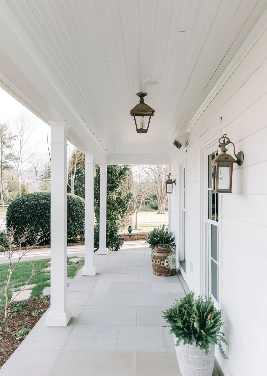
For Sanctuary on walls, Chantilly Lace on trim is the strongest pairing available - the 16-point LRV gap creates crisp, confident definition without any undertone conflict, since Sanctuary's grey-beige cast and Chantilly Lace's near-neutral cool cast do not fight each other.
For Chantilly Lace on walls, pairing with Sanctuary works best as an accent or lower-cabinet colour rather than trim - using Sanctuary as trim against Chantilly Lace walls inverts the usual brightness hierarchy and can look muddy rather than defined.
Sanctuary is more forgiving of cool-toned flooring than most warm neutrals, since its own undertone is already restrained by grey. Chantilly Lace works with virtually any floor tone precisely because it carries so little undertone of its own - warm wood, cool stone, and pale oak all sit comfortably beneath it.
Sanctuary suits aged brass, bronze, and warm black hardware, which reinforces its grounded character. Chantilly Lace is the more versatile of the two here - it reads cleanly against brushed nickel, matte black, unlacquered brass, and polished chrome without any of them clashing.
Architect's Verdict - Sanctuary or Chantilly Lace?

For most homes, the choice is not really Sanctuary or Chantilly Lace - it is where each one belongs.
Choose Sanctuary for rooms that need to feel grounded and enveloping - living rooms, primary bedrooms, and studies where a soft, warm-neutral backdrop supports the rest of the design rather than competing with it. It is the better choice whenever the brief includes the word "cosy" or "warm" in any form.
Choose Chantilly Lace for rooms that need to feel bright, expansive, and precise - kitchens, bathrooms, north-facing spaces starved of light, and any interior where the goal is to maximise reflected brightness. It is the better choice whenever the brief includes the word "crisp" or "clean."
The worst-case test for this pairing is a north-facing room with limited natural light. Buy sample pots of both, paint two large patches on the same wall, and check them at 8am and again at 4pm with the lights off. If Sanctuary still reads as a usable warm neutral rather than flat grey in that low morning light, it can carry the room on its own. If it looks muddy or dim, Chantilly Lace is the one that will actually make the space feel finished - and Sanctuary is better saved for a room with more light to work with.
Frequently Asked Questions

Is Sanctuary warmer than Chantilly Lace?
Yes - significantly. Sanctuary has a soft beige-grey undertone and a mid-range LRV of 76, giving it real warmth and body. Chantilly Lace has an LRV of 92 and almost no undertone at all, which is what makes it read as a true, cool-leaning white rather than a warm one.
Can I use Sanctuary and Chantilly Lace in the same house?
Yes, and it is one of the more reliable pairings available. Sanctuary on walls with Chantilly Lace on trim and ceilings creates clean, confident contrast without undertone conflict, precisely because the two colors are so far apart in LRV and character.
Which is better for a kitchen?
Chantilly Lace is the more practical choice for most kitchens. Its high LRV and near-neutral undertone make it the standard for crisp cabinetry and backsplashes. Sanctuary works well on an island or lower cabinets for contrast, but rarely as the sole kitchen color.
Does Sanctuary look grey or beige?
Both, depending on the light. In warm natural light Sanctuary leans beige. In cooler or lower light it can shift toward grey. This dual quality is what makes it read as sophisticated rather than simply warm or simply neutral - but it also means it should always be tested in your actual room before committing.
Which is better for a north-facing room?
Chantilly Lace handles north-facing rooms more reliably. Its high LRV and restrained undertone keep it bright and consistent even without warm direct light. Sanctuary can work in a north-facing room with strong artificial lighting and warm materials, but it needs more support to avoid reading flat.
What is the LRV difference between Sanctuary and Chantilly Lace?
Sanctuary has an LRV of approximately 76 and Chantilly Lace has an LRV of approximately 92 - a 16-point gap. That is a substantial difference in practice: Chantilly Lace reflects noticeably more light and reads as a true white, while Sanctuary reads as a genuine warm neutral with visible depth.
Final Thought
Sanctuary and Chantilly Lace are not competing for the same wall - and that is the point. The 16-point LRV gap and the opposite undertone directions mean this comparison is less about picking a winner and more about understanding which job each color is built to do.
If your room needs warmth, depth, and a grounded feel, Sanctuary is the right tool. If your room needs brightness, consistency, and a crisp cool-neutral finish, Chantilly Lace is the right tool. Used together - Sanctuary on walls, Chantilly Lace on trim - they do their best work as a pair rather than as alternatives.
Want a complete colour scheme built around Sanctuary or Chantilly Lace? Our design packages cover full palette selection, finish recommendations, and 3D visualisations - see our packages. |
About the Author
Beril Yilmaz is a qualified architect and interior designer based in the UK. She runs BY Design And Viz, a design platform covering paint colour reviews, interior design guidance, and residential design projects. Beril has specified both Sanctuary and Chantilly Lace across residential projects in the UK and internationally - Sanctuary in living rooms and primary bedrooms where a grounded, warm-neutral backdrop was the brief, Chantilly Lace in kitchens and north-facing spaces needing maximum brightness, often specifying both together in the same scheme with Chantilly Lace on trim.


Comments