Sherwin Williams Accessible Beige: What I Really Think of This Neutral as an Architect
- Beril Yilmaz

- Feb 25
- 6 min read
Updated: May 15
If you’ve spent any time at all looking for the "perfect" neutral, you have undoubtedly run into Sherwin Williams Accessible Beige (SW 7036). It is a legendary shade that has stood the test of time, gaining a cult following among homeowners and designers alike.
In my studio, I often call it the "peacemaker." It’s the shade I suggest when a couple is stuck between a cold, modern grey and a traditional, dated beige. It’s safe, it’s inviting, and it’s incredibly versatile—but as an architect, I know that even the most "accessible" paint has its secrets. I’ve seen it look like a designer dream in a sun-drenched living room, and I’ve seen it look like wet cement in a dark hallway.
This guide is exactly what I would tell you if we were sitting down for a consultation. No marketing fluff—just the honest, professional advice on how to actually make this color work in your real-life home.
Decoding the Undertones: Why It’s Not Just "Beige"

The biggest mistake people make is assuming Accessible Beige is just a light tan. It’s actually a complex "greige" with a very specific DNA.
With an LRV (Light Reflectance Value) of 58, it sits in that perfect middle ground—it’s light enough to keep a room feeling open, but has enough "weight" to provide a crisp contrast against white trim.
In my professional experience, you need to watch for two things:
The Grey Base: This is what keeps the color from looking yellow or "builder-grade."
The Hidden Green/Taupe: This is the secret sauce. Depending on your lighting, you may see a tiny hint of green or even a very subtle taupe. This makes the color feel organic and "stony" rather than synthetic.
For the full cross-brand comparison of Accessible Beige against Benjamin Moore's most popular light warm greige - the Accessible Beige vs Pale Oak guide covers exactly how the LRV gap and undertone difference play out on a wall and which one suits your room.
The Lighting Warning I Give Every Client

Just like I mentioned in my review of Shoji White, lighting is the most important factor when choosing a neutral. Accessible Beige is a total chameleon.
South-Facing Rooms: This is where the magic happens. The warm, golden light brings out the beige tones, making the room feel like it’s glowing.
North-Facing Rooms: Here is my designer warning. North light is cool and blue. It can "cancel out" the warmth of Accessible Beige, making it look a bit flat or even slightly "muddy." If your room is naturally dark, you must be intentional with warm artificial lighting to keep it from looking dingy.
For the full comparison of Accessible Beige against Alabaster as competing wall colors - and the full explanation of why Alabaster is the most natural trim choice for Accessible Beige walls - the Alabaster vs Accessible Beige guide covers every condition and a clear verdict.
Where to Use Sherwin Williams Accessible Beige (And Where to Avoid It)
I’ve used this color in almost every corner of a home, but some applications are more successful than others:
Open Floor Plans (The MVP): It is the ultimate "flow" color. It connects a kitchen to a living area effortlessly.
Kitchen Cabinetry: If you’re over white but aren't ready for a bold color, Accessible Beige on cabinets is stunning. Pair it with unlacquered brass hardware for a high-end look.
Living Rooms & Bedrooms: It creates a "hotel-at-home" vibe. However, avoid it in tiny, windowless powder rooms unless you want a very moody, enclosed feel—it needs natural light to really breathe.
My Specific Recommendations for Color Pairings

Accessible Beige is a team player, but it’s picky about its teammates. Get the trim wrong, and the whole room feels "off."
The Best Trim Colors
SW Alabaster: This is my absolute favorite pairing. It’s a soft, creamy white that shares the same warmth.
SW Pure White: If you want something a bit cleaner and more modern, this is the one.
The Best Accent Colors
SW Urbane Bronze: For a fireplace or a front door, this deep, earthy bronze looks incredible against Accessible Beige.
SW Sea Salt: For a bathroom, this muted green-blue brings out the organic side of the beige.
Tired of guessing which furniture finishes will actually match your new paint? Our Elite Design Package starts from £180 and includes a personalized moodboard with your exact Accessible Beige paint picks and furniture pairings.
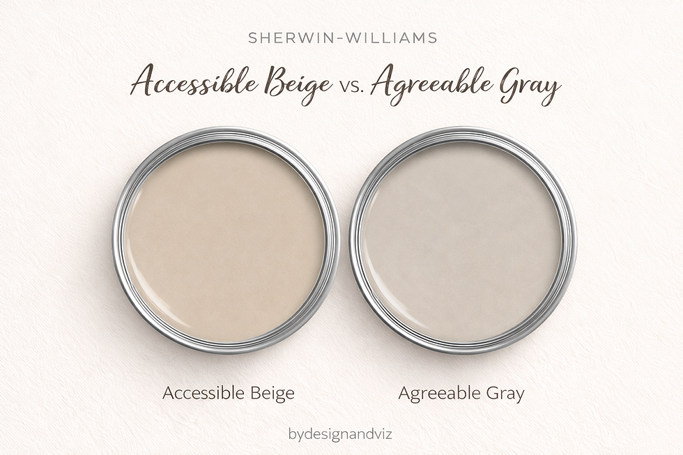
For a full head-to-head comparison between Accessible Beige and Agreeable Gray -- including undertone analysis, room-by-room breakdown, and a clear verdict -- the Accessible Beige vs Agreeable Gray guide covers everything.
Accessible Beige vs. Similar Colors: How to Choose?
Clients always ask: "Should I just use Agreeable Gray?" Here is my breakdown:
Accessible Beige vs. Agreeable Gray: Agreeable Gray is cooler. It’s a grey that’s been warmed up. Accessible Beige is warmer—it’s a beige that’s been toned down. If you have warm wood floors, stick with Accessible Beige.
Accessible Beige vs. Balanced Beige: Balanced Beige is the next step up. It's darker and more saturated. If Accessible Beige feels too "washed out" in your bright room, go for Balanced Beige.
Pros and Cons of Using Accessible Beige

The Pros:
It’s incredibly versatile and works with almost any decor style.
It masks small scuffs and dust better than pure white.
It provides a sophisticated, "expensive" backdrop for your furniture.
The Cons:
It can look "drab" or "muddy" in rooms with poor natural light.
The green undertone can be tricky to manage if you have a lot of red-toned wood.
The Mistakes I See Most Often

Pairing with Icy White: Never use a cool, blue-toned white on your trim with this color. It will make Accessible Beige look like it’s dirty.
Ignoring the Ceiling: People often paint the ceiling a "flat white" out of habit. This creates a harsh line. I usually suggest painting the ceiling in a soft white like Alabaster to keep the warmth consistent.
FAQs About Accessible Beige Sherwin Williams
Is Sherwin Williams Accessible Beige warm or cool?
It is a warm neutral. While the "greige" label implies a mix, the soul of this color is a soft, stony tan.
Should I use Agreeable Gray or Accessible Beige?
This is the question I get most often. If your home has cool lighting or blue/gray furniture, choose Agreeable Gray. If you have warm wood floors or want a "cozier" feel, I always recommend Accessible Beige.
What trim and ceiling colors go with Accessible Beige?
I advise my clients to avoid "icy" whites. I personally pair it with SW Alabaster or SW Pure White. For the ceiling, use the same white as your trim to keep the architectural lines clean.
Is beige going out of style for 2026?
Not at all. We are moving away from "flat" beiges and toward "organic neutrals" like Accessible Beige that add depth and make a house look expensive.
What is a lighter version of Accessible Beige?
If you love the tone but it feels too dark for your space, look at SW City Loft or SW Gossamer Veil. They offer a similar "greige" balance with a higher LRV (more light reflectance).
Should baseboards be lighter or darker than the walls?
As a general rule, I prefer baseboards that are lighter than the walls (like a crisp white) to provide a frame for the room. However, for a modern, "color-drenched" look, I sometimes specify the trim in the same color as the walls but in a higher sheen.
Final Thoughts
Sherwin Williams Accessible Beige is a timeless, elegant paint color that can truly transform a home. It’s the perfect backdrop for a life well-lived—allowing your furniture and your family photos to be the stars of the show.
The secret is simple: Sample, sample, sample. Don't rely on a tiny card. Paint a large swatch and watch it move through the day.
If you’re still not sure where to start, that’s exactly what I’m here for.
Ready to stop the paint-store overwhelm and finalize your home's look? Book a free 30-minute designer call and I'll help you choose the right shade, palette, and approach for your specific space—no guesswork, no regrets.
About the Author
Beril Yilmaz is an architect and interior designer and the founder of BY Design And Viz. She specialises in online interior and exterior design with photorealistic 3D visualisation, helping homeowners across the UK and US create beautiful, considered spaces. With a background in architecture, her approach is always practical, personal, and grounded in how people actually live.


Comments