


Sherwin-Williams Evergreen Fog SW 9130 - An Architect's Honest Review

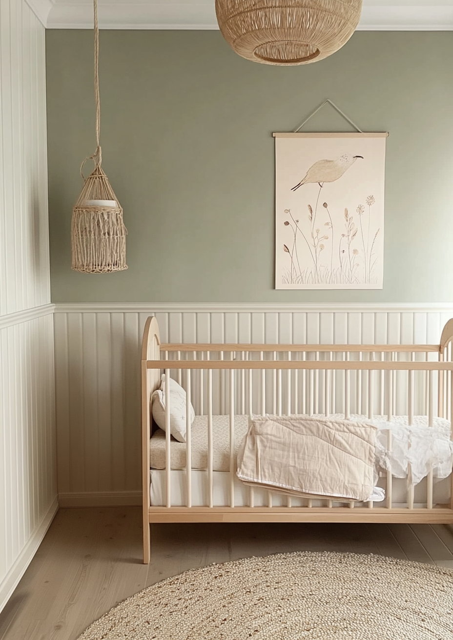
Sherwin-Williams Evergreen Fog SW 9130 is a green that behaves like a neutral, and that mismatch is the source of nearly every disappointment with it. On the chip it looks like sage. On the wall it often reads as a soft grey with a green suggestion, and the balance between the two changes with the light, the time of day, and whatever is standing next to it. I have specified it in bedrooms and on joinery where a client wanted colour without a statement, and the rooms that worked all had one thing in common: they gave the paint something to react against.
The colour has a grey-green undertone that sits on the line between warm and cool, and published reviews genuinely disagree about which side it falls on - some call it a warm green cooled by grey, others a neutral that leans cool. That disagreement is accurate rather than sloppy. At LRV 30 it is a true mid-tone, deep enough to feel like a colour decision and light enough that it will not swallow a well-lit room.
This review covers how the undertone behaves, what LRV 30 means in practice, how orientation and artificial lighting change it, which whites and neighbours sit well beside it, how it performs from bedroom accent walls to exteriors, and an honest assessment of who should and should not choose it.
Evergreen Fog SW 9130 - The Key Facts
Collection | Sherwin-Williams green family - rated for interior and exterior use |
LRV | ~30 (mid-tone - holds its colour in bright rooms, reads heavy in dim ones) |
Undertone | Grey-green - balanced between warm and cool, drifting grey in cool light and greener in warm light |
Character | Muted sage, organic, calm, quietly versatile |
Best trim | Pure White SW 7005 or Alabaster SW 7008 |
Best orientation | South or west-facing - warm light keeps the green alive |
Main risk | In north-facing or dim rooms it sinks toward a flat, heavy grey - and next to icy blue-leaning whites it turns cold |
Evergreen Fog Undertones - What Is Actually Going On

Evergreen Fog is a grey-green, not a green with grey added - the distinction matters. The grey is the dominant character and the green is the quiet tint on top of it, which is why the colour reads as muted and organic rather than leafy. Sherwin-Williams lists it in its green family, yet its pigment load is low enough that on a large wall it behaves much more like a soft sage-grey.
The warm-versus-cool question has no single answer because the colour is balanced. In warm light the yellow in the green comes forward and the wall reads as a gentle sage; in cool light the grey takes over and it reads flatter and more mineral. If your brief is a green that feels softer and more neutral than a clear sage, this is the appeal. For a lighter, fresher and more obviously green alternative, the Benjamin Moore Saybrook Sage review explains where that colour sits by comparison.
Where the undertone causes trouble is in rooms with a strong competing colour - red-toned cherry wood, pink-leaning beiges, or anything with a clear warm cast that Evergreen Fog can contrast against. Next to those surfaces the green becomes more noticeable and the wall can look more saturated than the sample did. The paint has not changed; the neighbouring material has pushed it.
LRV - What 30 Means in a Real Room
At LRV 30, Evergreen Fog is a mid-tone - Sherwin-Williams records it at just over 30, so I treat 30 as the working figure. That puts it well below the light neutrals most people shortlist alongside it: Accessible Beige sits at 58, Agreeable Gray at 60, and Alabaster at 82. The gap is what makes Evergreen Fog feel like a deliberate colour rather than a backdrop.
In practical terms, an LRV of 30 means the wall holds its colour in a bright room instead of washing out, which is a real advantage in south-facing spaces with strong sun. It also means a small, north-facing or poorly lit room will absorb light and feel closer and heavier than the chip suggested. I would not choose it as an all-walls colour for a dim room without adding lighting first.
LRV also explains why it works so well as an accent or joinery colour. Against a white or pale neighbour at LRV 58 or above, it creates clear definition without the severity of a dark colour. If you are weighing it against a light neutral for the main walls, the Sherwin-Williams Agreeable Gray review shows what a 30-point lighter, warmer partner looks like.
How Evergreen Fog Behaves in Different Light

South-Facing Rooms
South-facing rooms are where Evergreen Fog is most reliably itself - a muted, slightly warm sage with real depth. Strong, warm light lifts the green and keeps the mid-tone from looking dull. Because the LRV is 30, the colour also holds up against the brightness rather than bleaching out.
In my experience this is the orientation where an all-walls application is safest. Pair it with natural textiles and pale wood, and the room feels settled and calm without tipping into either grey or olive.
North-Facing Rooms
North-facing rooms are where Evergreen Fog asks for the most care. Cool, indirect light pulls the colour toward grey and makes it look darker and heavier than it did in the shop. The green nearly disappears and what remains can read as a flat, slightly gloomy mid-grey.
If you want it in a north-facing room, treat it as an accent wall or a cabinet colour instead of covering every surface. Keep the bulbs warm, bring in warm wood and linen, and keep a lighter neutral on the remaining walls so the room still has somewhere to bounce light. A full-room commitment in this orientation is the most common way I see the colour go wrong.
East and West-Facing Rooms
East and west-facing rooms show Evergreen Fog at its most changeable. In the cooler, shadowy part of the day it leans grey; when low warm sun arrives it swings noticeably toward green. West-facing rooms show this most dramatically, with the late-afternoon warmth giving the colour its richest appearance.
That shift is a feature if you enjoy a wall that moves through the day, and a problem if you want it to look identical at all hours. For a bedroom used mostly in the evening, a west-facing orientation is a strong match. For a room used at all hours, observe a large sample at morning, midday and dusk before committing.
For how Evergreen Fog compares to Saybrook Sage - the lighter Benjamin Moore sage that reads softer and more open at an LRV of 45 - the Saybrook Sage vs Evergreen Fog guide explains which one suits walls, which suits cabinets, and how to use both in the same scheme.
Artificial Lighting
Bulb temperature changes this colour more than most mid-tones. Warm bulbs around 2700K bring out the green and soften the grey, which is the version most people fall in love with. Cool or daylight bulbs push it toward a flat, slightly institutional grey-green.
I specify warm-spectrum lighting in every room where Evergreen Fog is used on more than a single wall, and I check the bulbs before the paint goes on rather than after. If a client wants cool, bright task lighting throughout, I steer them to a lighter, warmer neutral instead.
Trim Colours and What to Pair With Evergreen Fog

Trim - What White Goes With Evergreen Fog
The best white for Evergreen Fog is a soft, clean white rather than a cream or an icy one. Pure White SW 7005 (LRV 84) is the trim I reach for first: it has very little undertone, so it frames the wall without adding a competing temperature. Against a mid-tone like this it reads crisp but not harsh.
Alabaster SW 7008 (LRV 82) is the better choice when you want a gentler, tonal look. Its creamy yellow-beige warmth sits comfortably beside the green and softens the contrast, which suits a bedroom or a traditional room. The full set of palettes that work with it is in the Sherwin-Williams Alabaster coordinating colors guide, which is the right next stop if you are choosing between creamy whites.
Be cautious with very bright, blue-leaning whites. They make Evergreen Fog look cooler and greyer by contrast, and the combination can feel clinical rather than calm.
Floor Materials
Warm wood is the most flattering floor material for Evergreen Fog. Oak in natural and mid-honey tones supplies exactly the warmth the grey-green needs, and the pairing looks organic and unforced. Pale limed and washed floors also work, giving a softer, more Scandinavian version of the same scheme.
The caution is red-toned wood such as cherry or mahogany. The red pushes against the green and strengthens it, so the wall can look more saturated than intended. If you have those floors, sample the colour beside them in the actual room before deciding.
Metal Finishes
Brass and aged gold are the most natural metals for Evergreen Fog. Their warmth lifts the green and gives the muted wall a bit of glow, particularly on cabinet hardware and lighting. Matte black is the other strong option, adding a crisp graphic edge against the soft mid-tone.
Polished chrome and brushed nickel can work, but they push the scheme cooler and lean into the grey side of the colour. I would reserve them for rooms with strong warm light and plenty of wood.
Accent Colours
The easiest companions for Evergreen Fog are warm, soft neutrals. Creamy whites, warm greiges and beiges give the green a quiet counterweight, and the combination reads as calm and layered rather than coloured. Terracotta and other earthy tones can work too, though they are bolder and the green can feel cooler beside them.
For a layered neutral scheme, the Sherwin-Williams Accessible Beige review is a useful partner: its grey base and faint green flicker echo Evergreen Fog without competing with it. Keep the accent palette restrained, because this colour looks best when it is the only strong note in the room.
Evergreen Fog Room by Room

Bedrooms
Bedrooms are where an Evergreen Fog accent wall works best. Behind the bed, the mid-tone creates a soft focal point with real depth, and the muted green is restful in a way a clear colour is not. In my experience it needs a lighter neutral on the other walls so the room does not feel enclosed.
Warm bedside lighting and natural linen bedding complete the effect. If the room is north-facing, keep it to the single wall and lift the remaining walls with a light, warm neutral.
Living Rooms
Living rooms suit Evergreen Fog when the scheme is organic and warm. On all four walls in a south or west-facing room with natural wood, linen and brass, it creates a grounded, settled atmosphere. On a feature wall or built-in shelving it adds depth without overwhelming a smaller room.
In a room with limited daylight, I would use it on shelving or a single wall and keep the ceiling and remaining walls light. That keeps the colour present while preventing the space from feeling smaller than it is.
Kitchens
Evergreen Fog is a strong choice for kitchen cabinets. The mid-tone hides everyday marks better than a pale colour and reads softer than a deep green, so it feels modern without being dramatic. White or pale quartz worktops, warm wood and brass or black hardware all suit it.
Check it against the worktop and splashback in the real kitchen, because the green shows more against warm stone and less against cool white. Under warm under-cabinet lighting it looks at its best.
Home Offices and Studies
Home offices and studies are a natural fit for Evergreen Fog. The muted green is calm enough to support focus and the mid-tone gives the room a considered, enclosed feel. On all four walls with warm wood furniture and a brass lamp, it makes a restrained, professional workspace.
Because offices often have cool task lighting, switch to warm bulbs in the room before judging the colour. Under cool light it can look flat, and that is usually a lighting problem rather than a paint problem.
Exteriors
Evergreen Fog is rated by Sherwin-Williams for exterior use, and it is a good body colour for a house in a green setting. In daylight the mid-tone grey-green sits quietly against planting and reads as natural rather than painted. Outdoor light is brighter than indoor light, so the colour often looks lighter and a touch greener than it does on a wall.
For an exterior palette I would use Pure White on trim for a crisp edge, and keep metalwork dark or warm, such as black or aged bronze. Sample on the actual elevation and look at it in both direct sun and shade, since the difference between the two is larger than on an interior wall.
Who Evergreen Fog Is Right For - And Who It Is Not
Evergreen Fog is right for you if:
You want a green that reads as a soft neutral - Evergreen Fog gives you colour without the saturation of a clear sage or forest green. It suits people who find true greens too bold and want something that fades into the background of a calm interior.
The room is south or west-facing with warm natural light - this is where the grey-green is most balanced and the mid-tone holds its depth. The warmth keeps the green present, so the wall never collapses into flat grey.
Your materials are organic and warm - natural wood, linen, brass, and creamy whites all support Evergreen Fog. These finishes supply the warmth that balances the grey and make the scheme feel layered rather than cold.
You plan to use it as an accent wall, cabinet, or exterior colour - at LRV 30 it gives clear definition against pale neighbours. That is where it looks most intentional and where its muted character is a strength rather than a risk.
Evergreen Fog is not right for you if:
The room is small, dim, or north-facing and you want it on every wall - LRV 30 absorbs light and the grey side of the colour takes over. The room can end up feeling closer and heavier than you intended, and the green you chose it for will be hard to find.
You want a light, airy green - Evergreen Fog is a mid-tone, so it will never feel fresh or bright. If that is the brief, a lighter sage is the better answer and the Benjamin Moore Saybrook Sage review is a good starting point.
Your palette relies on cool, icy whites or red-toned wood - icy whites make the colour look colder and greyer, and cherry or mahogany makes the green look stronger. In either case the wall will read as a clash rather than a deliberate pairing.
You are not willing to test it in your own room - this colour changes more between a chip and a wall than most. A large sample, observed in morning, midday and evening, is the only reliable way to know which version of Evergreen Fog you will actually get.
How Evergreen Fog Compares to Similar Colours

vs Saybrook Sage HC-114 (Benjamin Moore) - Saybrook Sage has an LRV of about 45, roughly 15 points lighter than Evergreen Fog, and Benjamin Moore describes it as a soft aloe green cooled with a splash of grey. It reads fresher, lighter and more obviously green, while Evergreen Fog is deeper, greyer and more mineral. Choose Saybrook Sage for a gentle, airy room and Evergreen Fog when you want body and a more neutral character. The full colour profile is in the Benjamin Moore Saybrook Sage review.
vs Agreeable Gray SW 7029 - Agreeable Gray is a warm greige with an LRV of 60, so it is about 30 points lighter than Evergreen Fog and has no clear green in its character. It works as the main-wall neighbour to an Evergreen Fog accent, because the warm greige sits comfortably beside the muted green. Its occasional faint green flicker also echoes the green in Evergreen Fog, which helps the two feel related. See the Sherwin-Williams Agreeable Gray review for how it behaves on its own.
vs Accessible Beige SW 7036 - Accessible Beige has an LRV of 58 and a warm beige base over a muted grey, with only the faintest green hint. It is a more traditional, cosier neutral than Evergreen Fog, and they pair naturally as a wall-and-joinery scheme in the same warm, earthy family. Pick Accessible Beige for the larger surfaces and use Evergreen Fog where you want depth.
vs Alabaster SW 7008 - Alabaster is a creamy white at LRV 82, over 50 points lighter than Evergreen Fog, with a soft yellow-beige warmth. The two are not alternatives but partners: Alabaster is a gentle trim, ceiling or adjacent-wall colour that frames the mid-tone without hard contrast. Use it when you want a soft, tonal scheme rather than the crisper edge of Pure White.
Frequently Asked Questions
Is Evergreen Fog warm or cool?
Evergreen Fog is balanced, and it behaves differently depending on the room. Reviews describe it as everything from a warm green cooled by grey to a neutral that leans cool, which reflects how much it shifts with light. In warm light the green comes forward; in cool or north light the grey takes over. Test it in your room rather than relying on any single description.
Does Evergreen Fog look green or grey on the wall?
It usually reads as a muted grey-green, closer to sage-grey than to a clear green. The grey is dominant, so the colour feels soft and organic rather than leafy. In warm afternoon light the green becomes more visible, and in dim or north-facing light it can look almost entirely grey. A large sample in the actual room shows which version you will get.
What white goes with Evergreen Fog?
Pure White SW 7005 is the best all-round trim for Evergreen Fog. It is soft and clean with very little undertone, so it frames the wall without adding a competing temperature. Alabaster SW 7008 is a gentler, creamier alternative for a tonal look. Avoid very bright, blue-leaning whites, which make the colour look colder and greyer.
Can Evergreen Fog be used on exteriors?
Yes - Sherwin-Williams rates Evergreen Fog for both interior and exterior use. Outdoors, the brighter light usually makes it look a little lighter and greener than it does inside. It works well on houses with natural planting nearby, with white trim and dark or warm-toned metalwork. Always sample on the elevation and check it in both sun and shade.
What is a lighter version of Evergreen Fog?
Benjamin Moore Saybrook Sage is the closest lighter option I have verified. At an LRV of about 45 against Evergreen Fog's 30, it is roughly 15 points lighter and reads fresher and more obviously green. It is a different brand, so the undertone is not an exact match. Compare the two side by side in your room before choosing.
Does Evergreen Fog work as a bedroom accent wall?
Yes, and it is one of the best uses for it. Behind the bed, the mid-tone creates a soft focal point with depth, and the muted green suits a restful room. Keep the other walls a lighter, warm neutral so the room stays bright, and use warm bedside lighting. If the room is north-facing, restrict it to the single wall.
The Verdict
Sherwin-Williams Evergreen Fog is a muted, versatile grey-green that rewards the right room and punishes the wrong one. It is not a green for people who want clear colour, and it is not a neutral for people who want to forget about the wall. It is a considered mid-tone that needs warm light, warm materials, and a lighter neighbour to look its best.
In those conditions it is calm, organic and quietly distinctive. For a lighter, warmer neutral to pair with it, the Sherwin-Williams Accessible Beige review is a useful next stop. To test it properly: paint a large sample board and place it on the wall you intend to paint; view it at 9am, midday and dusk with curtains open; then repeat at night under your actual bulbs; finally, hold it beside your intended trim and floor. If it still reads as the colour you wanted at all four checks, commit.
Want a complete colour scheme built around Evergreen Fog? Our design packages cover full palette selection, finish recommendations, and 3D visualisations - see our packages. |
About the Author
Beril Yilmaz is a qualified architect and interior designer based in the UK. She runs BY Design And Viz, a design platform covering paint colour reviews, interior design guidance, and residential design projects. Beril has specified Evergreen Fog across residential projects in the UK and internationally - most often as a bedroom accent wall and on joinery, paired with warm wood, brass hardware, and soft white trim.


Comments