Sherwin Williams Shoji White vs Creamy: The Comparison That Actually Helps You Decide
- Beril Yilmaz

- 1 day ago
- 10 min read
Shoji White and Creamy are both Sherwin Williams warm off-whites and both appear on shortlists for homeowners who want warmth, depth, and an alternative to stark white. Both are clearly warm. Both have genuine body on the wall. On a paint chip they can look like they occupy the same warm off-white family. On a wall in a real room they create completely different atmospheres - and understanding why is the difference between a room that feels exactly right and one that reads slightly off in a way that is hard to identify.
Creamy is the lighter of the two. At LRV 81 it is a proper warm off-white that commits fully to its buttery yellow direction - open, warm, and clearly cream. Shoji White is the deeper one. At LRV 74 it has genuine body and a complex beige-greige undertone with a subtle grey-green quality that makes it one of the most sophisticated and chameleon-like off-whites in the SW range. One announces its warmth directly. The other wears it quietly and shifts with the light.
This guide covers exactly how Shoji White and Creamy differ in undertone, LRV, light behaviour, and room application - with a clear verdict on which one to choose and when, and an honest answer on whether they work together.

At a Glance
| Shoji White SW 7042 | Creamy SW 7012 |
Brand | Sherwin Williams | Sherwin Williams |
LRV | 74 - deeper warm off-white, sits between off-white and light greige | 81 - brighter warm off-white, reads as committed cream |
Colour category | Complex warm off-white - sophisticated, chameleon-like, reads between off-white and greige | Warm cream - reads as committed buttery off-white, warmth is obvious |
Undertones | Warm beige-greige with subtle grey-green quality - complex, shifts with light | Direct warm yellow with buttery quality - no grey anchor, committed cream direction |
Character | Sophisticated, earthy, quietly warm - shifts subtly with light | Bright, buttery, enveloping warm cream - warmth is the defining feature |
North-facing | Good - grey-green quality adapts gracefully to cool indirect light | Risky - yellow undertone can read as flat or slightly sharp without warm light |
South-facing | Beautiful - reads as warm and creamy, grey-green recedes | Exceptional - buttery warmth glows, at its most beautiful |
Open-plan | Very good - adapts across varied light conditions reliably | Best in zones with consistent warm light; challenging in north-facing zones |
On walls | Sophisticated warm off-white backdrop with real depth and body | Committed cream backdrop - warmth is front and centre |
On cabinets | Warm off-white - suits transitional and organic modern kitchens | Beautiful cream cabinet colour - suits farmhouse and traditional kitchens |
Use together? | Not on adjacent surfaces - undertone contrast is clear and jarring | Shoji White and Creamy should not appear on directly adjacent surfaces |
Trim for Shoji White | Alabaster SW 7008; Pure White SW 7005 for crisper result |
|
Trim for Creamy | Alabaster SW 7008 most natural; Pure White SW 7005 for more contrast |
|
Style fit | Organic modern, Japandi, transitional, coastal, warm contemporary | Traditional, farmhouse, warm organic modern - committed warm briefs |
Architect's pick | When sophisticated, complex, quietly warm off-white is the brief | When committed buttery cream warmth is specifically the brief |
SW Shoji White SW 7042 - What It Really Looks Like

Shoji White has an LRV of 74 and one of the most interesting and complex undertones in the SW off-white range. The base is warm beige-greige with a subtle grey-green quality - a combination that makes it simultaneously warm and sophisticated, never obviously yellow, never obviously cream. That grey-green component is the source of its famous chameleon quality: in warm south-facing light it reads as beautifully warm and creamy; in cooler indirect light the grey-green comes forward slightly and it reads as more muted, earthy, and greige. It is a colour that shifts with the light in a way that feels intentional and considered rather than unreliable.
The depth at LRV 74 is also meaningful. Shoji White has genuine body on the wall - it creates a room with presence and enclosure that brighter off-whites cannot replicate. It reads as an off-white with real character rather than a bright white with warmth. I reach for it most often in organic modern, Japandi, and transitional schemes where the brief calls for warmth and sophistication without the obvious creaminess that Creamy or Alabaster deliver. For how it compares to the other SW off-white it is most often directly shortlisted against, the Shoji White vs Alabaster guide covers that distinction in full.
SW Creamy SW 7012 - What It Really Looks Like
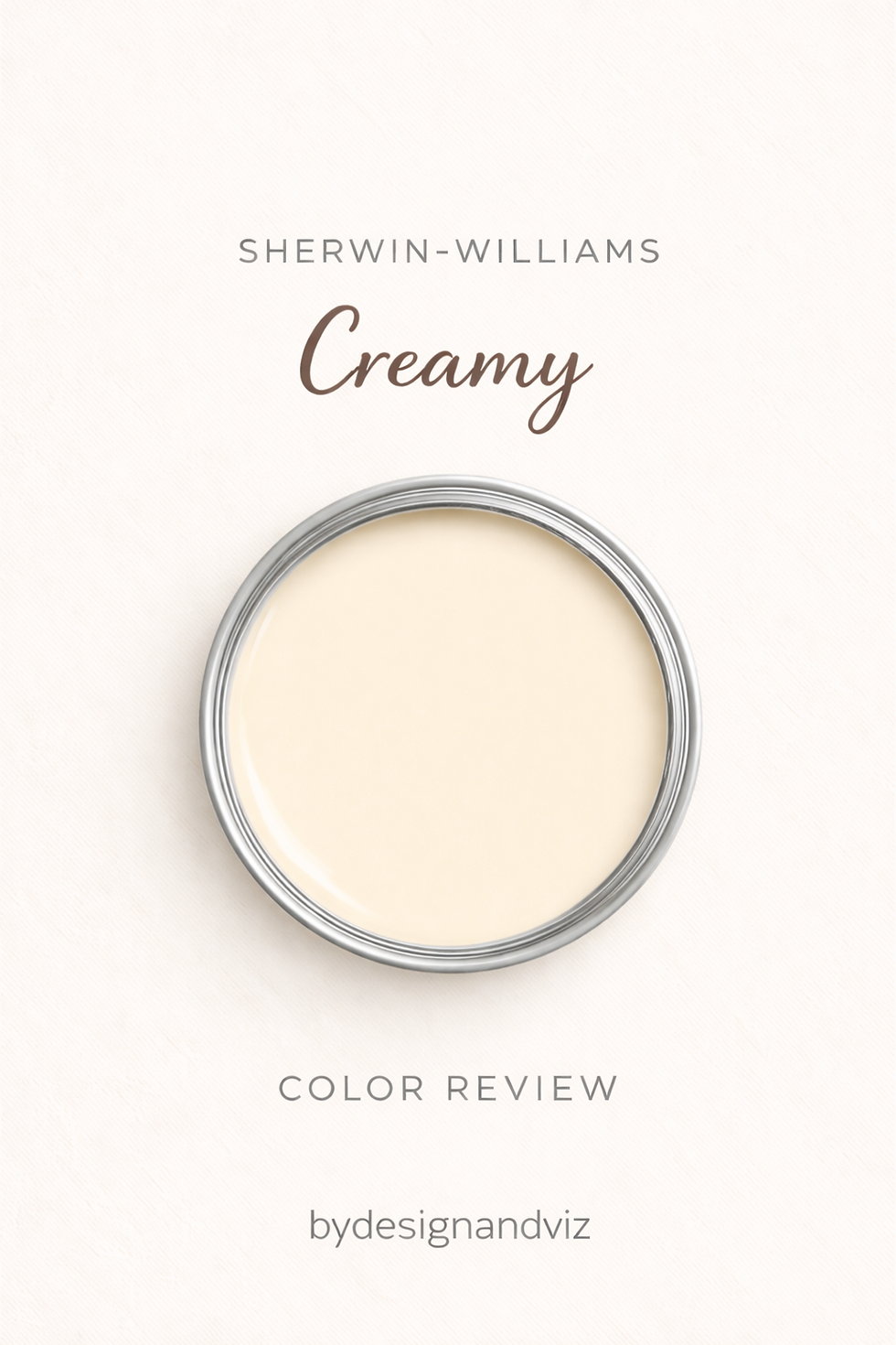
Creamy has an LRV of 81 and a direct warm yellow undertone with a committed buttery quality. There is no grey anchor, no grey-green complexity, no undertone doing anything other than being warm and cream-like. It announces its warmth clearly and openly - and in the right conditions, that directness is one of the most beautiful results available. In south-facing rooms with warm materials and warm light, Creamy glows with a buttery luminosity that Shoji White's more complex undertone cannot fully replicate.
The risk is the flip side of that same directness. Without warm light to give the yellow undertone context, Creamy can read as slightly flat or obviously yellow rather than warm and inviting. It rewards south-facing rooms and warm material palettes. It is a colour you choose because you specifically want cream - not just warmth, but cream. For how Creamy compares to the other SW warm white it is most often confused with at the same depth range, the Shoji White vs Natural Linen guide gives useful context on how different undertone characters perform in similar depth ranges.
The Real Difference Between Shoji White and Creamy

Shoji White is a complex, sophisticated warm off-white. Creamy is a committed, direct warm cream. Despite both sitting in the warm SW off-white range, their undertone characters pull in entirely different directions and create entirely different rooms.
Shoji White rooms feel warm, earthy, and sophisticated - the grey-green complexity gives the space a quality that is hard to define but immediately felt. The warmth is present but quiet. The room reads as considered. Creamy rooms feel warm, open, and specifically cream - the yellow undertone is the defining character of the space and it makes no apology for it. The warmth is front and centre.
The depth difference reinforces the undertone contrast. Shoji White at LRV 74 creates a room with more enclosure and presence - the deeper value reads as a deliberate depth decision. Creamy at LRV 81 is brighter and more open - the higher LRV keeps rooms feeling airy while the committed yellow delivers the warmth. Despite Creamy being the lighter of the two, it reads as the more obviously warm colour because the yellow is so direct. Shoji White reads as deeper but the warmth is more restrained and complex.
They should not appear on adjacent surfaces. The grey-green complexity of Shoji White next to the direct yellow of Creamy creates a clear and uncomfortable undertone contrast - the grey-green makes the yellow read as more obvious, and the yellow makes the grey-green read as slightly cooler than it actually is. Use Alabaster SW 7008 on trim for either colour - the warm cream-greige quality of Alabaster complements both without the direct undertone conflict that putting Shoji White and Creamy side by side creates.
Not sure which one works for your room? A colour consultation is included in all our design packages - book directly here. |
When to Choose Shoji White

Choose Shoji White when the brief is sophisticated, complex, quietly warm off-white with real depth and presence. Organic modern, Japandi, and transitional interiors where warmth needs to be felt rather than announced. Rooms with warm wood floors, warm stone, rattan, and natural materials where the beige-greige complexity sits naturally within the palette. Open-plan spaces where a warm off-white needs to handle varied light conditions reliably - the grey-green component means Shoji White adapts across orientations more gracefully than more committed warm yellows.
Shoji White is the right answer when Creamy feels too obviously cream for the brief - when the brief calls for warmth and sophistication rather than warmth and creaminess. It is also the significantly better choice for rooms with mixed or challenging light conditions, including open-plan layouts that span north and south-facing zones.
When to Choose Creamy

Choose Creamy when committed, buttery, enveloping cream is specifically the brief. South and west-facing rooms with good natural light where the yellow undertone activates beautifully. Traditional, farmhouse, and warm organic modern interiors where a cream quality is part of the design intent. Rooms with warm wood floors, warm stone, and brass hardware where everything is pulling in the same warm direction.
Avoid Creamy in rooms with north-facing light and no warm 2700K artificial lighting - the direct yellow undertone reads flat without warmth in the light. Avoid it on trim alongside most wall colours - the committed cream quality creates tension with almost any wall colour other than the most committed warm neutrals. And avoid it directly alongside Shoji White - the undertone contrast between the two creates a mismatch that neither colour deserves.
How the Pairings Differ

For Shoji White on walls, Alabaster SW 7008 on trim is the most natural within-system pairing - the warm cream-greige quality of Alabaster complements Shoji White's beige-greige base without fighting the grey-green component. Pure White SW 7005 gives a crisper, more contemporary result. Creamy on trim alongside Shoji White walls creates an undertone conflict - the direct yellow next to the grey-green reads as uncomfortable and unresolved.
For Creamy on walls, Alabaster SW 7008 on trim is again the most natural choice - its warm cream-greige bridges the warmth of the walls without the same-family depth mismatch that other warm whites create. Pure White SW 7005 gives a slightly crisper boundary. Shoji White on trim alongside Creamy walls creates the same undertone conflict from the other direction - avoid both combinations.
For flooring, Shoji White's grey-green complexity means it works most naturally with warm wood floors, rattan, and natural materials - it needs the warmth of organic materials to anchor the grey-green and keep the colour reading warm rather than muted. Cool grey stone or contemporary tile alongside Shoji White can make the grey-green read as slightly muddy. Creamy is most natural above warm wood and honey-toned floors where the shared yellow direction creates an instinctively cohesive relationship.
For hardware, both suit aged brass, warm bronze, and matte gold - the shared warm family means these metals complement both colours. Shoji White also handles matte black in organic modern and Japandi schemes where the depth contrast between the off-white walls and black fixtures reads as considered and deliberate. Creamy is strongest with exclusively warm metals - cool hardware can make the yellow undertone read as more obvious by comparison.
Architect's Verdict - Shoji White or Creamy?

Both are outstanding off-whites for the right brief - but they suit different rooms, different orientations, and different design intentions.
If the brief is sophisticated, complex, quietly warm off-white with real depth and earthy presence - a colour that wears its warmth with restraint and adapts beautifully across varied conditions - Shoji White is the answer. It is one of the most characterful and broadly reliable off-whites in the SW range.
If the brief is committed, buttery, enveloping cream - a colour that announces its warmth openly and glows in the right conditions - Creamy is the answer, with Alabaster SW on trim and south-facing light as the ideal conditions.
The test: look at a sample of each in your room in the worst light moment of the day. If Shoji White still reads as warm and earthy - it will be beautiful across all conditions. If Creamy still reads as warm and inviting rather than flat or yellow - trust it. If either reads as something other than warm and right in that worst-case light - it is telling you something important.
Frequently Asked Questions

Is Creamy lighter than Shoji White?
Yes - by 7 LRV points. Creamy has an LRV of 81 and Shoji White has an LRV of 74. Despite being the lighter of the two, Creamy reads as the more obviously warm colour because its yellow undertone is so direct. Shoji White at LRV 74 has more depth and body on the wall but its warmth is more complex and restrained.
Do Shoji White and Creamy go together?
Not on adjacent surfaces. The grey-green complexity of Shoji White and the direct yellow of Creamy create a clear undertone conflict when placed on trim and wall together - the contrast makes both read as more extreme than they actually are. Use Alabaster SW 7008 on trim for either colour and keep the two off-whites in separate zones if they both appear in the same home.
Which is better for north-facing rooms?
Shoji White handles north-facing rooms significantly more reliably than Creamy. The grey-green undertone adapts gracefully to cool indirect light - the colour shifts slightly toward greige rather than reading cold, which is a beautiful quality in north-facing conditions. Creamy's direct yellow undertone has no warm light to activate it in north-facing conditions and can read as flat or slightly sharp. For any challenging light condition, Shoji White is the considerably safer choice between the two.
Which is better for kitchen cabinets?
It depends entirely on the kitchen brief. Creamy on cabinets suits farmhouse and traditional kitchens with warm wood elements, warm stone countertops, and brass hardware - the buttery cream quality feels timeless and welcoming. Shoji White on cabinets suits organic modern and transitional kitchens where a more sophisticated, less obviously cream off-white is the goal - the grey-green complexity reads as considered and elevated alongside warm wood, stone, and natural materials.
What is the LRV of Shoji White vs Creamy?
Shoji White SW 7042 has an LRV of 74 and Creamy SW 7012 has an LRV of 81. Creamy is the lighter of the two by 7 points, but reads as the more obviously warm colour due to its direct yellow undertone. Shoji White is deeper with more body but its warmth is more complex and restrained.
Final Thought
Shoji White and Creamy are both exceptional off-whites - chosen for entirely different reasons. Shoji White is the off-white you choose when sophistication and complexity are part of the brief. Creamy is the off-white you choose when committed buttery warmth is specifically what the room needs.
Organic modern or Japandi brief with warm natural materials and varied light - Shoji White with Alabaster SW on trim. Traditional or farmhouse brief with south-facing light and a committed warm palette - Creamy with Alabaster SW on trim. Sample both at large scale in your specific room under morning light and evening artificial lighting. The answer will be clear within 24 hours.
Want a complete colour scheme built around Shoji White or Creamy? Our design packages cover full palette selection, finish recommendations, and 3D visualisations - see our packages. |
About the Author
Beril Yilmaz is a qualified architect and interior designer based in the UK. She runs BY Design And Viz, a design platform covering paint colour reviews, interior design guidance, and residential design projects. Beril has specified both Sherwin Williams Shoji White and Creamy across residential projects in the UK and internationally - Shoji White most often in organic modern and Japandi schemes where sophisticated quiet warmth is the brief, Creamy in traditional and farmhouse interiors where committed buttery cream is specifically what the room calls for.


Comments