


Strong White vs Wimborne White: The Comparison That Actually Helps You Decide

Updated: 11 minutes ago
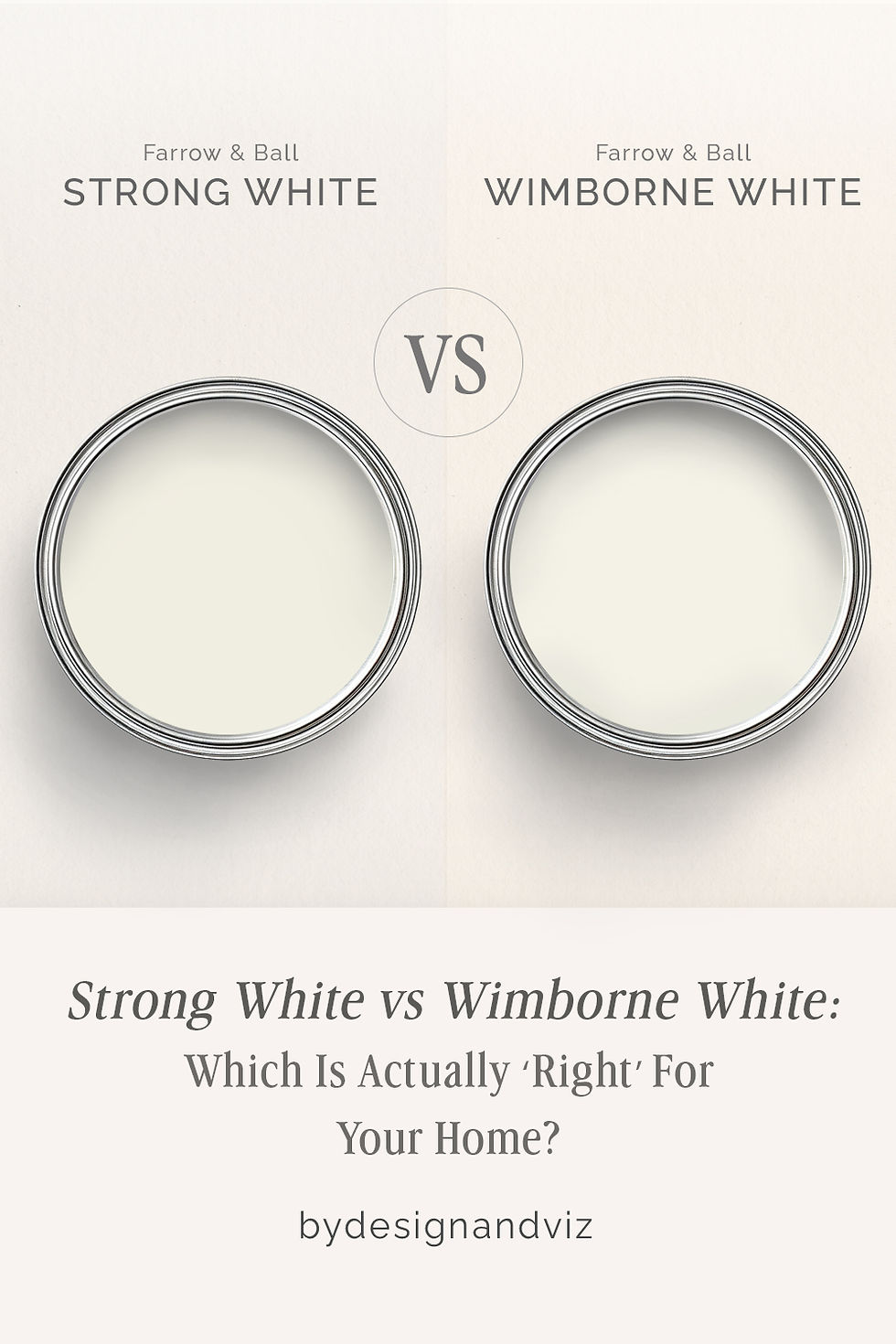
Strong White and Wimborne White sit only nine LRV points apart, and on the fan deck that gap reads like nothing. In a room it reads like everything, because the two colours are pulling in opposite directions. Strong White holds a cool grey undertone; Wimborne White carries a soft warm cream. One cools a space down, the other warms it up, and the LRV proximity is what makes people assume they're interchangeable when they aren't.
I have specified both across UK residential projects and I do not treat them as substitutes for each other. Strong White is the quieter, more architectural choice — it wants clean lines and natural light to do its work. Wimborne White is the more forgiving all-rounder, the one I reach for when a client wants warmth without going anywhere near cream.
This guide covers what each colour actually looks like on a wall, where the undertone helps or works against you, and which one your room's light and materials can support.
At a Glance
| Strong White | Wimborne White |
Brand | Farrow & Ball | Farrow & Ball |
LRV | ~80 - bright, but the undertone reads before the brightness does | ~89 - very bright, and the warmth is visible even at that reflectance |
Colour category | Cool-leaning off-white - reads as considered and architectural, not stark | Warm off-white - soft cream undertone that stays gentle rather than buttery |
Undertones | Subtle cool grey, with the faintest warmth underneath - never announces itself as either | Soft warm cream, present but restrained - close enough to neutral to suit most schemes |
Character | Restrained and contemporary; needs clean materials and good light to read as intended | Versatile and quietly warm; works across period and contemporary interiors alike |
North-facing | Risky - can flatten and grey out further without warm light or warm materials to balance it | Reliable - the cream undertone holds its warmth without tipping into obvious yellow |
South-facing | Excellent - the cool undertone stays soft rather than turning clinical | Clean and soft - warmth is visible without becoming heavy |
Open-plan | Moderate - reads consistently in good light, but can feel flat where light is patchy | Strong - reads consistently warm across zones with mixed light and material temperatures |
On walls | Quiet, considered off-white backdrop that lets furniture and materials carry the warmth | Soft warm-white backdrop that stays composed through the day |
On cabinets | Best in contemporary kitchens with stone, steel, and minimal detailing | The more practical choice across most kitchens, including those with warm stone and brass |
Use together? | Yes - Strong White on walls with Wimborne White on trim softens the cool-warm contrast | Yes - Wimborne White on trim against Strong White walls is the more tested direction |
Trim for each | Wimborne White for warmth on the joinery, or All White for a crisper cool step up | All White or Strong White for a cooler step up, or Pointing for a warmer, softer edge |
Style fit | Contemporary, minimal, architectural, Scandinavian-influenced interiors | Period, transitional, and contemporary interiors - the more broadly usable of the two |
Architect's pick | When the brief is clean and considered and the room already has good natural light | When warmth is needed but the room's light or material mix is uncertain |
Farrow & Ball Strong White No. 2001 - What It Really Looks Like
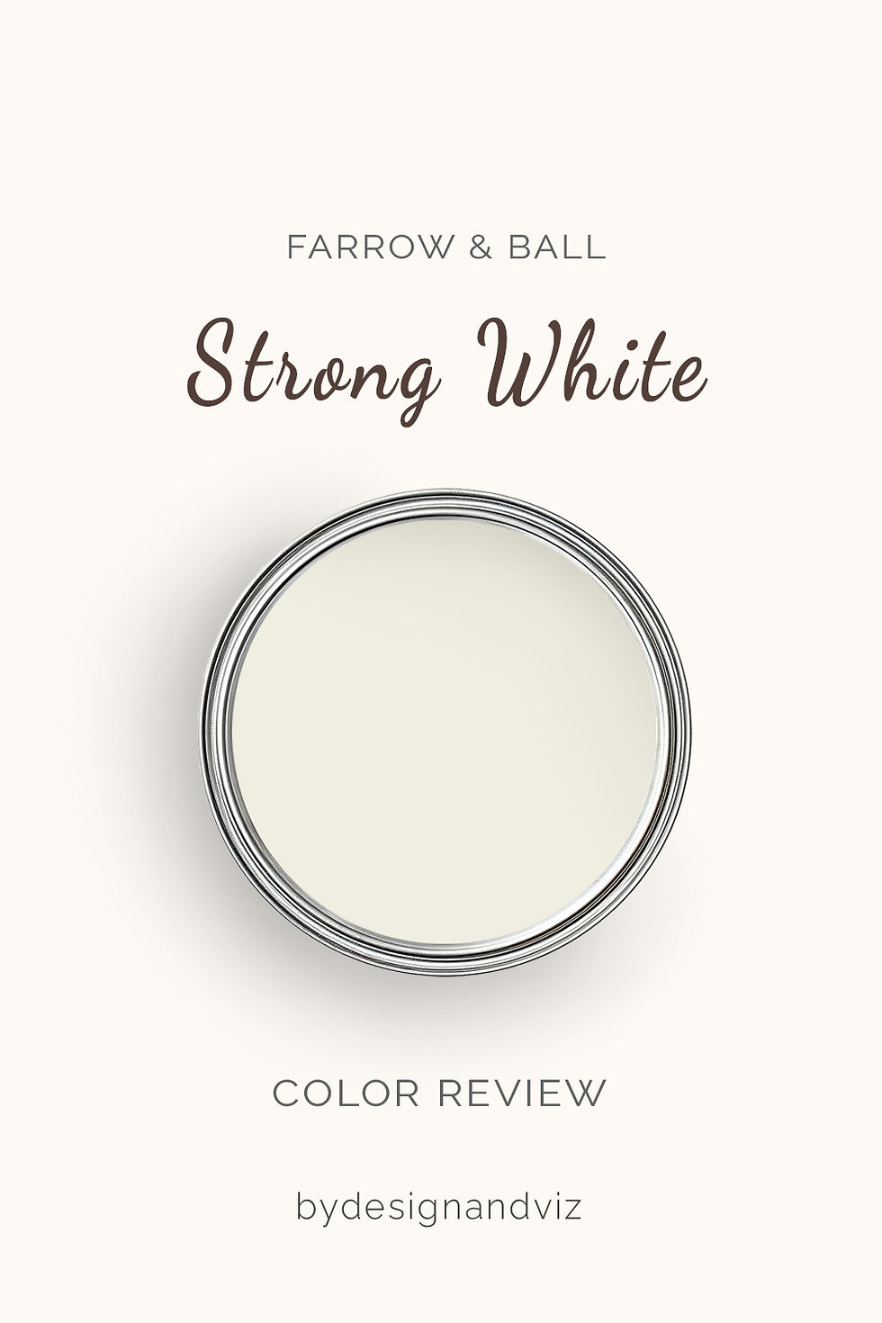
Strong White has an LRV of approximately 80, and the number is almost misleading on its own — it sits close to Wimborne White on the reflectance scale but reads nothing like it on the wall.
The undertone is a subtle cool grey, so faint it rarely announces itself outright. It does not hedge into beige and it does not tip into blue. In good daylight it simply looks clean.
In flat or north-facing light this restraint works against it. Without warmth to balance it, Strong White can read slightly grey and a little cold, which is exactly why the room around it has to do some of the work.
For a closer look at how this cool restraint behaves against a warmer grey-green neighbour, the Strong White vs Wevet guide walks through where each one wins once natural materials enter the room.
Farrow & Ball Wimborne White No. 239 - What It Really Looks Like

Wimborne White carries an LRV of approximately 89, making it one of the brighter whites in the Farrow & Ball range, and the warm cream undertone is visible even at that reflectance.
It is only a shade away from a pure white, but that small addition of warm pigment changes how it behaves entirely. There is nothing ambiguous about the warmth — it is gentle, but it is there.
In north-facing rooms this restrained warmth is exactly what keeps the colour from reading cold. It does not chase the light the way a stronger cream would; it simply holds steady.
For the full breakdown of where this warmth suits a room and where it does not, the Farrow & Ball Wimborne White review covers its behaviour across light conditions and finishes in more depth.
The Real Difference Between Strong White and Wimborne White

The simplest way to explain it: Strong White is a cool off-white that stays quiet. Wimborne White is a warm off-white that stays gentle. Neither is loud, but they are working in opposite directions. For how Wimborne White compares to Pointing - the warmer, red-based Farrow & Ball off-white most often shortlisted alongside it - the Pointing vs Wimborne White guide covers the undertone difference and the classic wall-and-trim pairing between the two.
The nine-point LRV gap barely registers in practice. What registers is the undertone — Strong White's faint cool grey against Wimborne White's soft warm cream. Side by side, the difference is unmistakable within a few minutes of daylight.
Strong White on walls with Wimborne White on trim is the pairing I use most often when a client wants a cool, architectural wall colour without the joinery feeling stark. The warmth on the trim keeps the room from tipping cold. Farrow & Ball Strong White review covers where Strong White works as a standalone wall colour and where it needs a warmer partner to succeed.
Not sure which one works for your room? A colour consultation is included in all our design packages - book directly here. |
When to Choose Strong White
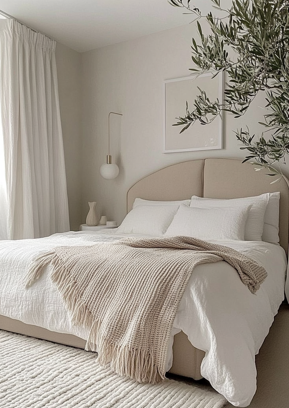
Choose Strong White when the brief is clean, architectural, and already well lit. These are the conditions where it performs:
South or west facing rooms with strong natural light, where the cool undertone stays soft rather than flat. Contemporary interiors with stone, steel, or matt black detailing, where a warmer white would compete with the materials instead of framing them.
Avoid it in north-facing rooms without a warm material palette to anchor it, and avoid it where the brief is explicitly cosy — Strong White will not deliver warmth it does not have.
When to Choose Wimborne White

Choose Wimborne White when warmth is needed but the room's conditions are mixed or uncertain. These are the situations where it outperforms Strong White:
North-facing rooms that need warmth without going near cream. Open-plan spaces where the colour has to hold its character across different zones and light levels throughout the day.
It is also the safer trim colour in most schemes — its warmth reads as considered rather than yellowed, even against cooler wall colours.
How the Pairings Differ

For Strong White on walls, Wimborne White on trim softens the contrast without losing the cool clarity that makes Strong White work. All White is the alternative for a crisper, cooler step up in brightness.
For Wimborne White on walls, Strong White or All White on trim gives a clean, slightly cooler definition. Wimborne White on both walls and trim also works, particularly in period properties where a seamless warm white is the goal.
Both colours suit pale oak and washed timber floors. Strong White is more forgiving of cool stone and polished concrete; Wimborne White pairs more naturally with warmer timber and honed limestone.
For hardware, Strong White suits brushed nickel, matte black, and unlacquered brass equally well given its neutrality. Wimborne White leans toward aged and brushed brass, where the warm metals echo its own undertone.
Architect's Verdict - Strong White or Wimborne White?
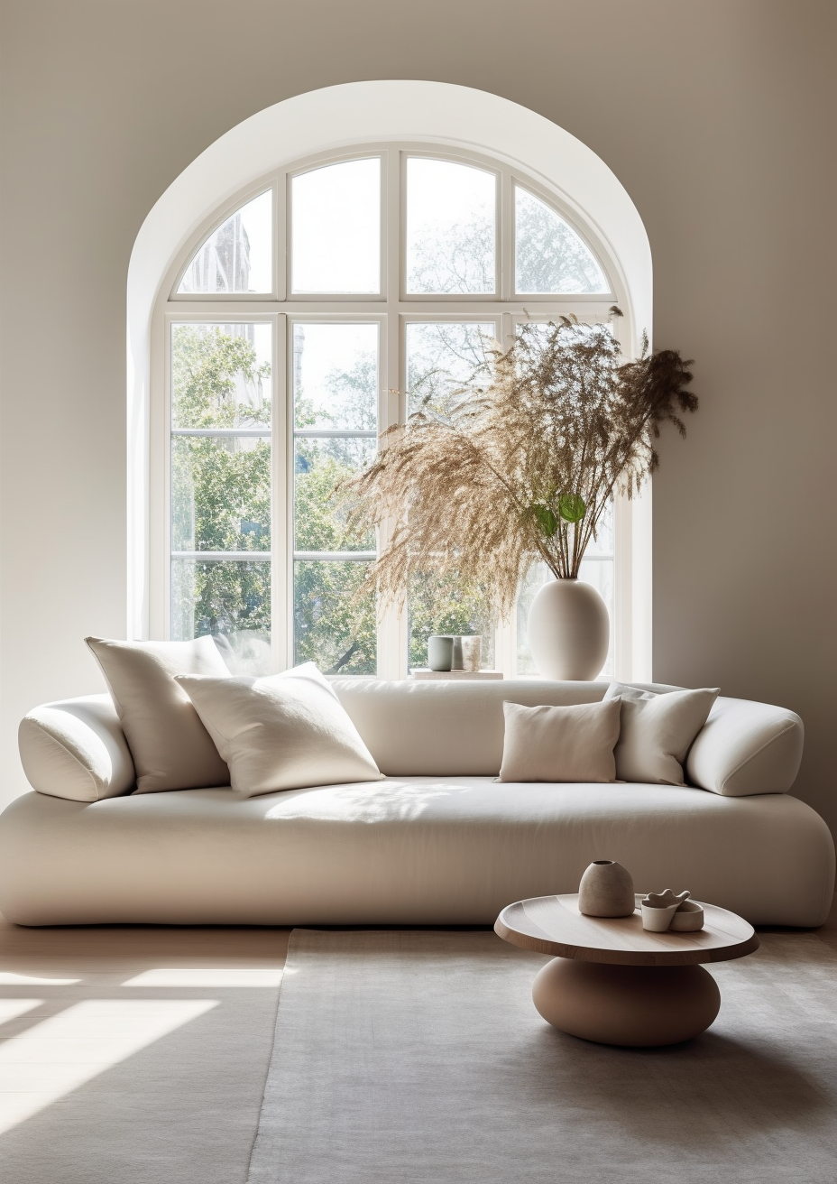
For most homes — particularly those with mixed or uncertain light — Wimborne White is the more reliable choice. Its warmth is gentle enough to avoid looking cream, but present enough to stop a room feeling flat.
Strong White is the right call when the room already has strong natural light and a clean, considered material palette to match. In a south-facing space with stone and steel, it reads exactly as intended — quiet, architectural, and never cold.
Wimborne White is the safer default everywhere else, especially north-facing rooms and open-plan spaces where the light shifts throughout the day. Its warmth does the work Strong White's restraint cannot.
The test I always use for this pair: paint two large sample boards and place them on the darkest wall in the room — usually the north-facing one. Check them first thing in the morning and again at dusk under lamplight. If Strong White still looks clean rather than grey in that worst-case light, it has passed. If it looks flat or cold at either check, Wimborne White is your answer.
Frequently Asked Questions

Is Strong White cooler than Wimborne White?
Yes — Strong White carries a subtle cool grey undertone, while Wimborne White is warm with a soft cream base. Held side by side in daylight, the difference is clear even though the two sit only nine LRV points apart.
Can I use Strong White and Wimborne White in the same house?
Yes, and it is a well-tested combination. Strong White on walls with Wimborne White on trim is the direction I use most often — the warmth on the joinery stops the cool walls from feeling stark. The reverse works too, but benefits from testing first.
Which is better for a north-facing room?
Wimborne White handles north-facing rooms far better. Its warm cream undertone holds steady in flat light, where Strong White's cool undertone can read grey and slightly cold without warm materials to balance it.
Which is better for kitchen cabinets?
Wimborne White is the more practical choice for most kitchens. Its warmth works across a wider range of countertop and appliance finishes. Strong White suits contemporary kitchens with stone and steel, where its cool restraint matches the material palette.
What is the LRV of Strong White vs Wimborne White?
Strong White has an LRV of approximately 80, and Wimborne White approximately 89. Both are bright, reflective colours — the real difference between them is undertone, not light reflectance.
Final Thought
Strong White and Wimborne White are both excellent off-whites, but they are not interchangeable. The choice comes down to what your room's light can support and what temperature you actually want it to read.
If your light is strong and your materials are clean and cool, Strong White will read exactly as intended — considered, architectural, and quietly confident. If your light is uncertain or your room needs warmth to feel settled, Wimborne White is the more forgiving and ultimately more reliable choice. Buy sample pots of both, paint boards on your darkest wall, and check them in morning and evening light before deciding. The answer will be clear within a day.
Want a complete colour scheme built around Strong White or Wimborne White? Our design packages cover full palette selection, finish recommendations, and 3D visualisations - see our packages. |
About the Author
Beril Yilmaz is a qualified architect and interior designer based in the UK. She runs BY Design And Viz, a design platform covering paint colour reviews, interior design guidance, and residential design projects. Beril has specified both Strong White and Wimborne White across residential projects in the UK and internationally — Strong White in contemporary, light-filled spaces with stone and steel detailing, Wimborne White in north-facing and open-plan rooms where warmth needed to hold steady across the day, often specifying both together in the same scheme with Wimborne White on trim.


Comments