


Swiss Coffee vs Agreeable Gray: The Comparison That Actually Helps You Decide

These two do not actually compete for the same wall, and that is the first thing to understand before comparing them at all. Swiss Coffee is a warm off-white, sitting near the top of the LRV scale as a light-reflecting backdrop colour. Agreeable Gray is a mid-toned warm greige, a genuine wall colour with body and depth. Put them on cards side by side and the comparison looks almost pointless - one is barely a colour at all, the other reads as a considered neutral from across the room.
I have specified both, often in the same house, and never in the same role. Swiss Coffee does the quiet work of trim, ceilings, and backdrop walls that need to disappear. Agreeable Gray does the work of a wall colour that wants to be noticed without shouting. Confusing the two roles is the most common mistake I see homeowners make when they shortlist paint from a Pinterest board rather than from their own rooms.
Here is how I decide which job each colour is actually suited for, and where they overlap enough to be used together rather than instead of each other.

At a Glance
| Swiss Coffee | Agreeable Gray |
Brand | Benjamin Moore | Sherwin-Williams |
LRV | 81 - very high, functions as a near-white | 60 - mid-toned, reads as a genuine wall colour rather than a near-white |
Colour category | True off-white - light enough to read as white in most rooms, warm enough to avoid feeling clinical | Warm greige - the reference point most other greiges in the SW range are measured against |
Undertones | Soft beige-yellow - present but restrained, rarely reads as obviously cream | Balanced warm-gray with a faint violet-brown cast that keeps it from reading beige or purple |
Character | A quiet backdrop white; it recedes rather than asserts itself | A committed wall colour with enough depth to anchor a room on its own |
North-facing | Reliable - the mild undertone keeps it from reading cold, without tipping into yellow | Good - the warm base holds up in cool light better than a true gray would |
South-facing | Good - a faint warm cast becomes visible but never dominates | Excellent - warms further without tipping into beige |
Open-plan | Strong - consistent across zones because the undertone is too subtle to shift dramatically under mixed light | Strong - one of the most consistently reviewed greiges for reading true across different rooms and light |
On walls | Best as a bright, low-commitment backdrop where the room's character comes from furnishings, not the wall colour itself | The main event - a full, considered wall colour that does the job Swiss Coffee cannot |
On cabinets | Excellent - one of the most-used whites for cabinetry because it stays clean without going stark | Works well in transitional kitchens, especially against warm wood and brass, less common than the lighter neutrals |
Use together? | Yes - Swiss Coffee on trim and ceilings with Agreeable Gray on walls is a genuinely classic pairing | Yes - Agreeable Gray walls with Swiss Coffee trim is a dependable, well-tested combination |
Trim for each | Not usually trimmed separately - Swiss Coffee is itself the trim colour in most schemes | Swiss Coffee, Extra White SW 7006, or Pure White SW 7005 depending on how much contrast is wanted |
Style fit | Transitional, coastal, farmhouse, contemporary - functions across nearly every style as a supporting colour | Transitional, modern farmhouse, traditional - the most broadly recommended greige on the market for a reason beyond fashion |
Architect's pick | When the brief needs brightness and a colour that will not compete with furniture, art, or a stronger wall shade | When the room needs an actual wall colour with presence, not just a brighter or duller version of white |
Benjamin Moore Swiss Coffee (OC-45) - What It Really Looks Like

Swiss Coffee has an LRV of 81, which puts it firmly in the near-white category rather than the true off-white range some people expect from its name. It is a Benjamin Moore colour, and its warm beige-yellow undertone is genuinely restrained - you have to look for it rather than have it announce itself the way a stronger cream would.
In most light it reads simply as a soft, clean white. It does not hedge toward gray, and it does not hedge toward cream - it sits quietly in between, which is exactly why it works so well as a supporting colour rather than a statement one.
In south-facing rooms a faint warm cast becomes visible in strong sun. In north-facing rooms it holds steady without turning cold. This consistency across light conditions is Swiss Coffee's real strength, and it is why it appears so often on trim, ceilings, and cabinetry rather than as the star of a room.
For how Swiss Coffee compares against another warm off-white closer to its own LRV, rather than against a mid-toned greige, the Swiss Coffee vs Alabaster guide is the more direct like-for-like comparison, and worth reading if the room genuinely needs a near-white rather than a wall colour.
Sherwin-Williams Agreeable Gray SW 7029 - What It Really Looks Like

Agreeable Gray has an LRV of 60, a genuine mid-tone that puts real weight on a wall rather than merely brightening it. It is a Sherwin-Williams greige, and its balanced warm-gray base carries a faint violet-brown undertone that keeps it from tipping fully into beige or fully into gray.
This balance is precisely why it has become the reference point most other greiges in the range are measured against. It commits to being a wall colour. It does not try to disappear the way a near-white does.
In flat, overcast light it can lean slightly cool. In warm natural light it settles into a soft, dependable greige. This sensitivity to light is normal for a colour at this LRV, and it is the main reason sampling on the actual wall matters more here than it does with a lighter neutral.
For how Agreeable Gray compares against another true wall-colour greige at a similar LRV, the Agreeable Gray vs Repose Gray guide covers the genuine head-to-head, which this comparison against a near-white cannot.
The Real Difference Between Swiss Coffee and Agreeable Gray

The comparison here is not undertone versus undertone - it is job versus job. Swiss Coffee, at an LRV of 81, is functioning as a near-white. Agreeable Gray, at an LRV of 60, is functioning as a genuine wall colour. A 24-point LRV gap is not a fine distinction to debate over paint chips. It is the difference between a colour that recedes and a colour that anchors a room.
This is why treating them as rivals for the same wall misses the point. Swiss Coffee does not compete with Agreeable Gray for a living room wall - it competes with other off-whites for trim, ceilings, and backdrop rooms that need brightness without character. Agreeable Gray competes with other greiges for the walls that need to hold a room together. Once the LRV gap is understood, the question stops being "which one" and becomes "which job."
The two work together more often than they work against each other. Agreeable Gray on walls with Swiss Coffee on trim and ceiling is one of the most dependable transitional pairings I specify, precisely because the LRV gap creates clean definition without any undertone conflict to manage. For a look at how Agreeable Gray sits against a lighter, more restrained greige rather than a near-white, the Agreeable Gray vs Pale Oak guide compares two greiges at opposite ends of the same warm-neutral family.
Not sure which one works for your room? A colour consultation is included in all our design packages - book directly here. |
When to Choose Swiss Coffee

Choose Swiss Coffee when the room needs brightness and a colour that recedes rather than competes. Small rooms, low-light spaces, ceilings, and trim throughout the house all benefit from a near-white this reliable.
It also suits any room where the wall colour should sit in the background - a strong piece of art, bold furniture, or patterned textiles all read more clearly against Swiss Coffee than against a colour with more presence of its own.
Avoid it where the brief specifically calls for a wall colour with body - a large open-plan space or a room that needs to feel grounded will read as unfinished with a near-white this light carrying the whole scheme alone.
When to Choose Agreeable Gray
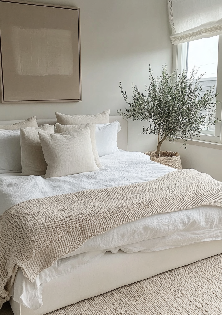
Choose Agreeable Gray when the room needs a wall colour with genuine presence. Open-plan living spaces, large rooms with strong architectural features, and any space that needs to feel anchored rather than airy all benefit from a greige at this depth.
It also suits rooms furnished with a mix of warm and cool materials, since its balanced undertone bridges both without clashing. It is one of the few greiges confident enough to sit behind stone, wood, and metal finishes at once.
Avoid it in small, low-light rooms where a colour this mid-toned will read heavier than intended. A dark room does not need a darker wall - that combination compounds rather than solves the problem.
How the Pairings Differ

For Swiss Coffee on walls, keep trim in the same family or slightly brighter - Extra White or a crisp trim white creates gentle definition without introducing a second undertone to manage. Swiss Coffee rarely needs a bold trim contrast because it is not asserting a strong identity of its own.
For Agreeable Gray on walls, Swiss Coffee on trim is the classic move - the LRV gap alone creates definition, and the shared warm base means there is no undertone clash to worry about. Extra White or Pure White also work where more contrast is wanted.
Swiss Coffee is forgiving with flooring - it works with cool and warm wood tones alike because its undertone is too restrained to fight with either. Agreeable Gray prefers warm wood, warm stone, or mid-toned oak; against very cool grey flooring it can start to read slightly flat.
Both colours suit brass, brushed nickel, and matte black equally well. This is one of the reasons the pairing works so cleanly in transitional kitchens - neither colour is fighting the metal finish, which frees up the hardware decision entirely.
Architect's Verdict - Swiss Coffee or Agreeable Gray?

This is not really a head-to-head. For most rooms, the honest answer is that you need to decide which job you are filling before you decide which colour wins it.
Choose Swiss Coffee when the room needs brightness and a colour that stays out of the way - trim, ceilings, small rooms with limited light, or any wall where the character should come from furnishings and art rather than the paint itself.
Choose Agreeable Gray when the wall itself needs to do work - anchoring an open-plan space, giving a living room presence, or holding its own against strong furniture and materials without disappearing into the background.
The test I always recommend: paint a large sample of Agreeable Gray on the wall you are considering and view it at midday under flat, overcast light - its most testing condition, where a weak greige slides toward lifeless blue-gray. If it still reads warm and settled rather than cold, it has passed. Then hold a Swiss Coffee sample against your existing trim in the same light to confirm the two sit together without a visible seam. Do both checks before you commit to either.
Frequently Asked Questions

Is Swiss Coffee the same as Agreeable Gray?
No - they are not comparable colours in the usual sense. Swiss Coffee is a near-white with an LRV of 81. Agreeable Gray is a mid-toned greige with an LRV of 60. They occupy entirely different positions on the light-reflectance scale and are typically used for different purposes in the same room, not as alternatives to each other.
Can I use Swiss Coffee and Agreeable Gray together?
Yes, and it is one of the most dependable pairings available. Agreeable Gray on walls with Swiss Coffee on trim and ceiling creates clean definition with no undertone conflict, because both colours share a warm base. This combination appears constantly in transitional and modern farmhouse interiors for exactly that reason.
Which is better for a small room?
Swiss Coffee, in most cases. Its high LRV reflects more light, which helps a small or low-light room feel more open. Agreeable Gray can still work in a small room, but it will read noticeably darker and more enclosed than Swiss Coffee would in the same space.
Does Agreeable Gray look purple or beige?
It can lean slightly toward either extreme depending on lighting, which is part of its reputation. In cooler or artificial light, a faint violet cast can appear. In warm natural light, it can read closer to a warm taupe. This sensitivity to light is normal for a warm greige and is why sampling on the actual wall matters more with Agreeable Gray than with a near-white like Swiss Coffee.
Is Swiss Coffee too white for a warm-toned home?
Rarely. Its beige-yellow undertone is restrained but genuine, and it will read as warm white rather than a stark or cool white in most rooms. It is a safer choice for warm interiors than a true white would be, without adding the depth a full greige like Agreeable Gray provides.
What is the LRV difference between Swiss Coffee and Agreeable Gray?
Swiss Coffee has an LRV of approximately 81 and Agreeable Gray has an LRV of approximately 60 - a gap of roughly 24 points. This is a substantial difference in real terms. It is the reason the two are best understood as colours for different purposes rather than as competing options for the same wall.
Final Thought
Swiss Coffee and Agreeable Gray are both excellent neutrals, but they are not really in competition. The choice between them is less about which one you prefer and more about which job the room is asking you to fill.
If the room needs brightness, restraint, and a colour that recedes, Swiss Coffee is the right tool. If the room needs presence, warmth, and a wall colour that can anchor the space on its own, Agreeable Gray is the better fit. Used together, on trim and wall respectively, they do more for a room than either could do alone.
Want a complete colour scheme built around Swiss Coffee or Agreeable Gray? Our design packages cover full palette selection, finish recommendations, and 3D visualisations - see our packages. |
About the Author
Beril Yilmaz is a qualified architect and interior designer based in the UK. She runs BY Design And Viz, a design platform covering paint colour reviews, interior design guidance, and residential design projects. Beril has specified both Swiss Coffee and Agreeable Gray across residential projects in the UK and internationally - Swiss Coffee on trim, ceilings, and backdrop walls where the room needed brightness without character, Agreeable Gray on feature walls and open-plan spaces where the room needed a colour with genuine presence, often specifying both together in the same scheme with Swiss Coffee on the trim.




Comments