


Swiss Coffee vs Accessible Beige: The Comparison That Actually Helps You Decide

Swiss Coffee and Accessible Beige rarely compete for the same wall, and that is the point worth understanding before you shortlist either one. Benjamin Moore Swiss Coffee is a warm off-white sitting near the top of the LRV scale; Sherwin-Williams Accessible Beige is a mid-tone greige sitting twenty-five LRV points below it. They are not two shades of the same idea - they do two different jobs in a room.
I have specified both across UK and international projects, usually not against each other but alongside each other - Swiss Coffee on trim and ceilings, Accessible Beige carrying the walls. Treating them as rivals misses what each one is actually for.
This guide covers exactly what each colour looks like in real light, when the gap between them actually matters, and how they work together rather than against each other.

At a Glance
| Swiss Coffee | Accessible Beige |
Brand | Benjamin Moore | Sherwin-Williams |
LRV | 83 - one of the brightest whites in the Benjamin Moore range | 58 - a genuine mid-tone, roughly twenty-five points darker than Swiss Coffee |
Colour category | Warm off-white - reads as a soft, creamy white rather than a true white or a beige | Balanced greige - sits evenly between warm beige and cool grey, tipping to neither |
Undertones | Faint warm yellow, held very close to neutral - visible mainly in shadow or against stark white trim | Soft warm-grey with a whisper of pink in some lights, never reads as obviously tan |
Character | Quiet, bright, and understated; functions as a backdrop rather than a colour statement | Grounded and versatile; carries a wall on its own rather than acting as a backdrop |
North-facing | Reliable - stays soft and warm rather than turning grey or blue in flat light | Can turn slightly cool and flat without warm materials or layered lighting to lift it |
South-facing | Clean and bright - can wash out slightly in strong direct sun but never turns yellow | Excellent - warms gently without tipping into obvious tan or gold |
Open-plan | Strong - its near-neutral warmth holds steady across zones and mixed light | Strong - its mid-tone balance reads consistently whether the light is warm or cool |
On walls | Bright, soft-white backdrop that keeps a room feeling open and airy | Full-coverage warm-neutral wall colour with real depth, not a whisper of a tone |
On cabinets | Excellent - a dependable off-white for cabinetry that needs to read clean, not beige | Works well in warm, traditional kitchens; too dark for cabinetry that needs to disappear |
Use together? | Yes - Swiss Coffee on trim and ceilings against Accessible Beige walls is a classic high-low pairing | Yes - Accessible Beige on walls with Swiss Coffee on trim is a dependable, well-tested pairing |
Trim for each | Chantilly Lace or Simply White for a crisper step up, though Swiss Coffee itself is often the trim | Swiss Coffee OC-45 or Chantilly Lace for definition without harsh contrast |
Style fit | Transitional, coastal, modern farmhouse - anywhere a soft, bright backdrop is needed | Traditional, transitional, warm contemporary - one of the most-specified greiges in the SW range |
Architect's pick | When the brief needs brightness and the beige tone should live elsewhere in the room | When the room needs actual depth and warmth, not just a lighter, brighter neutral |
Benjamin Moore Swiss Coffee OC-45 - What It Really Looks Like

Swiss Coffee has an LRV of 83, which puts it among the brightest whites Benjamin Moore makes. The undertone is warm, but only just - a trace of yellow that keeps it from reading stark or clinical. In most light it simply reads as a soft, clean white.
For how Swiss Coffee holds up against a genuinely warmer, creamier Benjamin Moore neighbour, Swiss Coffee vs Alabaster guide breaks down the undertone gap and which one survives a north-facing room.
It does not hedge on brightness. In evening lamplight it stays soft rather than turning yellow the way warmer creams do, which is why it works so well as a quiet backdrop for a stronger wall colour elsewhere in the room.
Sherwin-Williams Accessible Beige SW 7036 - What It Really Looks Like

Accessible Beige has an LRV of 58, a genuine mid-tone that puts real weight on a wall. The undertone is a soft warm-grey - beige without tipping into tan, grey without turning cold. It is one of the most balanced greiges Sherwin-Williams makes.
For the comparison against the Benjamin Moore greige it is most often shortlisted alongside, Accessible Beige vs Pale Oak guide covers how a five-point LRV gap plays out very differently from the twenty-five-point gap covered here.
It does not need warm materials around it to work. Cool stone, warm wood, brass, and matte black hardware all sit comfortably against it, which is part of why it has become one of the most widely specified greiges in the range.
The Real Difference Between Swiss Coffee and Accessible Beige

The simplest way to explain it: Swiss Coffee is a backdrop; Accessible Beige is a wall colour. A twenty-five-point LRV gap this wide means the two rarely compete for the same job in the same room.
Swiss Coffee's LRV of 83 keeps it close to true white in behaviour - it opens a room up and disappears into the background of whatever else is happening. Accessible Beige's LRV of 58 gives it actual visual weight; it holds a wall the way a paler neutral never could. This is not a close call decided by undertone. The gap in LRV settles the question before undertone even enters the conversation.
The practical result is that most homes do not choose between them - they use both, Accessible Beige carrying the walls where warmth and depth are wanted, Swiss Coffee handling trim, ceilings, and any surface that needs to stay bright and out of the way. For the pairing itself, and for a related warm-neutral wall colour that plays the same role as Accessible Beige, Greek Villa vs Accessible Beige guide compares two wall-carrying neutrals against each other and is worth reading if Accessible Beige feels a shade too grey for the brief.
Not sure which one works for your room? A colour consultation is included in all our design packages - book directly here. |
When to Choose Swiss Coffee

Choose Swiss Coffee when the room needs brightness and the colour statement belongs somewhere else. It is right for trim, ceilings, cabinetry, and any wall that should recede rather than lead - transitional and coastal interiors where the palette needs a quiet, reliable white that never turns yellow or grey.
Avoid it as the sole wall colour in a room that is meant to feel warm and enveloping - at LRV 83, it will always read as light and airy, never as a cosy neutral. It is also the wrong choice as a stand-in for a true beige; the undertone is too restrained to deliver that warmth.
When to Choose Accessible Beige

Choose Accessible Beige when the wall needs genuine depth and warmth, not just a lighter neutral. It suits traditional and transitional interiors, warm contemporary schemes, and any room where a lighter greige would read as insubstantial against furniture and trim.
Avoid it in small, north-facing rooms without layered lighting - at LRV 58 it can flatten and cool without warm materials or good artificial light to lift it. It is also the wrong pick where the brief specifically calls for brightness; nothing at this LRV will read as airy.
How the Pairings Differ

For Swiss Coffee on walls, pair with a slightly deeper warm neutral for definition - a beige or greige like Accessible Beige elsewhere in the scheme keeps the palette from feeling flat. Swiss Coffee on both walls and trim works too, in bright, minimal interiors.
For Accessible Beige on walls, Swiss Coffee or Chantilly Lace on trim gives clean definition without a harsh jump in value. Avoid pairing it with a very bright, cool white trim - the contrast can make the wall colour look muddier than it is.
Both colours work with warm wood tones. Accessible Beige is the more forgiving of the two with cool stone and grey-toned flooring, since its own undertone already sits close to neutral. Swiss Coffee prefers warmer floors to avoid feeling clinical.
Accessible Beige suits brass, matte black, and brushed nickel equally well. Swiss Coffee leans toward warmer metals - aged brass and brushed gold - to avoid feeling cold against its restrained warm undertone.
Architect's Verdict - Swiss Coffee or Accessible Beige?
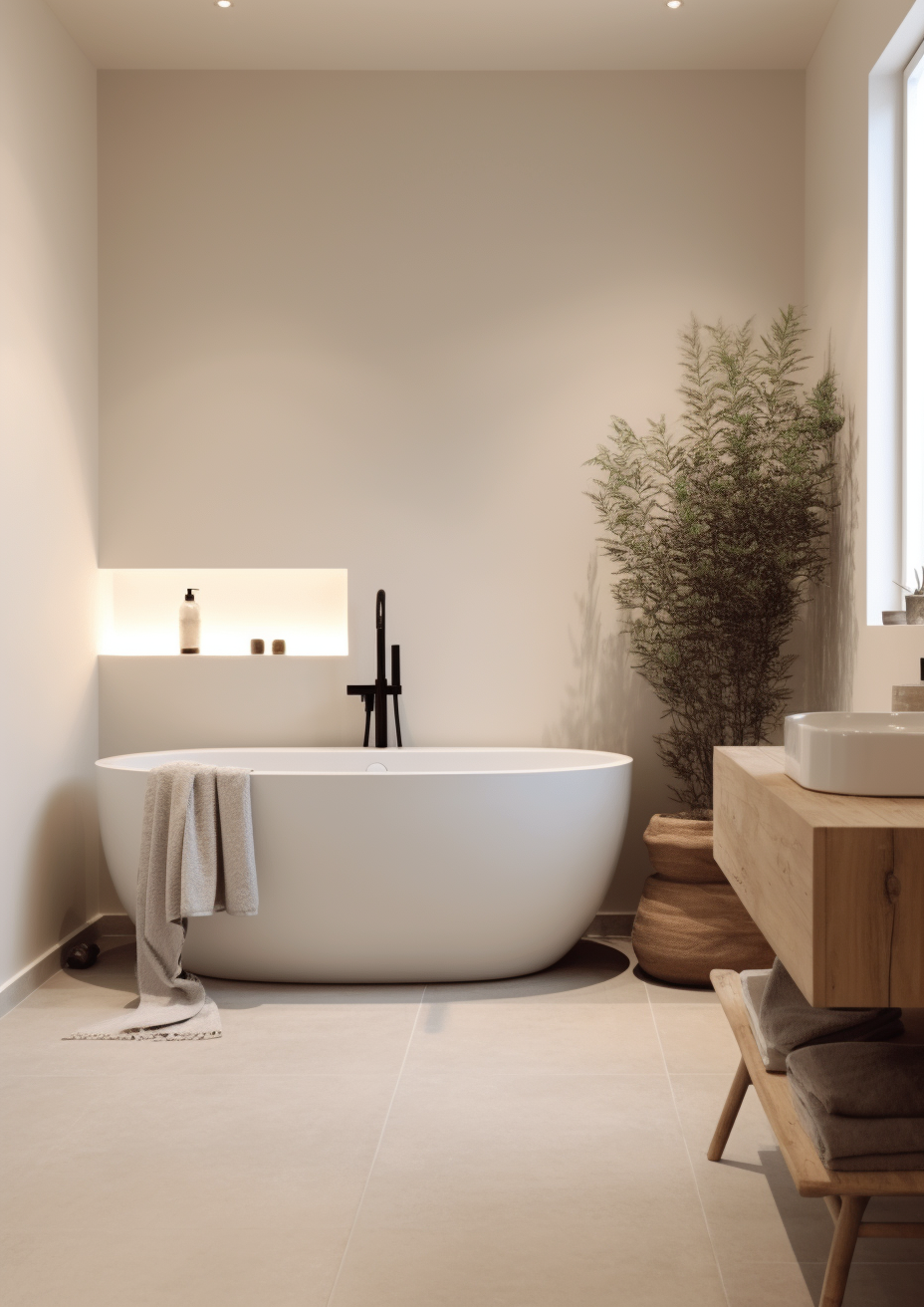
For most rooms, the question is not Swiss Coffee or Accessible Beige - it is which job needs doing. If the wall needs to carry the room, Accessible Beige is the only one of the two built for that.
Swiss Coffee is the right call when brightness is the priority - small rooms, low-light spaces, trim and ceilings throughout the house, or any interior where the palette needs a dependable, quiet white that will not compete with anything else.
Accessible Beige is the right call when the room needs actual warmth and weight - a living room, dining room, or entryway where a true off-white would look thin against the furniture and materials around it.
The test for this pairing is different from most, because the two rarely compete directly: paint a sample of Accessible Beige on the wall you are considering and hold a Swiss Coffee card against the trim in the same light. If the beige still reads warm and grounded next to that bright white in your dimmest north-facing hour, it has passed. If it flattens to grey, add warmer lighting before committing.
Frequently Asked Questions

Is Swiss Coffee the same as Accessible Beige?
No - they sit twenty-five LRV points apart, which is a significant gap. Swiss Coffee is a bright off-white; Accessible Beige is a mid-tone greige. They read as entirely different colours in person, not close variations of the same idea.
Can I use Swiss Coffee and Accessible Beige in the same house?
Yes, and it is a common, well-tested pairing. Accessible Beige on the walls with Swiss Coffee on trim, ceilings, and woodwork gives a room genuine warmth without losing brightness on the details.
Which is better for a small room?
Swiss Coffee, in most cases. Its high LRV reflects more light and will make a small room feel more open. Accessible Beige can work in a small room too, but it needs good natural or layered artificial light to avoid feeling closed in.
Does Accessible Beige look grey or beige?
Both, depending on the light. It is a genuine greige - warm enough to avoid reading cold, restrained enough to avoid reading tan. In flat or north light it can lean slightly cooler; in warm light it leans beige.
Which is better for kitchen cabinets?
Swiss Coffee is the more practical choice for cabinetry. Its high LRV and restrained undertone keep it looking clean against a wide range of countertops and hardware. Accessible Beige on cabinets works only in warm, traditional kitchens with the depth to support it.
What is the LRV of Swiss Coffee vs Accessible Beige?
Swiss Coffee has an LRV of approximately 83 and Accessible Beige has an LRV of approximately 58. That twenty-five-point gap is the single most important fact in this comparison - it is the reason the two colours are rarely used to compete for the same wall.
Final Thought
Swiss Coffee and Accessible Beige are not really rivals. The LRV gap between them is too wide for that - one is built to recede, the other to carry a room.
If the brief needs brightness and a quiet backdrop, Swiss Coffee delivers it without complication. If the brief needs a wall with real warmth and depth, Accessible Beige is the more honest choice - Swiss Coffee simply will not do that job at LRV 83. Test both in your own light before deciding where each one belongs.
Want a complete colour scheme built around Swiss Coffee or Accessible Beige? Our design packages cover full palette selection, finish recommendations, and 3D visualisations - see our packages. |
About the Author
Beril Yilmaz is a qualified architect and interior designer based in the UK. She runs BY Design And Viz, a design platform covering paint colour reviews, interior design guidance, and residential design projects. Beril has specified both Swiss Coffee and Accessible Beige across residential projects in the UK and internationally - Swiss Coffee on trim, ceilings, and cabinetry that needs to stay bright and out of the way, Accessible Beige on walls that need genuine warmth and depth, often specifying both together in the same scheme with Swiss Coffee carrying the woodwork.




Comments