


Swiss Coffee vs Pale Oak: The Comparison That Actually Helps You Decide

Swiss Coffee and Pale Oak get placed on the same shortlist constantly, and the reason is almost never the paint chip - it's the brief. Someone wants a calm, warm, whole-house neutral, and both names surface. But these two are not close relatives; they are two different categories of colour wearing similar reputations. Swiss Coffee is a warm white. Pale Oak is a warm greige, sitting a full 13 points lower on the LRV scale. Confuse the two and you'll end up with a room that reads far brighter, or far duller, than you intended.
I have specified both across residential projects, and I have never once treated them as interchangeable. Swiss Coffee behaves like a white with a personality; Pale Oak behaves like a neutral with real depth. The decision between them is rarely "which one looks nicer" - it's "does this room need brightness or does it need weight."
This guide covers the LRV and undertone difference in detail, where each colour performs and where it fails, how they pair together as a wall-and-trim combination, and the specific lighting test I use before recommending either one to a client.

At a Glance
| Swiss Coffee OC-45 | Pale Oak OC-20 |
Brand | Benjamin Moore | Benjamin Moore |
LRV | 82 - a soft, reflective white | 69 - a genuine neutral, not a white |
Colour category | Warm cream white | Warm greige (taupe-leaning) |
Undertones | Yellow-green - creamy, with an unusual cool wink underneath | Warm taupe with a pink-violet whisper in flat or overcast light |
Character | Full-commitment warm white; behaves like white, not like a neutral | Quiet warm neutral with real colour depth; a backdrop, not a white |
North-facing | Risky - cool light pulls the green cast forward | Flat and cool - the pink-violet undertone can read muddy without warm light to balance it |
South-facing | Excellent - reads bright, warm, and classically creamy | Strong - the taupe settles and reads warm without tipping into pink |
Open-plan | Good as a ceiling or trim white across zones; less reliable as the sole wall colour in mixed light | Excellent - the reason it's Benjamin Moore's best-selling non-white colour |
On walls | Full warm-white backdrop with genuine presence, not a quiet neutral | Soft, calm greige backdrop with genuine depth - not stark, not bright |
On cabinets | Classic warm-white cabinetry, best against warm wood and brass | Muted, timeless cabinetry that needs contrast nearby to avoid reading flat |
Use together? | Yes - Swiss Coffee on trim and ceiling against Pale Oak walls is a considered, well-tested pairing | Yes - Pale Oak on walls with Swiss Coffee on trim keeps both colours in a coherent warm family without competing |
Trim for each | Chantilly Lace OC-65 or Simply White OC-117 for contrast | Chantilly Lace OC-65 for crisp definition against the greige |
Style fit | Traditional, classic, farmhouse | Transitional, modern organic, quiet-luxury interiors |
Architect's pick | When the brief specifically calls for a warm white, not a warm neutral | When the room needs colour and depth, not just brightness |
Benjamin Moore Swiss Coffee OC-45 - What It Really Looks Like

Swiss Coffee has an LRV of approximately 82, with a yellow undertone that carries an unusual green cast running underneath it. That combination is not common among warm whites, and it's the first thing to test for.
It does not behave like a simple cream. In warm, direct light it reads soft and buttery, close to how the name suggests. Under cooler bulbs, in shaded corners, or against very cool-toned surfaces, the green surfaces and the colour can look faintly murky rather than clean. It is a white that rewards testing before it rewards trust.
For the closest Sherwin-Williams equivalent at almost the same LRV, the Swiss Coffee vs Alabaster guide breaks down why two nearly identical numbers on paper still produce two noticeably different rooms - useful reading before committing to either as a whole-house white.
Benjamin Moore Pale Oak OC-20 - What It Really Looks Like

Pale Oak has an LRV of approximately 69, which puts real distance between it and a colour like Swiss Coffee. This is not a white with a hint of grey - it's a genuine greige with enough depth to read as its own colour category, not a shade of white.
The undertone is where it gets interesting. Pale Oak carries a warm taupe base with a pink-violet whisper that most people don't notice on the paint chip. In flat, overcast, or north-facing light, that whisper becomes a whole sentence - the colour can drift towards a dusty, slightly muddy pink rather than the composed neutral grey it promises indoors under warm light.
For how Pale Oak compares against a deeper Benjamin Moore greige at a similar undertone family, the Pale Oak vs Revere Pewter guide covers the depth difference in detail and which one holds its warmth better through a full day of changing light.
The Real Difference Between Swiss Coffee and Pale Oak
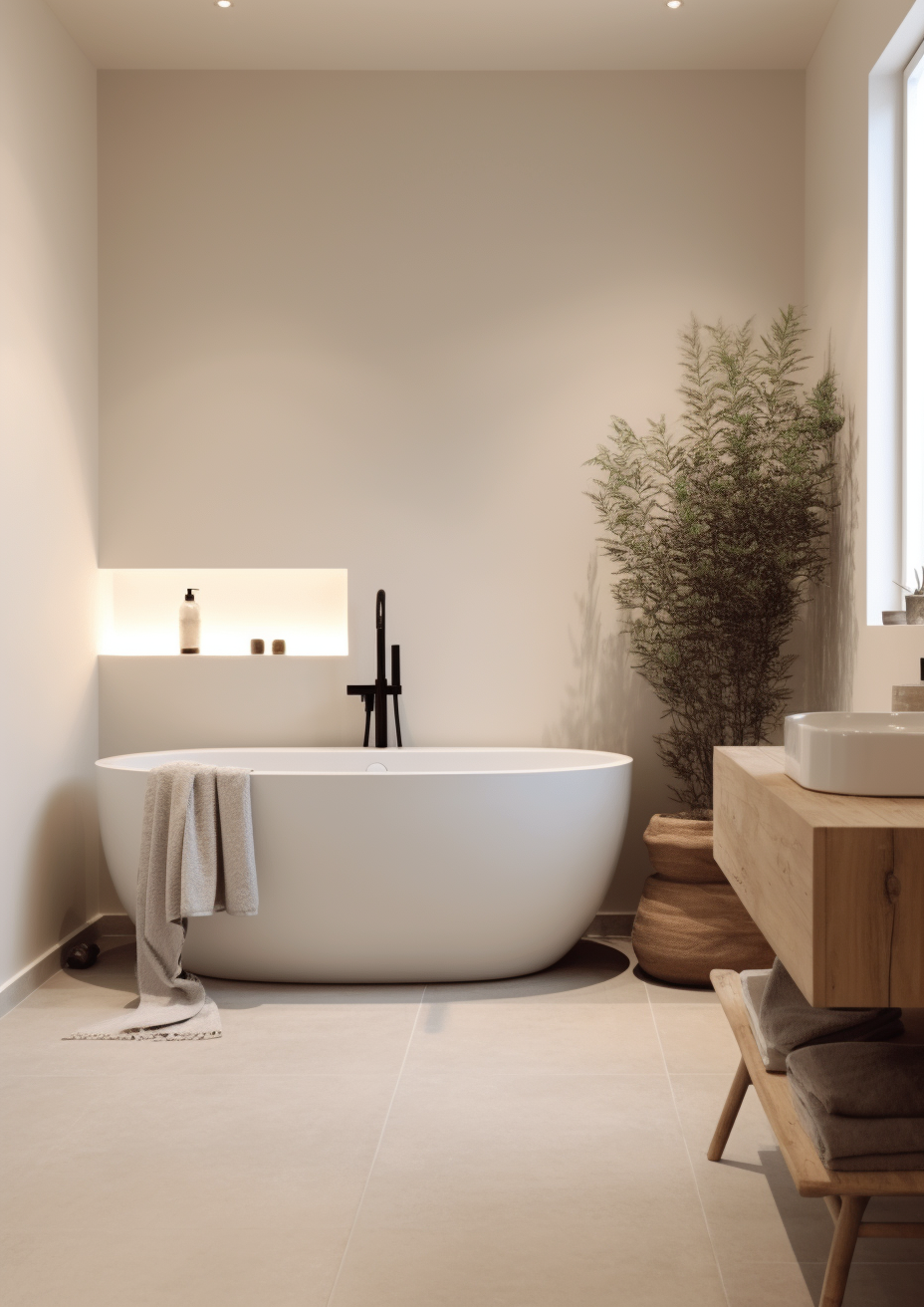
Swiss Coffee and Pale Oak solve two different problems, not the same one. Swiss Coffee is a warm white, full stop - a wall colour that behaves like a white while carrying real warmth underneath it. Pale Oak is not a white at all. At an LRV of 69 against Swiss Coffee's 82, it sits a full 13 points lower, deep enough to read as a genuine neutral with colour and weight rather than a bright backdrop. That gap is the entire story.
Swiss Coffee's LRV of 82 puts it solidly in the soft-white category - bright, reflective, and close enough to true white that it can serve as a ceiling or trim colour in its own right. Pale Oak's LRV of 69 puts it in warm-neutral territory, closer to a light greige than a white. It will never read as bright as Swiss Coffee, and it isn't trying to. The undertones diverge just as sharply. Swiss Coffee carries a yellow-green cast that can flash cool under the wrong bulb. Pale Oak leans warm taupe with a pink-violet whisper that shows up in flat, overcast conditions. Neither undertone behaves like the other, even though both colours are marketed as easy, forgiving neutrals.
The two are best understood as a wall-and-trim pair rather than as competitors for the same surface. Swiss Coffee on trim, ceilings, or cabinetry against Pale Oak walls is a genuinely useful combination - the 13-point LRV gap creates clean definition without introducing a second colour family into the room. Reversing the pairing works less reliably; Pale Oak trim against Swiss Coffee walls can look muddy rather than crisp, because the trim needs to be brighter than the wall to read as trim at all. For the comparison between Swiss Coffee and a true, more neutral white on the same wall, the White Dove vs Swiss Coffee guide covers the trade-off between Swiss Coffee's warmth and a cleaner, less undertone-prone alternative.
Not sure which one works for your room? A colour consultation is included in all our design packages - book directly here. |
When to Choose Swiss Coffee

Choose Swiss Coffee when the brief genuinely calls for a warm white, not a warm neutral. These are the conditions where it performs:
South or west-facing rooms with warm wood floors, brass hardware, and natural materials throughout - where the whole room is already warm and Swiss Coffee simply completes it. Kitchens and cabinetry where a soft, creamy white is the goal rather than a stark, clinical one. Whole-house trim and ceiling schemes, where its high LRV keeps mouldings crisp without introducing a second colour family.
Avoid it in north-facing rooms and under cool LED lighting. Both conditions pull the green undertone forward, and what should read as a soft cream can start to look faintly institutional instead. Test a large sample in your actual room before committing - Swiss Coffee's undertone shift is real, not theoretical.
When to Choose Pale Oak

Choose Pale Oak when the room needs colour and depth, not just brightness. These are the situations where it is the stronger choice:
Open-plan spaces where a whole-house neutral needs to read consistently warm without being a bright white. Living rooms and bedrooms where the goal is a calm, enveloping backdrop rather than an airy one. Rooms with warm wood floors, brass or aged gold hardware, and warm stone - materials that support the taupe undertone instead of fighting it.
Avoid it in north-facing rooms with limited daylight. Without warm light to activate it, Pale Oak can look dull and slightly pink rather than composed. It is not a colour that hides flaws in a dark room - it needs light to do its best work.
How the Pairings Differ

Swiss Coffee on walls pairs best with warm wood tones, aged brass, and other warm whites on trim. Chantilly Lace or Simply White on mouldings gives clean contrast without fighting the green undertone. Avoid pairing it with cool grey stone or stainless steel - the contrast will feel unresolved rather than intentional.
Pale Oak on walls pairs naturally with warm stone, oak flooring, and brushed brass or aged gold hardware. It handles a wider range of adjacent materials than Swiss Coffee because its undertone is more muted, but it still needs warmth nearby - next to cool white marble or chrome fixtures, the pink-violet whisper can become more noticeable than it should be.
For flooring, both colours want warmth underneath them. Swiss Coffee needs it more urgently - cool grey engineered flooring alongside Swiss Coffee walls creates a genuine undertone conflict. Pale Oak is more forgiving and can sit comfortably alongside warm-toned porcelain, limestone, or mid-tone oak without clashing.
For hardware, both colours suit brass and aged gold. Pale Oak also handles brushed nickel reasonably well in transitional schemes. Swiss Coffee is less comfortable with cool metals - the green-yellow undertone reads more unresolved against chrome or matte black than Pale Oak's warmer, more settled taupe does.
Architect's Verdict - Swiss Coffee or Pale Oak?

This is not really a close call, and that's the point worth understanding before comparing anything else.
Choose Swiss Coffee when the room genuinely needs a white - brightness, reflectivity, and a soft warm cast rather than colour and depth. It is the right call for trim, ceilings, cabinetry, and any wall that needs to stay light while still carrying warmth. Its LRV of 82 does real work in rooms that need to feel open.
Choose Pale Oak when the room needs a neutral with actual presence - a backdrop that reads as colour, not just brightness. It is the stronger choice for whole-house schemes, open-plan living spaces, and any room where a stark white would feel too clinical. Its LRV of 69 gives it weight that Swiss Coffee simply does not have.
The test I always recommend: buy a sample pot of each, paint two large boards, and place both in the room's worst light - typically a north-facing wall in late afternoon, under a cool-white LED bulb rather than a warm one. Watch Swiss Coffee for a green cast creeping into the white. Watch Pale Oak for a pink-violet drift pulling it away from neutral grey. Whichever one still looks composed and intentional in that light, rather than accidental, is the one your room actually needs.
Frequently Asked Questions

Is Swiss Coffee warmer than Pale Oak?
Not exactly warmer - differently warm. Swiss Coffee carries a yellow-green undertone and reads as a warm white. Pale Oak carries a warm taupe base with a pink-violet whisper and reads as a warm neutral, not a white at all. The two undertone families don't behave the same way in the same light.
Can I use Swiss Coffee and Pale Oak together?
Yes, and it's a genuinely useful pairing. Swiss Coffee on trim, ceilings, or cabinetry against Pale Oak walls gives clean definition thanks to the 13-point LRV gap between them, while keeping both colours in the same warm family. Reversing the pairing is less reliable and should be tested carefully first.
Which is better for a north-facing room?
Neither performs at its best in a north-facing room, but they fail in different ways. Swiss Coffee's green undertone becomes more pronounced under cool, indirect light. Pale Oak's pink-violet whisper can read flat and slightly muddy without warm light to activate it. Test both with a large sample before deciding.
What is the LRV of Swiss Coffee vs Pale Oak?
Swiss Coffee has an LRV of approximately 82, and Pale Oak has an LRV of approximately 69. That 13-point gap is significant - Swiss Coffee reflects noticeably more light and reads as a genuine white, while Pale Oak reads as a true, colour-forward neutral rather than a bright backdrop.
Which is better for kitchen cabinets?
It depends on whether the kitchen wants a white or a neutral. Swiss Coffee suits kitchens with warm wood and brass that want a soft, creamy white cabinet colour. Pale Oak suits kitchens that want a quieter, more muted cabinet tone with genuine depth - particularly alongside warm stone countertops. Always test both against your actual countertop and floor before committing.
Final Thought
Swiss Coffee and Pale Oak are not competing for the same job. One is a warm white with a distinctive undertone quirk; the other is a warm neutral with genuine colour depth. Treating them as interchangeable is where most colour decisions in this pairing go wrong.
If the room needs brightness, reflectivity, and a soft warm cast, Swiss Coffee delivers it - provided the light and materials around it are warm enough to keep the green undertone in check. If the room needs a neutral with real weight and presence, Pale Oak is the more considered choice - provided there's enough warm light to keep the pink-violet whisper from taking over. Sample both properly, in your own room, across a full day, before either goes anywhere near a full wall.
Want a complete colour scheme built around Swiss Coffee or Pale Oak? Our design packages cover full palette selection, finish recommendations, and 3D visualisations - see our packages. |
About the Author
Beril Yilmaz is a qualified architect and interior designer based in the UK. She runs BY Design And Viz, a design platform covering paint colour reviews, interior design guidance, and residential design projects. Beril has specified both Swiss Coffee and Pale Oak across residential projects in the UK and internationally - Swiss Coffee on trim, ceilings, and cabinetry in traditional and farmhouse schemes with warm wood and brass, Pale Oak on walls in open-plan and transitional spaces that need a neutral with genuine colour depth, often specifying both together in the same scheme with Swiss Coffee on the trim.


Comments