


Swiss Coffee vs Simply White: The Comparison That Actually Helps You Decide

Updated: Oct 15
Swiss Coffee and Simply White both sit in Benjamin Moore's warm white family, but they occupy completely different jobs on a colour card. Swiss Coffee holds a soft, creamy backdrop with a seven-point-lower LRV, while Simply White pushes toward true brightness with a cleaner, more assertive warmth. Held side by side, one reads settled and the other reads lit.
I have specified both across residential projects, and the decision is never about which is the "better" white - it is about which job the room needs done. Swiss Coffee behaves like a warm off-white that recedes; Simply White behaves like a bright white that still carries a trace of warmth. They are rarely interchangeable once you have tested them in the same space.
This guide covers the undertone behaviour, the LRV gap that actually matters, and exactly which rooms each colour is built for.

At a Glance
| Swiss Coffee | Simply White |
Brand | Benjamin Moore | Benjamin Moore |
LRV | 82 - a soft off-white, reflects well but never reads bright | 90 - genuinely bright, reflects strongly and lifts a room |
Colour category | Creamy backdrop white - warm and settled rather than crisp | Bright warm white - crisp with just enough undertone to avoid feeling cold |
Undertones | Warm yellow with a faint green cast that keeps it from tipping fully cream | Clean, subtle yellow - warm enough to avoid starkness, restrained enough to stay crisp |
Character | Cosy and grounded; recedes into a room rather than announcing itself | Fresh and versatile; lifts a room rather than settling into it |
North-facing | Manageable - the green cast tempers the yellow, though it can look flat without warm light | Reliable - the subtle warmth keeps it from reading cold even in flat light |
South-facing | Warm and inviting - the cream quality softens strong sun rather than fighting it | Can lean slightly warm and buttery in strong direct sun, though rarely to excess |
Open-plan | Moderate - reads consistently warm but can look dated next to brighter white trim | Strong - the high LRV reads consistently bright across zones and material temperatures |
On walls | Warm, settled backdrop that holds a room together without demanding attention | Crisp, light-filled backdrop that genuinely brightens a room rather than just warming it |
On cabinets | Classic in traditional kitchens with wood tones; can look dated against bright white counters | The more practical choice for classic white kitchens - clean against most stone and metal finishes |
Use together? | Yes - Swiss Coffee on walls with Simply White on trim gives clean definition without harsh contrast | Yes - Simply White on trim against Swiss Coffee walls is the classic pairing; the reverse rarely works |
Trim for each | Simply White for a brighter step up, or Chantilly Lace for maximum contrast | Chantilly Lace for a cooler, crisper step up, or keep Simply White throughout for a seamless scheme |
Style fit | Traditional, transitional, warm minimalism | Transitional, coastal, classic white kitchens, light-filled modern |
Architect's pick | When the room needs warmth that stays quiet and does not compete with furnishings | When the room needs genuine brightness and the warmth only needs to be a whisper |
Benjamin Moore Swiss Coffee OC-45 - What It Really Looks Like

Swiss Coffee has an LRV of approximately 82, which puts it firmly in the soft off-white category rather than the bright-white one. The name suggests something crisper than it actually delivers - in practice this is a creamy, settled warm white with a faint green undertone running underneath the yellow.
In north-facing or low-light rooms that green cast becomes more noticeable, occasionally reading slightly grey rather than warm. It does not chase brightness the way Simply White does. In south-facing rooms with strong natural light, the cream quality comes forward and the colour feels genuinely cosy rather than flat.
The critical thing to understand about Swiss Coffee is that it commits to warmth without demanding attention. It sits back. Against warm wood tones and traditional finishes it looks intentional and settled. Against very bright white trim or stark modern fixtures, it can look slightly dated - the gap in brightness becomes the story rather than the undertone.
Benjamin Moore Simply White OC-117 - What It Really Looks Like

Simply White has an LRV of approximately 90, nearly eight points brighter than Swiss Coffee, and it shows immediately on the wall. This is a genuinely bright white with a subtle yellow undertone underneath - present enough to avoid feeling clinical, restrained enough to still read as white rather than cream.
In bright natural light Simply White can look almost pure, with the undertone all but disappearing. In dimmer or north-facing rooms the warmth becomes more visible and keeps the colour from reading cold or flat. It does not need warm materials around it to perform.
This is what separates Simply White from a colour like Swiss Coffee. It is not trying to be a cream. It is a bright white that happens to carry enough warmth to avoid the sterile quality that pure whites can bring into a room. That makes it far more forgiving across different light conditions and material palettes.
The Real Difference Between Swiss Coffee and Simply White

The simplest way to explain it: Swiss Coffee is a warm white that settles into a room. Simply White is a warm white that lifts one. The nearly eight-point LRV gap between them is the real story here, not the undertone alone.
Because that gap is close to the ten-point threshold where two colours stop competing and start serving different jobs, Swiss Coffee and Simply White are best understood as functional opposites rather than rivals. Swiss Coffee is the quieter backdrop; Simply White is the brighter lift. Choosing between them usually comes down to how much light the room already has and how much brightness it needs to borrow.
The pairing between them makes this clearest. Swiss Coffee on walls with Simply White on trim is the classic combination - the brightness step-up on the joinery does real work rather than just creating contrast for its own sake. For the comparison of Swiss Coffee against SW Alabaster - a near-identical LRV but a very different undertone story - the Swiss Coffee vs Alabaster guide walks through exactly where the two diverge and which one wins in a north-facing kitchen.
Not sure which one works for your room? A colour consultation is included in all our design packages - book directly here. |
When to Choose Swiss Coffee

Choose Swiss Coffee when the brief calls for a warm, settled backdrop rather than a bright, crisp one. These are the conditions where it is the right answer.
South or west-facing rooms with good natural light, where the cream undertone has warmth to work with. Traditional and transitional interiors where a soft, aged quality suits the scheme. Living rooms and bedrooms where the goal is cosy rather than airy - Swiss Coffee reads as a colour that has always been there.
Avoid it in rooms that need real brightness - basements, north-facing spaces with limited light, or interiors where the brief is specifically clean and modern. In those conditions the green undertone can read flat rather than warm, and the LRV gap against a brighter trim will be obvious.
When to Choose Simply White

Choose Simply White when the room needs genuine brightness and a white that stays clean under mixed light. These are the situations where it outperforms Swiss Coffee.
Kitchens with white cabinetry, where a true bright white keeps stone and metal finishes looking sharp. North-facing rooms or spaces with limited natural light, where the higher LRV does real work lifting the space. Open-plan interiors where the colour needs to read consistently bright across different zones and finishes.
It is also the stronger choice for trim and woodwork against a warmer wall colour - the brightness gap creates definition without looking mismatched. Avoid it where the brief specifically wants a cosy, creamy quality; that is Swiss Coffee's job, not Simply White's.
How the Pairings Differ

For Swiss Coffee on walls, Simply White is the natural trim choice - a genuine step up in brightness that creates clean definition without the contrast feeling harsh. Chantilly Lace works too, for those who want a cooler, crisper edge. Avoid pairing Swiss Coffee with a trim white that has grey undertones; the clash reads as dirty rather than intentional.
For Simply White on walls, keep trim in the same colour or step up to Chantilly Lace for a slightly cooler, crisper edge. Simply White on both walls and trim is a popular choice for a seamless, light-filled scheme, particularly in kitchens and bathrooms where the goal is brightness throughout.
For flooring, Swiss Coffee needs warm wood or warm stone to avoid an undertone conflict - cool grey tile alongside Swiss Coffee walls will fight the green-yellow undertone. Simply White is more forgiving and handles both warm wood and cooler stone or porcelain without clashing, thanks to its higher LRV doing more of the visual work.
For hardware, Swiss Coffee suits aged brass and warm brushed gold - cool metals fight its undertone in the same way cool flooring does. Simply White is considerably more flexible, working well with brushed nickel, matte black, and polished chrome as easily as it does with warm brass.
For how Swiss Coffee compares to School House White - the chalkier Farrow & Ball off-white that sits below it on the brightness scale - the School House White vs Swiss Coffee guide shows why Swiss Coffee works as trim against School House White walls and why the reverse fails.
Architect's Verdict - Swiss Coffee or Simply White?
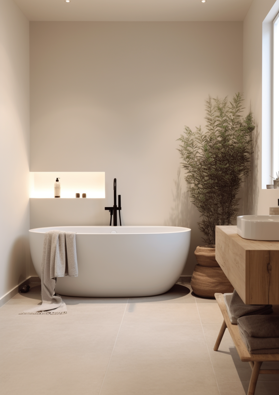
For most homes - particularly rooms that already have good natural light and simply need a warm, settled backdrop - Swiss Coffee is the more characterful choice. For rooms that need the wall colour itself to lift the space, Simply White is the more reliable one.
Swiss Coffee is the right choice in a south-facing traditional room with warm wood floors and furnishings already in place. The colour has somewhere to sit and something to sit against. Push it into a dim, north-facing room and that same settled quality can start to look flat rather than cosy.
Simply White is the right choice wherever the room is working against limited light or needs a genuinely bright backdrop for white cabinetry or trim. It does not need warm materials to perform, which makes it the safer pick when the room's conditions are uncertain or mixed.
The test I always use for this pairing specifically: paint a large sample of each on the darkest wall of the room - typically the one furthest from the window - and check it against north light in the morning and lamplight in the evening. A pass for Swiss Coffee is a colour that still reads warm and settled rather than grey in that worst-case light. A pass for Simply White is a colour that still reads clean and bright rather than dull. Whichever one survives its worst-case test is the one your room needs.
Frequently Asked Questions

Is Swiss Coffee warmer than Simply White?
Swiss Coffee is creamier, but not necessarily warmer in undertone strength. Swiss Coffee carries a green-yellow cast that reads as settled cream, while Simply White carries a cleaner yellow undertone that reads as bright warmth. The bigger difference is brightness - Simply White's LRV sits nearly eight points higher, which changes how each colour behaves far more than the undertone does.
Can I use Swiss Coffee and Simply White in the same house?
Yes, and it is a well-established combination. Swiss Coffee on walls with Simply White on trim is the classic pairing - the brightness step-up on the joinery creates genuine definition rather than just contrast. Using Swiss Coffee on trim against Simply White walls is far less common and needs testing first.
Which is better for kitchen cabinets?
Simply White is the more practical choice for kitchen cabinets in most kitchens. Its higher LRV keeps it looking clean against a wide range of countertop and appliance finishes. Swiss Coffee on cabinets works best in traditional kitchens with warm wood and stone, but can look dated alongside bright white counters or stainless steel.
Does Swiss Coffee look yellow on the walls?
In warm natural light it can lean cream, but the green undertone usually keeps it from reading fully yellow. In north-facing rooms or under cool artificial lighting, that green cast can occasionally make it look slightly flat rather than warm. Always test with a large sample patch before committing.
Which is better for a north-facing room?
Simply White handles north-facing rooms more reliably than Swiss Coffee. Its higher LRV does real work lifting a room with limited natural light, while Swiss Coffee's lower reflectance and green undertone can leave a north-facing space feeling slightly flat. If you are committed to Swiss Coffee in that orientation, test it carefully with warm artificial lighting first.
What is the LRV of Swiss Coffee vs Simply White?
Swiss Coffee has an LRV of approximately 82 and Simply White has an LRV of approximately 90. That near eight-point gap is the most important number in this comparison - it is large enough that the two colours function as different tools rather than close competitors, even though both are described as warm whites.
Final Thought
Swiss Coffee and Simply White are both excellent Benjamin Moore whites, but they are not really competing for the same job. The choice between them comes down to what the room already has and what it still needs.
If your room already has good light and warm materials, Swiss Coffee will settle in and add quiet character without demanding attention. If your room needs genuine brightness - limited light, white cabinetry, mixed finishes - Simply White is the more dependable choice. Buy sample pots of both, paint large patches on the darkest wall in the room, and check them in morning light and evening lamplight. The one that still looks right in that worst-case light is the one to commit to.
Want a complete colour scheme built around Swiss Coffee or Simply White? Our design packages cover full palette selection, finish recommendations, and 3D visualisations - see our packages. |
About the Author
Beril Yilmaz is a qualified architect and interior designer based in the UK. She runs BY Design And Viz, a design platform covering paint colour reviews, interior design guidance, and residential design projects. Beril has specified both Swiss Coffee and Simply White across residential projects in the UK and internationally - Swiss Coffee in traditional living rooms and bedrooms with warm wood and good natural light, Simply White in kitchens and north-facing rooms that need genuine brightness, often specifying both together in the same scheme with Simply White on trim.


Comments