


White Heron vs Shoji White: The Comparison That Actually Helps You Decide

White Heron is a crisp white with a faint cool cast. Shoji White is a soft, greige-leaning white with real warmth. One brightens a room. The other settles it. That is the whole tension, and it decides which one belongs on your walls.
The numbers show the gap before your eyes do. White Heron sits at an LRV of 87. Shoji White sits at LRV 74. Thirteen points is the difference between a white that throws light back and a neutral that holds some of it. I have used both across residential projects, and they solve opposite problems. White Heron clears a dim room. Shoji White calms a bright one.
This guide covers the undertone difference, how each behaves in north- and south-facing light, which suits walls, cabinets and open-plan layouts, and the trim and flooring pairings that make or break each one. By the end, you will know which one your room can carry.

At a Glance
| White Heron | Shoji White |
Brand | Benjamin Moore | Sherwin-Williams |
LRV | 87 - very bright, reflects most of the light it receives and visibly lifts a dim room | 74 - mid-light, softly reflective, holds enough light to feel settled rather than glaring |
Colour category | Crisp bright white - clean and near-neutral, built for clarity rather than coziness | Warm greige-white - behaves more like a pale greige than a true white |
Undertones | Faint cool green-gray cast - barely there in sun, more visible in shade and under cool LEDs | Warm beige-gray with a taupe lean - reads sandy and stone-like, rarely yellow |
Character | Gallery-clean and precise. Frames art, joinery and architecture without adding a mood of its own. Needs warm wood, textiles or lamplight around it to avoid reading clinical | Quiet, earthy and enveloping. Adds a mellow depth that makes rooms feel layered and lived-in. Needs light and texture to avoid reading flat |
North-facing | Workable with care - the cool cast can surface as a flat gray-green on overcast days, but the high LRV keeps the room bright | Holds its warmth better than most, but the greige base can turn gray and subdued without lamplight to lift it |
South-facing | Excellent - strong sun absorbs the cast and leaves a clean, luminous white that stays crisp rather than creamy | Warm and mellow - sun pulls out the sand and beige, giving a soft glow without glare |
Open-plan | Good for continuity - one bright white reads consistently from zone to zone, provided the floors and furnishings supply warmth | Good for flow - the mid-depth tone blurs the edges between zones and gives a sheltered feel, if floor tones stay consistent |
On walls | High-reflectance backdrop that makes walls recede and ceilings feel taller. Shows shadows and surface flaws more readily in raking light | Soft envelope that hides imperfections and stays composed as the light changes. Shadows add gentle depth rather than harshness |
On cabinets | Sharp, contemporary finish for flat-panel and shaker kitchens with stainless, quartz and black or nickel hardware. Can feel stark beside warm wood | Best in organic modern and warm kitchens with oak, limestone and brass. Can look dingy beside bright white countertops |
Use together? | Yes - White Heron on trim, doors or ceilings against Shoji White walls gives clean definition through a 13-point step in brightness | Yes, with testing - Shoji White walls with White Heron trim works well. The reverse risks heavy-looking trim |
Trim for each | White Heron itself in semi-gloss, or Chantilly Lace OC-65 for a brighter edge | White Heron OC-57 for crisp contrast, or Extra White SW 7006 or Pure White SW 7005 within the same brand |
Style fit | Contemporary, Scandinavian, minimalist and modern farmhouse | Organic modern, transitional, Japandi and coastal neutral |
Architect's pick | When the room is dim, the brief is crisp and clean, and warmth can come from materials rather than paint | When the room already has good light, the brief is soft and layered, and you want warmth without committing to cream |
Benjamin Moore White Heron OC-57 - What It Really Looks Like

White Heron has an LRV of 87, which puts it firmly in the very bright white category. That is high enough to lift a dim room visibly. It is also close to neutral, with only the faintest cool, green-gray cast beneath the brightness.
White Heron does not read as warm. In strong south-facing light the cast disappears and you get a clean, luminous white. In shade or under cool LEDs it surfaces as a flat gray-green. In evening lamplight it warms slightly but stays crisp.
Brightness is its strength and its risk. On large walls with no warm materials to answer it, it can feel stark. Before committing to a full room, the Benjamin Moore White Heron guide walks through how it behaves on ceilings, trim and exteriors, which helps if you are weighing it beyond walls.
Sherwin-Williams Shoji White SW 7042 - What It Really Looks Like

Shoji White has an LRV of 74, which puts it in the mid-light greige-white category. That is 13 points below White Heron, and you can see it. The color sits closer to a pale greige than a true white, with a warm beige-gray base and a soft taupe lean.
Shoji White settles a room. In sunlight it turns sandy and stone-like. In evening lamplight it deepens into a soft, mellow greige. It rarely tips yellow, which separates it from the cream-leaning whites. In a north-facing room the greige base can go gray and subdued.
It needs texture to avoid reading flat. Linen, oak and honed stone give it depth. Bare walls under cool light do not. To see how that mid-depth warmth holds up beside a brighter neutral, the Shoji White vs Cloud White guide shows the same contrast between a bright white and Shoji's softer greige in real rooms.
The Real Difference Between White Heron and Shoji White

White Heron is a white that behaves like a white. Shoji White is a neutral that behaves like a soft greige. That is the whole comparison. Everything else follows from it.
The 13-point LRV gap is visible side by side. White Heron reflects about 87 percent of the light that hits it. Shoji White reflects about 74 percent. In a sunny south-facing room, both feel bright. In a north-facing room the gap widens fast. White Heron keeps its clarity, while Shoji White drops toward a mellow, shadowed greige. Neither is wrong. They are built for different jobs.
The trim relationship tells you the most. Shoji White walls with White Heron trim is the pairing that works. The 13-point step gives clean definition without harshness. The reverse needs care, because a darker, warmer trim can look heavy against bright walls. If you are weighing Shoji White against another Sherwin-Williams soft white instead, the Shoji White vs Alabaster guide explains how Shoji's greige base separates it from a true warm white, which is the question to settle before you buy samples.
Not sure which one is right for your room? A Color Direction consultation gets you a full custom palette built around your space - book yours here. |
When to Choose White Heron

Choose White Heron when the room needs light, clarity and a clean architectural edge. These are the conditions where it is the right answer.
Dim rooms gain the most, especially north- and east-facing spaces, basements and deep-plan interiors, where an LRV of 87 does real work. Contemporary, Scandinavian and modern farmhouse interiors with stainless, quartz and black or nickel hardware suit it well. So do ceilings, trim and kitchens where a crisp, gallery-like finish is the goal.
Avoid it where warmth is the brief. In a cozy living room beside warm oak and cream upholstery, White Heron can feel stark and slightly gray. Avoid it in period homes where a mellow, aged character is the intent. It does not soften itself.
When to Choose Shoji White
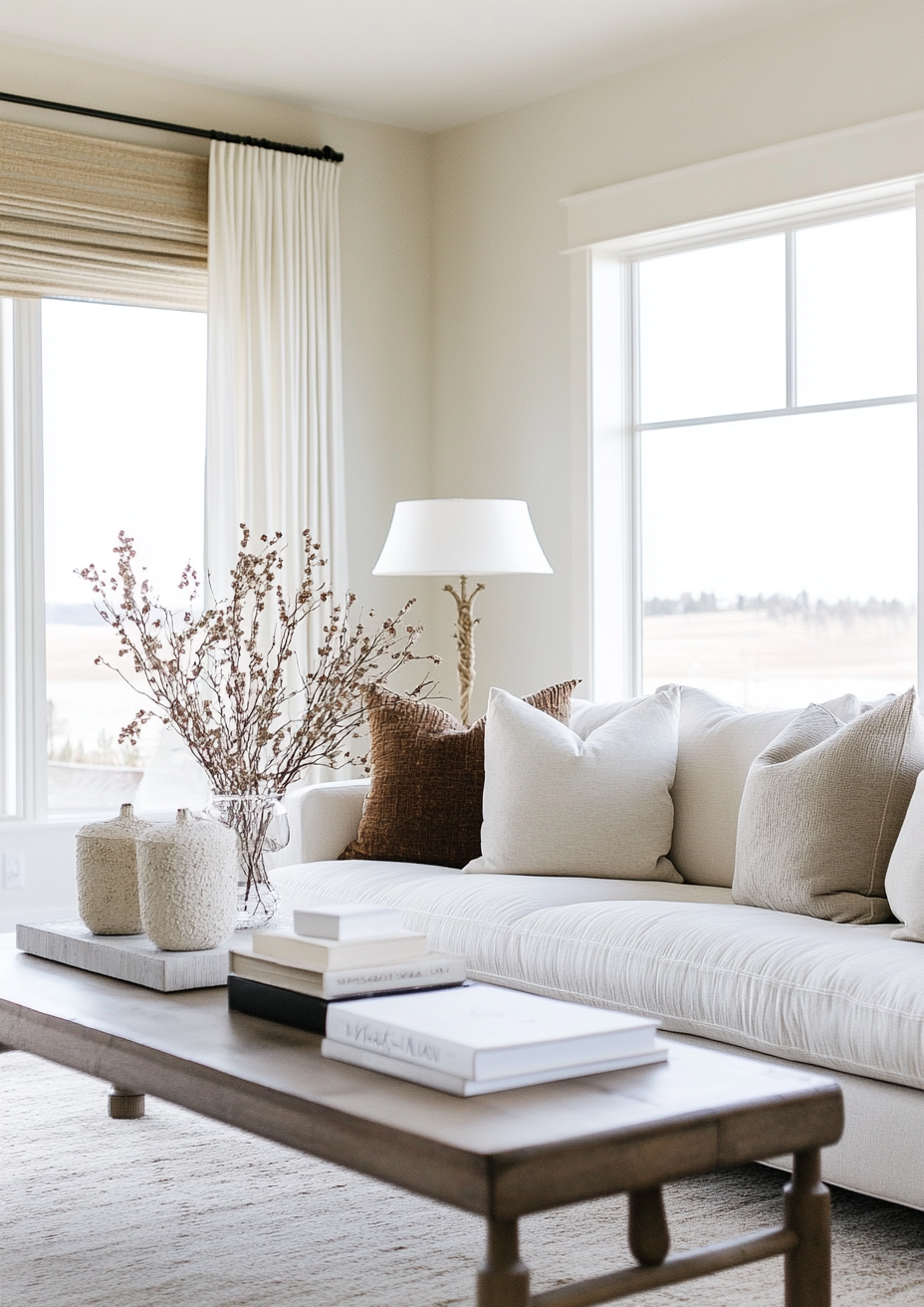
Choose Shoji White when the room already has light and the brief is soft, layered and warm. This is where it outperforms White Heron.
South- and west-facing rooms, living rooms, bedrooms and open-plan spaces with oak, linen and honed stone, give it the depth it needs. Organic modern, Japandi and transitional interiors suit it well. It also hides scuffs and shadows better than a bright white. The softness is deliberate.
Avoid it where brightness is the brief. In small, dim rooms or beside bright white countertops, Shoji White can read dingy and gray. Skip it for ceilings and crisp trim, where it looks flat. It is a backdrop, not an accent.
How the Pairings Differ

For White Heron on walls, the most natural trim is White Heron itself in a higher sheen. Semi-gloss on joinery gives definition without a color shift. Chantilly Lace OC-65 is the brighter alternative when you want a distinctly crisp edge. Avoid warm cream trim, which makes White Heron look gray by comparison.
For Shoji White on walls, White Heron on trim is the sharpest choice. It lifts the joinery clearly without a stark jump. Extra White SW 7006 or Pure White SW 7005 are the same-brand options. Alabaster SW 7008 softens the step for a more enveloping scheme.
For flooring, Shoji White is the more forgiving. It sits comfortably with oak, walnut, honed limestone and warm porcelain. White Heron prefers warm wood and natural stone underfoot to offset its cool cast. Gray tile beside it makes a room feel cold.
For hardware, White Heron suits brushed nickel, matte black and chrome. Aged brass also works if you want warmth against the crispness. Shoji White pairs best with aged brass, bronze and unlacquered brass. Polished chrome can feel too sharp against its soft greige base.
Architect's Verdict - White Heron or Shoji White?

For most homes, the choice comes down to one question. Does the room need more light, or more calm?
Choose White Heron when the room is dim, the brief is crisp, and you can add warmth elsewhere. It is cleaner, brighter and more architectural. It is also less forgiving.
Choose Shoji White when the room already has light and the brief is soft, layered and warm. It is the better backdrop for oak, linen and stone. It rarely feels stark. It can feel muted.
The test I always use: paint two patches roughly two feet square on two different walls, with a strip of your trim color between them. Check them at midday on an overcast day, which is the worst case for both, then again at dusk under a 2700K lamp. A pass for White Heron means it still reads clean and white, with no green-gray tint and no clinical chill under the lamp. A pass for Shoji White means it still reads warm and soft in the flat light, not gray, muddy or dingy. Whichever one passes both checks is your answer.
Frequently Asked Questions

Is White Heron warmer than Shoji White?
No - Shoji White is the warmer of the two. Its beige-gray base with a taupe lean reads warm in almost any light. White Heron is near-neutral with a faint cool cast. The difference shows most in shade and evening light.
Which is better for a north-facing room?
White Heron keeps its clarity better. Its LRV of 87 bounces back more of the weak light, so the room stays bright. Shoji White can go gray and subdued in the same conditions, though lamplight warms it. If the room feels dim, choose White Heron. If it feels cold, test Shoji White with warm bulbs.
Can I use White Heron and Shoji White in the same room?
Yes, and it is a strong pairing. Shoji White on walls with White Heron on trim, doors or the ceiling gives clean definition. Test it first, because the 13-point LRV step is clear and the ceiling shows it most.
Which is better for kitchen cabinets?
It depends on the finishes around them. White Heron suits contemporary kitchens with stainless, quartz and black or nickel hardware. Shoji White suits organic and transitional kitchens with oak, limestone and brass. Bright white countertops can make Shoji White cabinets look dingy, so test beside the actual slab.
Does White Heron look stark or blue?
It can look stark, but not blue. The cast is faint and leans green-gray rather than blue. It surfaces in shade and under cool LEDs. Warm bulbs, wood and textiles fix it quickly.
What is the LRV of White Heron vs Shoji White?
White Heron has an LRV of approximately 87 and Shoji White has an LRV of 74. That 13-point gap is large. White Heron reflects far more light, which makes it the better choice for dark rooms. The undertone gap matters just as much as the number.
Final Thought
White Heron and Shoji White solve different problems. The choice is not about which is better. It is about whether your room needs brightness or softness.
If your room is dim and your materials are warm, White Heron gives you clean light and sharp architecture. If your room is bright and you want a calm, layered backdrop, Shoji White delivers warmth without the cream. Order sample pots of both, paint large patches side by side, and watch them at morning, midday, dusk and under lamplight. The answer will be clear within 24 hours.
Want a complete colour scheme built around White Heron or Shoji White? Our design packages cover full palette selection, finish recommendations, and 3D visualisations - see our packages. |
About the Author
Beril Yilmaz is a qualified architect and interior designer based in the UK. She runs BY Design And Viz, a design platform covering paint colour reviews, interior design guidance, and residential design projects. Beril has specified both White Heron and Shoji White across residential projects in the UK and internationally — White Heron in contemporary kitchens and low-light spaces where clean brightness was the brief, Shoji White in living rooms and open-plan spaces where a softer, warmer backdrop was needed, often in the same scheme with Shoji White on walls and White Heron on trim.


Comments