


White Heron vs White Dove: The Comparison That Actually Helps You Decide

White Heron and White Dove sit at opposite ends of Benjamin Moore's soft-white range, and the gap between them is bigger than their shared reputation as "easy whites" suggests. White Heron pulls cool — a faint grey-green whisper that keeps it crisp. White Dove pulls warm — a muted, grayed-back yellow that keeps it soft. Held side by side on a swatch card, the difference looks subtle. Painted across a full wall in your actual room, under your actual light, one of them will look right and the other will look slightly wrong — and which is which depends entirely on the room.
I have specified both across very different briefs, and the decision is never about which colour is nicer. It comes down to what the room's light and materials are already doing, and which of these two whites will support that rather than fight it.
This guide covers the undertone difference in detail, where each colour performs best by orientation, how they pair with trim, cabinetry, and hardware, and which one an architect would actually specify for your specific room.
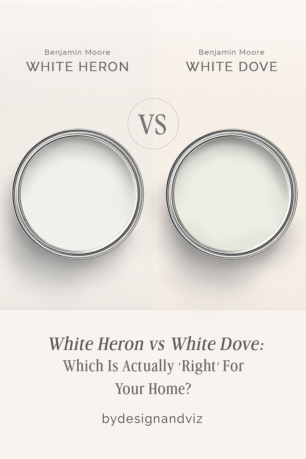
At a Glance
| White Heron | White Dove |
Brand | Benjamin Moore | Benjamin Moore |
LRV | 87 — cool, near-neutral, one of BM's brightest whites | 85 — warm and soft, reads warmer than the number alone suggests |
Colour category | Cool crisp white — the coolest "white" in BM's soft-white range | Warm soft white — BM's most popular warm neutral white |
Undertones | Faint grey-green, occasionally reads blue-grey in shade | Muted yellow, grayed down so it never turns custard |
Character | Clean and architectural; holds its cool line even under warm light | Soft and enveloping; never reads stark even in bright light |
North-facing | Reliable in daylight, risky after dark — can flatten toward grey without natural light to activate it | Reliable — the warm undertone keeps it from reading flat or grey in low light |
South-facing | Can look slightly clinical if the room is already bright and cool-toned | Excellent — the warmth activates gently and the room feels inviting |
Open-plan | Strong — consistent cool-white read across zones and materials | Moderate — can shift slightly warmer or cooler depending on adjacent light |
On walls | Crisp, gallery-like backdrop with real definition | Soft, warm backdrop that recedes rather than announces itself |
On cabinets | Best against cool stone, stainless steel, and matte black hardware | Best against warm wood, brass, and traditional stone |
Use together? | Yes — White Heron on trim against White Dove walls sharpens the warmth without fighting it | White Dove on trim against White Heron walls needs testing — the warmth can compete |
Trim for each | Chantilly Lace for a brighter, cooler step up | White Heron for a crisp neutral step up without introducing warmth |
Style fit | Modern, minimalist, coastal-cool, gallery interiors | Traditional, transitional, farmhouse, classic interiors |
Architect's pick | When the brief calls for a clean, cool, architectural white | When the brief calls for a warm, soft, universally liked white |
Benjamin Moore White Heron OC-57 - What It Really Looks Like

White Heron has an LRV of 87, which puts it firmly in the cool, high-reflectance white category. It reads as a crisp, near-neutral white with a faint whisper of grey-green behind it — never yellow, never warm. There is nothing ambiguous about it.
That LRV means it bounces back a huge amount of light, which is why it performs so well in rooms that already get plenty of daylight. In flat or overcast light the cool undertone can edge toward grey rather than white. It does not compromise. Put White Heron next to a warm material and the contrast is immediate — it holds its cool line regardless of what surrounds it.
For the full single-colour breakdown of White Heron — LRV behaviour across all four exposures, coordinating trims, and real project photos — the Benjamin Moore White Heron review goes deeper into how it performs on its own, outside of this comparison.
Benjamin Moore White Dove OC-17 - What It Really Looks Like

White Dove has an LRV of 85, which puts it firmly in the soft, warm-white category. The undertone is a muted yellow, grayed down enough that it never turns custard or cream. It reads as gently warm rather than obviously warm.
That restraint is what makes White Dove so widely specified. It does not spike yellow in strong south light the way a stronger warm white would, and it does not go flat or grey in low light either. It holds a soft, even warmth across most conditions, which is exactly why it shows up on so many trim schedules as well as walls.
For how White Dove compares to Agreeable Gray — Benjamin Moore's warm-leaning grey that shares similar popularity but a completely different undertone family — the White Dove vs Agreeable Gray guide covers the undertone contrast and which rooms favour each.
The Real Difference Between White Heron and White Dove

The simplest way to put it: White Heron is a white that stays cool no matter what you put next to it. White Dove is a white that stays warm no matter what light hits it.
White Heron sits two points higher on the LRV scale, but the number is almost beside the point. The undertone is what separates them — grey-green against muted yellow — and that difference shows up long before the brightness does. Side by side, White Heron looks noticeably cooler and White Dove looks noticeably softer, even though both read as "just white" from across the room.
White Heron on walls with White Dove on trim rarely works. The two undertones compete rather than complement, and the warmth in the trim can look slightly dirty against the cooler wall colour. The safer route is choosing one undertone family and staying in it throughout the room. For how White Heron compares against a true, undertone-neutral white rather than a warm one, the White Heron vs Simply White guide is the better reference — it shows what White Heron looks like next to a white with almost no undertone at all, rather than against White Dove's warmth.
Not sure which one works for your room? A colour consultation is included in all our design packages - book directly here. |
When to Choose White Heron

Choose White Heron when the brief calls for a clean, cool, architectural white that won't drift warm. These are the conditions where it performs best:
South- or west-facing rooms with strong natural light, where the cool undertone stays crisp rather than clinical. Modern, minimalist, and coastal interiors where the brief is bright and pared-back. Rooms with cool stone, stainless steel, or black metal finishes, where a warm white would create an undertone clash. Bathrooms and kitchens where a bright, clean, gallery-like white is the goal.
Avoid White Heron in north-facing rooms with limited natural light — the cool undertone can flatten into grey without daylight to activate it. Avoid it in traditional or farmhouse interiors where warmth is part of the design intent, and test it carefully against warm wood floors and brass, since the contrast can look stark rather than intentional.
When to Choose White Dove

Choose White Dove when the brief calls for a soft, universally liked warm white that holds up in mixed light. These are the situations where it outperforms White Heron:
North-facing rooms and low-light spaces, where the warm undertone keeps the colour from reading flat or grey. Traditional, transitional, and farmhouse interiors where warmth is part of the character. Trim and woodwork in almost any room, where its soft warmth reads as classic rather than stark. Any room where White Heron has already tested too cool or too clinical for the brief.
White Dove is also the safer default when you are unsure — it is one of Benjamin Moore's most specified trim whites for exactly this reason. It rarely looks wrong, even in rooms with mixed material temperatures.
How the Pairings Differ

For White Heron on walls, Chantilly Lace on trim keeps the whole room in the same cool family without introducing any competing warmth. White Dove on trim against White Heron walls can work in a very bright, south-facing room, but test it first — the warmth can look slightly grubby against the cooler wall colour.
For White Dove on walls, White Heron on trim sharpens the definition without fighting the warmth — the cooler trim reads as a clean, deliberate contrast rather than a clash. Simply White is a softer, more traditional alternative for trim if you want to stay entirely within the warm-white family.
Both colours work with a wide range of flooring, but White Heron is the more forgiving choice over cool-toned stone, polished concrete, and pale oak with an ashy finish. White Dove needs warmer floors to perform — walnut, warm oak, and honey-toned stone all support its undertone rather than fighting it.
For hardware, White Heron pairs naturally with matte black, brushed nickel, and chrome — the cool undertone sits comfortably alongside cool metals. White Dove leans toward aged brass, unlacquered brass, and warm gold, though it can handle brushed nickel without the clash a stronger warm white would show.
Architect's Verdict - White Heron or White Dove?

For most homes with mixed light and a mix of warm and cool materials, White Dove is the more forgiving choice. Its warmth is restrained enough not to clash, and it performs reliably in the low light most rooms actually get for most of the day.
White Heron is the right call when the brief is specifically bright, cool, and architectural — a new-build with generous glazing, a coastal scheme, a minimalist kitchen with stone and steel. In the right light it looks genuinely crisp rather than cold, and nothing else in Benjamin Moore's range delivers the same clean, high-reflectance white.
White Dove is the right call whenever warmth needs to hold up under changing or difficult light — period properties, north-facing rooms, and any scheme where the materials are warm rather than cool. It is the safer, more universally liked option, and it rarely reads as the wrong decision.
The worst-case test here is a north-facing room lit only by cool LED bulbs after dark. Buy sample pots of both, paint two large patches side by side on the same wall, and check them at three points: mid-morning daylight, an overcast afternoon, and after dark under your actual bulbs. A pass for White Heron means it still reads white, not grey, once the daylight drops. A pass for White Dove means it still reads soft and warm, not dull, under the cool bulbs. If one of them fails that evening check, the other is your answer.
Frequently Asked Questions

Is White Heron warmer or cooler than White Dove?
White Heron is noticeably cooler than White Dove. White Heron carries a faint grey-green undertone that keeps it crisp, while White Dove carries a muted, grayed-back yellow that keeps it soft and warm. The difference is visible side by side in almost any light.
Can I use White Heron and White Dove in the same house?
You can, but it takes planning. The two undertones sit far enough apart that using them in adjoining rooms without a transition can look unintentional. They work best in separate zones — White Heron in brighter, more modern spaces and White Dove in warmer, more traditional ones — rather than side by side in an open-plan layout.
Which is better for a north-facing room?
White Dove handles a north-facing room better than White Heron. Its warm undertone keeps it from looking flat or grey in low, cool-toned daylight. White Heron can lose its crispness in the same conditions and start to read as a dull grey rather than a clean white.
Which is better for kitchen cabinets?
It depends on the rest of the kitchen. White Heron is the stronger choice against cool stone, stainless steel, and black hardware. White Dove is the more practical choice against warm wood, brass, and traditional stone. Match the cabinet colour to the material temperature already in the room, not the other way around.
What is the LRV of White Heron vs White Dove?
White Heron has an LRV of approximately 87, and White Dove has an LRV of approximately 85. The two-point gap is minor — the real difference is in the undertone, not the brightness. Both reflect a similar amount of light; they simply do it with a different colour behind it.
Final Thought
White Heron and White Dove are both excellent whites, but they are not interchangeable. The choice is not about which one is objectively better — it is about which undertone your room's light and materials can actually support.
If your room is bright and your materials are cool, White Heron will read as genuinely crisp rather than cold. If your room is low-lit or your materials lean warm, White Dove is the more forgiving and ultimately more reliable choice. Test both with a large sample patch before committing — the difference only becomes obvious once it is on the wall.
Want a complete colour scheme built around White Heron or White Dove? Our design packages cover full palette selection, finish recommendations, and 3D visualisations - see our packages. |
About the Author
Beril Yilmaz is a qualified architect and interior designer based in the UK. She runs BY Design And Viz, a design platform covering paint colour reviews, interior design guidance, and residential design projects. Beril has specified both Benjamin Moore White Heron and White Dove across residential projects in the UK and internationally — White Heron in coastal and minimalist new-builds where a crisp, cool white was the brief, White Dove in period renovations and traditional interiors where warmth and softness mattered more than brightness, occasionally specifying White Heron on trim against White Dove walls when a scheme needs both softness and definition.


Comments