


Alabaster vs Linen White: The Comparison That Actually Helps You Decide

Alabaster is a soft white with its warmth held back. Linen White is a creamy off-white with its warmth turned up. Sherwin-Williams Alabaster SW 7008 and Benjamin Moore Linen White OC-146 sit one LRV point apart, yet they land on a wall as two different colors. One reads white first and warm second. The other reads cream first. That order of perception decides everything.
I have used both across residential projects in the UK and internationally, and the wrong pick shows up fast. Alabaster rewards rooms that need flexibility. Linen White rewards rooms that have already committed to warmth. Put Linen White beside cool stone and it turns sandy. Put Alabaster in a room that wants real cream and it looks underpowered.
This guide covers the undertone gap, how each color behaves in different light, where each belongs on walls, trim and cabinets, and a light test that settles the choice. Short on time? Read the verdict first. Then test both on your own wall.

At a Glance
| Alabaster | Linen White |
Brand | Sherwin-Williams | Benjamin Moore |
LRV | 82 - marginally the brighter of the two, though the gap is too small to see. Undertone does the work. | 81 - reflects almost as much light as Alabaster, with a creamier undertone that registers before the brightness does |
Colour category | Restrained warm white - clearly white, with just enough warmth to avoid reading cold | Creamy off-white - sits between a warm white and a pale sandy cream |
Undertones | Soft, muted yellow - present but quiet, and steady as the light changes | Yellow with a sandy, slightly orange lean - reads as cream in daylight and deepens toward butter in lamplight |
Character | Airy and adaptable - steps back and lets furniture, stone and timber lead | Cozy and settled - sets a lived-in cream tone that the room's materials have to match |
North-facing | Reliable - holds a gentle warmth and stays clean, though it can go slightly flat in deep shade | Workable with warm bulbs - the cream stays inviting, but it can turn dull and sandy in cool grey light |
South-facing | Bright and clean - the warmth stays quiet and the white reads crisp | Glowing - the cream opens into soft butter and can feel very yellow in strong midday sun |
Open-plan | Strong - one color that reads consistently from kitchen to living zone | Moderate - works if every zone shares warm materials; cool-toned zones expose the sandy undertone |
On walls | Soft, light backdrop that stays composed from first light to lamplight and lets art and furniture lead | Warm, enveloping backdrop that makes a room feel older, softer and more settled in every light |
On cabinets | Clean cabinet white that handles stainless, cool stone and white marble without clashing | Creamy, traditional cabinet color for warm timber, soapstone and aged brass; can look yellowed beside polished white quartz |
Use together? | Yes, in a tonal scheme - the shared yellow base lets the two layer. Test the cross-brand pair in your own light. | Yes, in a tonal scheme - Linen White on walls with a lighter trim works best where the room is warm enough to carry the cream. |
Trim for each | Extra White SW 7006 or Pure White SW 7005 for crisp definition | Benjamin Moore Simply White OC-117 for a warm step up, or Chantilly Lace OC-65 for sharper contrast |
Style fit | Transitional, contemporary, organic modern, coastal - the broader style range | Traditional, farmhouse, cottage, period - styles built on warm timber and layered textiles |
Architect's pick | When the room mixes warm and cool materials, the light is uncertain, or you want a white that keeps its composure | When the brief is cream and cozy, and the timber, stone and fabrics already lean warm |
Sherwin-Williams Alabaster SW 7008 - What It Really Looks Like

Alabaster has an LRV of 82, which puts it firmly in the light, warm-white category. That figure is high. It reflects light freely and keeps a room open. The warmth is real but restrained: a soft yellow that stops the color feeling stark without turning it cream.
In daylight, Alabaster looks clean and softly warm. Morning light sharpens it. Afternoon light relaxes it. In evening lamplight it warms slightly but never tips into butter. It does not drift.
Alabaster is the white that adapts to its surroundings. It sits comfortably beside stainless steel, white marble and pale oak without picking a fight. If your room needs a cleaner, brighter white than Alabaster can give, the Alabaster vs Simply White guide explains where the extra brightness pays off and where it flattens the warmth.
Benjamin Moore Linen White OC-146 - What It Really Looks Like

Linen White has an LRV of 81, which puts it firmly in the light, creamy off-white category. That is a hair below Alabaster on paper and a clear step warmer in practice. The undertone is yellow with a sandy lean. It reads as cream, not as white with a warm tint.
Linen White is at its best in soft daylight and lamplight. Morning light shows a pale cream with a faint sand cast. In the evening the yellow deepens toward butter and the room feels settled. In flat grey light the color can look dull. Warm bulbs fix that.
Linen White is a cream that carries age well. It suits timber, linen and aged brass, and it looks deliberate beside them. If Linen White feels too sandy and you want a creamy but cleaner white to test beside it, the Swiss Coffee vs Alabaster guide shows where another Benjamin Moore cream sits against Alabaster, and which rooms tip the balance.
The Real Difference Between Alabaster and Linen White
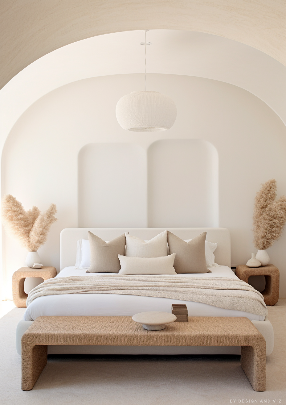
The simplest way to say it: Alabaster is a white with warmth. Linen White is a cream with whiteness. One leads with brightness. The other leads with comfort.
Do not read the numbers as the answer. A one-point LRV gap (82 versus 81) is close to meaningless on a wall. What you see is undertone. Alabaster's yellow is muted and steady. Linen White's yellow carries a sandy, orange-leaning depth that strengthens as the light drops. Side by side in daylight, Linen White looks like the color that has been steeped in tea.
On trim, the two behave in opposite ways. Alabaster looks crisp beside Extra White or Pure White. Linen White needs a warm trim partner such as Simply White, because a cold white beside it makes the cream look grubby. Alabaster trim against Linen White walls can work in a tonal scheme, though it needs testing. If you are weighing Pure White as the sharper trim partner for Alabaster, the Alabaster vs Pure White guide shows exactly how much definition it adds and when it tips into stark.
Not sure which one is right for your room? A Color Direction consultation gets you a full custom palette built around your space - book yours here. |
When to Choose Alabaster

Choose Alabaster when you want warmth that stays in the background and the room has to cope with mixed light, mixed materials or both. It is the right answer in open-plan spaces, transitional and contemporary interiors, and kitchens with stainless appliances or cool stone. It also suits exteriors, where restrained warmth reads cleanly in changing daylight. It rarely looks wrong.
Avoid Alabaster when the brief is distinctly cozy. In a period bedroom with warm timber and heavy linen, it can look thin and a little anonymous. Rooms that want real cream need real cream.
When to Choose Linen White

Choose Linen White when the brief is cream, cozy and settled, and the room's materials already lean warm. That means warm oak or walnut floors, linen upholstery, aged brass and stone with a golden cast. South and west-facing rooms with generous light suit it best. Dining rooms, living rooms and bedrooms in traditional or period homes are its natural territory.
Avoid Linen White beside cool materials. Polished white quartz, grey stone and chrome expose the sandy undertone and make walls look tired. In a north-facing room with cool grey light it can look flat unless warm bulbs carry it. There is little room for compromise here.
How the Pairings Differ

For Alabaster on walls, Extra White SW 7006 or Pure White SW 7005 on trim gives crisp, clean definition. Alabaster on both walls and trim is an equally valid choice for a seamless, soft scheme, particularly in bedrooms. Avoid stark brilliant whites, which make Alabaster look dull by comparison.
For Linen White on walls, Benjamin Moore Simply White OC-117 on trim is the natural step up. It stays warm without chasing the cream. Chantilly Lace OC-65 gives sharper contrast where you want the joinery to stand out. Avoid cool, blue-leaning whites, which turn Linen White grubby.
Both colors suit warm timber floors. Linen White needs them more. Cool grey stone or tile beside Linen White creates an undertone clash that is hard to fix. Alabaster is more forgiving and copes with limestone, pale oak and warm porcelain without complaint.
Both colors work with aged brass and unlacquered brass. Alabaster also accepts brushed nickel and matte black in contemporary schemes. Linen White prefers warm metals: bronze, brass and copper. Chrome beside it feels unresolved.
Architect's Verdict - Alabaster or Linen White?

For most homes, Alabaster is the safer choice. For the right room, Linen White is the better one.
Alabaster does not push. That is its defining strength. It works across mixed light, mixed materials and mixed styles, and it lets furniture and art lead. If you are unsure, choose Alabaster.
Linen White commits to cream. In a south-facing room with warm timber and layered textiles it is more beautiful than Alabaster, and it feels as though the room has always been that color. It is a decision, not a default.
The test I always use: buy sample pots of both and paint two large patches, about 60 cm square, side by side on the room's darkest wall, away from corners. Check them at 8am, at midday on an overcast day, and at 8pm under your actual bulbs. The overcast midday check is the worst case for this pair. Linen White passes if it still reads as soft cream rather than dull sand. Alabaster passes if it still looks warm rather than flat grey-white. If Linen White turns sandy and Alabaster holds, choose Alabaster. If both pass, choose the one you want to live with at 8pm.
Frequently Asked Questions

Is Linen White warmer than Alabaster?
Yes - Linen White is the creamier, deeper-toned of the two. Its yellow undertone has a sandy lean that reads as cream. Alabaster's yellow is muted, so it reads as a soft warm white. The difference is clearest side by side in warm daylight.
What is the LRV of Alabaster vs Linen White?
Alabaster has an LRV of 82 and Linen White has an LRV of approximately 81. The gap is too small to see. Undertone, not brightness, separates them. Benjamin Moore's listings for Linen White vary slightly between regions, so treat both figures as approximate.
Can I use Alabaster and Linen White in the same house?
Yes, if the scheme is tonal and the light is warm. Both share a yellow base, so they layer without clashing. Keep each in its own zone or on its own surface, and test the pairing on the wall before committing.
Which is better for kitchen cabinets?
Alabaster is the more practical cabinet color for most kitchens. It copes with stainless steel, cool stone and white marble. Linen White is lovely on cabinets in warm, traditional kitchens with timber and soapstone, but it can look yellowed beside polished white quartz. Always test in your own kitchen.
Which is better for a north-facing room?
Alabaster handles north light better. Its muted warmth stays clean in cool light. Linen White can turn dull and sandy, though warm bulbs and warm materials can rescue it. Test both on the darkest wall before you commit.
Does Linen White look yellow on walls?
In strong south or west light, it can lean yellow. That is part of its character. In cool or flat light it can look sandy instead. Always test a large patch in your own room.
Final Thought
Alabaster and Linen White are both excellent warm whites, but they answer different questions. Alabaster asks how to bring warmth without commitment. Linen White asks how to bring cream with confidence.
If your light or materials are mixed, Alabaster is the safer choice. If your timber and textiles are warm and your light is generous, Linen White will reward you. Paint large patches of both, side by side, and watch them across a full day. The answer will show within 24 hours.
Want a complete colour scheme built around Alabaster or Linen White? Our design packages cover full palette selection, finish recommendations, and 3D visualisations - see our packages. |
About the Author
Beril Yilmaz is a qualified architect and interior designer based in the UK. She runs BY Design And Viz, a design platform covering paint colour reviews, interior design guidance, and residential design projects. Beril has specified both Alabaster and Linen White across residential projects in the UK and internationally - Alabaster in open-plan and transitional spaces where light and material temperature shift through the day, Linen White in traditional and period rooms with warm timber and layered textiles, often testing both in the same scheme where a tonal wall-and-trim relationship is needed.


Comments