


City Loft vs Repose Gray: The Comparison That Actually Helps You Decide

Updated: Sep 8
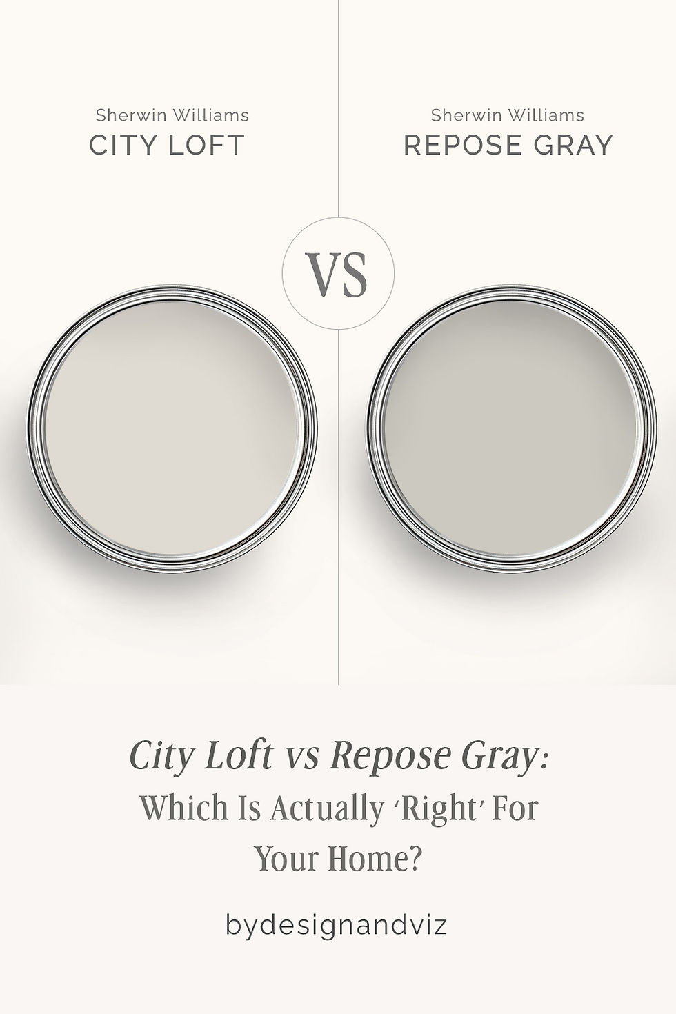
City Loft and Repose Gray both live on Sherwin-Williams' warm-neutral wall, and both turn up on the same shortlists for that reason. But they are not competing for the same job. City Loft sits high on the LRV scale as a pale, chameleon greige. Repose Gray sits a full twelve LRV points lower as a genuine warm gray with body and weight. Confuse the two and you end up with either a wall that reads too pale to anchor a room, or one that reads too heavy for a space that needed lift.
I have specified both across residential projects, and the decision usually comes down to one question: does this room need a light, shape-shifting backdrop, or a warm gray with enough depth to hold its own against furniture and cabinetry? City Loft answers the first brief. Repose Gray answers the second.
This guide covers the undertone behaviour of each, where they perform and where they fail, and how to choose between them with confidence.
At a Glance
| City Loft | Repose Gray |
Brand | Sherwin-Williams | Sherwin-Williams |
LRV | 70 - light, bright, borders on off-white | 58 - mid-tone, holds real depth on a wall |
Colour category | Pale warm greige - reads closer to a soft white than a true gray | True warm gray - reads as gray first, with warmth held in reserve |
Undertones | Violet-pink with beige and red-brown underneath - shifts taupe, peach, or faintly lavender depending on the light | Cool-leaning gray base with a whisper of green and violet that keeps it from turning cold |
Character | A chameleon backdrop; it takes its cue from the room rather than asserting one of its own | A committed mid-tone gray; it anchors a room rather than blending into it |
North-facing | Workable, but unpredictable - the violet undertone can flash lavender under cool artificial light | Reliable - the warmth underneath keeps it from tipping into a flat, cold gray even in low light |
South-facing | Excellent - strong light settles the undertone into a warm, soft taupe-beige | Balanced - strong light softens the gray without washing it out |
Open-plan | Strong - its high LRV keeps it consistent as a bright connective backdrop across zones | Moderate - its deeper tone reads consistently but can feel heavy across very large connected volumes |
On walls | Light, airy backdrop that recedes rather than anchors - ideal where the furniture and finishes should do the talking | A full-bodied gray backdrop with genuine presence - it holds contrast against white trim and furnishings |
On cabinets | A favourite for painted cabinetry - light enough to brighten, warm enough to avoid feeling clinical | Strong choice for cabinetry that wants to read as intentional gray rather than accidental beige |
Use together? | Yes - City Loft on walls with Repose Gray as a grounding accent (island, front door, built-ins) is a considered high-low pairing | Yes - Repose Gray as an accent wall or island against City Loft's paler field is the classic way to combine them |
Trim for each | Pure White SW 7005 for crisp contrast, or Snowbound SW 7004 for a softer edge | Pure White SW 7005 or Extra White SW 7006 for clean definition |
Style fit | Modern farmhouse, transitional, soft contemporary | Transitional, modern, classic grey-and-white schemes |
Architect's pick | When the brief needs a pale, adaptable neutral that will not compete with statement finishes | When the brief calls for a gray with actual weight - somewhere the wall needs to hold its own |
Sherwin-Williams City Loft SW 7631 - What It Really Looks Like

City Loft has an LRV of 70, which puts it firmly in the pale warm-greige category, bordering on off-white.
The undertone is where it gets interesting: a violet-pink base with beige and red-brown underneath. That combination is what lets it shift toward taupe, peach, or even a faint lavender depending on the light and the hour. For the full standalone review of City Loft - undertones, LRV, light behaviour by orientation, best rooms, trim colours, and an honest verdict on who this colour is and is not right for - the Sherwin-Williams City Loft review covers everything you need to know before committing.
In strong, warm natural light City Loft settles into a soft, believable taupe-beige. Under cooler artificial light, particularly in the evening, the violet can surface and read faintly purple. It does not hedge on this point - City Loft is genuinely a chameleon, not a stable neutral with a fixed identity.
Because it sits so high on the LRV scale, City Loft reflects a great deal of light and keeps a room feeling open. It rarely feels heavy. What it does not do is anchor a space the way a deeper neutral would - it recedes rather than asserts, and that is precisely the job it is best suited for.
For the comparison of City Loft against BM Pale Oak - a similarly pale warm neutral with its own violet undertone - the City Loft vs Pale Oak guide covers which one holds its undertone more predictably across changing light.
Sherwin-Williams Repose Gray SW 7015 - What It Really Looks Like

Repose Gray has an LRV of 58, which puts it firmly in true mid-tone gray territory, well below City Loft's pale end of the scale.
The base is a cool-leaning gray, but a whisper of green and violet underneath keeps it from ever reading flat or clinical. There is nothing ambiguous about it - Repose Gray reads as gray first, with warmth held quietly in reserve.
In good natural light it softens without losing definition; the gray stays legible rather than washing toward beige. In low or north-facing light, the underlying warmth is what stops it tipping into a cold, institutional gray.
Unlike a pale chameleon neutral, Repose Gray commits to being a gray. It holds contrast against white trim, reads consistently across a large wall, and gives a room genuine visual weight rather than simply lifting it.
For the comparison of Repose Gray against BM Alabaster - a true warm white sitting far higher on the LRV scale - the Repose Gray vs Alabaster guide covers what changes in a room when you swap gray depth for white reflectance.
The Real Difference Between City Loft and Repose Gray

The twelve-point LRV gap is the real story here, not the undertone. City Loft, at LRV 70, behaves like a pale, light-catching neutral that shifts with the room around it. Repose Gray, at LRV 58, behaves like a true mid-tone gray with enough pigment to anchor a space on its own. These are not two shades of the same idea - they are two different tools.
Undertone matters too. City Loft carries violet-pink beneath its beige, which is what lets it drift toward taupe, peach, or lavender depending on the light. Repose Gray's undertone is far more restrained - a trace of green and violet that keeps a fundamentally gray colour from reading cold. Side by side, City Loft looks like a light, breathing neutral. Repose Gray looks like gray that has decided to stay warm.
Because of the LRV gap, these two rarely compete for the same wall. City Loft works where the room needs lift and pale, adaptable light; Repose Gray works where the room needs a gray with actual body. For how City Loft performs against a true warm white rather than a mid-tone gray, the City Loft vs Alabaster guide walks through where the extra reflectance of a true white changes the room in a way Repose Gray's depth cannot.
Not sure which one works for your room? A colour consultation is included in all our design packages - book directly here. |
When to Choose City Loft

Choose City Loft when the room needs a pale, light-catching neutral that will not compete with the furniture, art, or finishes around it.
It performs best in open-plan spaces, rooms with limited natural light that still need to feel bright, and interiors where a bold sofa, a stone countertop, or a statement light fitting is meant to be the visual anchor. City Loft's job is to stay quiet.
Avoid it in rooms lit primarily by cool LED bulbs at night, where the violet undertone is most likely to surface unflatteringly. It needs warm light or warm materials nearby to stay settled. Avoid it too where you specifically want a wall with visual weight - City Loft, by design, will not deliver that.
When to Choose Repose Gray

Choose Repose Gray when the room needs a wall with genuine presence rather than a backdrop that recedes.
It is the right call for a study, a dining room, an accent wall behind open shelving, or any space where the gray itself is meant to register as a considered design decision rather than disappear.
Avoid it in small, north-facing rooms with minimal artificial light, where its depth can feel heavy rather than grounded. Your room will tell you which one it needs - if City Loft feels too pale to anchor the space, Repose Gray is very often the answer.
How the Pairings Differ

For City Loft on walls, Pure White on trim gives clean, crisp definition without fighting the violet-pink undertone. Snowbound is the softer alternative for a more traditional feel. Avoid a stark blue-white trim above LRV 90 - it will push City Loft toward its cooler, pinker read.
For Repose Gray on walls, Pure White or Extra White on trim keeps the contrast crisp and lets the gray hold its depth. Repose Gray on cabinetry against a City Loft wall is a strong high-low pairing that keeps the room from feeling monotone.
Both colours pair well with warm wood, but for different reasons. City Loft's pale field needs less from the floor to feel warm - even a mid-tone oak will do the work. Repose Gray, being darker and cooler at its base, benefits from a genuinely warm wood tone to keep the room from skewing cold.
City Loft is forgiving with hardware - brass, nickel, and matte black all sit comfortably against its pale, shifting undertone. Repose Gray favours brushed nickel and matte black, which reinforce its gray identity rather than fighting it the way warm brass sometimes can.
Architect's Verdict - City Loft or Repose Gray?

There is no universal winner between City Loft and Repose Gray - the twelve-point LRV gap means they are rarely actually competing for the same wall.
Choose City Loft when the room needs a pale, adaptable backdrop - open-plan spaces, rooms with limited natural light that still need to feel bright, or interiors where the furniture and finishes are meant to carry the visual weight. It recedes. That is its job.
Choose Repose Gray when the room needs a wall with genuine presence - a study, a dining room, an accent wall behind open shelving, anywhere the gray itself is meant to register as a design decision rather than disappear into the background.
The test I always recommend for this pair: paint two large sample boards and hang them on a north-facing wall - the hardest light for both colours to hold their character. Check them at midday and again after dark under your own bulbs. If City Loft still reads pale and settled rather than flashing lavender, it passes. If Repose Gray still reads warm rather than flat and cold, it passes. Whichever one fails that test in your room has told you the answer.
Frequently Asked Questions

Is City Loft lighter than Repose Gray?
Yes, significantly. City Loft has an LRV of approximately 70 against Repose Gray's approximately 58 - a twelve-point gap that is very visible on the wall. City Loft reads as a pale, light-catching neutral, while Repose Gray reads as a genuine mid-tone gray.
Can I use City Loft and Repose Gray in the same house?
Yes, and the LRV gap makes them work well together. City Loft as the main wall colour with Repose Gray on an island, accent wall, or built-in creates a considered high-low contrast rather than a clash. Using them side by side on adjoining walls needs more care, since the tonal jump can feel abrupt without a trim line to separate them.
Which is better for a north-facing room?
Repose Gray tends to hold up more reliably. City Loft's violet-pink undertone can flash lavender under cool, low light, which reads as unintentional. Repose Gray's warmth is more deeply embedded, so it stays a believable warm gray even when the light is working against it. Test both before committing.
Is Repose Gray too dark for a small room?
Not necessarily, but it needs planning. At LRV 58, Repose Gray has real depth, and a small room with limited natural light will feel that depth more than a larger, brighter one. Pairing it with a crisp white trim and ensuring good artificial light in the evening usually resolves the concern.
Which is better for kitchen cabinets?
It depends on the effect you want. City Loft brightens a kitchen while adding warmth, and suits schemes where the cabinets should feel light and current. Repose Gray gives cabinetry genuine presence and suits schemes built around a deliberate gray-and-white palette. Test both against your countertop and hardware finishes first.
What is the LRV of City Loft vs Repose Gray?
City Loft has an LRV of approximately 70 and Repose Gray has an LRV of approximately 58. That twelve-point difference is the main reason these two colours are usually chosen for different roles in a room rather than compared as direct substitutes.
Final Thought
City Loft and Repose Gray are not really rivals - the twelve-point LRV gap puts them in different categories before undertone even enters the conversation. City Loft is the pale, adaptable neutral for rooms that need lift. Repose Gray is the warm gray with the weight to anchor a space on its own.
If your room needs brightness and flexibility, City Loft will deliver it. If your room needs a gray with real presence, Repose Gray is the more honest choice. Sample both at scale, in your own light, before deciding - the twelve points on paper are exactly what you will see on the wall.
Want a complete colour scheme built around City Loft or Repose Gray? Our design packages cover full palette selection, finish recommendations, and 3D visualisations - see our packages. |
About the Author
Beril Yilmaz is a qualified architect and interior designer based in the UK. She runs BY Design And Viz, a design platform covering paint colour reviews, interior design guidance, and residential design projects. Beril has specified both City Loft and Repose Gray across residential projects in the UK and internationally - City Loft as a pale, adaptable wall colour in open-plan spaces, Repose Gray as a grounding gray on cabinetry and accent walls, often specifying both together in the same scheme for contrast.


Comments