


Benjamin Moore Calm OC-22 - An Architect's Honest Review

Benjamin Moore Calm OC-22 is one of the hardest colours in the Benjamin Moore range to pin down on a paint chip - and that difficulty is precisely what makes it worth understanding properly before it goes on a wall. Most off-whites announce their undertone clearly: warm beige, cool grey, obvious cream. Calm does none of that. It sits in a genuinely ambiguous zone, and in my practice that ambiguity is exactly why clients either love it immediately or find it unsettling until they understand what is actually happening on the wall.
Calm has a soft lavender-grey undertone - and that single fact explains almost everything about how the colour behaves. It is not a true cool grey and it is not a warm greige. It is a genuine shape-shifter: warm and soft under 2700K lamplight, cooler and more overtly grey-violet in daylight, and capable of reading three different ways in three different corners of the same room depending on what light is falling on it and what materials sit nearby.
What follows is the full breakdown: undertone, LRV, how Calm shifts across orientation and artificial light, what to pair it with, and a candid read on who should specify it and who should look elsewhere.
Calm OC-22 - The Key Facts
Collection | Benjamin Moore Color Preview Collection |
LRV | ~76-78 (high off-white zone - reads bright and airy, one step below true white) |
Undertone | Soft lavender-grey - shifts warmer under 2700K light, coolers and greyer in daylight |
Character | Serene, versatile, quietly shape-shifting - reads differently through the day |
Best trim | Chantilly Lace OC-65 |
Best orientation | South or west-facing - warm light keeps the lavender from tipping cold |
Main risk | In north-facing rooms or under cool daylight bulbs, the lavender undertone reads as flat blue-grey rather than soft and warm |
Calm Undertones - What Is Actually Going On
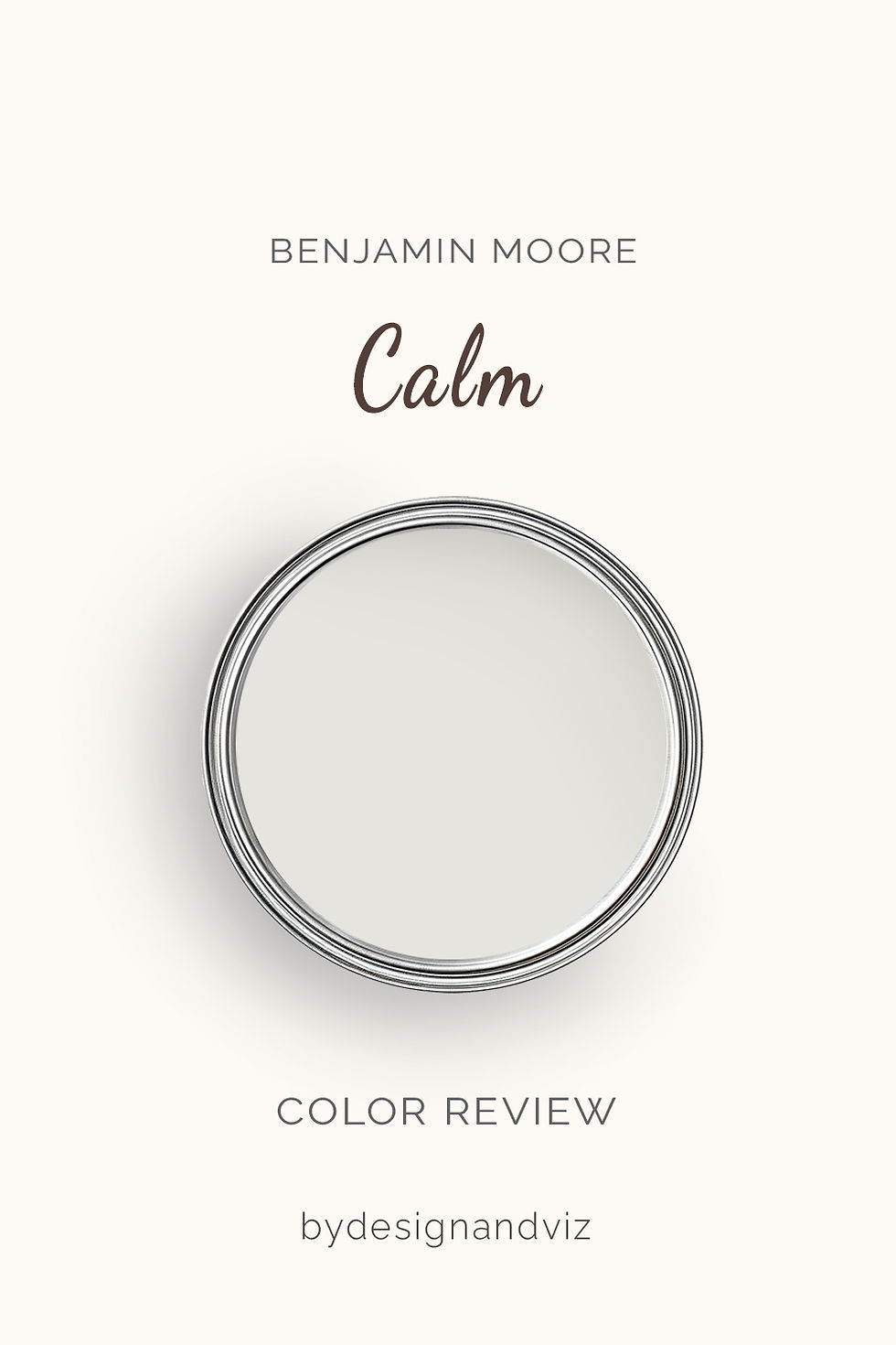
The undertone of Calm is a soft lavender-grey - and the word 'soft' matters as much as 'lavender'. This is not an obviously violet or purple colour in the way a true lavender paint would be. On the chip it reads as a nearly neutral off-white with the faintest grey cast. On the wall, in the right light, a gentle violet-pink warmth becomes visible, particularly under incandescent or warm LED lighting in the evening.
Under natural daylight the balance shifts - the lavender softens and the colour reads closer to a clean, quiet grey, with the undertone barely perceptible unless you are looking for it directly beside a true neutral white. This is the quality that makes Calm genuinely versatile: it can sit comfortably in both a warm-leaning scheme and a cooler, more contemporary one, depending on what light and materials it is given.
Where the undertone becomes a liability is in consistently cool conditions - north-facing rooms, cool-temperature LED bulbs, or a room dominated by cool stone and metal with no warm counterbalance. In those conditions the lavender can tip toward a flatter blue-grey that reads colder and less inviting than the colour promises on the chip. For the closest cool-neutral comparison in the Benjamin Moore range - a true off-white with a much warmer, pink-purple undertone at a similar depth - the Alabaster vs Pale Oak guide is a useful reference point for understanding how differently two seemingly similar off-whites can behave.
LRV - What ~76-78 Means in a Real Room
At an LRV in the high 70s, Calm sits close to the top of the off-white zone - bright enough to function almost like a soft white in a well-lit room, with just enough depth to avoid the flatness of a true white. Independent measurements place it between roughly 76 and 78, which is high enough that most rooms will read it as a luminous near-white rather than a colour with strong presence.
In practical terms, this means Calm will not weigh a room down the way a mid-LRV greige like Revere Pewter or Classic Gray would. It keeps small or dim rooms feeling open. What it will not do is behave like a true white at LRV 85 and above - it retains just enough undertone and depth to read as a considered colour choice rather than a blank backdrop, which is part of why it rewards more careful specification than a straightforward white would.
How Calm Behaves in Different Light

South-Facing Rooms
South-facing rooms are where Calm performs at its most reliable and most flattering. The abundant warm natural light keeps the lavender undertone soft and gentle rather than pronounced, and the high LRV means the room stays bright throughout the day without ever feeling stark. I have specified Calm in south-facing bedrooms and sitting rooms with light oak floors and brass fittings, and the result consistently reads as serene rather than ambiguous - exactly the quality the colour is named for.
North-Facing Rooms
North-facing rooms are where Calm needs the most careful handling - and where I would think twice before specifying it without compensating materials. The cool, flat quality of north light strips away the warmth that keeps the lavender undertone soft, and in those conditions Calm can read as a slightly chalky, blue-tinged grey rather than the gentle off-white the name suggests. If I do specify it in this orientation, I insist on three things: 2700K warm-spectrum bulbs throughout, warm wood tones in the flooring or furniture, and at least one warm metal accent to counterbalance the cool exposure.
East and West-Facing Rooms
East-facing rooms give Calm a warm start and a cooler finish - the lavender softens beautifully in morning light and becomes slightly more grey and restrained by late afternoon. This suits rooms used mainly in the mornings, such as a breakfast room or an east-facing home office. West-facing rooms tend to be the more consistently flattering of the two - the warm evening light activates the lavender-pink quality and Calm reads at its most serene in the hours a sitting room or bedroom is typically used.
Artificial Lighting
Artificial lighting temperature genuinely changes how Calm reads, more so than most off-whites. Under 2700K warm bulbs the lavender undertone comes forward gently and the colour feels soft and cosseting. Under 4000K or cooler bulbs the same colour can read as a plainer, cooler grey with the lavender all but disappearing. I recommend clients commit to warm-spectrum lighting throughout any room specified in Calm - mixing temperatures within the same space will make the colour look inconsistent from wall to wall.
Not sure if Calm works for your room? A colour consultation is included in all our design packages - book directly here. |
Trim Colours and What to Pair With Calm

Trim - Crisp White, Not Warm Cream
For trim, I reach for Chantilly Lace OC-65 alongside Calm more than any other white - its clean, near-neutral crispness creates a defined boundary against Calm's soft lavender-grey without introducing the yellow warmth that would fight the undertone. A crisp white trim lets Calm's subtlety read clearly rather than getting muddied by a warmer companion. Avoid deeply cream trims such as White Dove or Swiss Coffee directly against Calm - the warmth of those whites can make Calm's lavender read as duller and greyer by contrast, an effect the White Dove coordinating colors guide covers in more detail for anyone deciding between the two families.
Floor Materials
Light and mid-tone oak floors sit most comfortably alongside Calm - the natural warmth in the wood grain provides just enough counterbalance to keep the lavender undertone soft rather than cool. Very pale, ashy floors with no warmth of their own can push Calm toward reading colder, particularly in rooms that are already north-facing or heavily glazed with cool light.
Metal Finishes
Warm brass and aged brass are the most flattering metal companions for Calm - the warmth in the metal echoes the lavender-pink undertone and the combination reads as considered rather than accidental. Brushed nickel and chrome also work well in more contemporary schemes, particularly where the room already has strong warm natural light to keep the overall palette from tipping cold.
Accent Colours
Soft, dusty taupes and gentle warm greys sit comfortably alongside Calm without fighting its undertone, creating a quiet, layered neutral scheme that reads as deliberate rather than flat. Deep charcoal or soft navy accents provide the depth and drama that Calm's high LRV cannot deliver on its own, and both read well against the lavender-grey without clashing. Avoid strong, saturated warm oranges or rust tones as a dominant accent - they push hard against Calm's cooler-leaning undertone in a way that reads as unresolved rather than intentional.
Calm Room by Room

Bedrooms
Bedrooms are where Calm is most frequently and most successfully specified, and it is easy to see why. The soft, shifting quality of the lavender undertone suits a room meant for rest, feeling gentle rather than assertive at any time of day. I have used it in south and west-facing bedrooms with warm oak floors, brass hardware, and 2700K bedside lighting, and the combination consistently reads as restful without tipping into the flatness a plainer white can bring.
Bathrooms
Bathrooms suit Calm well, particularly where the fixtures and tile already lean warm or neutral rather than stark white or cool grey. The colour's high LRV keeps a small bathroom feeling bright, while the lavender undertone adds a gentle sense of calm that plain white cannot provide. In north-facing bathrooms I would specify warm-toned tile and warm lighting alongside it to prevent the cooler shift the orientation invites.
Living Rooms
Living rooms benefit from Calm's versatility - it works in both a soft, contemporary scheme and a more traditional one, provided the surrounding materials lean warm rather than stark. Given a south or west-facing living room, warm oak floors, linen upholstery, and brass lamps, Calm creates a considered, quietly sophisticated backdrop that holds its character through the day.
Kitchens
Calm on kitchen walls works best where the cabinetry and countertops already have some warmth - warm white or cream cabinetry, natural stone countertops, and brass or warm brushed hardware. On kitchen cabinets themselves it is a more demanding choice that requires strong, consistent warm lighting to avoid reading as an unresolved grey against stark white worktops.
Home Offices and Studies
Calm suits a home office or study where the brief calls for a calm, focused atmosphere without the starkness of a true white. Paired with warm wood shelving, a leather desk chair, and warm-spectrum task lighting, a Calm study reads as serene and considered rather than clinical.
Who Calm Is Right For - And Who It Is Not

Calm is right for you if:
You want a genuinely versatile off-white that shifts subtly through the day - Calm's shape-shifting quality is precisely what makes it interesting rather than flat, and it rewards a client who wants a colour with quiet complexity rather than a single fixed reading.
Good warm natural light reaches the room - typically south or west-facing - this is the condition under which the lavender undertone reads at its softest and most flattering, and where Calm's ambiguity resolves into genuine serenity.
The brief calls for something restful rather than assertive - bedrooms, bathrooms, and quiet sitting rooms are where Calm's gentle character is most valued, and where its subtlety is an asset rather than a source of uncertainty.
You will commit to warm-spectrum bulbs across every fitting in the room - 2700K lighting is what keeps the lavender undertone soft and consistent from room to room; mixed lighting temperatures will make Calm look like different colours in different spaces.
Calm is not right for you if:
The room is north-facing and you are not prepared to add warm materials - without warm wood, warm metal, and warm-spectrum lighting, Calm in a north-facing room risks reading as a flat, slightly chalky blue-grey rather than the soft neutral the name promises.
You want a colour with one clear, fixed identity - if the brief calls for a colour that reads the same in every light and every room, Calm's shifting undertone will feel inconsistent rather than intriguing, and a more stable neutral is the safer choice.
The material palette is dominated by cool stone, chrome, and glass with no warm counterbalance - Calm needs some warmth nearby to keep the lavender from tipping cold, and a fully cool material palette will push it toward its least flattering reading.
A quick chip glance is as far as you're willing to go before committing - Calm is one of the more light-sensitive colours in the Benjamin Moore range, and a small swatch checked at a single moment will not reveal how it actually behaves in your specific room across a full day.
How Calm Compares to Similar Colours

vs Pale Oak OC-20 - Pale Oak sits roughly 8-9 LRV points below Calm and carries a much more assertive pink-purple, greige-leaning undertone rather than Calm's soft, barely-there lavender-grey. In practice Pale Oak reads warmer and more clearly beige-toned on the wall, while Calm stays closer to a true off-white; Pale Oak suits a warmer, more grounded brief, while Calm suits a brighter, more ambiguous one.
vs White Dove OC-17 - White Dove sits roughly 8-9 LRV points above Calm and carries a warm, soft yellow undertone rather than Calm's cool-leaning lavender. Side by side, White Dove reads as a genuine soft white while Calm reads as a colour with more presence and complexity; White Dove suits a warm, classic brief, while Calm suits a client who wants subtlety and shift through the day.
vs Classic Gray 1548 - Classic Gray sits at a similar LRV to Calm but carries a warmer, more pronounced greige undertone against Calm's cooler purple-grey base, meaning the two read as distinctly different colours despite their closeness in depth. Classic Gray is the steadier, more predictable choice; Calm is the more light-reactive one.
vs Silver Satin OC-26 - Silver Satin shares Calm's lavender-grey family and sits within a point or two of it on LRV, making the two genuinely close cousins rather than clear alternatives. The practical difference is subtlety of depth rather than undertone direction, and choosing between them in a real room comes down to a side-by-side sample rather than the numbers alone.
Frequently Asked Questions
Is Benjamin Moore Calm warm or cool?
Calm is neither firmly warm nor firmly cool - it is a genuine shape-shifter. Its lavender-grey undertone reads warmer and softer under 2700K artificial light and cooler, more grey, in daylight. This is the defining characteristic of the colour: if you want a fixed, predictable neutral, Calm will frustrate you; if you want a colour with quiet complexity that changes through the day, it is one of the most rewarding options in the Benjamin Moore range.
Does Calm look purple or lavender on the wall?
In most conditions, no - Calm reads as a soft, nearly neutral off-white rather than an obviously purple colour. The lavender is a genuine undertone rather than a dominant hue, and it typically only becomes clearly visible under warm artificial light or directly beside a true neutral white for comparison. A large swatch checked on the actual wall, across morning, midday, and evening, is the only reliable way to see how prominent the lavender reads in your specific conditions.
What is the best trim colour for Calm?
Chantilly Lace OC-65 is the trim I recommend most consistently alongside Calm - its crisp, near-neutral quality creates a clean boundary without introducing warmth that would muddy the lavender undertone. Warmer, creamier trims such as White Dove or Swiss Coffee can make Calm read duller and greyer by contrast, so I generally steer clients toward the crisper white family for trim.
Can Calm work in a north-facing room?
With the right compensating materials, yes, but it requires more care than most off-whites. I would insist on three elements together: 2700K warm-spectrum lighting throughout, warm wood tones in flooring or furniture, and at least one warm metal accent such as brass. Without those elements, Calm in a north-facing room risks reading as a flat, cool blue-grey rather than the soft neutral its name suggests.
What rooms is Calm best for?
Bedrooms are where Calm is most consistently and most successfully specified - its gentle, shifting quality suits a room meant for rest. South and west-facing bathrooms, quiet sitting rooms, and home offices are also strong applications. It is a more demanding choice in north-facing living rooms and in kitchens with predominantly cool, stark material palettes.
The Verdict

Benjamin Moore Calm is a genuinely distinctive off-white - not because it announces itself boldly, but because of exactly the opposite. It is a colour that rewards patience and careful light management rather than a safe, predictable default. The lavender-grey undertone that makes it interesting is the same quality that makes it demanding: get the light and materials right, and it delivers a serene, quietly sophisticated result that a flatter neutral cannot match.
In the right conditions - warm natural light, warm-spectrum artificial lighting, and at least some warmth in the surrounding materials - Calm lives up to its name in a way that few off-whites manage. For the closest warm-toned alternative at a similar depth in the Benjamin Moore range, the White Dove vs Pale Oak guide is a useful next stop for understanding where Calm sits relative to two of the range's more predictable neutrals.
Before committing, sample Calm at large scale directly on the wall it will be used on. Observe it first thing in the morning, at midday, and again in the evening under your actual bulbs - not a showroom's. If the lavender undertone reads as soft and welcome in all three conditions, you have found a colour that will reward the extra attention it demands. If it reads as flat or cold in any one of them, address the light or the materials before committing to the full room.
Want a complete colour scheme built around Calm? Our design packages cover full palette selection, finish recommendations, and 3D visualisations - see our packages. |
About the Author
Beril Yilmaz is a qualified architect and interior designer based in the UK. She runs BY Design And Viz, a design platform covering paint colour reviews, interior design guidance, and residential design projects. Beril has specified Calm across residential projects in the UK and internationally - most often in south and west-facing bedrooms and bathrooms, paired with warm oak floors and brass fittings under warm-spectrum lighting.


Comments