


Swiss Coffee vs City Loft: The Comparison That Actually Helps You Decide

Updated: Sep 15
These two are compared more often than the twelve-point LRV gap between them justifies, and the reason is simple: both get shortlisted as "safe neutral" whites for the same rooms, even though Swiss Coffee OC-45 is a warm off-white and City Loft SW 7631 is a warm greige. On paper they read like near-neighbours. On a wall, twelve LRV points is not a subtle difference - it is the gap between a colour that behaves like a white and a colour that behaves like a background.
I have specified both, and I do not treat them as competitors. They do different jobs. Swiss Coffee brightens and softens. City Loft grounds and quiets. Once you understand which job your room needs, the choice mostly makes itself.
I have used Swiss Coffee to lift a dark, north-facing hallway and City Loft to calm an over-bright, glass-heavy living room in the same renovation. Here is how I tell them apart and how I decide which one a room actually needs.

At a Glance
| Swiss Coffee | City Loft |
Brand | Benjamin Moore | Sherwin-Williams |
LRV | 82 - a bright, high-reflectance off-white | 70 - a light warm greige, noticeably deeper than Swiss Coffee |
Colour category | Soft off-white with a green-yellow undertone - reads as warm but never fully commits to cream | Warm greige with beige, taupe, and a quiet pink-violet undercurrent - a genuine neutral, not a white |
Undertones | Yellow base with a subtle green cast - can flash cooler than expected under artificial light | Beige and red-brown base with a faint violet edge - shifts taupe, pink, or lavender depending on the light |
Character | Bright and versatile; behaves like a near-white rather than a colour statement | Grounded and atmospheric; reads as an intentional neutral rather than a brightener |
North-facing | Reliable - the high LRV keeps rooms feeling lifted even when daylight is limited | Risky without warm supporting light - the violet undertone can surface and read cool or slightly lavender |
South-facing | Good, but can wash out slightly in strong direct sun - watch for a flat, bleached look at midday | Excellent - warm daylight settles the undertone into a soft, consistent taupe-beige |
Open-plan | Strong - reads consistently bright across zones, though the green undertone needs checking under mixed artificial light | Moderate - the chameleon undertone means it can read differently in each zone unless the lighting temperature is consistent |
On walls | A bright, lifting off-white backdrop that keeps rooms feeling open and airy | A grounded, atmospheric greige backdrop with genuine depth and colour presence |
On cabinets | Excellent - a long-standing favourite for kitchen cabinetry against warm and cool countertops alike | Good in warm, materially rich kitchens - less reliable than Swiss Coffee across a wide range of countertop tones |
Use together? | Yes, but not as a close pairing - City Loft works as a deeper accent wall or lower-level material against Swiss Coffee trim and ceilings | Yes - City Loft as the wall or lower-cabinet colour with Swiss Coffee on trim and upper cabinetry is a considered, layered combination |
Trim for each | Chantilly Lace or Simply White for a crisper step up | Pure White for crisp contrast, or Swiss Coffee for a softer, warmer step up |
Style fit | Coastal, transitional, classic kitchens and trim-heavy interiors | Modern greige interiors, warm minimalist kitchens, transitional living spaces |
Architect's pick | When the room needs brightness first and colour second | When the room needs a genuine neutral with depth, not another near-white |
Benjamin Moore Swiss Coffee OC-45 - What It Really Looks Like

Swiss Coffee has an LRV of approximately 82, which puts it firmly in the soft white category rather than the neutral-greige range. It reads as an off-white with a gentle warmth - present, but never the dominant note in the room. For how Swiss Coffee compares to Calm - the warm grey it's most often confused with on paper, given the two sit only four LRV points apart - the Calm vs Swiss Coffee guide covers the undertone difference and the classic wall-and-trim pairing between them.
The undertone is where Swiss Coffee gets interesting. It leans yellow at base, but many rooms reveal a faint green cast under cooler artificial light or against certain countertop stones. It is not an aggressive undertone. It is a quiet one that shifts more than most people expect.
Because the LRV sits so high, Swiss Coffee behaves more like a white than a colour choice. It brightens without adding visual weight, which is exactly why it has stayed a long-running cabinet and trim favourite - it does the job of white without the sterility of a cool, stark shade.
Sherwin-Williams City Loft SW 7631 - What It Really Looks Like

City Loft has an LRV of approximately 70, a full twelve points below Swiss Coffee, and that gap is the whole story. It does not read as a white in any light condition. It reads as a warm, light greige with real colour presence. For how Swiss Coffee compares to Snowbound - two near-white colours both sitting around LRV 83 that read completely differently on the wall - the Snowbound vs Swiss Coffee guide explains why the undertone, not the LRV, decides which one a room needs.
The undertone is genuinely complex - beige and red-brown at the base, with a violet edge that can surface under cool or dim light. In warm daylight it settles into a soft taupe. In a north-facing room under cool LEDs, it can drift toward lavender. This is not a colour you specify without testing it in your actual room.
Because it sits well below Swiss Coffee on the LRV scale, City Loft has genuine weight on a wall. It grounds a space rather than lifting it, which is precisely what makes it useful in rooms that already have plenty of natural light and do not need more brightness. For how Agreeable Gray compares to City Loft - a lighter, more shifting Sherwin-Williams greige that trades stability for brightness - the City Loft vs Agreeable Gray guide covers the undertone behaviour behind that trade-off and which rooms favour each colour.
The Real Difference Between Swiss Coffee and City Loft

The simplest way to explain it: Swiss Coffee is a white that happens to be warm. City Loft is a neutral that happens to be light.
A twelve-point LRV gap is not a close call. Swiss Coffee reflects far more light and will always read brighter, cleaner, and closer to white regardless of the room's other conditions. City Loft holds more pigment and more depth - it is a colour choice in a way that Swiss Coffee, at LRV 82, simply is not. This is not a rivalry between two similar shades. It is a choice between two different tools for two different jobs.
The pairing logic follows from that gap rather than fighting it. Swiss Coffee on trim and ceilings with City Loft on walls creates genuine depth without either colour competing for attention - the brightness stays at the edges of the room while the wall colour does the atmospheric work. For the fuller picture of how Swiss Coffee performs against Sherwin-Williams' own warm-neutral entry, the Swiss Coffee vs Alabaster guide breaks down why a near-identical LRV still produces two very differently behaving whites - a useful companion read for anyone deciding between a true white and a warm greige in the same shortlist.
Not sure which one works for your room? A colour consultation is included in all our design packages - book directly here. |
When to Choose Swiss Coffee

Choose Swiss Coffee when the room needs lift and brightness above all else. These are the conditions where it performs:
North-facing rooms starved of natural light, where a higher LRV genuinely changes how the space feels. Kitchens where cabinetry needs to read clean and bright against a range of countertop tones. Trim-heavy interiors where Swiss Coffee on walls, trim, and ceiling creates a seamless, enveloping brightness. Small rooms where a deeper neutral would feel closing-in.
Avoid Swiss Coffee where you want the wall colour to register as a deliberate neutral statement - at this LRV it will always read closer to white than to greige, however the undertone shifts.
When to Choose City Loft

Choose City Loft when the room already has light to spare and needs grounding, not brightening. These are the situations where it wins:
South or west-facing rooms with strong natural light, where the violet undertone stays settled and warm. Open-plan spaces with large glazing where an all-white palette would feel clinical. Modern or transitional interiors that want a genuine neutral rather than an off-white. Kitchens and living rooms where the brief calls for atmosphere over airiness.
Avoid City Loft in north-facing rooms with cool artificial lighting - the violet undercurrent is the first thing to misbehave, and it misbehaves visibly.
How the Pairings Differ

For Swiss Coffee on walls, Chantilly Lace or Simply White on trim gives a clean, crisp step up without competing with the warmth. Swiss Coffee on both walls and trim is the classic, cohesive choice for kitchens and trim-heavy rooms.
For City Loft on walls, Pure White on trim creates confident contrast that keeps the greige from feeling murky. Swiss Coffee on trim alongside City Loft walls is softer and more blended - the better choice when the room should feel enveloping rather than defined.
Swiss Coffee is forgiving with flooring - it sits comfortably against warm wood, cool stone, and most countertop tones without conflict, which is part of why it has stayed a cabinet standard for so long. City Loft is more particular - it wants warm-toned wood or stone to keep its violet undertone settled; cool grey flooring can push it further toward lavender than most people want.
Both colours suit brass and matte black. Swiss Coffee also handles brushed nickel comfortably given its high LRV and restrained undertone. City Loft is more selective - cool chrome can highlight the violet undercurrent in a way that brass and black tend to soften instead.
Architect's Verdict - Swiss Coffee or City Loft?
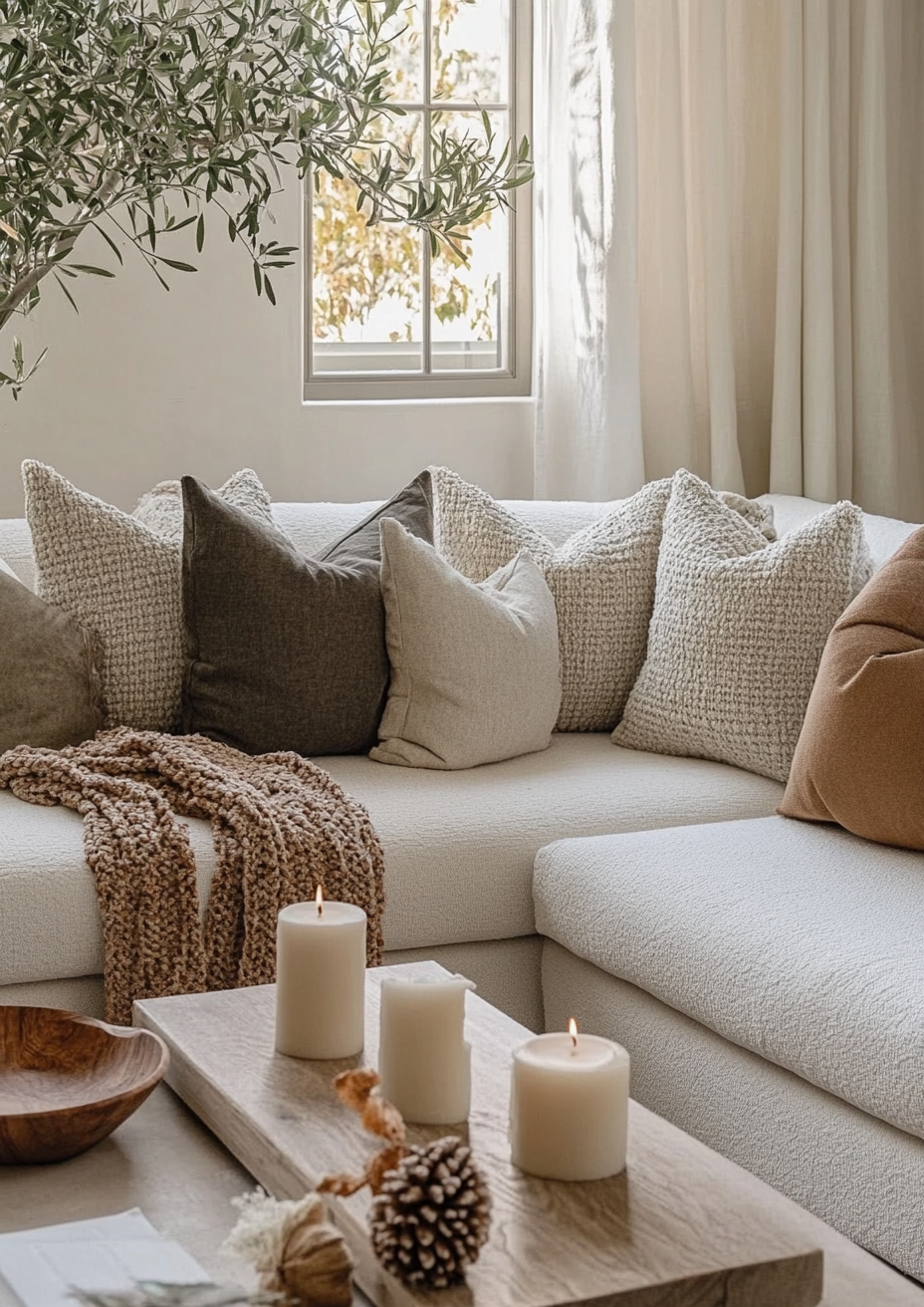
For most homes - particularly those that already read bright, open-plan, or heavily glazed - City Loft is the more considered choice. It adds the depth and atmosphere that an all-white palette can lack, without tipping into a full mid-tone grey.
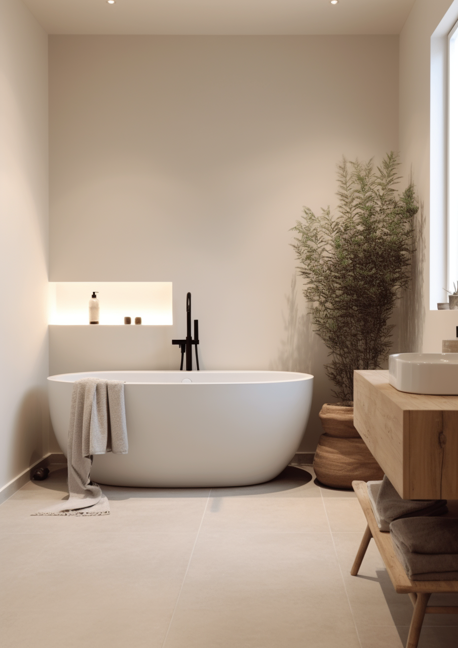
Swiss Coffee is the right call when the room is starved of light and needs every LRV point it can get - a dark hallway, a north-facing bedroom, a kitchen that wants to feel bright regardless of countertop or cabinet finish. It is the more forgiving, lower-risk choice of the two.
City Loft is the right call when the room has light to spare and the brief is atmosphere, not brightness - a sun-filled living room, a modern kitchen with warm wood floors, an open-plan space that would otherwise feel clinical. It rewards a room that can support its undertone shifts rather than fighting them.
The test I always use for this pairing: paint a large sample of City Loft on the wall that gets the least natural light in the room, and check it first thing in the morning under cool artificial light - that is the worst-case condition for its violet undertone. If it still reads as a settled warm greige rather than lavender or grey, City Loft passes. If it drifts, Swiss Coffee is the safer choice for that room.
Frequently Asked Questions
Is Swiss Coffee brighter than City Loft?
Yes, significantly. Swiss Coffee has an LRV of approximately 82 against City Loft's 70 - a twelve-point gap that is easily visible on the wall, not just on paper. Swiss Coffee will always read closer to white.
Can I use Swiss Coffee and City Loft in the same house?
Yes, and the pairing works well because of the gap rather than despite it. Swiss Coffee on trim and ceilings with City Loft on walls creates layered depth - the brightness frames the room while the greige gives it atmosphere. Treat them as partners with different jobs, not as matching tones.
Which is better for a kitchen?
Swiss Coffee is the more reliable choice for cabinetry across a wide range of countertops. City Loft works beautifully in warmer, more materially rich kitchens with wood and warm stone, but it needs testing against cool surfaces first - the violet undertone is less forgiving than Swiss Coffee's restrained green-yellow.
Does City Loft look pink or purple?
It can, under the wrong light. City Loft's undertone includes a quiet violet edge that surfaces under cool artificial lighting or in north-facing rooms without warm daylight. In warm, south-facing light it settles into a soft taupe-beige instead.
Which is better for a north-facing room?
Swiss Coffee, without much competition. Its high LRV keeps north-facing rooms feeling lifted regardless of undertone drift, while City Loft's violet edge is most likely to misbehave in exactly this light condition. If the brief is a north-facing room, start with Swiss Coffee.
What is the LRV of Swiss Coffee vs City Loft?
Swiss Coffee has an LRV of approximately 82 and City Loft has an LRV of approximately 70. This is a substantial twelve-point gap - large enough that the two colours should be understood as different categories of neutral rather than close alternatives.
Final Thought
Swiss Coffee and City Loft are not really competing for the same slot. The choice between them is not about which reads better in isolation - it is about whether your room needs lifting or grounding.
If your room is dim and needs every point of reflectance it can get, Swiss Coffee is the dependable answer. If your room already has light and wants atmosphere and depth, City Loft is the more rewarding choice. Buy sample pots of both, paint large patches on the darkest and brightest walls in the room, and check them in cool morning light and warm evening lamplight. The twelve-point gap will be obvious within the first hour.
Want a complete colour scheme built around Swiss Coffee or City Loft? Our design packages cover full palette selection, finish recommendations, and 3D visualisations - see our packages. |
About the Author
Beril Yilmaz is a qualified architect and interior designer based in the UK. She runs BY Design And Viz, a design platform covering paint colour reviews, interior design guidance, and residential design projects. Beril has specified both Swiss Coffee and City Loft across residential projects in the UK and internationally - Swiss Coffee in north-facing hallways and cabinetry needing maximum brightness, City Loft in sun-filled, heavily glazed living spaces needing grounding and atmosphere, often specifying the two together with Swiss Coffee on trim against City Loft walls.


Comments