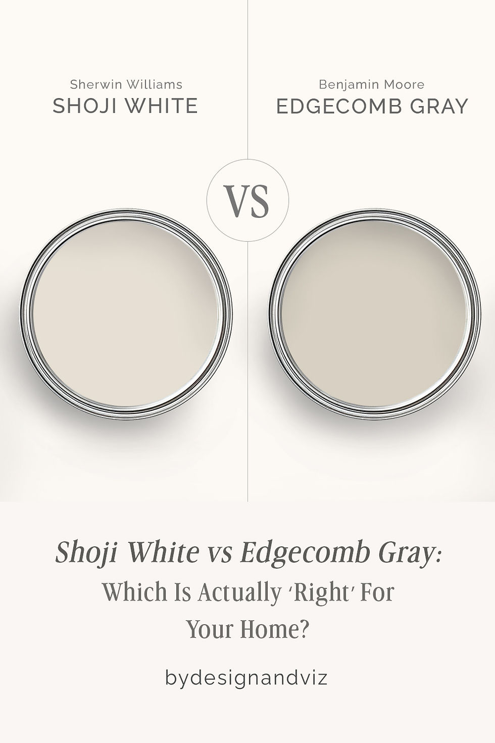
City Loft vs Shoji White: The Comparison That Actually Helps You Decide
- Beril Yilmaz

- 1 day ago
- 11 min read
City Loft and Shoji White appear on warm off-white shortlists constantly - both from Sherwin Williams, both described as sophisticated warm neutrals that work in almost any room, both broadly popular with designers and homeowners looking for something softer than a true white but more balanced than a committed cream. On a chip they read as close companions in the same warm off-white family. On a wall in a real room, the 4-point LRV gap between them is visible and the undertone difference - violet-inflected warmth versus creamy yellow-green warmth - creates two rooms that feel meaningfully different in temperature, saturation, and character.
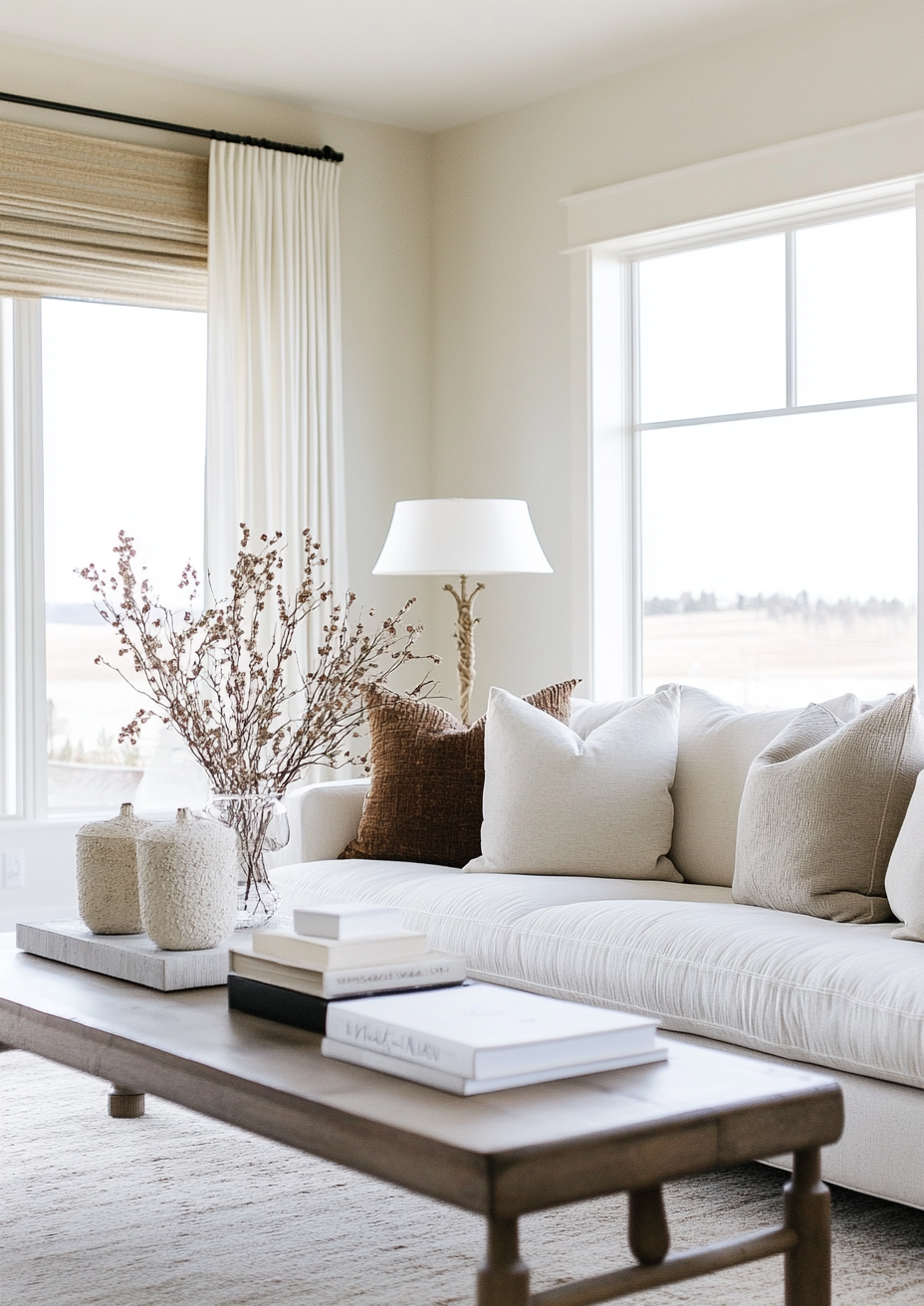
City Loft SW 7631 reads as a balanced, architecturally muted off-white. At LRV 70 it sits at the lighter end of the off-white spectrum with a violet-beige undertone that gives it a sophisticated, softly balanced quality - warm enough to feel inviting, muted enough to feel contemporary and considered, and complex enough to shift subtly with the light. Shoji White SW 7042 reads as a warm, creamy off-white with greige depth. At LRV 74 it is slightly richer, warmer, and more obviously present as an off-white - a settled, committed warm neutral with a creamy yellow-green quality that holds its warmth direction more consistently across varied conditions.
This guide covers exactly how City Loft and Shoji White differ in undertone, LRV, light behaviour, and room application - with a clear verdict on which one to choose and when.

At a Glance
| City Loft SW 7631 | Shoji White SW 7042 |
Brand | Sherwin Williams | Sherwin Williams |
LRV | 70 - light off-white greige, reads as airy and balanced | 74 - off-white with presence, reads as creamy, warm, and grounded |
Colour category | Warm light greige - sophisticated, balanced, violet-inflected off-white | Warm off-white with greige base - creamy, grounded, more committed warm direction |
Undertones | Warm violet-beige with subtle red-pink base - complex, muted, light-sensitive | Creamy yellow-green with greige anchor and occasional pink flicker - warm, muted, moderately complex |
Character | Balanced, airy, sophisticated off-white with quiet warmth and architectural muting | Warm, grounded, creamy off-white with greige depth and broad material compatibility |
North-facing | Surprisingly capable - violet undertone balances cool indirect light | Good - greige anchor holds warmth; can shift toward green-gray in very cool light |
South-facing | Excellent - warm light brings out peachy-warm quality at its most inviting | Beautiful - creamy warmth glows; can read more beige-forward in strong warm light |
Open-plan | Good - performs consistently across zones; violet undertone prevents cold reads | Excellent - greige base performs consistently across varied zones and light conditions |
On walls | Sophisticated light greige - reads as balanced and quietly warm; can shift toward pink in strong warm light | Warm creamy off-white - feels settled and inviting; clearly warmer than a true white |
On cabinets | Contemporary and transitional - lighter LRV keeps cabinets fresh and airy | Warm off-white cabinets - traditional, transitional, and warm contemporary kitchens |
Use together? | Possible as wall and trim combination if one is lighter; not ideal on directly adjacent walls | Not on directly adjacent surfaces - 4-point LRV gap creates a visible step rather than a considered contrast |
Trim for each | Pure White SW 7005 for clean contrast; Extra White SW 7006 for crispest result | Pure White SW 7005 for clean definition; White Snow SW 7004 for slightly softer contrast |
Style fit | Contemporary, transitional, modern farmhouse, organic modern - balanced warm-neutral palette | Traditional, transitional, farmhouse, warm contemporary, Japandi - creamy warm-neutral palette |
Architect's pick | When a balanced, sophisticated off-white with quiet violet warmth and contemporary muting is the brief | When a warm, creamy off-white with greige depth and broad compatibility across warm materials is the brief |
SW City Loft SW 7631 - What It Really Looks Like

City Loft SW 7631 has an LRV of 70 and a warm violet-beige undertone with a subtle red-pink base that keeps it from reading as a flat or cold neutral. It sits at the edge of the off-white and light greige spectrum - warm enough to feel inviting, muted enough to feel considered and contemporary, and complex enough to shift subtly with the light. In warm south-facing conditions the peachy-warm quality surfaces and City Loft reads as beautifully soft and inviting. In cooler conditions the violet base moderates the warmth and the colour reads as a more balanced, almost architectural off-white. The violet undertone is actually one of City Loft's greatest assets - it allows the colour to function well across a wider range of light conditions than purely warm or purely cool off-whites.
City Loft occupies a very specific and useful position in the SW neutral range: lighter and more airy than Agreeable Gray, warmer and more complex than a near-true white like Pure White, and more balanced than an overtly creamy off-white like Alabaster. For how it compares to the SW neutral it is most often placed alongside in warm off-white shortlists, the City Loft vs Accessible Beige guide covers that contrast in detail.
SW Shoji White SW 7042 - What It Really Looks Like

Shoji White SW 7042 has an LRV of 74 and a creamy yellow-green undertone with a greige anchor that keeps it from reading as stark or cold in any condition. Unlike City Loft there is no violet complexity in the base - the warmth direction is clear, creamy, and committed. It reads as what I think of as a confident off-white: present enough to feel like a deliberate warm colour decision, muted enough by its greige anchor to remain broadly compatible with a wide range of materials and finishes. In south-facing rooms Shoji White glows warmly and beautifully. In north-facing conditions the greige base holds its ground though the colour can shift toward a cooler gray-green reading in very dim or overcast light. The green undertone is present but subtle - a more stable warm quality than the violet-inflected warmth City Loft delivers.
The critical difference from City Loft: Shoji White is a more committed, more obviously warm off-white with greater saturation and depth, and it reads as clearly warmer in almost all light conditions. Its creamy yellow-green base does not carry the violet complexity that makes City Loft shift so interestingly with the light. For how it compares to the other SW off-white it is most often placed alongside, the Shoji White vs Accessible Beige guide covers that distinction in full.
The Real Difference Between City Loft and Shoji White

City Loft is a balanced, sophisticated off-white with a quiet violet-inflected warmth that shifts subtly with the light. Shoji White is a warm, creamy off-white with a committed yellow-green warmth and greige depth that reads consistently across most conditions.
The 4-point LRV gap is smaller than many greige comparisons but still visible on the wall. City Loft at LRV 70 reads as lighter, more airy, and more balanced - the violet quality gives it a muted, contemporary precision that reads as architectural and considered. Shoji White at LRV 74 reads as slightly richer, warmer, and more obviously present as an off-white - the creamy direction gives it a settled, inviting quality that reads as clearly warmer and more traditional in character. City Loft rooms feel light and precisely neutral. Shoji White rooms feel warm and settled.
The trim requirements are similar but not interchangeable. City Loft suits Pure White SW 7005 on trim - the clean, bright white provides clear definition without activating the pink-red base or making the walls read as peachy. Shoji White suits Pure White SW 7005 or White Snow SW 7004 on trim - both provide warm definition that relates to the creamy warmth without creating undertone tension. The critical caution with both: avoid Alabaster on trim alongside either colour. Alabaster's cream quality is too close in temperature to Shoji White and creates an indistinct, muddy relationship; alongside City Loft it activates the peachy-red base and makes the walls read warmer and more coloured than they should. Use a clearly lighter, brighter white on trim for both - definition comes from LRV contrast, not a subtle warmth-to-warmth relationship.
Not sure which one works for your room? A colour consultation is included in all our design packages - book directly here. |
When to Choose City Loft

Choose City Loft when the brief is a balanced, sophisticated off-white with quiet warmth and architectural muting. Contemporary, transitional, and modern farmhouse interiors where the walls need to contribute soft warmth without committing to a clearly creamy or beige direction. Rooms with warm wood floors, mixed metals, natural linen, and contemporary joinery where the balanced violet-beige quality reads as considered and precise. Rooms that receive a full range of light conditions throughout the day, where City Loft's violet undertone provides balance in both warm and cool moments.
Always sample City Loft at large scale in your specific room across a full day before committing. The red-pink base can read as noticeably peachy in rooms with very warm artificial lighting or in strong south-facing afternoon light. It is a subtle shift rather than a dramatic one, but worth confirming at sample stage - particularly if surrounding fixed materials are warm-toned.
When to Choose Shoji White

Choose Shoji White when the brief is a warm, creamy off-white with greige depth and broad compatibility across warm materials and varied light conditions. Traditional, transitional, farmhouse, and Japandi interiors where the walls need to contribute warmth and a sense of settled quality. Rooms with warm wood tones, natural linen and wool textiles, warm stone, and brass or bronze hardware where the creamy quality reads as instinctively cohesive. Open-plan spaces where colour consistency across zones matters - the greige anchor keeps Shoji White reading warmly regardless of the light direction each zone receives.
Shoji White is the more predictable specification of the two for most residential briefs. Its warm creamy direction is more consistent across varied light conditions than City Loft's violet-inflected warmth, and its LRV of 74 gives it enough saturation to hold its quality in rooms that receive limited natural light. For any project where light conditions are uncertain or variable, Shoji White is the lower-risk choice between these two off-whites.
How the Pairings Differ

For City Loft on walls, Pure White SW 7005 on trim is the cleanest and most reliable pairing - the bright clean white provides LRV contrast and definition without pulling toward the pink or activating the violet base. Extra White SW 7006 gives an even crisper, more contemporary result for interiors where maximum wall-to-trim contrast is the goal. Avoid Alabaster and warm cream whites on trim alongside City Loft - the warmth narrows the contrast gap and can make the wall colour read as more peachy and more committed to a beige direction than it actually is.
For Shoji White on walls, Pure White SW 7005 on trim is the most natural pairing - enough contrast to define the architecture clearly while respecting the warm off-white direction. White Snow SW 7004 gives a softer result for interiors where a more tonal relationship between walls and trim is the goal. Avoid Alabaster on trim with Shoji White - the two colours are too close in warmth and depth, creating an indistinct, muddy transition rather than a considered pairing.
For flooring, City Loft handles a wide range of floor materials - the balanced violet-beige quality works alongside cool stone, white oak, warm wood, and contemporary tile without creating undertone conflict. Shoji White is most naturally at home above warm wood floors - honey oak, warm walnut, and traditional hardwoods share the creamy warmth and create an instinctively cohesive layered palette. Cool gray stone alongside Shoji White can make the creamy quality read as slightly more beige and warm by contrast.
For hardware, City Loft handles the full contemporary range including brushed nickel, matte black, aged brass, and mixed metals - the balanced undertone creates no significant conflict with any metal finish. Shoji White is strongest with warm metals - aged brass, warm bronze, unlacquered brass, and matte gold. The creamy yellow-green quality relates most naturally to warm metal tones and creates a cohesive warmth-on-warmth relationship. Cool polished chrome alongside Shoji White can make the creamy quality read as more obviously yellow by contrast.
Architect's Verdict - City Loft or Shoji White?
Both are genuinely excellent warm off-whites for the right brief. The choice comes down to which warmth direction the room needs and how much contemporary muting versus settled creaminess is the goal.
If the brief is a balanced, sophisticated off-white with a quiet violet-inflected warmth and contemporary architectural quality - City Loft is the answer, with Pure White SW 7005 on trim, a full range of floor and metal materials, and any room from north-facing to south. Sample it carefully in rooms with very warm artificial lighting where the peachy-red base may surface more strongly.
If the brief is a warm, creamy off-white with greige depth and settled presence that reads consistently across varied light conditions and warm material palettes - Shoji White is the answer, with Pure White or White Snow on trim and warm wood, brass, and natural linen throughout. It is the more predictable and more consistently warm specification for most residential rooms and most traditional or transitional briefs.
The test: in your room in the worst light moment of the day - does City Loft still read as balanced and sophisticated, or does the pink-red base become noticeable in a way that reads as peachy rather than warm? Does Shoji White still read as warm and creamy, or does the green-gray shift in cool light become a concern? The answers tell you which one belongs in your room.
Frequently Asked Questions

Is City Loft lighter than Shoji White?
Yes - by 4 LRV points. City Loft has an LRV of 70 and Shoji White has an LRV of 74. The gap is visible on the wall though smaller than many off-white comparisons - City Loft reads as slightly lighter, more airy, and more balanced. Shoji White reads as slightly richer, warmer, and more clearly present as an off-white rather than a near-white.
Which is warmer - City Loft or Shoji White?
Shoji White reads as warmer in most conditions. Its creamy yellow-green undertone commits clearly to its warm direction across a wide range of light conditions. City Loft's violet-beige undertone creates a more balanced warmth that shifts more noticeably with the light - warmer and peachy in strong warm light, more muted and balanced in cooler conditions. For rooms where committed, consistent warmth is the brief, Shoji White is the more reliable choice.
Which is better for north-facing rooms?
Both can work in north-facing rooms, but City Loft performs slightly more reliably. City Loft's violet undertone actually helps it read as balanced in cool indirect light rather than cold or flat. Shoji White's greige anchor holds warmth well but in very cool or overcast conditions the green-gray base can surface and shift the colour toward a slightly muted, cooler reading. Neither is a risky north-facing specification - both outperform colder, greyer neutrals - but City Loft's violet base gives it a small advantage in challenging light.
Do City Loft and Shoji White go together?
Not on directly adjacent surfaces. The 4-point LRV gap creates a visible step between them - enough to read as an unintentional mismatch rather than a considered tonal pairing. The undertone difference between City Loft's violet-beige and Shoji White's creamy yellow-green also creates a subtle warmth contrast that surfaces when the two colours are placed side by side. In separate rooms with clear visual boundaries and distinct light conditions both colours can appear in the same home - but adjacent walls or adjacent trim and wall combinations should be avoided.
What is the LRV of City Loft vs Shoji White?
City Loft SW 7631 has an LRV of 70 and Shoji White SW 7042 has an LRV of 74. The 4-point gap places Shoji White as the slightly richer and more saturated of the two. City Loft reads as a lighter, more airy balanced off-white greige. Shoji White reads as a warmer, creamier off-white with more visible presence and settled warmth on the wall.
Final Thought
City Loft and Shoji White are both outstanding off-whites for the right brief. The 4-point LRV difference and the violet-inflected versus creamy yellow-green undertone distinction make the choice between them clearer than it first appears when both swatches are held up against each other on a chip.
Balanced, sophisticated, architecturally muted off-white with contemporary precision - City Loft with Pure White SW 7005 on trim, a full range of floor and metal materials. Warm, creamy, settled off-white with greige depth and broad material compatibility - Shoji White with Pure White or White Snow on trim and warm wood and brass throughout. Never on adjacent surfaces. Sample both at large scale in your room across a full day. The answer will be clear within 24 hours.
Want a complete colour scheme built around City Loft or Shoji White? Our design packages cover full palette selection, finish recommendations, and 3D visualisations - see our packages. |
About the Author
Beril Yilmaz is a qualified architect and interior designer based in the UK. She runs BY Design And Viz, a design platform covering paint colour reviews, interior design guidance, and residential design projects. Beril has specified both City Loft and Shoji White across residential projects in the UK and internationally - City Loft in contemporary and transitional schemes where a balanced, architecturally muted off-white with a light and sophisticated quality is the brief, Shoji White in traditional and warm transitional interiors where a committed, creamy off-white with greige depth and broad material compatibility is the priority.


Comments