


Dimity vs Skimming Stone: The Comparison That Actually Helps You Decide

Dimity is a cream. Skimming Stone is a stone. That is the whole tension. Both are warm Farrow & Ball neutrals, but Dimity lifts a room with soft yellow light while Skimming Stone settles it with a grey-led, mineral calm. On a paint card they look like cousins. On a full wall they are not.
I have used both across residential projects in the UK, and the choice is never arbitrary. I decide on three things: the direction of the light, the temperature of the materials, and how much weight the room should carry. The LRV gap helps, at roughly 78 against 68. The undertone settles it.
This guide covers what each color actually does on a wall, where each one fails, the trim, flooring, and hardware pairings, and a worst-case light test you can run before you buy a single tin.

At a Glance
| Dimity | Skimming Stone |
Brand | Farrow & Ball | Farrow & Ball |
LRV | 78 - bright for a Farrow & Ball neutral, but the cream reads before the brightness does | 68 - ten points below Dimity, so it sits as a soft stone tone rather than a near-white |
Colour category | Warm cream - a pale, sunlit off-white with real yellow in it | Warm light grey-greige - a stone neutral with a faint pink cast, not a white |
Undertones | Soft yellow with a trace of peach - buttery in daylight, deeper and cozier under lamplight | Grey-beige base with a subtle pink-stone cast beneath - the grey leads and the warmth sits underneath |
Character | Light, sunny, and gently traditional - adds warmth that is visible rather than implied, and lifts a room | Calm, mineral, and grounded - mutes a room into soft stone and gives it quiet weight without going dark |
North-facing | Needs care - on grey UK daylight the cream can drop toward flat putty; works only with warm bulbs and warm materials | Strong - the grey-beige base absorbs cool light without turning blue or green, and the warmth stops it going cold |
South-facing | Excellent - strong light activates the yellow-cream and the room glows; can lean buttery by late afternoon | Good - reads as a soft warm stone; may look slightly pinker or more beige in strong sun, but never yellow |
Open-plan | Moderate - the yellow shifts between zones and can read differently from kitchen to living area | Strong - the grey-led base holds steady across zones, so one color reads consistently |
On walls | A lifted, sunny backdrop that makes ceilings feel higher - unmistakably cream from every angle | A muted, enveloping backdrop that flatters oak, linen, and stone and gives a room depth without a heavy color |
On cabinets | Lovely in painted country kitchens with timber worktops and brass; looks yellow against cold quartz or white appliances | The more contemporary choice - sits well with stone, slate, and steel, and forgives marks better than a pale cream |
Use together? | Yes - Dimity on woodwork against Skimming Stone walls is a natural, tonal step within the same warm family | Yes - Skimming Stone on walls with Dimity on woodwork gives soft, tonal definition; the reverse needs testing |
Trim for each | New White No. 59 or Wimborne White No. 239 for a clean lift - avoid brilliant white | Dimity No. 2008 for a gentle step up, or Wimborne White No. 239 for crisper definition |
Style fit | Period homes, cottage, country kitchen, and traditional schemes | Contemporary, modern country, Scandinavian-leaning, and layered neutral interiors |
Architect's pick | When the brief is a lighter, sunnier, cozy room and the light is good or the materials are warm | When the brief is a calm, grounded room and the light is cool, changeable, or uncertain |
Farrow & Ball Dimity No. 2008 - What It Really Looks Like
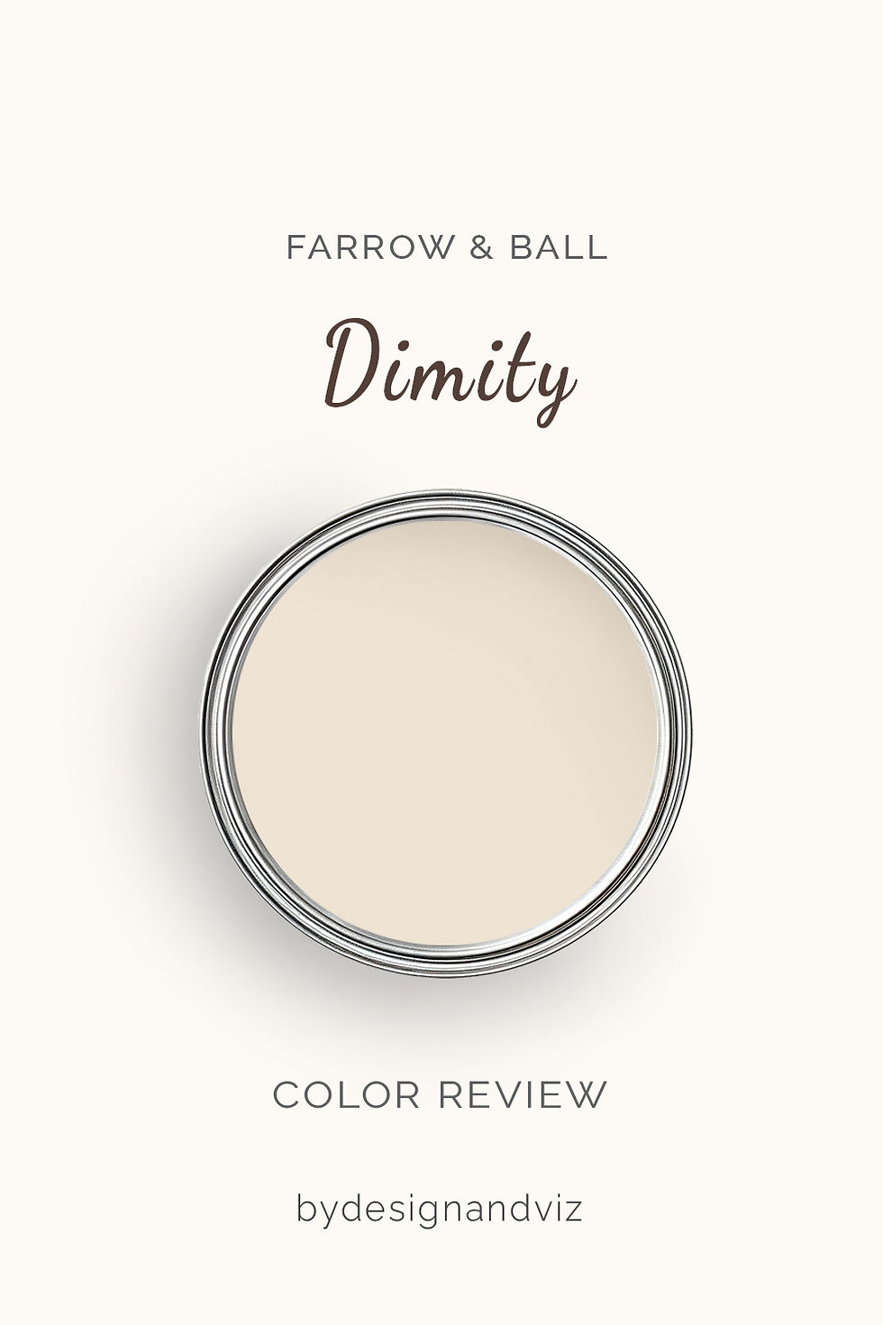
Dimity has an LRV of approximately 78, which puts it firmly in the light, warm cream category. The color is a pale, buttery cream with soft yellow and a trace of peach in it. It is not a white pretending to be warm. It is a cream, and it says so. In daylight it brightens a room without glare, and in lamplight the yellow deepens into something genuinely cozy.
The critical thing about Dimity is that it needs light and warmth to perform. In a south or west-facing room it glows. In a north-facing room on a grey day it can drop toward flat putty and lose its warmth entirely. Warm timber, brass, and natural linen keep it alive. Cold white appliances and blue-grey stone do the opposite. It does not hedge, so the room has to back it up.
Farrow & Ball Skimming Stone No. 241 - What It Really Looks Like

Skimming Stone has an LRV of approximately 68, which puts it in the light-to-mid range as a stone neutral rather than a near-white. The base is a warm light grey with a soft pink-stone cast beneath it. The grey leads. The warmth shows mostly in evening light and beside cooler colors. That ten-point drop from Dimity is visible on the wall: Skimming Stone absorbs light where Dimity throws it back.
Skimming Stone is the calmer, more forgiving of the two. Its grey-beige base absorbs changing light without swinging yellow or cold, which is why it holds up in north-facing rooms and open-plan spaces. The one risk is the pink cast, which can read faintly fleshy beside orange-toned timber or in low, strong sun. There is no ambiguity about its character once you see it at scale. For the full single-color picture, including how it reads in every orientation, the Farrow & Ball Skimming Stone review takes it room by room, so you can judge whether that pink cast will suit your own light.
The Real Difference Between Dimity and Skimming Stone

Dimity is a cream that lifts. Skimming Stone is a stone that settles. Dimity carries yellow and a trace of peach, so it reads warm from every angle and makes a room feel sunnier. Skimming Stone carries a grey-beige base with a pink-stone cast beneath it, so it reads calm and mineral and makes a room feel grounded. Set the two samples side by side and Dimity looks nearly white. Skimming Stone looks like a different material.
The LRV gap is real, at roughly 78 against 68. Ten points is enough to feel. A small north-facing room painted Dimity stays noticeably brighter than the same room in Skimming Stone, which counts for something where light is scarce. But the undertone decides the outcome, not the number. Skimming Stone can be the better choice in a dim room precisely because it does not try to be bright. It accepts the gloom and softens it. Dimity pushes against it and sometimes loses.
Trim is where the two work together. Skimming Stone on walls with Dimity on woodwork gives soft, tonal definition without a harsh edge. Dimity on walls with a crisper warm white on trim, such as New White No. 59, keeps the cream clean. Avoid brilliant white beside either, as it makes Dimity look yellow and Skimming Stone look dull. If Dimity feels too yellow for your room and you want a second reference point, the Slipper Satin vs Skimming Stone guide shows how Skimming Stone reads beside a lighter Farrow & Ball neutral, which is the fastest way to judge how much brightness you are giving up.
Not sure which one is right for your room? A Color Direction consultation gets you a full custom palette built around your space - book yours here. |
When to Choose Dimity

Choose Dimity when the brief is a lighter, sunnier, distinctly cream room and the light or materials can support it. South and west-facing rooms where the yellow has light to work with. Period homes, cottages, and country kitchens where cream is part of the character. Rooms with warm timber floors, brass fixtures, and natural linen. Bedrooms and sitting rooms where the goal is cozy rather than crisp.
Avoid Dimity where warmth has nothing to push against. That means dim north-facing rooms without warm lighting, rooms beside cold blue-grey stone, and contemporary schemes built on steel and glass. In those settings the cream turns flat and slightly dirty. Cream in the wrong room looks like a mistake.
When to Choose Skimming Stone

Choose Skimming Stone when the brief is a calm, grounded room and the light is cool, changeable, or uncertain. North-facing rooms. Open-plan spaces where one color must carry across zones. Contemporary and modern-country interiors with stone, slate, or steel. Hallways and stairwells where light changes by the hour. Kitchens that need a softer, more practical tone than a pale cream that shows every mark.
Avoid Skimming Stone where brightness is the priority. Very small windowless rooms will feel heavier, and strongly orange timber can pull the pink cast forward. It settles a room. It does not lift one.
How the Pairings Differ

For Dimity on walls, choose a warm white on trim such as New White No. 59 or Wimborne White No. 239. The small lift keeps the cream clean and the edge soft. Skip brilliant white. It makes Dimity look yellow by contrast.
For Skimming Stone on walls, Dimity on woodwork is the natural pairing. The lift is gentle and tonal. For a crisper edge, use Wimborne White No. 239. Skimming Stone on walls and trim together creates a quiet, enveloping scheme that suits bedrooms and studies.
For flooring, Dimity wants warmth: oak, pine, terracotta, and warm limestone. Cool grey tile creates an undertone conflict that is hard to resolve. Skimming Stone is far more flexible. It handles pale oak, grey-toned oak, limestone, and slate without strain.
For hardware, Dimity suits aged and unlacquered brass. Skimming Stone works with aged brass too, and also with brushed nickel and blackened iron. Polished chrome is a poor match for either.
Architect's Verdict - Dimity or Skimming Stone?

For most homes with changeable light or mixed materials, Skimming Stone is the safer specification. For rooms with good light and a clear warmth brief, Dimity is the more beautiful one.
Dimity is the right choice when you want cream. In a south-facing sitting room with timber floors and linen, it is lovelier than Skimming Stone. It lifts the room and the yellow reads as a decision. It fails in rooms that are dark and cold.
Skimming Stone is the right choice when you want calm. It holds steady in cool light, in open plans, and beside stone and steel. It forgives a great deal. It will never make a dark room bright, and it is not meant to.
The test I always use targets the worst case for this pair: a north-facing room on an overcast afternoon. Buy sample pots of both and paint two patches about 60cm square on different walls, two coats each, away from corners. Check them at 9am, at 2pm on a grey day, and again at 7pm under your normal lamps. Dimity passes if it still reads as warm cream at 2pm rather than flat putty or dull yellow. Skimming Stone passes if it reads as soft stone at 2pm rather than flat grey, and does not turn pink under the lamps. If Dimity fails at 2pm, choose Skimming Stone. Your room will tell you which one it needs.
Frequently Asked Questions

Is Dimity lighter than Skimming Stone?
Yes - by roughly 10 LRV points. Dimity sits at about 78 and Skimming Stone at about 68. The gap shows most in low-lit rooms, where Dimity stays brighter. The bigger difference is character: Dimity reads as cream, Skimming Stone as stone.
Is Skimming Stone grey or beige?
It is a warm light grey that leans greige. The grey leads and the beige warmth sits underneath, with a faint pink cast in some lights. That balance is why it behaves so steadily across different rooms.
Which is better for a north-facing room?
Skimming Stone handles north light better. Its grey-beige base absorbs cool light without going blue or green. Dimity can drop toward putty on a grey day and needs warm bulbs and warm materials to stay alive. Test both in the actual room before committing.
Can I use Dimity and Skimming Stone together?
Yes, and it is a natural pairing. Skimming Stone on walls with Dimity on woodwork gives soft, tonal definition within the same warm family. Test the reverse carefully, as the contrast between the two is gentle.
Which is better for kitchen cabinets?
Skimming Stone is the more practical choice for most kitchens. It sits comfortably with stone, slate, and steel and hides marks better than a pale cream. Dimity is beautiful in a warm country kitchen with timber worktops and brass, but looks yellow beside cold quartz or white appliances.
Does Skimming Stone look pink?
Sometimes, in low strong sun or beside orange-toned timber. The pink-stone cast is subtle and usually reads as warmth rather than color. If you see it clearly in a large sample patch at 2pm and again at 7pm, that is your answer: choose a different neutral or switch to Dimity.
Final Thought
Dimity and Skimming Stone are both excellent Farrow & Ball neutrals, but they solve different problems. The choice is not about which is better. It is about what your room needs: lift or calm.
If your light is good and you want cream, Dimity will reward you with warmth and brightness. If your light is cool or uncertain, Skimming Stone is the steadier, more forgiving choice. Buy both sample pots, paint large patches side by side, and watch them across a full day. The answer will be clear within 24 hours.
Want a complete colour scheme built around Dimity or Skimming Stone? Our design packages cover full palette selection, finish recommendations, and 3D visualisations - see our packages. |
About the Author
Beril Yilmaz is a qualified architect and interior designer based in the UK. She runs BY Design And Viz, a design platform covering paint colour reviews, interior design guidance, and residential design projects. Beril has specified both Dimity and Skimming Stone across residential projects in the UK and internationally — Dimity in period living rooms and country kitchens with warm timber and brass, Skimming Stone in open-plan and north-facing spaces where the light is cool or changeable, often in the same scheme with Dimity on woodwork against Skimming Stone walls.


Comments