


Slipper Satin vs Dimity: The Comparison That Actually Helps You Decide

Slipper Satin and Dimity sit three LRV points apart and a full undertone apart. Slipper Satin is the muted one: a chalky off-white with a trace of yellow-grey that sits back on the wall. Dimity is the warm one: a soft cream with a red-based glow that fills the room. Put the two sample boards side by side and Dimity looks lit from within while Slipper Satin looks settled. Neither is wrong. Each belongs in a different room.
I have used both across residential projects, and the paint card never decides the choice. The light in the room and the materials beside the wall decide it. A north-facing room in a UK period house treats these two very differently. I have watched one hold its warmth and the other drift flat by mid-morning.
This guide covers the undertone behind each color, where each one performs, how to pair them with trim, flooring and hardware, and the light test I run before anyone commits to a tin.

At a Glance
| Slipper Satin | Dimity |
Brand | Farrow & Ball | Farrow & Ball |
LRV | Approx. 75 - light, but never bright; the muted undertone keeps it soft | Approx. 78 - slightly brighter, and the red-based warmth makes the gap look wider than three points |
Colour category | Muted, chalky off-white - reads as aged parchment rather than cream | Warm cream - a soft, glowing off-white with a rosy base |
Undertones | Faint yellow-grey, close to stone; sits back and rarely shows a pink or peach note | Red-based warmth (Farrow & Ball files it under Red Based Neutrals); shows as soft apricot-cream in lamplight |
Character | Quiet and mellow; a backdrop that lets oak, stone and art lead. Works on walls and woodwork alike | Warm and enveloping; the wall contributes atmosphere itself. Makes a room feel lived in rather than neutral |
North-facing | Acceptable in good daylight, but flat overcast light can strip its softness and push it slightly grey | The stronger of the two - the red base offsets cool light and keeps the wall warm instead of grey |
South-facing | Lifts into a gentle, stable parchment; nothing tips toward yellow | Glows; can tip toward peach-cream in strong afternoon sun, lovely when intended, too sweet when not |
Open-plan | Strong - reads consistently across zones and sits easily with oak, stone and painted joinery | Weaker - shifts warmer beside timber and lamps, so zones can read differently |
On walls | Soft backdrop that stays composed from morning to evening; the furnishings carry the warmth | Warm backdrop that carries the mood itself; best where you want the wall to do the work |
On cabinets | Painted-timber off-white that suits stone, steel and brass; the better pick for kitchens with cool counters | Warm cream cabinetry that suits oak, brass and warm limestone, but can look pink against cool grey quartz |
Use together? | Yes, in adjoining rooms - Slipper Satin as the calmer space, Dimity as the warmer one | Not as wall and trim - three LRV points is too small a step, so it reads as a mistake rather than definition |
Trim for each | Wimborne White for a soft step up, or All White for crisper contrast | All White to keep the walls clean without stacking extra pink; Wimborne White for a closer tonal match |
Style fit | Period, Georgian, Scandinavian-leaning, organic modern | Cottage, traditional, relaxed country, warm contemporary |
Architect's pick | When the room needs a calm, grown-up off-white that adapts to stone, oak and steel and never announces itself | When the brief is warmth and glow - bedrooms, snugs and dim north-facing rooms where the wall must give heat back |
Farrow & Ball Slipper Satin No. 2004 - What It Really Looks Like

Slipper Satin has an LRV of approximately 75, which puts it firmly in the light, muted off-white category. It is not a bright white and does not try to be. The color reads as a soft, chalky parchment with a trace of yellow-grey that keeps it close to stone. There is nothing sugary about it.
The defining trait is restraint. Where Dimity glows, Slipper Satin recedes. In south-facing light it lifts into a gentle, stable cream-white, and in evening lamplight it warms slightly but stays composed. Under flat overcast light it can lose some of that softness and read a touch grey. That matters in a north-facing room.
On woodwork it is a proven off-white that gives joinery definition without a stark edge. It also works as a wall color alongside other whites, lighter and darker. For how it behaves in period rooms, kitchens and next to its closest neighbors, the Slipper Satin review breaks down the light and material cases in full, which a head-to-head has no room for.
Farrow & Ball Dimity No. 2008 - What It Really Looks Like
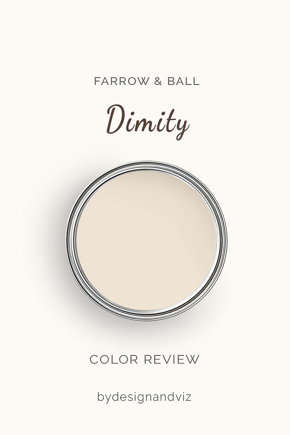
Dimity has an LRV of approximately 78, which makes it the lighter of the pair by a small margin. The number undersells the difference. Dimity belongs to the red-based neutrals, so the brightness arrives wrapped in warmth. It reads as a soft cream with a faint rosy-apricot base. It is light. It is not cool.
The defining trait is warm glow. In lamplight the base deepens to apricot-cream and the room feels genuinely cozy. In south or west light it can tip toward peach, which delights or irritates depending on the brief. In north light the red base works in its favor, keeping the wall warm where other off-whites turn grey. That is its real strength.
Dimity needs warm materials around it. Oak floors, brass, linen and warm limestone make it look composed. Cool grey stone or chrome makes the pink base obvious. It rewards a committed scheme and punishes a mixed one.
The Real Difference Between Slipper Satin and Dimity

The simplest way to put it: Slipper Satin is an off-white that sits back. Dimity is an off-white that steps forward.
The LRV gap is only about three points, so neither makes a room feel meaningfully brighter. The difference lives in the undertone. Slipper Satin leans yellow-grey and reads as stone-adjacent parchment. Dimity leans red-based and reads as soft apricot-cream. Side by side in good light, Dimity looks warmer and slightly pinker. Slipper Satin looks quieter and more weathered. In practice that decides everything: Slipper Satin adapts to the room, and Dimity changes it.
Trim is where the two colors part ways again. Slipper Satin takes Wimborne White comfortably and keeps the scheme calm. Dimity wants All White to stay clean, because a creamier trim stacks pink on pink. Using one as trim against the other adds little, since the brightness step is too small. To see how Slipper Satin behaves beside a deeper stone neighbor, the Slipper Satin vs Skimming Stone guide shows where its softness ends and a true stone color begins.
Not sure which one is right for your room? A Color Direction consultation gets you a full custom palette built around your space - book yours here. |
When to Choose Slipper Satin

Choose Slipper Satin when you want a calm off-white that adapts to whatever the room throws at it. That means open-plan spaces with mixed zones, kitchens with stone or stainless steel, period rooms with painted joinery, and schemes where oak, art and textiles should lead. South and west light show it at its best. It is the lower-risk pick when you cannot predict the light.
Avoid Slipper Satin in dim, north-facing rooms with no warm material to rescue it. Flat overcast light leaves it looking grey and slightly dull. Skip it too where the brief is a glowing, enveloping cream. It will not deliver that. It is a backdrop, not a mood.
When to Choose Dimity

Choose Dimity when the wall itself should provide the warmth. That means bedrooms, snugs, dining rooms and north-facing living rooms where cool light needs counteracting. It suits timber floors, brass fittings and linen. In a small room it feels embracing rather than boxed in. It also suits period cottages where a pure white would look sterile.
Avoid Dimity beside cool grey stone, chrome or blue-toned furnishings. The red base shows as pink and the room looks unresolved. Avoid it in open-plan layouts too, where it shifts between zones. Skip it in strong south-facing sun if you dislike peach. Test first.
How the Pairings Differ

For Slipper Satin on walls, Wimborne White on trim is the natural step up. It adds definition without breaking the calm. All White gives crisper contrast in a contemporary scheme. Avoid anything creamier than the walls. It will look dingy.
For Dimity on walls, All White on trim keeps the scheme clean. Wimborne White works where you want a softer, more tonal edge. Skip warm creams on the joinery. Pink on pink reads as muddy.
For flooring, both colors suit warm oak and limestone. Dimity is the pickier of the two. Cool grey tile or polished concrete pulls its pink base forward. Slipper Satin tolerates mid-tone stone, pale oak and even soft grey-toned boards without conflict.
For hardware, aged brass suits both. Slipper Satin also takes iron, bronze and brushed nickel without friction. Dimity prefers brass, copper and bronze. Chrome and polished nickel make its warmth look accidental.
Architect's Verdict - Slipper Satin or Dimity?

For most homes, Slipper Satin is the more reliable choice. Its muted undertone adapts to stone, oak, steel and changing light, and it rarely produces a surprise. That is why I reach for it first in open-plan and mixed-material rooms.
Slipper Satin is the right call when versatility matters. It sits quietly, takes trim well and lets the furniture lead. It does not add warmth to a cold room. Plan for that.
Dimity is the right call when warmth is the brief and the room is short on it. In a dim north-facing bedroom with oak floors and linen, Dimity beats Slipper Satin outright. It gives the room heat back. In a cool-toned kitchen it does the opposite.
Run this test before you buy a full tin. Paint two 60 cm squares of each color on lining paper, tape them to the darkest wall in the room and leave them there. Look at 9am on an overcast morning, which is the worst case for both. Dimity passes if it still reads as warm cream and not pink beside your floor. Slipper Satin passes if it still reads as soft off-white and not grey. Repeat at 7pm with the lamps on. If Slipper Satin looks flat at 9am, choose Dimity. If Dimity turns pink against your materials, choose Slipper Satin.
Frequently Asked Questions

Is Dimity warmer than Slipper Satin?
Yes, Dimity is warmer. Its red-based undertone gives it a rosy, apricot-cream warmth, while Slipper Satin leans yellow-grey and sits closer to stone. The difference is easy to see side by side and larger than the LRV gap suggests.
What is the LRV of Slipper Satin vs Dimity?
Slipper Satin is approximately 75 and Dimity approximately 78. Published figures vary by a point or two depending on the source, so treat both as approximate. The gap is too small to change how bright a room feels. The undertone does the real work.
Which is better for a north-facing room?
Dimity, in most cases. Its red base keeps the wall warm under cool light. Slipper Satin can read flat and slightly grey in overcast north light. Test both on the darkest wall before committing.
Which is better for kitchen cabinets?
Slipper Satin is the more practical choice for most kitchens. It tolerates stone, stainless steel and brass. Dimity works beautifully with oak, brass and warm limestone, but can look pink against cool grey quartz.
Can I use Slipper Satin and Dimity in the same house?
Yes, in adjoining rooms. Both are warm, so the transition feels seamless. Avoid using one as trim against the other, as the three-point gap is too small to create definition.
Does Dimity look pink on walls?
It can. The red-based undertone shows as a faint rosy note, mainly beside cool materials or in flat grey light. In warm light and with warm materials it reads as cream. Large samples will tell you quickly.
Final Thought
Slipper Satin and Dimity are both excellent soft off-whites. The choice is not about quality. It is about what your room needs from its walls.
If your materials are mixed or your light is unpredictable, Slipper Satin is the steadier answer. If the room is cool, dim and short on warmth, Dimity gives it back. Put sample patches of both on the darkest wall and watch them across a full day. The answer shows itself by evening.
Want a complete colour scheme built around Slipper Satin or Dimity? Our design packages cover full palette selection, finish recommendations, and 3D visualisations - see our packages. |
About the Author
Beril Yilmaz is a qualified architect and interior designer based in the UK. She runs BY Design And Viz, a design platform covering paint colour reviews, interior design guidance, and residential design projects. Beril has specified both Slipper Satin and Dimity across residential projects in the UK and internationally — Slipper Satin in open-plan living areas and period rooms where stone, oak and painted joinery share the space, Dimity in bedrooms and north-facing rooms where the wall needs to supply the warmth, often in adjoining rooms of the same scheme.


Comments