


Dimity vs Wimborne White: The Comparison That Actually Helps You Decide

Dimity is a cream. Wimborne White is a white. Both sit in the Farrow & Ball warm neutral family, and on a swatch they look like neighbours. On a full wall they are not. Dimity wraps a room in biscuit warmth. Wimborne White lifts it and keeps its warmth in reserve. The LRV gap between them is small on paper and obvious in a room.
I have specified both across residential projects in the UK, usually in period properties where north light is the problem and the woodwork needs to hold its own. The choice is never about which colour is prettier. It is about what your room does to the colour. Dimity rewards a room that needs warmth. Wimborne White rewards a room that needs light.
This guide covers the undertone difference, how each behaves in north and south light, the trim and flooring pairings that work, and a clear verdict on which one to choose.

At a Glance
| Dimity | Wimborne White |
Brand | Farrow & Ball | Farrow & Ball |
LRV | 77 - reflects enough light to keep a room open, but settles into the space rather than lifting it | 82 - brighter; lifts a room and reads as white before it reads as warm |
Colour category | Warm cream - reads as biscuit or parchment on a full wall, never as white | Soft warm white - warm enough to avoid looking stark, restrained enough to read as white |
Undertones | Warm yellow with a soft red-based edge - visible from across the room, deepening to a rich cream in lamplight | Faint warm yellow held well back - present in lamplight and south light, almost invisible in cool light |
Character | Enveloping and settled; gives a room a lived-in, period quality and needs warm materials around it to look deliberate | Quiet and adaptable; a backdrop that lets floors, joinery and art lead rather than a colour in its own right |
North-facing | Holds up well - the warm pigment keeps it from going flat or grey, so it stays cosy where whites turn dull | Workable but flat - loses warmth and can settle into a muted grey-cream; needs warm light and warm materials to stay lively |
South-facing | Glowing - strong light brings out the cream and can push it towards butter; best with warm timber and some shade | Soft and clean - the warmth shows gently without tipping towards cream; one of the safer whites in strong light |
Open-plan | Risky - the warmth reads strongly in every zone and competes with cooler finishes in adjoining spaces | Strong - reads consistently across zones and sits comfortably against both warm and cool finishes |
On walls | A full-commitment cream backdrop for sitting rooms, snugs and bedrooms; wraps the room in warmth and softens hard edges | A bright, softened white backdrop that opens small rooms, hallways and landings and stays composed as the light moves |
On cabinets | Beautiful on painted timber cabinets in traditional kitchens with wood worktops and brass; looks dingy beside cool stone or stainless steel | The more flexible choice for kitchens with mixed worktops and appliances; crisp enough for cool stone, warm enough for timber |
Use together? | Yes - Dimity walls with Wimborne White trim is the natural pairing; the reverse needs testing first | Yes - it is the trim that lifts Dimity walls; on its own walls, a tonal eggshell trim works |
Trim for each | Wimborne White for a soft step up in brightness, or All White for sharper contrast | Wimborne White in Estate Eggshell for a tonal finish, or All White for crisp definition |
Style fit | Period, traditional, cottage and country interiors; layered, warm schemes | Traditional, transitional, contemporary country and minimal schemes; the more versatile of the two |
Architect's pick | When the brief is a deliberate, enveloping cream and the room has north light or warm materials to support it | When the room needs light, the materials are mixed, or you want white without the starkness |
Farrow & Ball Dimity No. 2008 - What It Really Looks Like
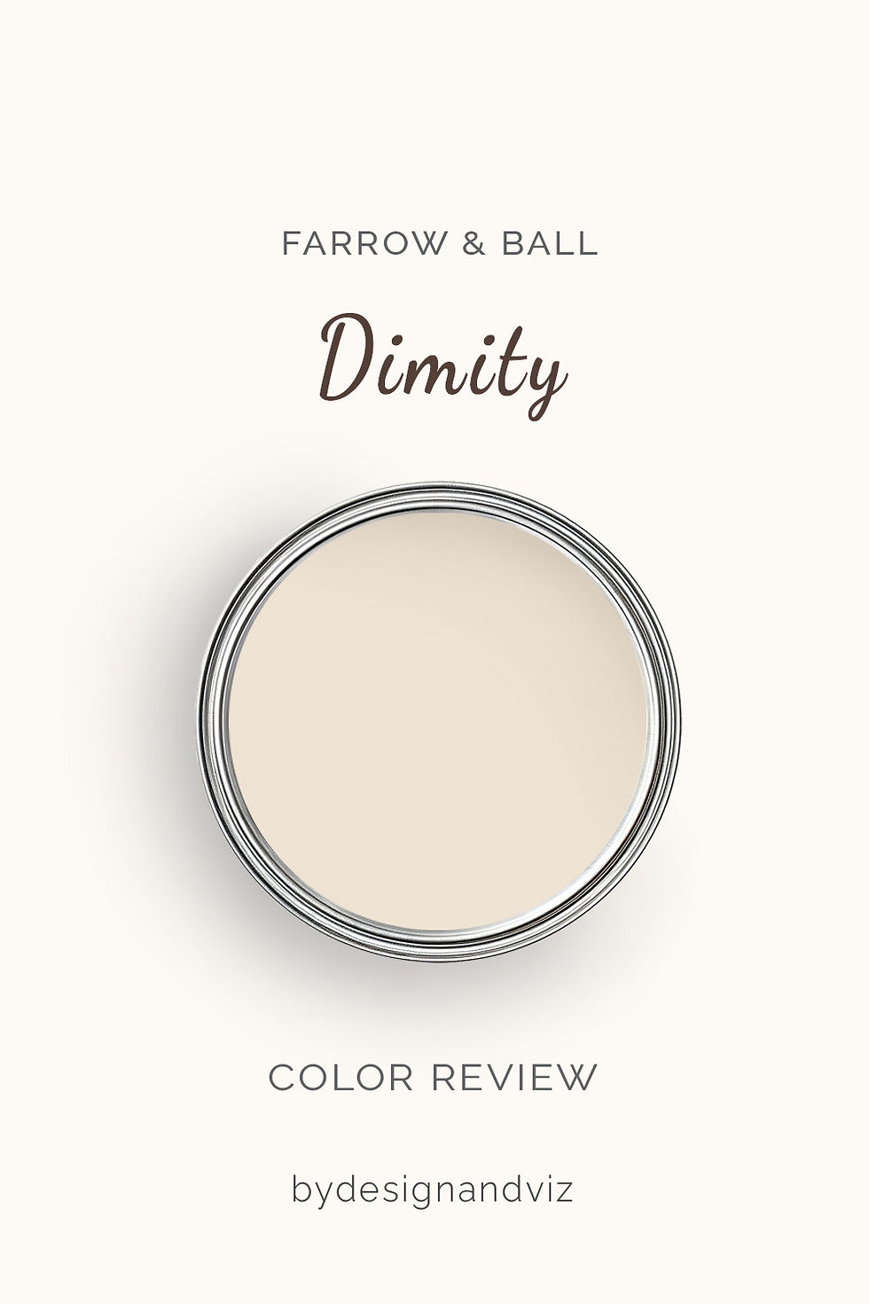
Dimity has an LRV of approximately 77, which puts it firmly in the warm cream category. It is not a white. On a full wall it reads as a soft biscuit, a pale parchment with a gentle warmth that Farrow & Ball files under its red-based neutrals. Beside a true white it looks distinctly creamy. On its own it simply looks warm.
The LRV matters here. At 77 Dimity reflects enough light to keep a room open, but it does not throw light around the way a brighter white does. In north-facing rooms, where paint tends to read flatter, that warm pigment is an advantage. It holds its warmth when the light turns grey. In evening lamplight it deepens into a soft, enveloping cream.
If Dimity is already your frontrunner, read the single-colour detail before you buy a sample pot. The Farrow & Ball Dimity review looks at the colour on its own terms rather than against Wimborne White, which is the right next step once you know cream is what the room wants.
The critical thing to understand about Dimity is that it commits to warmth. It does not hedge. With warm timber, aged brass and natural linen it looks settled and considered. Against cool grey stone or stark white units it can look dingy and dated.
Farrow & Ball Wimborne White No. 239 - What It Really Looks Like

Wimborne White has an LRV of approximately 82, which puts it firmly in the soft warm white category. It is Farrow & Ball's just-off-white, and the description is accurate. Warm enough to avoid looking stark. Restrained enough that nobody mistakes it for cream. On a full wall it reads as a clean, gently softened white that asks for no attention.
That restraint is its strength. It brightens a room without announcing its undertone, which is why it works on both walls and woodwork. In south light it glows softly. In north light it loses some warmth and can settle into a muted grey-cream, so it needs a warm element in the room to stay lively. Evening lamplight brings the warmth back.
If Wimborne White is your frontrunner, look at it away from Dimity before you commit. The Farrow & Ball Wimborne White review covers the colour on its own terms, which matters if you are considering it for the whole house rather than choosing between two cans.
The critical thing to understand about Wimborne White is that it is a background colour. It does not carry a room the way Dimity does. Beside a true white it looks creamy. Beside Dimity it looks crisp. Context decides everything.
The Real Difference Between Dimity and Wimborne White

The simplest way to explain it: Dimity is a cream that wraps a room. Wimborne White is a white that lifts one. Dimity carries more pigment and a distinctly warmer undertone, and it shows. Wimborne White keeps its warmth in reserve, so it reads as a soft white rather than a colour in its own right.
In practice, Dimity works when warmth is the brief and the room can take it: a period sitting room, a north-facing snug, a bedroom meant to feel enclosed and calm. Wimborne White works when light is the brief: a hallway that needs lifting, a kitchen with mixed finishes, a scheme where walls and woodwork must share one family. The LRV gap helps here. Dimity at roughly 77 settles into a room. Wimborne White at roughly 82 opens it.
The other key difference is how they behave on woodwork. Wimborne White trim with Dimity walls is the natural pairing. The step up in brightness gives clean definition without a harsh edge. Reverse it and Dimity trim can look heavy against Wimborne White walls, so test that combination before committing. If Wimborne White's closest neighbour in the range is also on your shortlist, the Pointing vs Wimborne White guide shows which of the two your woodwork can support.
Not sure which one is right for your room? A Color Direction consultation gets you a full custom palette built around your space - book yours here. |
When to Choose Dimity

Choose Dimity when you want a deliberate, enveloping cream and the room can support it. These are the conditions where it is the right answer:
North-facing sitting rooms and snugs where whites go flat and the warm pigment keeps the room cosy. Period properties with timber floors, aged brass and linen, where cream is part of the design intent. Bedrooms that should feel enclosed and calm. Rooms where you want the walls to look softly lit even on a grey day. Avoid Dimity in kitchens with cool stone or stainless steel, in compact rooms that need every point of light, and anywhere cool-toned finishes sit directly beside the walls. The warmth will fight them.
When to Choose Wimborne White

Choose Wimborne White when you want white without the starkness and the room needs light. This is where it outperforms Dimity:
Hallways, landings and small rooms that need lifting. Open-plan spaces where the colour must read consistently across zones. Kitchens with mixed finishes. Rooms where walls and woodwork should share one calm family. Any room where you have tested Dimity and found it heavy. Avoid Wimborne White in north-facing rooms that get little direct light and have no warm materials to balance them, where it can settle into a flat grey-cream. It needs some warmth around it. A timber floor or warm lamplight does the job.
How the Pairings Differ

For Dimity on walls, Wimborne White on trim is the natural choice. It steps up in brightness for clean definition while staying in the same warm family. All White gives sharper contrast. Avoid brilliant white trim, which will make Dimity look dingy and unintentional.
For Wimborne White on walls, tonal trim is the safest route. The same colour in Estate Eggshell gives a seamless, soft scheme. All White adds crisp definition where you want the joinery to read. Avoid creamier trim such as Dimity, which can look heavy against the lighter wall.
For flooring, both colours suit warm timber. Dimity needs warm floors more urgently. Cool grey tile or stone alongside Dimity walls creates an undertone conflict that is hard to resolve. Wimborne White is more forgiving and sits comfortably with limestone, pale oak and warm-toned flagstones.
For hardware, both suit aged and unlacquered brass. Wimborne White also takes polished nickel and black iron in more transitional schemes. Dimity is less comfortable with cool metals, because its warm undertone fights them.
Architect's Verdict - Dimity or Wimborne White?

For most homes, Wimborne White is the more reliable choice. It works on walls and woodwork, reads consistently across zones, and forgives mixed materials. Dimity asks more of the room. When the room delivers, it gives more back.
Dimity is the right choice when you want a deliberate cream and the room has warm materials to support it. In a north-facing period sitting room with timber floors and linen, it beats Wimborne White. The warmth reads as intentional. Your room has to earn it.
Wimborne White is the right choice when the room needs light and the materials are mixed. It is the safer wall colour, the better trim beside Dimity, and the easier colour to live with. It never overreaches.
The test I always use has four steps. Buy sample pots of both. Paint a large patch of each, at least A2, on the same north-facing wall, a hand's width apart. Check them at 9am on an overcast morning, when north light is at its flattest, then again at 6pm with your lamps on. A pass looks like this: Dimity still reads as cream rather than muddy beige in the morning, and Wimborne White still reads as clean white rather than grey. If Dimity turns dull in the morning light, choose Wimborne White. If Wimborne White goes flat and grey, choose Dimity. Your room will tell you which one it needs.
Frequently Asked Questions

Is Dimity warmer than Wimborne White?
Yes - Dimity is warmer, creamier and noticeably deeper. The difference is clear side by side in any light. Wimborne White reads as a softened white. Dimity reads as a cream. Both are warm, but only one of them looks it.
Can I use Dimity and Wimborne White in the same room?
Yes, and it is the natural way to use them. Dimity on walls with Wimborne White on trim gives clean definition inside one warm family. Test the reverse before committing, as Dimity trim can look heavy against lighter walls.
Which is better for a north-facing room?
Dimity holds up better. Its warmer pigment keeps the room cosy when the light turns grey. Wimborne White can settle into a flat grey-cream in weak north light. Test both with your lamps on before deciding.
Which is better for kitchen cabinets?
Wimborne White is the more flexible choice for most kitchens. It works across stone, timber and stainless finishes. Dimity suits traditional kitchens with timber worktops and brass, but can look dingy beside cool surfaces. Always test on a cabinet door in your own kitchen.
Is Dimity a white or a beige?
Neither exactly - it is a warm cream. It is too warm to read as white and too light and soft to read as a true beige. Beside Wimborne White its creaminess is obvious.
What is the LRV of Dimity vs Wimborne White?
Dimity has an LRV of approximately 77 and Wimborne White approximately 82. Wimborne White is the brighter of the two, and the gap shows most in lower light. Published LRV figures for Farrow & Ball colours vary between sources, so treat them as a guide and trust a large sample in your own room.
Final Thought
Dimity and Wimborne White are both excellent warm neutrals. The choice between them is not about which is better in an absolute sense. It is about what your room needs.
If your room needs warmth and has warm materials, Dimity will reward you with real depth and character. If your room needs light, or you are unsure of either factor, Wimborne White is the more forgiving choice. Buy sample pots of both, paint large patches side by side, and check them at 9am and 6pm. The answer will be clear within 24 hours.
Want a complete colour scheme built around Dimity or Wimborne White? Our design packages cover full palette selection, finish recommendations, and 3D visualisations - see our packages. |
About the Author
Beril Yilmaz is a qualified architect and interior designer based in the UK. She runs BY Design And Viz, a design platform covering paint colour reviews, interior design guidance, and residential design projects. Beril has specified both Dimity and Wimborne White across residential projects in the UK and internationally — Dimity in period sitting rooms and north-facing snugs where the brief is warmth, Wimborne White in hallways, kitchens and woodwork where light and consistency matter, often in the same scheme with Wimborne White on trim.


Comments