Ecru Color Palette for Modern Interiors: How to Create a Soft, Balanced Look
- Beril Yilmaz

- Feb 8
- 6 min read
Design trends come and go, but certain colors quietly remain relevant, evolving with the way we live. Ecru is one of those colors. Sitting somewhere between beige, cream, and soft linen, ecru feels familiar yet refined—never cold, never overpowering. In modern interiors, it offers a softer alternative to stark whites and flat grays, creating spaces that feel calm, layered, and intentional.
As homes shift toward warmer minimalism and more tactile design, the ecru color palette has become increasingly popular. It bridges the gap between contemporary simplicity and lived-in warmth, making it ideal for modern spaces that still feel welcoming. Whether used as a wall color, upholstery tone, or foundational neutral, ecru adapts effortlessly to a wide range of styles.
A well-balanced ecru colour palette relies on subtle undertones rather than contrast-heavy neutrals. Instead of sharp transitions, ecru allows colors, textures, and materials to flow naturally—making it easier to create interiors that feel cohesive rather than styled. In this guide, we’ll break down how to build, layer, and refine an ecru-based palette for modern interiors.
At a Glance: What You’ll Learn
What defines an ecru color palette in modern interiors
How undertones influence the way ecru reads in different spaces
Why ecru works so well with modern design principles
How to layer textures and materials using ecru as a base
Which colors complement ecru without overwhelming it
Common mistakes to avoid when decorating with ecru
How to apply ecru room by room for a cohesive home
1. Ecru Color Palette: Understanding the Foundation

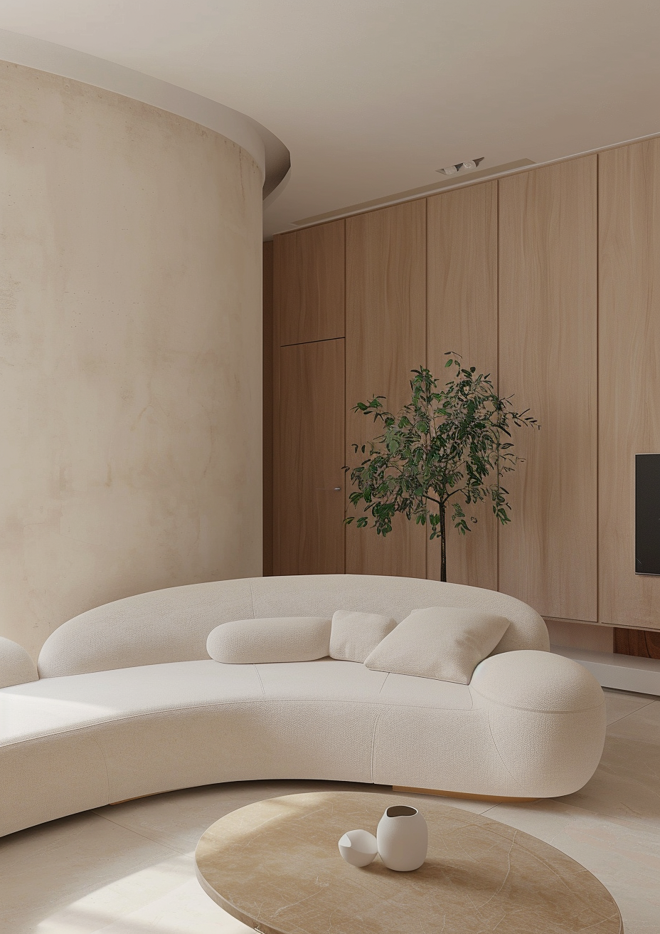
An ecru color palette starts with understanding what ecru actually is—and what it is not. Unlike bright white or standard beige, ecru is a softened neutral inspired by natural fibers such as unbleached linen, raw cotton, and parchment. It often contains gentle yellow, gray, or taupe undertones, which give it depth without heaviness.
In modern interiors, ecru functions as a grounding base. It reflects light more softly than white and avoids the starkness that can make minimalist spaces feel sterile. Because it sits comfortably in the middle of the neutral spectrum, ecru allows architecture, furniture silhouettes, and materials to take the spotlight.
An effective ecru palette doesn’t rely on a single shade. Instead, it uses variations—light ecru walls, deeper ecru textiles, and slightly warmer or cooler accents—to create dimension. This tonal layering is what makes modern spaces feel intentional rather than flat.
2. Ecru Color Palette: Why It Works in Modern Interiors

Modern interiors are defined by clean lines, open layouts, and a balance between form and function. The ecru color palette aligns perfectly with these principles because it softens structure without competing with it.
Ecru works particularly well in modern homes because:
It complements natural materials like wood, stone, and concrete
It enhances natural light instead of bouncing it harshly
It allows negative space to feel warm rather than empty
Understanding whether ecru reads warm or cool is essential when building a palette. If you’re unsure, this breakdown on is ecru a warm or cool color explains why lighting and context matter. In a south-facing room, ecru may feel creamy and warm, while in cooler light it can lean more neutral or slightly gray.
This adaptability is what makes ecru so effective in open-plan homes, where one color often needs to work across multiple zones without feeling repetitive.
3. Ecru Color Palette: Undertones and Lighting Matter

One of the most overlooked aspects of using an ecru color palette is undertone awareness. Two ecru shades may look similar on a paint swatch but feel completely different once applied.
Key undertone variations include:
Yellow-based ecru: warmer, more inviting, ideal for living areas
Gray-based ecru: cooler, more refined, works well in modern spaces
Taupe-based ecru: balanced and versatile, suitable for whole homes
Lighting plays a major role in how these undertones show up. Natural daylight reveals warmth, while artificial lighting can push ecru toward cream or gray depending on bulb temperature. This is why sampling is essential—especially in modern interiors where color consistency matters.
When undertones are chosen intentionally, ecru becomes a stabilizing element that connects walls, furniture, and finishes seamlessly.
Let’s Map Out Your Space Together
If you're planning a makeover and want a designer’s eye on how stick on tiles could work in your home, we’d love to help you visualise the transformation. Book a free 30-minute consultation and let’s sketch out a layout that feels tailored to your space.
4. Ecru Color Palette: Layering Texture for Depth

Because ecru is subtle by nature, texture becomes a critical design tool. A modern ecru color palette thrives on tactile contrast rather than color contrast.
Consider layering:
Linen and cotton upholstery
Plaster or limewashed walls
Natural wood in light to medium tones
Stone, travertine, or ceramic accents
These materials introduce visual interest without disrupting the calm of the palette. In modern interiors, this approach creates spaces that feel rich and dimensional—even when the color scheme is restrained.
Texture also helps prevent ecru from feeling bland. The goal isn’t to decorate more, but to choose materials that naturally add character.
5. Ecru Color Palette: Room-by-Room Applications

An ecru color palette works best when applied consistently throughout the home, with subtle variations depending on function.
Living Rooms
Ecru walls paired with warm wood furniture and neutral upholstery create a relaxed yet polished atmosphere. Accent pieces in muted browns or soft blacks add structure.
Bedrooms
In bedrooms, ecru feels especially calming. Layer it with textured bedding, soft lighting, and minimal contrast for a restful environment.
Kitchens
Ecru cabinetry or backsplashes soften modern kitchens, especially when paired with stone countertops and brushed metal hardware.
Bathrooms
When combined with natural stone and matte finishes, ecru brings warmth to spaces that often feel cold or overly minimal.
6. Ecru Color Palette: Pairing with Other Neutrals

Once the base palette is set, choosing accent tones becomes easier. A closer look at what colours go with ecru helps refine combinations without overpowering the space.
Ecru pairs especially well with:
Warm taupes and greiges
Soft browns and camel tones
Muted olive or sage greens
Charcoal and soft black for contrast
The key is moderation. Ecru works best when it remains the dominant tone, allowing accent colors to support rather than compete.
Your Renovation, Simplified
If you’re diving into a big home update, our Ultimate Renovation Planner can make the entire process far easier. From material planning to budgeting, it’s designed to keep your project organised while
helping you visualise every detail. Explore the planner and plan your makeover with clarity.
7. Ecru Color Palette: Common Mistakes to Avoid

Even a versatile neutral like ecru can fall flat if misused. Common mistakes include:
Pairing ecru with overly cool grays
Using too many high-contrast elements
Ignoring undertones across finishes
Relying solely on paint without texture
Modern interiors rely on restraint. When ecru is treated as a foundation rather than a filler, the result feels elevated and intentional.
Conclusion: Why Ecru Is a Modern Essential
The ecru color palette offers something rare in modern design: flexibility without compromise. It adapts to light, complements natural materials, and creates interiors that feel calm, cohesive, and timeless. Rather than demanding attention, ecru supports the overall design—allowing architecture, texture, and form to shine.
For homeowners seeking warmth without heaviness and simplicity without sterility, ecru is an ideal starting point. When layered thoughtfully, it becomes more than a neutral—it becomes the backbone of a modern interior.
FAQ: Ecru Color Palette
What is an ecru color palette?
An ecru color palette is a neutral-based scheme centered around soft, linen-inspired tones that balance warmth and subtle depth.
Is ecru better than white for modern interiors?
Ecru offers a softer alternative to white, reducing glare and creating a more inviting atmosphere while maintaining a clean look.
Does ecru work in small spaces?
Yes. Ecru reflects light gently, making small rooms feel open without appearing stark.
Can ecru be used with bold accents?
It can, but muted or earthy accents tend to work best to preserve balance.
Is ecru timeless or trendy?
Ecru is timeless. Its current popularity reflects a broader shift toward warmer, more natural interiors rather than a short-lived trend.
Start Your Dream Home Transformation
Our online design packages were created to make the entire process smoother, clearer, and far more enjoyable — no stress, no second-guessing. Whether you’re refreshing one room or reimagining your whole home, we guide you every step of the way with layouts, visuals, and a fully personalised design plan.
See our interior and exterior design packages to get started.
Author Bio
Beril Yilmaz is the founder of BY Design And Viz, an online interior and exterior design studio specialising in clear layouts, thoughtful architectural details, and design decisions that support how people actually live. With a background in architecture and a practical design approach, her work focuses on creating homes that feel considered, functional, and intentionally designed.


Comments