Ecru Colour: 9 Designer-Approved Ways to Style This Timeless Shade in Your Home
- Beril Yilmaz

- Nov 4, 2025
- 6 min read
Updated: Feb 10
Some colours don’t shout — they whisper sophistication. The Ecru colour is one of them. A quiet, creamy neutral that balances warmth and softness, it has become a designer favourite for interiors that feel timeless, natural, and inviting.
Derived from the French word for “unbleached,” Ecru sits somewhere between beige, cream, and light taupe. It carries the warmth of natural linen, the softness of sand, and the depth of parchment. Unlike stark whites or cool greys, it radiates subtle warmth without turning yellow — making it the perfect backdrop for both modern and traditional spaces.
In this guide, you’ll learn exactly how to use Ecru colour in your home — from wall paints to fabrics and finishes — and why it’s the neutral that elevates every interior.
At a Glance
• Tone: Soft, warm neutral with beige and grey undertones
• Best for: Calm, layered, and timeless interiors
• Pairs well with: White, black, greige, soft brown, and muted green
• Use it in: Walls, textiles, cabinetry, and accent details
• Design style match: Organic modern, minimal, coastal, and traditional
1. Ecru Colour: What Exactly Is It?

The Ecru colour sits in the elegant space between cream and beige. It’s slightly deeper than ivory and softer than tan, offering a creamy warmth that feels natural and lived-in.
Historically, the term “Ecru” referred to the shade of unbleached linen or silk — a pale, natural tone with just a hint of grey or yellow. Today, it’s celebrated for its versatility: light enough to brighten a room, warm enough to feel cosy, and neutral enough to pair with almost anything.
Designers love Ecru because it doesn’t demand attention. It allows texture and form to shine — from plaster walls to boucle upholstery — creating balance and quiet luxury.
2. Ecru Colour: Why Designers Love This Neutral
Unlike white or beige, the Ecru colour carries complexity. It has depth and warmth but still reflects light, adapting beautifully to different settings and styles.
Designers favour it because it instantly makes a space feel curated yet effortless. It’s one of those “perfectly imperfect” shades that shifts with the light — cooler by morning, warmer by evening — always maintaining its soft character.
In layered interiors, Ecru creates a visual bridge between tones. It softens contrasts between white and darker shades, creating a cohesive and comfortable flow throughout the home.
3. Ecru Colour: Undertones and Light Behaviour

The magic of Ecru colour lies in its undertones. Depending on light exposure and pairing, it can appear creamy, sandy, or even faintly greige.
Warm Light (South-facing rooms): Ecru appears golden and soft, perfect for sunny kitchens or living spaces.
Cool Light (North-facing rooms): It reveals a slightly muted, elegant tone with hints of taupe or stone.
Artificial Light: Warm LED or ambient lighting enhances its depth, creating a cosy and inviting glow.
To ensure harmony, always test Ecru samples on your walls before committing. Observe it across different times of day — you’ll notice how adaptable and graceful it feels in every light condition.
Thinking about updating your interiors with warm neutrals? Explore our Design Packages — tailored to help you choose the perfect Ecru-inspired palette for your space.
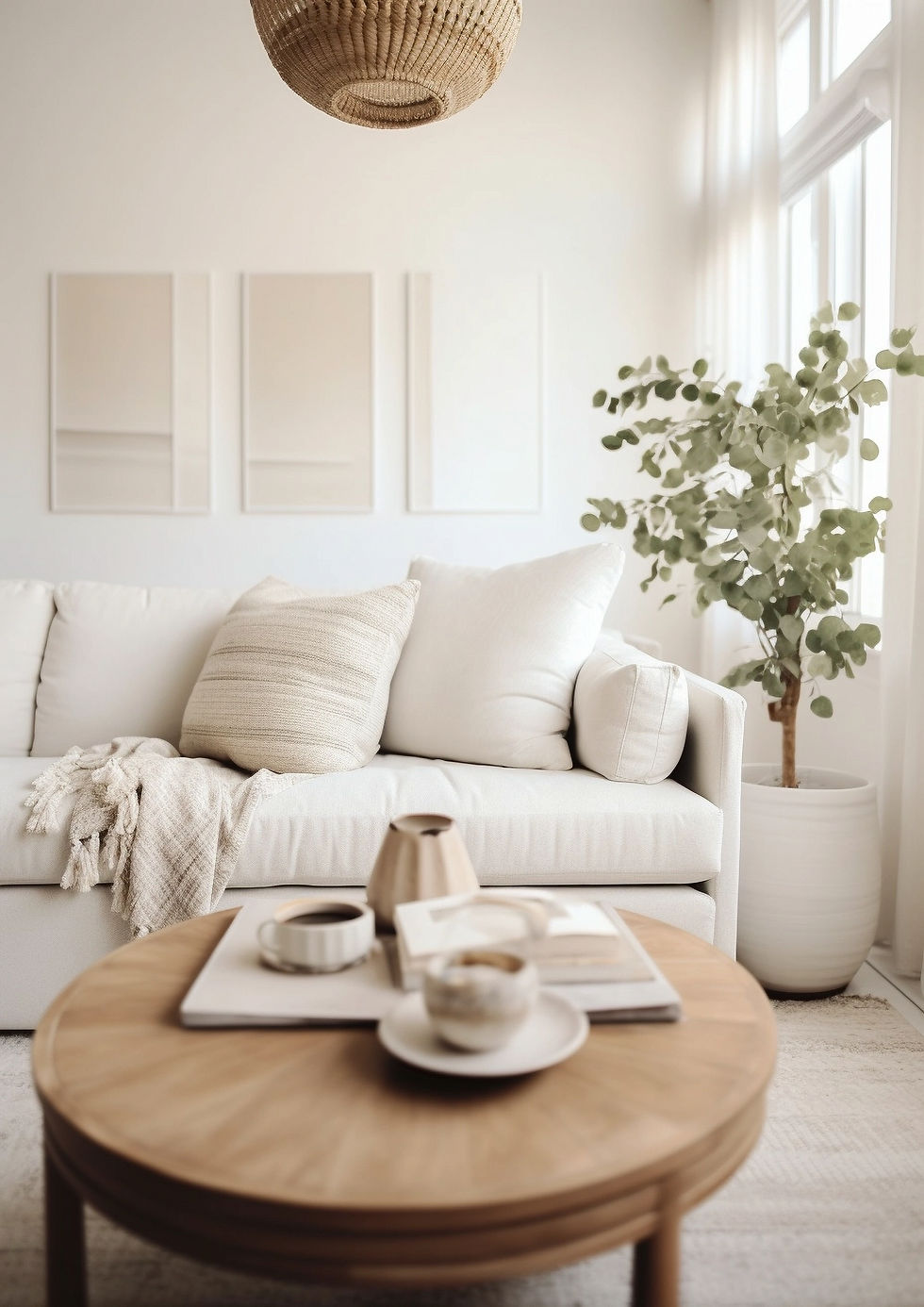
4. Ecru Colour: How to Use It on Walls

Painting your walls in Ecru colour creates an instant feeling of calm and sophistication. It’s softer than white, making large rooms feel welcoming and smaller spaces feel brighter without harshness.
For a seamless, high-end look, use Ecru on both walls and trim in a matte or eggshell finish. This approach blurs boundaries and gives a modern, enveloping feel. Alternatively, pair Ecru walls with crisp white trim for subtle contrast and definition.
In open-plan homes, Ecru works beautifully as a consistent backdrop. It ties spaces together while allowing architectural details and furniture to stand out naturally.
5. Ecru Colour: Perfect Pairings for a Balanced Palette

The Ecru colour thrives when layered with tones that complement its warmth. Here’s how to build a cohesive palette:
White and Off-White: For a calm, minimal look.
Greige and Soft Grey: To create subtle tonal layering.
Olive or Sage Green: For a fresh, organic touch.
Black or Charcoal: To add contrast and sophistication.
Warm Wood or Terracotta: For depth and natural grounding.
When styling, mix finishes — matte Ecru walls with woven jute, linen, and brushed metals — to enhance the material richness this colour evokes.
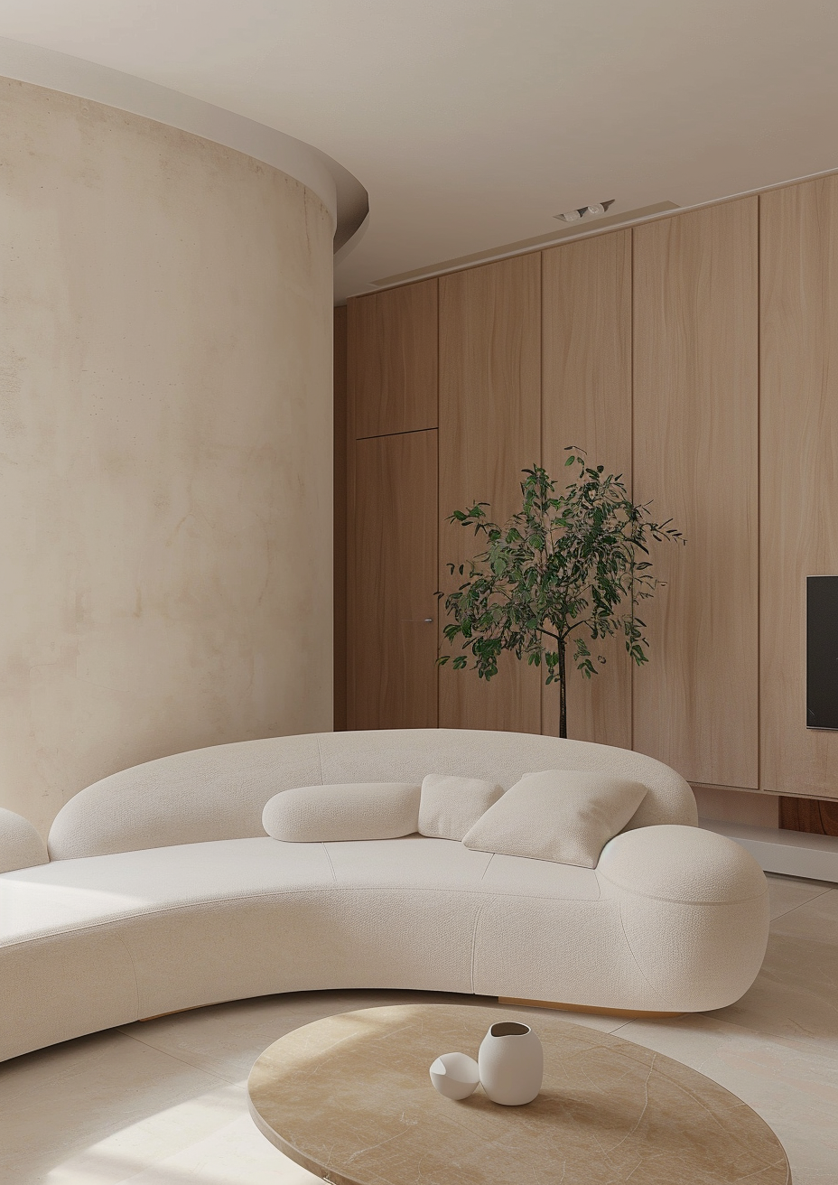
6. Ecru Colour: In Furniture and Textiles

In textiles and upholstery, Ecru colour is both forgiving and timeless. It hides wear better than white but still looks refined.
Ecru linen sofas, boucle armchairs, or wool throws add texture without visual noise. Layering these pieces creates an atmosphere of quiet luxury.
For curtains or bedding, pair Ecru with tone-on-tone shades for a monochromatic look — or mix it with muted olive, ivory, or chocolate brown for a deeper, organic contrast.
In modern interiors, Ecru also works beautifully for cabinetry or built-ins, softening sharp lines with warmth and tactility.
Want help finding the perfect balance of warm neutrals? Book a Consultation Call with BY Design And Viz — and let us help you create a palette that feels effortlessly timeless.
7. Ecru Colour: Complementing Materials and Finishes

The Ecru colour pairs elegantly with a range of natural materials — making it a dream for designers who love tactile, grounded spaces.
Wood: Light oak, walnut, and ash enhance its warmth.
Stone: Limestone, marble, and travertine add organic luxury.
Metal: Brass and bronze bring out its golden undertones, while matte black creates striking contrast.
Textiles: Linen, hemp, and wool reflect its natural origins beautifully.
This adaptability makes Ecru ideal for organic modern interiors — where the goal is to create comfort without clutter.
8. Ecru Colour: Accents and Layering Techniques

Layering is the secret to making an Ecru colour scheme feel intentional rather than bland. Introduce subtle tonal shifts by using different textures within the same palette — smooth plaster walls, boucle cushions, natural wood, and woven jute rugs.
A monochromatic palette works beautifully with Ecru — varying texture keeps it dynamic. Alternatively, contrast Ecru with black fixtures, dark wood, or olive accents for a more defined, designer-led look.
Remember, simplicity is where Ecru shines. Let natural light and materiality do the talking — less is truly more.
9. Ecru Colour: Where It Works Best

Because of its warmth and neutrality, Ecru colour is incredibly versatile across the home:
Living Rooms: Creates a relaxed, inviting feel.
Bedrooms: Soft, cocooning, and perfect for layering texture.
Kitchens: Warm alternative to white cabinetry or walls.
Bathrooms: Elegant backdrop for stone and brass fittings.
Hallways: Light and welcoming without feeling stark.
It adapts to both modern minimalism and classic style — always timeless, never trendy.
10. Ecru Colour: The Designer Takeaway

The true beauty of Ecru colour lies in its balance. It’s soft without being flat, warm without being yellow, neutral without being cold. It acts as a natural link between tones, allowing materials, textures, and lighting to shine.
Whether used as paint, upholstery, or decor, Ecru quietly elevates any space. It’s the ultimate designer’s secret — a tone that makes everything around it feel more considered, cohesive, and timeless.
Conclusion
The Ecru colour is proof that subtlety can be powerful. It transforms a home not through boldness, but through balance — a quiet warmth that feels refined yet effortless.
Whether you’re painting walls, styling textiles, or building a full neutral palette, Ecru brings the softness and depth that white often lacks. It adapts, enhances, and soothes — the ultimate colour for modern, organic interiors that feel truly timeless.
If your goal is to design a space that feels elegant, warm, and grounded — start with Ecru.
ALT Text Suggestion: Calm, minimal interior in layered Ecru tones with natural light.
FAQ
1. What colour family does Ecru belong to?
Ecru belongs to the warm neutral family — sitting between beige, cream, and taupe with soft, natural undertones.
2. Is Ecru colour warm or cool?
Ecru is a warm neutral, though it can appear cooler in shaded or north-facing rooms due to its subtle grey undertone.
3. What colours complement Ecru?
Ecru pairs beautifully with white, black, olive green, soft brown, and natural wood tones.
4. Is Ecru suitable for modern interiors?
Absolutely. Ecru’s understated warmth makes it ideal for organic modern, minimalist, and Scandinavian-inspired interiors.
Ready to transform your home with the warmth of Ecru colour? You’ll receive a curated colour palette, material recommendations, and a full design concept that brings calm sophistication to your space.
Author Bio
Written by Beril Yilmaz, founder of BY Design And Viz — a UK-based interior designer known for creating timeless, layered interiors with a warm, organic feel. Through bespoke online design services, Beril helps homeowners craft spaces that are elegant, balanced, and effortlessly personal.


Comments