


Farrow & Ball All White 2005 - An Architect's Honest Review

Updated: Aug 10
Farrow & Ball All White 2005 is the brand's purest white - and the most misunderstood. Most people assume 'no pigment' means no character, and reach past it for one of F&B's more obviously warm off-whites instead. In the right room, All White is one of the most quietly sophisticated colours the brand makes, precisely because it refuses to compete with anything else in the space.
All White carries no added colour pigment, which is unusual even within F&B's own range - most of their 'whites' are built from a base tint. That absence is what gives it its particular quality: it is bright without the coldness of a blue-white, and clean without drifting into the cream or beige territory that so many 'warm whites' fall into.
What follows sets out where All White earns its reputation, where it disappoints, and the specific conditions - light, materials, orientation - that decide which of those two outcomes you get.
All White 2005 - The Key Facts
Collection | Farrow & Ball Architectural Neutrals collection |
LRV | ~92-95 (sources cluster in the low-to-mid 90s - among the very highest LRVs Farrow & Ball produces, functionally a near-white) |
Undertone | Essentially pigment-free - reads soft and warm-neutral rather than cool or blue-white |
Character | Architectural, quiet, restrained - a white built to disappear rather than announce itself |
Best trim | Works as its own trim on walls painted a deeper neutral; on white-on-white schemes pair with Wimborne White for a fractionally softer companion |
Best orientation | South, east or west-facing - needs some warmth in the light or it can read clinical |
Main risk | In a north-facing room with cool artificial light it can lose the softness that makes it distinctive and read as a flat, slightly clinical white |
All White Undertones - What Is Actually Going On

All White has no added pigment, and that single fact is the whole story of how it behaves. It is not built on a grey base, a beige base, or a blue base the way most 'clean whites' are. What that produces on the wall is a white that is soft rather than stark - it avoids the faintly clinical, faintly blue-cast look that a true brilliant white can have under cool light.
Because there is no pigment steering it, All White is unusually responsive to whatever light and materials surround it - it borrows warmth from a room with warm materials and can read fractionally cooler in a room that has none. This is different from a colour with a fixed grey-green or beige-pink undertone, which holds its character regardless of context. All White has less inherent character to hold onto, which is exactly what makes it useful as an architectural backdrop.
Where this creates risk is in rooms with no warmth to lend it - north light, cool LED bulbs, polished cool-toned stone. In those conditions All White can read thinner and flatter than it does in a well-lit room with timber or brass nearby. For the comparison against F&B's other benchmark whites, the Strong White vs Wevet guide covers how All White's two closest siblings differ in warmth and depth.
LRV - What the Low-to-Mid 90s Means in a Real Room
All White sits at the very top of Farrow & Ball's LRV range - published figures cluster between roughly 92 and 95, depending on the source and measurement method, which places it comfortably among the brightest colours the brand produces. In practical terms, that means it will not add measurable depth to a room the way a mid-LRV neutral does - it is functionally a bright, reflective white.
That level of reflectance means All White is genuinely useful in rooms that need every available bit of daylight bounced around - small rooms, rooms with limited window area, hallways with borrowed light only. It is not the colour to reach for if you want a wall with presence or a sense of enclosure; for that, F&B's mid-LRV neutrals such as Skimming Stone will do far more work.
How All White Behaves in Different Light
South-Facing Rooms
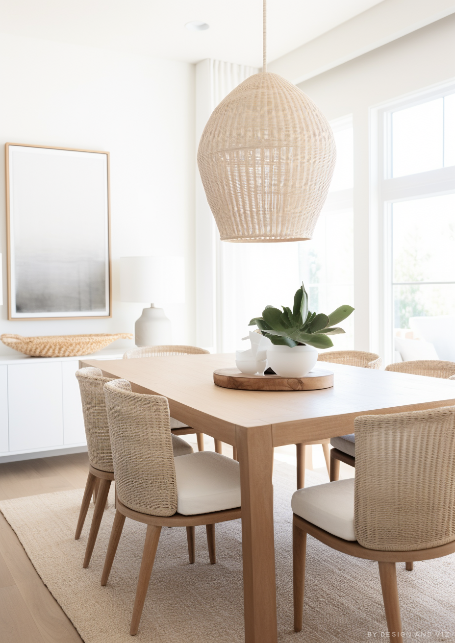
South-facing rooms are where All White is most reliably beautiful - the warmth of direct sun keeps the white feeling soft rather than stark, and it holds its quiet, architectural quality all day. I have specified it on walls and joinery in south-facing kitchens and studies and it consistently reads as clean without ever tipping cold. In this orientation it is close to a safe default.
North-Facing Rooms
North-facing rooms are where All White needs the most support - without pigment of its own to lean on, the flat, cool light of a north aspect can leave it reading thin and slightly clinical rather than soft. If the room is north-facing and All White is still the brief, I would specify warm timber flooring, warm metals, and 2700K lighting throughout to give the white something to borrow warmth from.
East and West-Facing Rooms
East-facing rooms give All White a genuinely flattering morning character - the warm early light softens it beautifully, though it can read a touch cooler once the afternoon shifts to indirect light. West-facing rooms are similarly strong in the evening, when low warm sun keeps the white from ever feeling sterile; for a sitting room used mainly after work, a west-facing All White scheme performs well right through the day.
Artificial Lighting
Artificial lighting is not optional to specify carefully with All White. Under warm 2700K bulbs the white reads soft and considered, close to how it looks in good natural daylight. Under cool 4000K-plus bulbs it can shift toward a flatter, slightly blue-tinged white that undermines the entire point of choosing a pigment-free colour in the first place. I do not recommend All White in a room where the client wants cool white lighting - the two work against each other.
For how Wimborne White compares to All White - the brand's cleanest, most neutral shade and the classic trim partner for Wimborne White walls - the All White vs Wimborne White guide explains the undertone gap and which one suits a north-facing room.
Not sure if All White works for your room? A colour consultation is included in all our design packages - book directly here. |
What to Pair With All White
Trim and Joinery
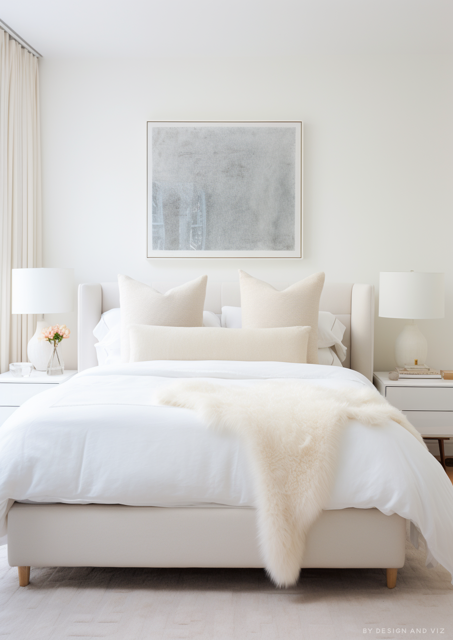
The simplest and most reliable trim strategy for All White is to use it on both wall and trim, varying only the finish - matt on walls, eggshell or gloss on trim and joinery, which gives definition without introducing a second white to reconcile. Where a genuinely separate trim white is wanted, Wimborne White is the closest F&B match and reads marginally softer without creating any visible undertone clash.
Floor Materials
Warm pale timber floors are the most reliable pairing for All White - oak, ash, and similar warm-toned woods give the pigment-free white something to bounce warmth off, which is exactly what it needs to avoid reading flat. Cool polished concrete or pale cool-toned stone is a harder pairing; it can be done, but it needs warm furnishings elsewhere in the room to stop the whole space reading clinical.
For how Brilliant White compares to Farrow & Ball's All White - a much softer, warmer-reading near-white despite a similarly high LRV - the All White vs Brilliant White guide breaks down the undertone gap and the classic trim pairing between the two.
Metal Finishes
Warm brass and aged bronze are the most flattering metal companions for All White - the warmth of the metal gives the white a point of contrast and prevents the whole scheme from feeling flat or shopfront-clean. Brushed nickel and chrome also work, but read considerably more clinical against All White than they would against a warmer off-white, so they suit a deliberately architectural, minimal brief rather than a soft or lived-in one.
Accent Colours
Deep, saturated colours are where All White earns its keep as a backdrop - a room of All White walls with a single strong colour on joinery, a door, or a piece of furniture reads considerably more dramatic than the same colour against a warmer off-white. Charcoal, deep bottle green, and navy joinery all work well against it. Avoid pairing All White with another near-white that has a discernible undertone of its own - the contrast reads as a mismatch rather than a considered layering.
For how All White compares to Strong White - the cool, grey-based Farrow & Ball neutral roughly 20 LRV points below it - the All White vs Strong White guide explains why the two are complementary partners rather than rivals, and which one to use where.
All White Room by Room

Bathrooms
All White is one of the most dependable bathroom whites in the F&B range - the brightness and cleanliness suit the brief directly and it reads as fresh rather than sterile provided the room has warm materials nearby. My standard specification is All White walls and ceiling, warm oak vanity, brushed brass fittings, and 2700K lighting - the combination keeps a naturally cool room type from tipping clinical.
Bedrooms
All White in a bedroom is a considered rather than a default choice - it can read genuinely calm and restful in a south or west-facing room with warm linen and timber furniture, but in a north-facing bedroom it needs real material support to avoid feeling cold at the hours a bedroom is actually used. Where the brief is a soft, hotel-like bedroom, I more often reach for a mid-LRV warm white instead, but for a genuinely minimal, architectural bedroom brief All White is hard to beat.
Living Rooms
Living rooms suit All White best when the brief is deliberately minimal and the furnishings are doing the warmth-giving work - a room of All White walls with warm linen upholstery, a large sisal or wool rug, and timber furniture reads as calm and considered rather than empty. In a room where the brief already leans traditional or heavily patterned, All White can feel like an odd fit; a warmer off-white generally serves that brief better.
Kitchens
Kitchens are one of the strongest applications for All White, particularly on cabinetry - the brightness keeps a working kitchen feeling clean and the pigment-free quality means it does not compete with stone worktops or a tiled splashback with its own undertone. On walls in a north-facing kitchen it needs the same warm-material support as any other north-facing room, but on cabinetry in almost any orientation it performs reliably well.
Home Offices and Studies
Home offices and studies benefit from All White's quiet, non-competing quality - it keeps the room feeling clear-headed rather than busy, which suits a working space. Paired with a dark joinery wall of bookshelving, a warm timber desk, and brass task lighting, an All White study reads architecturally considered rather than blank.
Who All White Is Right For - And Who It Is Not
All White is right for you if:
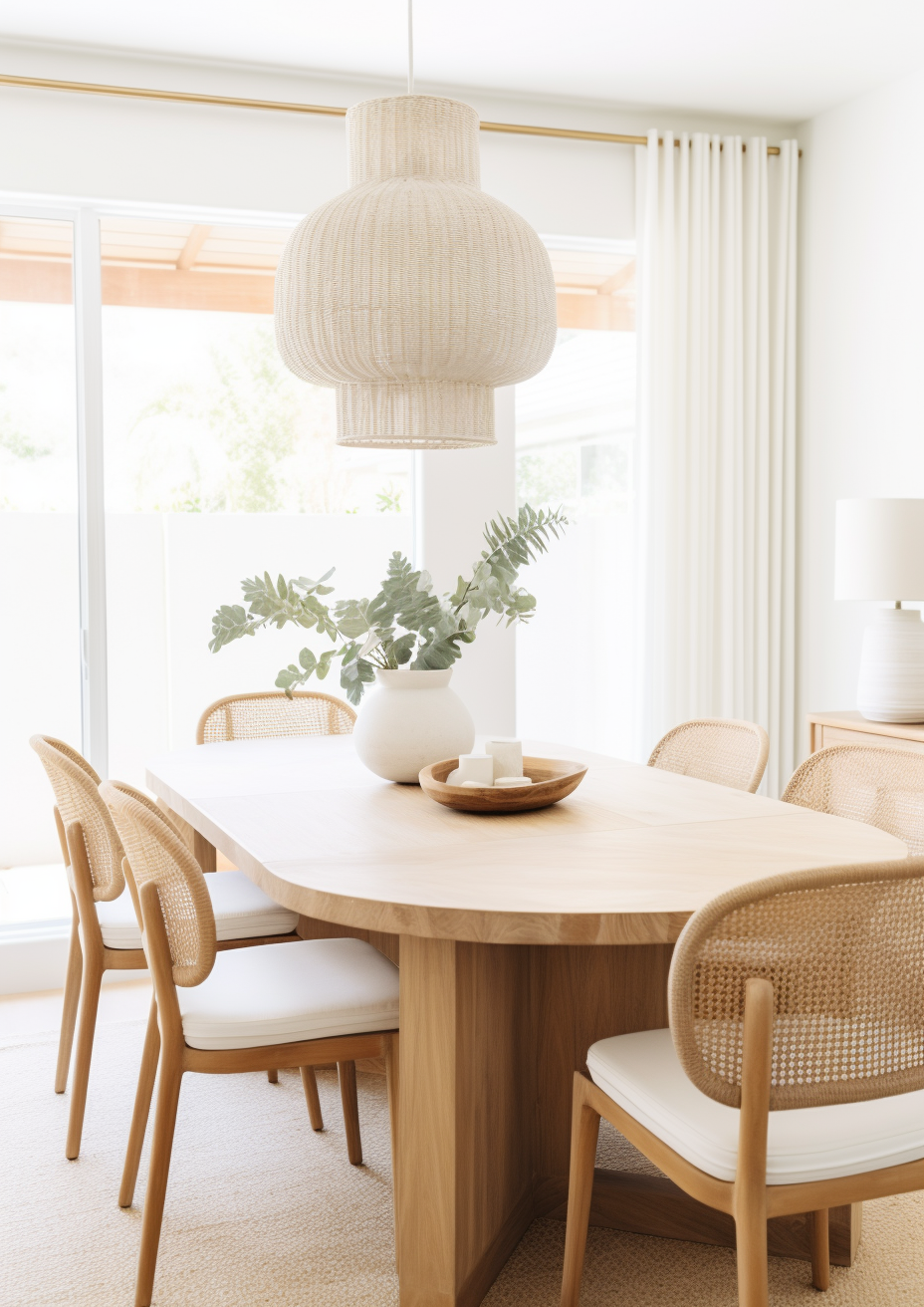
The brief is architectural, minimal, or deliberately restrained - All White's lack of pigment is precisely what makes it work as a quiet backdrop rather than a wall colour with its own agenda. It suits interiors where the materials and furnishings are meant to carry the visual interest.
The room has good warm natural light, or warm materials to lean on - south, east, or west-facing rooms with timber floors, brass fixtures, or warm textiles give All White the warmth it does not generate on its own.
You want maximum reflectance in a small or light-starved room - at an LRV in the low-to-mid 90s, All White does more to bounce available daylight around a space than almost any other colour in the F&B range.
You are committed to warm-spectrum artificial lighting throughout - 2700K bulbs are what keep All White reading soft rather than clinical once natural light fades.
All White is not right for you if:
The room is north-facing with no warm materials to compensate - without timber, brass, or warm textiles nearby, All White in cold light can read thin and slightly clinical rather than the soft white it is on the tin.
The brief is warmth, cosiness, or a traditional character - All White does not generate warmth of its own. If the brief calls for a room that feels enveloping or cosy, a warmer, higher-pigment off-white will serve it better than a pigment-free white ever will.
The material palette is dominated by cool stone, polished concrete, or cool metals with no warm counterpoint - All White needs at least one warm element in the room, or the whole scheme risks reading sterile rather than clean.
You are choosing between several near-white F&B colours without sampling them side by side - the differences between All White, Wimborne White, and Strong White are subtle enough that a chip alone will not settle it; a large sample board in the actual room is essential.
How All White Compares to Similar Colours
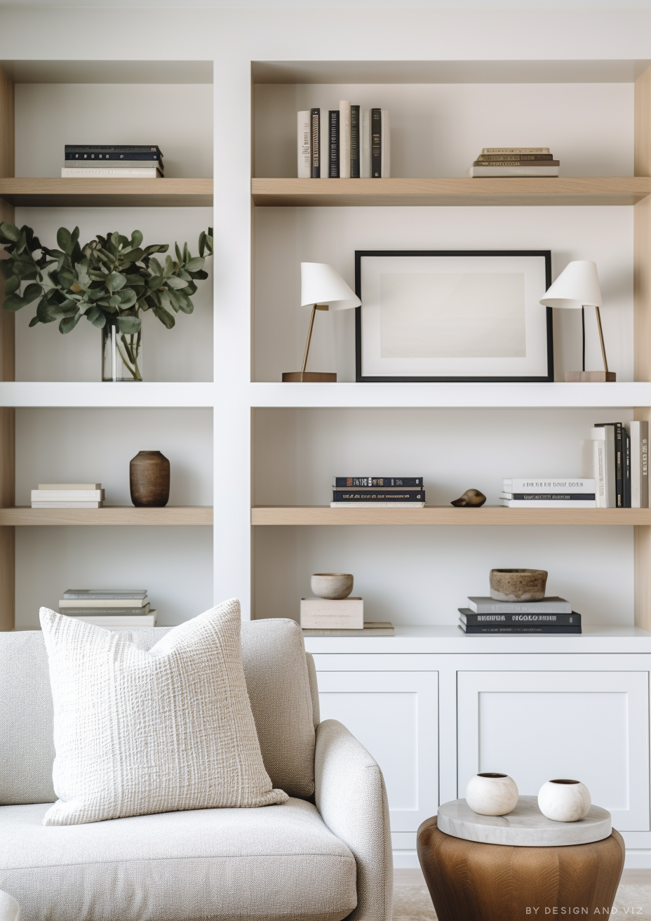
vs Strong White No.2001 - Strong White is F&B's other benchmark bright white, and the two are frequently confused on a chip. Strong White carries a touch more warmth in the base than the genuinely pigment-free All White, which makes it read marginally softer in a cool room, while All White stays the purer, more architectural choice. The full breakdown of how the two diverge under different light is in the linked comparison.
vs Wevet No.273 - Wevet sits considerably deeper and warmer than All White - it is a genuine warm off-white with a greige undertone, not a near-white. Where All White is chosen for maximum brightness and a non-committal backdrop, Wevet is chosen specifically for its warmth and quiet presence, so the two rarely compete for the same brief.
vs Skimming Stone No.241 - Skimming Stone is a mid-LRV warm neutral, considerably deeper than All White, and F&B itself pairs the two directly - Skimming Stone on walls with All White on trim and ceiling is one of the brand's own recommended architectural neutral schemes. The pairing works precisely because the two sit far enough apart in depth and warmth to read as a considered layering rather than a mismatch.
vs Wimborne White No.239 - Wimborne White is F&B's softer near-white, generally read as fractionally warmer and less stark than All White while remaining in the same bright, high-LRV territory. Where All White is chosen for its almost total absence of undertone, Wimborne White is chosen when a very slightly warmer, marginally more forgiving near-white is wanted for the same brief.
Frequently Asked Questions
Is All White warm or cool?
All White is neither strictly warm nor cool - it has no added pigment at all. That absence of a fixed undertone is what defines it: it reads soft rather than stark in good light, but it has no inherent warmth to fall back on in a cold, north-facing room. Whether it reads warm or cool in practice depends almost entirely on the light and materials around it.
Is Farrow & Ball All White really pure white?
Yes - it is the one F&B colour built with no added colour pigment, which is unusual within the brand's range. This is what gives it the softness F&B describes as avoiding 'the colder blue undertones of a brilliant white', while still sitting at the very top of the brand's LRV scale.
What LRV is All White?
Published figures cluster in the low-to-mid 90s, generally cited around 92 to 95 depending on the source and measurement method. Either way, it sits among the brightest colours Farrow & Ball produces and should be treated as a functional near-white for reflectance purposes.
What should I pair with All White?
Warm timber, brushed or aged brass, and warm textiles are the most reliable companions. Farrow & Ball's own guidance pairs it with Skimming Stone and Strong White for a considered architectural neutral scheme. Avoid pairing it with cool stone or cool metal with nothing warm nearby, since the combination can tip the whole room clinical.
What rooms is All White best for?
Kitchens and bathrooms are where All White performs most consistently - the brightness suits both briefs directly, provided warm materials are present. South, east, and west-facing living spaces and studies also work well. It is least reliable in north-facing rooms without warm-material support, and in briefs where cosiness rather than clarity is the goal.
The Verdict
Farrow & Ball All White is a genuinely distinctive colour precisely because it has almost no colour of its own to offer - it is a backdrop, not a statement, and it is at its best when treated that way. It rewards rooms with good light and warm materials, and it exposes rooms that have neither.
The way to test it properly: paint a large sample - at least A2 size - on two different walls in the room, one that receives direct daylight and one that does not. Check it at three points across the day: mid-morning, early afternoon, and again after dark under the room's actual bulbs at whatever colour temperature you plan to install. If it still reads soft rather than flat in all three conditions, the room can support it. For the closest F&B comparison on brightness and warmth, the Strong White guide is a useful next stop.
Want a complete colour scheme built around All White? Our design packages cover full palette selection, finish recommendations, and 3D visualisations - see our packages. |
About the Author
Beril Yilmaz is a qualified architect and interior designer based in the UK. She runs BY Design And Viz, a design platform covering paint colour reviews, interior design guidance, and residential design projects. Beril has specified All White across residential projects in the UK and internationally - most often on kitchen cabinetry and in south-facing bathrooms, paired with warm oak and brushed brass fittings.


Comments