Green Color Combinations That Actually Work in Real Homes
- Beril Yilmaz

- 6 minutes ago
- 8 min read
Nature-inspired interiors are a staple of modern residential design, yet getting a green colour combination right is notoriously difficult. The human eye can distinguish more shades of green than any other colour, making the margin for error incredibly slim. In my practice, I frequently see clients struggle when a "soothing sage" reads as a cold, clinical grey or a "moody forest" makes a small room feel claustrophobic.
The issue usually isn't the paint itself, but a failure to account for lighting and material context. This guide draws on my experience as an architect to explain the logic behind successful palettes. I will provide specific paint pairings and structural rules to ensure your space feels cohesive rather than accidental.
At A Glance
The single most common mistake: Picking a green without testing it against the room’s specific natural light orientation.
The design principle: Use the "Temperature Rule" to match green undertones with your flooring and furniture.
11 specific ideas: Distinct pairings using brands like Farrow & Ball, Little Greene, and Sherwin Williams.
What to avoid: High-contrast "vibrating" pairings and choosing a green that exactly matches the lawn outside.
Beril's recommendation: Olive green and warm stone for a versatile, timeless interior.
Why Most Green Colour Combinations Get It Wrong

The problem most homeowners face is a phenomenon I call the "Store Light Trap." You find a swatch in a shop under bright, consistent LED lighting, and it looks like the perfect earthy sage. However, once that colour is applied to a room in a typical UK home, it reacts to its environment. Green is a highly reflective colour. If you have a lush garden outside a large window, that green light will "bounce" into the room, making a subtle sage look neon.
In my professional practice, I’ve seen dozens of projects where a deep forest green was chosen for a small, north-facing room, only for it to feel like a cave. Because north-facing light is inherently blue and cool, it pulls the life out of greens that have grey or blue undertones. People make the mistake of thinking all greens are "natural" and therefore neutral, but green is one of the most volatile colours in the spectrum. The solution lies in understanding the architecture of the light before you ever pick up a paintbrush.
The Design Principles Behind Green That Works

Principle 1: Balance the Undertone Temperature
Every green leans either toward blue (cool) or yellow (warm). If you are designing an organic modern bathroom, you might lean toward a cool, eucalyptus green. However, if that bathroom has warm terracotta floor tiles, the cool green will feel disconnected. I recommend matching the temperature of your green to the largest fixed element in the room—usually the flooring. Warm woods like oak or pine thrive with yellow-based greens like moss or olive.
Principle 2: Texture Prevents "Flatness"
Green can easily look like a solid, unyielding block of colour that sucks the depth out of a room. To combat this, I specify green alongside natural textures. A matte green wall needs the "break" of a linen curtain, a jute rug, or a grain-heavy wood. These textures catch the light differently than a flat painted surface, providing the visual variety needed to make a green colour combination feel sophisticated rather than flat.
Principle 3: Use LRV to Control Mood
The Light Reflectance Value (LRV) is a scale from 0 to 100 that tells you how much light a colour reflects. I use this as a technical tool. In a small snug where you want a "cocoon" effect, I’ll choose a green with an LRV below 20. In a kitchen where you want a sense of space, I’ll look for an LRV above 50. Most people choose a shade based on the "look" without realising that the LRV is what actually dictates how the room feels at 4:00 PM on a Tuesday.
11 Green Colour Combinations to Try
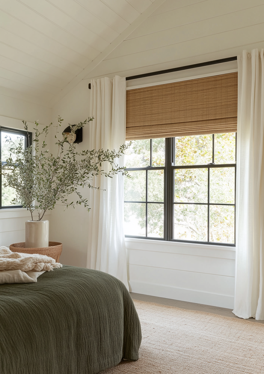
1. Sage Green and Warm Stone

This is my go-to for residential projects that require a sense of calm without feeling cold. I often recommend Farrow & Ball French Gray—which, despite its name, is a beautiful grey-green—paired with a creamy white like benjamin moore alabaster for the woodwork. This combination works best in south-facing rooms where the warm light brings out the green pigments.
2. Olive Green and Terracotta

For an earthy, grounded atmosphere, I find that an olive like Little Greene Olive Colour is unmatched. When you pair this with natural terracotta or unglazed clay, the orange-red tones of the clay act as a muted complement to the green. This is ideal for kitchens or entryways where you want to bridge the gap between the indoors and outdoors.
3. Forest Green and Cognac Leather

If you want to create a space that feels established and expensive, pair a deep forest green with warm amber leather. I suggest a shade like Sherwin Williams Jasper. The weight of the dark walls provides a dramatic backdrop that makes the texture of the leather pop. This is a classic choice for a home office or a secondary living room.
4. Mint Green and Charcoal Grey
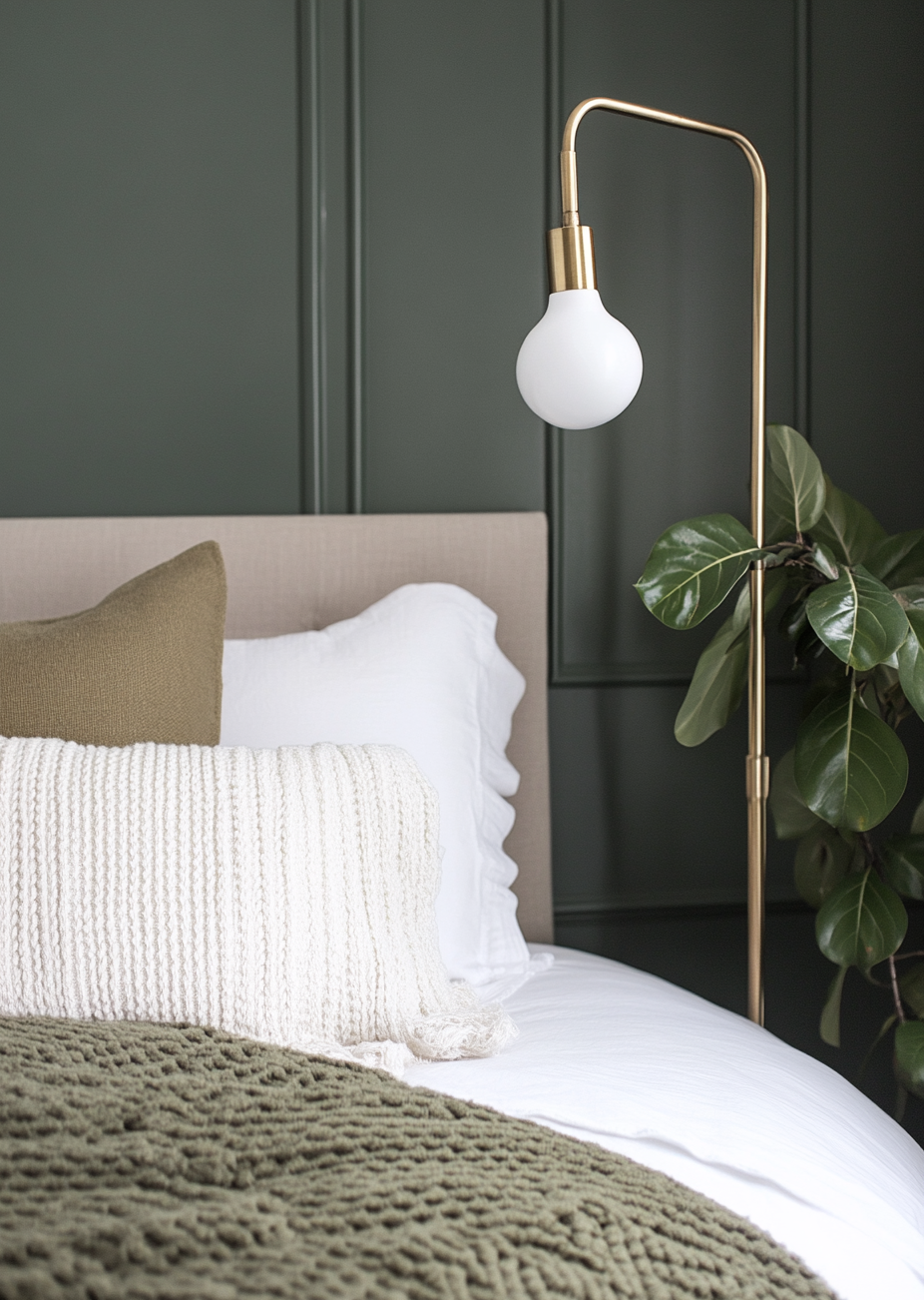
Mint often gets a bad reputation for looking "sweet" or "childish." I fix this by grounding it with a heavy charcoal. Using a light mint against grey living room ideas or architectural features in Sherwin Williams Iron Ore creates a sharp, modern contrast. It moves the mint away from "shabby chic" and into a more architectural territory.
5. Eucalyptus and Light Oak

This is the hallmark of Scandinavian-inspired design. The silvery, blue-ish tones of eucalyptus green pair perfectly with the desaturated look of white oak or ash. It is a very low-stress combination that feels airy. I find it works particularly well in bedrooms where you want to avoid visual clutter.
6. Teal Green and Unlacquered Brass

Teal is a heavy, saturated green with a strong blue influence. In my practice, I find teal can look a bit dated when paired with silver or chrome. However, when paired with unlacquered brass or aged gold hardware, it feels incredibly modern. The warmth of the metal cuts through the "coolness" of the teal.
7. Moss Green and Linen White

For a soft, textural approach, I love a mossy green paired with off-white linen. Use a shade like Sherwin Williams Svelte Sage on the walls and bring in heavy, ivory-coloured linen curtains. The lack of harsh contrast makes the room feel expansive and soft, perfect for a quiet reading corner.
8. Emerald and Dusky Pink
This is a bold choice that requires a specific balance. The key is to choose a pink that is "muddy" rather than "candy." I recommend Farrow & Ball Setting Plaster against a rich emerald. Because they sit near-opposite each other on the colour wheel, they provide a natural energy that is tempered by the muted nature of the pink.
9. Pistachio and Dark Walnut

Light, yellow-based greens like pistachio can feel very retro. To make them feel contemporary, pair them with dark, heavy woods like walnut. The darkness of the wood grain provides a "weight" that anchors the light-hearted green. I often specify this for mid-century modern dining rooms.
10. Seafoam and Navy Blue

If you want a coastal feel without using the cliché of blue and white, try seafoam green and navy. Using sherwin williams naval as an accent—perhaps on a kitchen island or a piece of built-in cabinetry—against seafoam walls creates a sophisticated, nautical depth that feels fresh rather than themed.
11. Hunter Green and Carrara Marble
In bathrooms or kitchens, a deep hunter green provides a stunning contrast to the grey veining of white marble. The organic movement of the stone softens the intensity of the green. This is one of my favourite ways to make a small bathroom feel like an intentional "jewel box" rather than just a utility space.
Finding the right balance for your home's architecture is a technical process. If you are struggling to visualise how these greens will work with your layout, book a design package here and I will build you a complete room palette around it.
What to Avoid With Green Colour Combinations

The "Vibrating" Pair
Avoid pairing a primary, bright green with a primary, bright red. Because they are exact opposites on the colour wheel, your eye cannot focus on both simultaneously, creating a "vibrating" effect that causes genuine physical discomfort. If you want to use red tones, always go for a muted burgundy, a rust, or a terracotta.
The Garden Mirror
Do not try to match your interior green exactly to the grass or trees outside your window. The light reflecting off the actual foliage will make your indoor green look neon or "sickly." I always recommend choosing a green that is two shades "greyer" or more "muddied" than the colour you see in nature.
The All-Cool Trap
Avoid a "cool" green (like a blue-toned mint) if you have cool grey flooring and cool LED lightbulbs. Without a warm element—be it wood, brass, or a warm-toned textile—the room will feel physically colder, which is a common complaint in UK residential design.
Architect's Top Pick
If I had to choose one green colour combination that works in almost any context, it is Olive Green and Warm Stone.
Specifically, I recommend a shade like Little Greene Sage & Onions paired with a limestone-coloured trim. This combination is incredibly forgiving. In the morning, the yellow undertones in the olive make the room feel sun-drenched and energising. In the evening, under warm artificial light, the green deepens and becomes intimate. It feels historical in a Victorian terrace yet clean and organic in a modern new-build. It is the ultimate "new neutral" that provides personality without overwhelming the architecture.
FAQ : Green Colour Combinations
What is the best green for a north-facing room? I recommend staying away from greens with blue or grey undertones. Instead, choose "warm" greens like olive, moss, or a yellow-based sage. These tones counteract the cool, blue-ish light that enters north-facing windows.
Which green goes best with grey flooring? If you have cool, blue-grey floors, a eucalyptus or a muted teal works best. If your grey floors are warmer (often called "greige"), you should look toward a sage or a lichen green to maintain harmony.
Can I use a dark green in a small room? Yes. In fact, using a low-LRV green like a forest or hunter green can blur the boundaries of the walls, making a small room feel deeper and more expansive than
a bright, flat white would.
What finish should I use for green paint? For dark, saturated greens, I almost always specify a matte or "dead flat" finish. Darker colours in a high-sheen finish can look like plastic and will highlight every imperfection in your plasterwork.
Conclusion
Mastering a green colour combination is about more than just picking a pretty swatch; it’s about understanding the dialogue between the pigment, the light, and the materials in your room. If you lead with the architecture and the orientation of your space, green can be the most rewarding colour in your home.
Ready to start your project?
If you need professional help selecting the perfect palette for your renovation, book a colour consultation with me today. We can work together to ensure your home feels exactly how you imagined.
Author Bio
Beril Yilmaz is a qualified architect based in the UK with a background in specifying materials and colours for real residential clients. She has a deep interest in how colour affects the perception of architectural space and has designed interiors across a range of styles for residential clients in the UK and internationally.


